Famous 1970s logos: The best 70s logo design examples
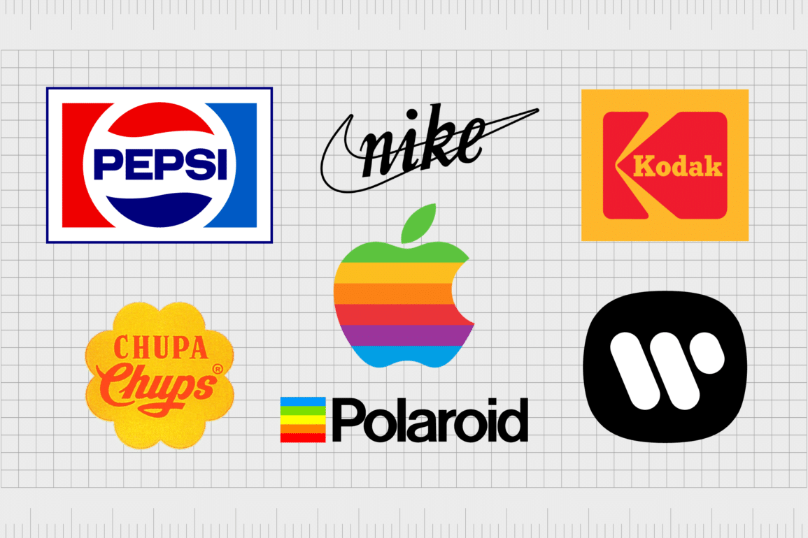
When you visualize 1970s logos, a few specific features are likely to immediately jump to mind. While 70s logos, just like the emblems we see today, were extremely varied, they often shared some similarities. The biggest 1970s brands took advantage of the trends of the generation, prioritizing bold, bubbly fonts, bright colors, and over-the-top imagery.
The strategies used for 1970s logo design a world apart from the methodologies most graphic designers embrace today. In the modern world, simplicity, and minimalism reign supreme.
But in the 70s, branding was all about making an impact. Logo designers experimented with a host of shapes, styles, and colors to delight, excite, and engage their audience.
In an era of over-the-top fashion, logo designs adhered to the bohemian mindset of the mass population, in regions all across the globe.
Today, we’re going to be taking a closer look at the design elements of 1970s logos, and how they shaped the evolution of major brands.
Nostalgic design: Looking back at iconic 70s logos
Looking back at 1970s logos, and other evolving emblems throughout the decades provides some unique insights into the nature of successful logo design. Creating an incredible brand identity means understanding the preferences and expectations of your audience.
As global trends and generations evolve, logo designs often evolve with them. We’ve seen countless examples of this throughout the decades. Even major brands like Coca-Cola, Starbucks, and Nike have adapted their logos to suit the tastes of their changing audience.
The 70s was a revolutionary time for many brands. It was an era of significant cultural and societal change, spurred by a global desire for peace and love, in a world rocked by war. Self-expression and creativity reigned supreme, paving the way for designers to experiment more than ever.
Typography evolved with new typesetting technologies, imagery was influenced by the rise of cultural movements in the musical and social world. Even the way we used colors began to change. People were drawn to bright and vibrant motifs, symbolic of an evolving world.
Though the great logos produced in the 70s may seem outdated, or “retro” today, they also demonstrated the ability of companies to understand and adapt to their audience.
This is a lesson that stands the test of time. No matter which industry you serve, or what you do, your logo design and brand identity should always connect with your customers values.
Famous 1970s logo: A journey into 1970s logo design
There are plenty of excellent examples of 70s logo design worth exploring today, whether you’re a budding designer, or an entrepreneur starting your own company. While the trends in logo design may have evolved today, there’s still a lot to learn from the images produced by decades-old brands.
Here are just some of the most famous, and impressive 1970s logos to be produced throughout the iconic decade.

1. Space Invaders
Few logos in the gaming industry have captured more attention than the Space Invaders emblem over the years. The unforgettable “shoot ‘em up” game was produced initially in 1978, by a video development expert in Japan, Tomohiro Nishikado.
The introduction of Space Invaders transformed the gaming landscape, setting the template for the fixed shooter genre.
The Space Invaders logo is an excellent example of iconic 70s logo design. It features a bold sans-serif font with squared edges, intended to symbolize the digital era. The drop shadow behind the font, often depicted in either blue or red, was also a popular design element from the decade.
2. Ruffles
First launched in 1948, Ruffles has retained elements of its 70s retro logo design throughout the decades. Even today, the brand’s emblem showcases bold colors and blocky fonts common in the era. Of course, the logo used during the 70s was far more fun and playful than the one we see now.
The unique logo is packed with dynamism and movement. Each letter seems to bounce off the page (or packet), demonstrating energy and life. Even the typography used is uneven, with some letters seeming to overlap others.

3. Nintendo
One of the few examples of iconic 70s logos that haven’t changed much over the years comes from Nintendo. After its initial launch in 1889 as a card game company, Nintendo seemed to finally find its identity during the 70s.
It was during this decade that the company introduced the wordmark emblem, surrounded by an oval border – the design most of us know today.
During the 70s, Nintendo produced various versions of this logo, in red, black, and even grey, to suit different use cases. Even now, the Nintendo logo uses most of the same elements introduced in the 70s, giving the company an almost retro vibe.
Find out more about the Nintendo logo here.
4. Atari
Another unforgettable company from the gaming industry, Atari was established in 1972, and quickly became a pioneer in home video game consoles, and arcade games. Atari captured the attention of a generation with games like Pong, and the Atari 2600 console.
The logo used by Atari in the 1970s is beautifully bright and eye-catching. Created by designer George Opperman, it features a stylized letter “A”, above the inscription for the company’s name.
The Atari symbol featured a rainbow of colors, showcasing the company’s fun and playful nature. Many elements of the Atari logo still remain to this day.
Find out more about the Atari logo here.

4. Nike
First introduced in 1964, Nike is seen by many design experts to be an expert in both marketing and branding. The company’s approach to building a unique image and position in the sportswear space has made it one of the most recognizable companies of all time.
The 70s is when Nike first introduced the “Nike Swoosh” into its visual identity. Today, this swoosh forms the whole of the Nike logo, but in the 70s, it was accompanied by a fun and eye-catching wordmark.
This is the logo that launched Carolyn Davidson’s career, and changed the athletic apparel landscape forever.
Find out more about the Nike logo here.
5. Kodak
Similar to Nike and Nintendo, Kodak hasn’t made many changes to its 70s style logo over the years. The Eastman Kodak company, first introduced in 1892, has long utilized a consistent color palette, as well as geometric shapes in its emblem design.
Though many of the elements of the 1970s logo remain in the emblem as it stands today, there are some key differences.
For instance, in the 1970s, the Kodak logo used a bolder, more playful font in its icon. The wordmark, presented horizontally, rather than vertically, included a number of fun serifs and stylistic elements throughout the characters.
The square design was also often surrounded by a black outline.

6. HBO
Otherwise known as the Home Box Office company, HBO launched for the first time in 1972, making it an excellent example of a true 1970s brand. HBO has used a number of 70s retro logo designs over the years, utilizing the blocky, bold fonts common in the era.
The 1970s logo used by HBO remains one of the most iconic emblems in the company’s history today. It’s very similar to the logo used by the company now.
However, in the previous emblem, the “O” character is superimposed over the “B”. The old logo was also accompanied by an inscription beneath the “HBO” acronym.

7. Goodyear
American multinational tire manufacturing company Goodyear, first hit the market in 1898, and developed a number of logo designs over the years. In the 70s, the company invested in a complete brand redesign, incorporating new colors into its emblem – blue and yellow.
The thick, weighted font, combined with the unique Goodyear symbol of the shoe with a set of wings has remained with the company ever since, though there have been some minor changes. Bright and colorful, the Goodyear logo in the 70s was ideal for capturing the attention of a wide audience.
8. Apple
Surprisingly, the Apple brand, first launched in 1976, has only made a handful of changes to its logo over the decades. However, perhaps the most significant change to the Apple logo occurred during the 70s, when the company decided to replace its old-fashioned emblem.
Switching to a new, more modern design, Apple paved the way for decades of growth.
Perhaps the best example of a perfect 70s logo, the Apple design introduced in the 1970s was created by graphic designer rob Janoff. It featured the same Apple shape we know today, and horizontal stripes in a rainbow of colors.
Find out more about the Apple logo here.

9. Star Wars
In a world searching for joy and happiness, the color yellow quickly became an iconic part of many 1970s logo. This is clearly evident in the original Star Wars logo, which combined the color palette of the decade with a unique approach to typography.
The Star Wars logo introduced in the 70s remains one of the most iconic and memorable logos ever produced for the film industry. It’s similar in some ways to the Space Invaders logo, with its unique positioning, and squared letters.
10. Joseph Enterprises
If you were a child of the 70s, you’re probably familiar with Joseph Enterprises, the company responsible for producing the “Chia Pet” – one of the most popular products of all time. The company didn’t launch officially until 1981, but the Chia Pet was already being produced in 1977.
Clearly taking inspiration from the 70s, the Joseph Industries logo features a chunky monogram, with rounded negative space used to define the letters. The use of soft shapes with sharp angular lines creates a fantastic contrast, perfect for attracting attention from younger customers.

11. Biba
Though Biba is no longer operational today, it was a memorable brand back in the 60s and 70s. The London fashion store achieved phenomenal success over the years, in part thanks to its approach to branding.
The elaborate logo used by the company was highly ornate and interesting, allowing it to distinguish itself from other department stores at the time.
In the 70s, the best way for brands to connect with customers was usually through print media. Biba’s maximalist logo made it easy for it to grab attention in a cluttered marketplace, and showcased ideas of luxury and excellence.
12. Chupa Chups
The Chupa Chups brand quickly became one of the most recognizable candy companies in the world through the 60s and 70s. It’s now sold in more than 150 countries worldwide, but was originally founded by the Spanish entrepreneur Enric Bernat in 1958.
The logo used by Chupa Chups in the 1970s inspired the image we associate with the brand today. Interestingly, it was created by Salvador Dali, one of the most iconic artists of the time.
The designer developed the brightly colored yellow and red logo to appeal to the over-the-top tastes of consumers throughout the decade.

12. Burger King
Introduced into the fast food industry during 1953 as “Insta-Burger King”, the Burger King brand is one of the most well-known companies in the world today. Since the 70s, Burger King introduced a variety of different logos and visual assets into its brand strategy.
However, if we look back at the 1970s, we can see the logo used then clearly inspired the image the company has today. The design was fun and surprisingly simple, placing the name of the brand between two orange “bun” shapes.

13. Warner Bros
Since its launch in 1923, the Warner Bros media company has used a variety of different logos. Most feature the same shield-style emblem, with the “WB” monogram placed within the outline. However, during the 70s, Warner Bros went through an interesting experimental phase.
After introducing a relatively traditional logo between the years of 1970 and 1972, Warner Bros created a brand-new logo, which bucked the trend of other 70s logo designs. It was simple, monochromatic, and bold.
This emblem stayed with the company for nearly 20 years.

14. Goodwill
First launched in 1902, Goodwill is one of the better-known non-profit organizations operating in the United States. Despite a long history spanning over 100 years, Goodwill has only used two different logos throughout its lifespan.
The logo we know today is the one the company created in the 1970s. It features a number of elements common in 1970s logos, such as blocky, bold font, written in a sans-serif typography.
The image also features a number of simple shapes and bright colors, designed to connect with customers on an emotional level.
15. Lego
Danish toy company, Lego is one of the most profitable companies in its niche today. The organization was first created in 1949, where it began in the workshop of Ole Kirk Christiansen.
After its initial launch, Lego experimented with a variety of logo designs. However, it didn’t find it’s iconic visual identity until the 70s.
During 1972, Lego introduced the red square emblem for the first time. The Lego symbol featured a bold, bubbly font in white, surrounded by black and yellow lines. The design is almost exactly the same as the image we associate with Lego today, with a few minor changes.
16. Pepsi
One of the world’s best-known beverage brands, Pepsi, has made countless alterations to its logo since launching in 1893. The company appears to be on a constant quest to create an ever-more interesting and engaging design for its brand.
However, it has retained quite a consistent color palette through the years.
The Pepsi logo introduced in the 1970s is one of the best examples of iconic 1970s logos out there. It’s a wonderfully impactful banner, featuring the circular Pepsi emblem, and a bold wordmark, depicted in dark blue.
The Pepsi emblem introduced in 2023 shares a lot of similarities with this design.
17. FedEx
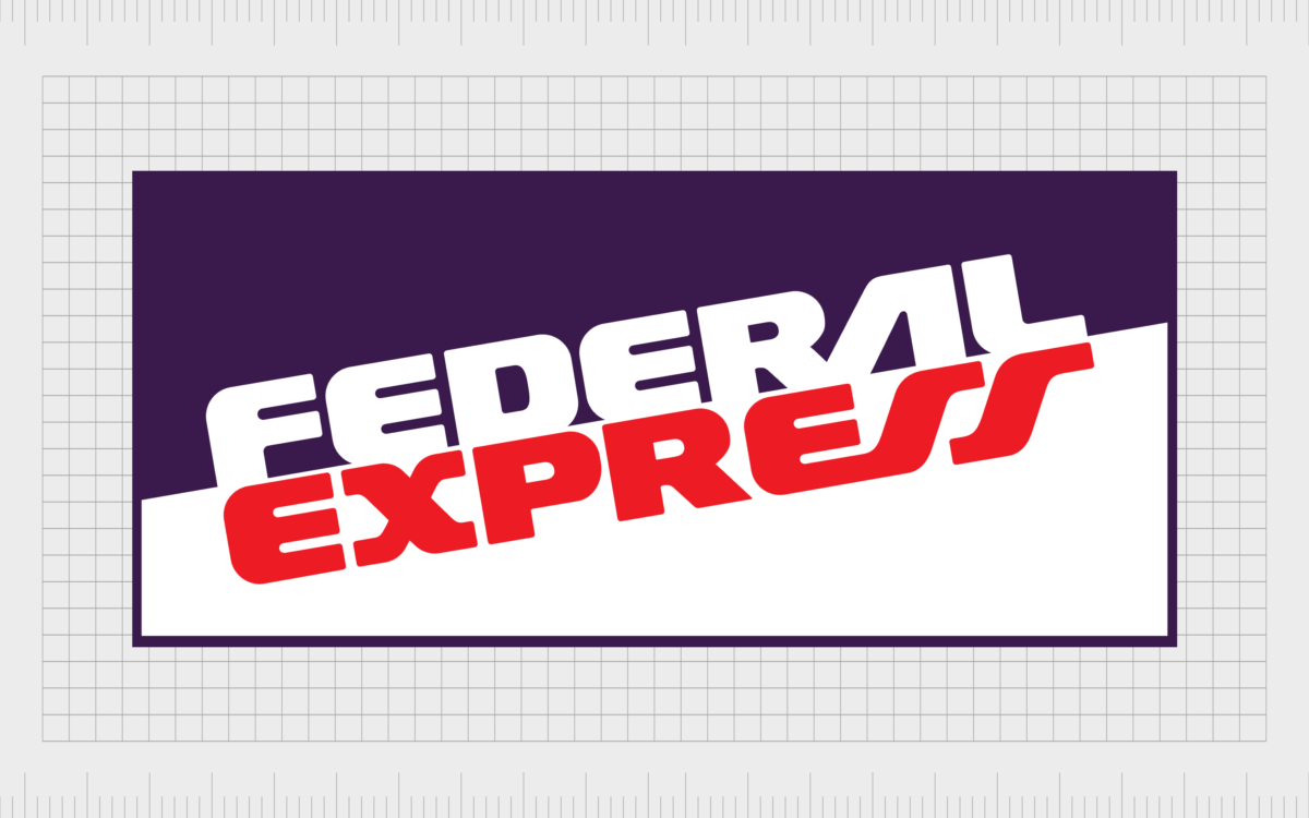
Established during 1971, FedEx is among the largest multinational conglomerate holding companies in the United States. Today, the company is best-known for its unique use of white space, which hides an arrow in the space between the “E” and the “X”.
However, in the 70s, the FedEx logo was very different. It conveyed the full name of the company “Federal Express”, on an angled line in a banner of white and blue. The image was bold and modern at the time, with uniquely stylized letters, and blocky font.
18. Polaroid
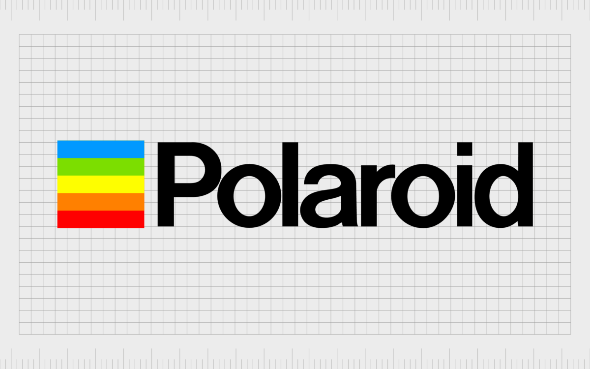
Established in 1943 by Edwin Land, Polaroid is a name most people in the photography landscape will be familiar with today. Though the company started life with a relatively simplistic, monochromatic logo, it made a significant update to its image throughout the 70s.
During the 1970s, the Polaroid logo took advantage of the trend of using a variety of colors in its brand image. Alongside a simple sans-serif wordmark, the company introduced a square made up of multiple rainbow-colored horizontal lines.
19. Tang
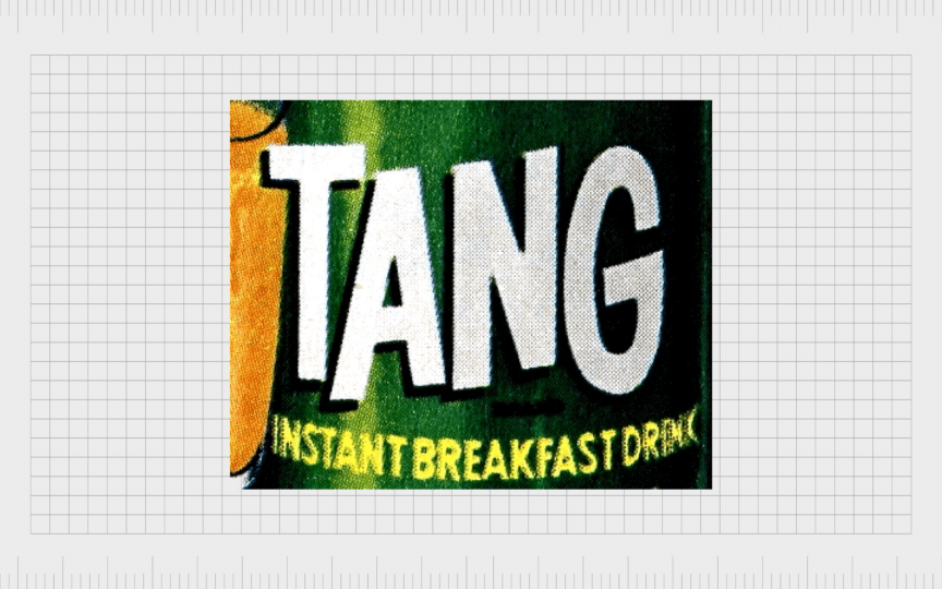
Love it or hate it, the Tang orange-flavored drink was a staple of the 70s. The breakfast drink, intended as an orange juice substitute, was popular throughout the United States, and even continues to sell in regions around the world today.
The Tang logo from the 1970s was packed with 70s design elements. The bold white letters used in the wordmark appear to jump around on the packaging, showing vibrancy and movement. They even feature the iconic drop shadow, which appeared on many 70s logos at the time.
The common components of 70s style logos
As you can see from the many examples of 1970s logos above, many of the famous emblems used throughout the decade had a few components in common.
While there were many different styles of logo in play at the time, from wordmarks to combination marks, the 70s was a time for bold, eye-catching, and over-the-top imagery.
The art of using bright colors and flashy imagery began in the 1970s for most companies. Before then, many organizations used to work only with a handful of colors, due to the limitations of print design.
Additionally, it wasn’t until new typography technology was introduced around this era that people could truly begin experimenting with new fonts.
Today, many companies still use elements of 70s retro logo design in their brand images, to evoke nostalgia in customers, and showcase their history.
Some of the most common components we saw in logos throughout the 70s included:
Geometric design
The early 70s and beyond were brimming with examples of geometric logos in business cards and banners. Common, easily recognizable shapes, such as circles and square shape badges appeared frequently throughout the landscape.
Chunky fonts
Script font styles and serif typefaces weren’t as common in the 70s as they were in other decades. Many companies attempted to capture attention quickly in print, by using thicker, bubblier fonts.
These font styles are commonly seen as “retro” typefaces today.
Shadows
Alongside bold fonts, many companies used shadows in their brand logos to help convey depth and dimension. Multi-colored drop shadows were also a common tool used to make logos pop in the print advertising era.
Bright colors
A bright and bold color palette was a consistent part of most branding choices back in the 70s. Companies began experimenting with rainbow shades, and more versatile colors, thanks to the evolution of print space.
Movement
As you can see in many of the 70s logos showcased above, a lot of designers attempted to show movement in their designs. It was common to see the characters in wordmarks placed on different lines, to make them look bouncy and fun.
Learning from 1970s brands: 70s logo design
Looking back at 1970s logos, it’s easy to see we’ve come a long way in the graphic design industry. For the most part, many elements of 70s logo design have been replaced.
Maximalist logos gave way to simplified, minimalistic designs. Bright and over-the-top color palettes were switched out for simpler shade selections.
However, while the logos of 1970s brands might seem old-fashioned today, they made an incredible impact on audiences in their era. Even now, the components of 70s style logos have become so iconic, they still resonate with multiple generations.
If you’re keen to show a fun and playful personality in your logo, or you want to draw attention to the history behind your company name, using 70s logo design elements could be a good choice.
Reach out to Fabrik today to learn more about how you can create a retro logo with different colors, geometric patterns, and unique font choices.
Fabrik: A branding agency for our times.
Now read these:
—The best 70s fonts for retro designs
—The very best 1970s fonts on Canva
Clarity starts with a conversation.
Thanks—we’ll get back to you shortly.
Whether you're navigating a rebrand, merger, or simply need a clearer identity—we’re here to help. No hard sell, just honest advice from people who know the sector.
Let’s start with a simple question…
Prefer to email? Drop us a line.
Fabrik’s been helping organisations rethink and reshape their brands for over 25 years. We’ve guided companies through mergers, rebrands and new launches. Whatever stage you’re at, we’ll meet you there.


