The best band logos of all time (from rock to pop to rap)

Ask anyone to share a list of the best bands of all time, and you’re sure to get a different response from every person you meet. However, no matter your musical tastes, it’s safe to say the best band logos ever created always make an impact.
Evocative, engaging, and memorable, band logos are designed to tell fans everything they need to know about a musical group. The right emblem can offer an insight into a musician’s genre, their inspiration, and even their personality.
Of course, just as there’s no one-size-fits-all strategy to designing the ultimate business logo, there’s no one right way to create an iconic band logo. As you’ll see from the examples in this list, every iconic emblem has its own unique story to tell.
Let’s take a closer look at some of the most popular band logos throughout history.
The best band logos: What makes an iconic band logo?
Creating a memorable band logo is similar to designing an emblem for a business or non-profit. Just like companies, bands need their emblem to differentiate them from other artists in their space, and capture the attention of customers on album covers and store shelves.
Similarly, like businesses, bands use their logos to build emotional connections with their target audience. The right emblem provides an insight into a band’s focus genre, its personality, and even its unique values or vision.
While the best band logos of all time feature many different shapes, color palettes and design elements, they do have a few things in common.
For instance, the best band logos are always:
- Unique: A band’s logo can be a compelling promotional tool. Music listeners wear branded merchandise to demonstrate their support of a band, which makes it all the more important to create a unique image. You don’t want someone to confuse your group with another.
- Evocative: Band logos, like music, need to connect with human emotions. They should ignite feelings of passion, excitement, or even relaxation. A legendary band knows how to convey a world of emotions through a single image.
- Memorable: Effective band logos are inherently memorable. There are probably more people in the world today familiar with the “hot lips” Rolling Stones logo than the band’s music. Outstanding logos are simple, effective, and unforgettable.
Famous rock band logos: Iconic rocker emblems
Crucially, there are dozens of emblems that could fit into the category of “iconic band logo”, from virtually every musical genre. We’re starting our list with some of the most famous rock band logos of all time, best-known for their unique use of typography, eye-catching imagery, and vibrant colors.

1. The Rolling Stones
Easily one of the most memorable band icons of all time, the Rolling Stones logo, otherwise known as the “hot lips” emblem is a staple of the rock and roll landscape. Designed by John Pasche, the idea for the Rolling Stones logo came to the graphic designer when he was approached by the band.
The rock group showed John an image of the Hindu goddess Kali, often portrayed with her tongue sticking out in an act of defiance. Taking this image, as well as inspiration from the pop art landscape, John created an iconic emblem, intended to symbolize empowerment and rock and roll.
Find out more about the Rolling Stones logo here.
2. ACDC
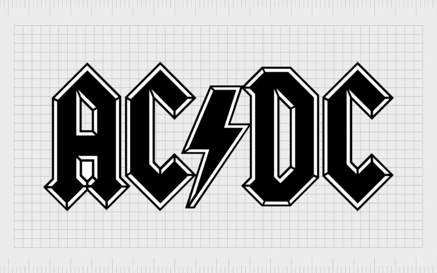
Rock legends AC/DC first introduced their iconic logo on the international version of the album cover for “Let There Be Rock”. The logo was designed by Gerald Huerta in 1977, and was based on the group’s name, which references alternating and direct current electricity.
The “high voltage” lightning bolt in the center highlights the dynamic personality of the brand, and their commitment to bringing raw energy to their performances. Combined with the angular typeface, the emblem is a perfect example of a memorable, yet simple logo.
3. Nirvana
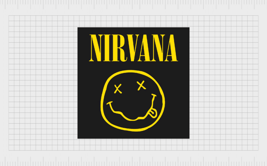
Alternative and progressive rock band Nirvana, created one of the most iconic and memorable logos of all time, using a simple typeface and a basic smiling face. The smiley face was first introduced on the “Nevermind” 1991 album cover.
According to some experts, the design was apparently inspired by a similar face that appeared on the marquee of a notorious Seattle strip club. Wherever it came from, the bright, eye-catching, and playful logo conveys the rebellious spirit of the rock group.

4. Guns N’ Roses
Though the rock n’ roll band, Guns N’ Roses, has used a few symbols through the years, the most memorable icon embraced by the band features two revolvers, pointing in opposite directions, entwined by vines and roses.
The memorable image clearly refers to the name of the group, which was inspired by the last names of Axl Rose, and Tracii Guns. Though more complex than other famous logos used by bands, this image is dark, romantic, and unforgettable.

5. Metallica
The Metallica emblem proves that a recognizable logo doesn’t have to be complex to be impactful. After brainstorming some ideas, and settling on a name for the group, the lead singer, James Hetfield created a strong band logo from scratch, using stylized typography.
What really makes this classic rock logo stand out is its use of sharp edges and points on the “M” and “A” letters. The lines look similar to lightning bolts, conveying the energy and passion of the heavy metal band, and its musicians.

6. KISS
Legendary American band KISS burst into the music scene in 1973, when Gene Simmons, Ace Frehley, Paul Stanley and Peter Criss chose to shake up the industry. The band members immediately caught attention with their unique outfits and face paint, conveying different personas.
Some fans say Frehely created the initial logo design idea after sketching various wordmarks with a felt-tip pen. Similarly to many rock music groups, the group embraced the concept of a “lightning bolt” as an iconic image, trying to infuse it into the “S” characters in their name.

7. Queen
By far one of the most complicated logos on this list, Queen’s logo is also among the most memorable. The iconic badge was apparently created by Freddy Mercury himself, and it was intended to highlight the band’s style, music, and philosophy.
Comprising of various evocative images, such as lions (representing the United Kingdom), an ornate crown, and even a gryphon, the emblem effectively separates the band from countless other rock and roll masters in music history.

8. Ramones
Fans of the punk rock genre are sure to be familiar with the Ramones emblem. After emerging into the music scene in 1974, the Ramones created a variety of promotional materials, intended to draw attention to their unique approach to rock and roll.
The iconic band logo, designed by the band’s creative director, Arthuro Vega, includes a variety of unique elements. The symbol is similar to the US presidential seal, and features a baseball bat, symbolizing the musician’s passion, and an apple tree branch.
Popular band logos from the pop industry
While alternative rock, heavy metal bands, and classic rock groups often have particularly bold logos, they’re not the only musicians that have created amazing images over the years.
Let’s take a look at some of the best band logos from the pop genre.

1. The Monkees
Like many bands, the Monkees have experimented with a range of unique images since they first formed in 1966. Perhaps the most memorable logo of all features the name of the group, stylized into the shape of an acoustic guitar.
The logo’s bold shapes, combined with its bright red color palette and retro style font gives the image an almost nostalgic, and psychedelic appeal. The heart-shape tuning keys on the guitar shape also symbolize a commitment to romantic, love-focused music.

2. The Beatles
Compared to some of the other famous band logos on this list, the Beatles emblem might seem relatively simplistic. The wordmark is somewhat understated when compared to the fame and popularity of the English band, but it’s still iconic.
The famous drop-T logo was designed by Ivor Arbiter in 1963, and it fit perfectly on the front of Ringo’s drums, making it an easy emblem for the band to adopt. Straightforward and instantly memorable, this original logo has stood the test of time.

3. One Direction
Love them or loathe them, One Direction have demonstrated a crucial understanding of the power of branding with their logo. The official wordmark, featuring the band name, is presented in a distinctive, almost grungy typeface, showcasing playfulness and rebellion.
The group also has a fantastic secondary logo, featuring the characters “1D” in a similar font style. The most interesting part of the smaller logo is the use of an arrow in the white space of the “D” symbolizing the forward momentum of the band.

4. The Beach Boys
With a smooth, sophisticated style, the Beach Boys logo has become an iconic part of American culture. Though the group used a number of emblems through the years, their most memorable design simply features the band’s name in a stylized, cursive font.
The sweeping, dreamy typeface has become synonymous with the personality of the Beach Boys, and their dynamic, retro flair. This eye-catching logo reminds us of summer days and good times, just like the name “The Beach Boys”.

5. Twenty One Pilots
The Twenty One Pilots logo is something of a controversial image. Even when the members of the band shared insights into the design’s meaning, it didn’t stop disputes. The experimental logo, introduced in 2021 features a simple image of a trident, in a calm blue shade.
According to the group, the design has no hidden meaning. However, graphic designers believe it is intended to symbolize motion, and progression. It aims to remind fans of the sea, and its incredible power.

6. Kings of Leon
Another pop band with a highly memorable, but simplistic logo is the Kings of Leon. After forming in 1999, the Kings of Leon experimented with a variety of band logo ideas. However, the most memorable logo used by the group features a straightforward wordmark.
The most memorable element of this logo is its unique typography, with bold, blocky serifs on each letters, sharp edges, and a swooping lower line on the “L”. Like many of our other favorite band logos, this design is versatile, diverse, and easily recognizable.
7. Daft Punk
Pop and electronic music pioneers, Daft Punk are another example of a group that has used unique typography to create an iconic band logo. At a glance, the inscription looks bizarre, with an almost “punk” aesthetic, due to the texture in each of the letters.
The “punk patch” was intended replicate the patches that many punk bands already used back when the group was first formed. The image has appeared in a variety of colors and styles over the years, though the font remains the same.
Hip-hop and rap groups with iconic band logos
So far, we’ve covered some of the best band logos of all time created by indie pop bands, rock and roll legends, and more. Now let’s take a closer look at some of the logos from another famous genre of music, the hip-hop and rap sector.

1. Run DMC
Simple, yet unforgettable, the Run DMC logo places the name of the band on two levels, in a bold, aggressive font, intended to demonstrate power. The words are surrounded by red lines on the top and bottom, showcasing vitality and passion.
Though relatively simple, the Run DMC logo is one of the most prolific to ever appear in the music industry. The solid typography and basic color scheme makes the design extremely versatile, and highlights the enduring power of the hip-hop group.

2. Bad Bunny
Rising to fame in recent years, the Bad Bunny logo is the symbol of one of the most successful Puerto Rican musicians in history. Rumors suggest that when Benito Antonio misbehaved as a child, he was asked to wear bunny ears, inspiring his stage name.
The logo design might be quite simple, but it’s enticing. The unique nature of the bunny graphic, with its crosses for eyes symbolize something sinister or mysterious hiding behind the adorable image. Combined with the graffiti style writing, the graphic portrays a unique visual identity.
Find out more about the Bad Bunny logo here.

3. Wu-Tang Clan
Another of the best band logos to ever emerge in the music industry, the Wu-Tang clan emblem is evocative, eye-catching, and brightly colored. The design features the shape of a letter “W”, stylized to look a little like a bird with outstretched wings.
This unique image, combined with the yellow coloring, connects the band to ideas of freedom, joy, and enlightenment. The interesting typeface also provides an insight into the company’s playful and experimental approach to logo design.

4. The Beastie Boys
Created by Cey Adams, a man with an iconic history helping to shape the earliest aesthetics of the Hip-hop industry, the Beastie Boys logo is truly iconic. It features a diamond in the background, referencing Mike D Diamond, the group’s vocalist, and drummer.
Atop the diamond emblem, we see the band’s name, presented in two different styles of font. “Beastie” is presented in a bold white typeface on a black banner, while “Boys” sits underneath in a sleek, compact font.
5. N.W.A
Aggressive, rebellious, and unapologetic are some of the core words that come to mind when looking at the N.W.A logo. Despite their defiant attitude, the band wanted their logo to convey ideas of energy and power, rather than hatred.
The emblem, with its bold, textured font has become one of the most recognizable music logos in history, despite its simplicity. The red coloring in the visual identity is also an important choice, symbolizing passion, and vitality.

6. Public Enemy
The Public Enemy band logo is another clear example of an emblem that makes a statement. Created by Chuck D in 1986, the logo was introduced with the release of the “Yo! Bum Rush The Show” concert in 1987, with refinement from Eric Haze.
The monochromatic logo aims to highlight the violence suffered by African Americans at the hands of the state and the police, with the crosshair emblem. It’s an evocative design, beloved by hip-hop and rap fans around the world.
Other well-known band logos throughout history
So far, you’ve had a behind-the-scenes look at some of the best band logos of all times connected to three separate, but equally popular genres. Of course, there are still a lot of other great designs worth mentioning.
Here are some of the other noteworthy logos created by bands through the years.
1. Red Hot Chili Peppers
Formed in 1982, the Red Hot Chili Peppers are considered one of the most iconic bands in history. This indie band has explored countless different genres in their albums, and they’ve created some of the most memorable music videos of all time.
The logo for the band features the group’s name, positioned as a circular border around a multi-pointed red star. It’s simple, but powerful, conveying passion and innovative thinking.
2. Van Halen
By far one of the most memorable logos in the musical industry, the winged Van Halen logo is recognizable all over the world. It has been a part of the group’s visual identity since the 70s, after the group had a violent altercation with their record company.
Straightforward and sleek, this unforgettable logo connects the group with the classic rock landscape, conveying sharp lines, combined with wings, intended to symbolize freedom.
Find out more about the Van Halen logo here.

3. MisFits
One of the best-known punk rock groups in history, the Misfits first formed in 1977, and have transformed the world of music ever since. The iconic Misfits skull logo first appeared on the single for “Horror Business”, based on a poster for the Crimson Ghost.
It quickly became so popular that it emerged as the group’s official icon and mascot. The design is often combined with a unique logotype, reflecting the essence of the band’s music, and their grunge, punk-rock style.

4. Pink Floyd
One of the few bands on this list with a handful of iconic images linked to their name, Pink Floyd has transformed the musical industry for decades. The official logo of the band features a graffiti style script, showcasing the group’s name with an almost handwritten aesthetic.
The design makes the band seem authentic and human, with a slightly edgy nature. This image is often aligned with the iconic “prism” design that appears on the “Dark Side of the Moon” album – one of the most memorable album art choices in history.

5. Bon Jovi
Presented in various colors and formats over the years, the Bon Jovi logo has gone through a handful of alterations. However, it’s two most significant identifying elements have remained quite consistent. The first is the simple “Bon Jovi” wordmark, in a sleek serif typeface.
The second is the heart image, with the dagger through the center, featuring wings on either side of the weapon’s hilt. The design draws attention to the band’s romantic music, love ballads, and their unapologetic view of love and heart break.
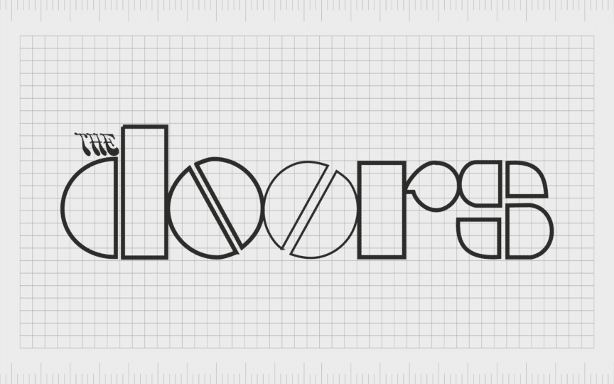
6. The Doors
American rock band, The Doors, is another memorable icon from music history, not just for their albums, but also for their approach to branding. The Doors’ logo might seem simple at a glance, but it’s powerfully unique, with a typeface evocative of the 1960s.
The bold characters in The Doors logo demonstrates the personality of the group, as well as their target audience, and unique musical style.
Unforgettable band logos throughout music history
As you can see from the list of the best band logos ever created above, musicians and artists rely on branding just as much as companies and non-profits. A memorable band logo can quickly become an important symbol for both a band, and its fans.
For those who fall in love with a musician or group, wearing its logo can be a way to show solidarity and support. Some people even have their favorite band logos tattooed onto their skin.
While the iconic band logos above all feature their own unique elements and styles, they’ve carved a space in history with timeless graphics and meaningful components.
Fabrik: A branding agency for our times.
Clarity starts with a conversation.
Thanks—we’ll get back to you shortly.
Whether you're navigating a rebrand, merger, or simply need a clearer identity—we’re here to help. No hard sell, just honest advice from people who know the sector.
Let’s start with a simple question…
Prefer to email? Drop us a line.
Fabrik’s been helping organisations rethink and reshape their brands for over 25 years. We’ve guided companies through mergers, rebrands and new launches. Whatever stage you’re at, we’ll meet you there.


