Bad Bunny logo: Exploring the Bad Bunny symbol

The Bad Bunny logo is quickly gaining attention all around the world as love for the Latino rapper continues to grow. However, like many famous musical logos, many people aren’t sure where this unique symbol originally came from.
The Bad Bunny icon is a crucial part of the artist’s unique aesthetic appeal, and something any true fan should be familiar with. As this graphic takes the world by storm, appearing on everything from laptop sleeves to clothing lines, we thought it was time we explored the history behind the logo.
Here’s everything you need to know about the Bad Bunny sign.

Who is Bad Bunny?
Let’s start with the basics, Bad Bunny is the stage name of a reggaeton, and trap artist named Benito Antonio Martinez Ocasio.
The young rapper skyrocketed to fame after the release of his hit single “Diles” and has since earned a huge following for his unique musical style and passion for experimentation. Bad Bunny has even won the American Latin Grammy.
Like many musical logos, the Bad Bunny sign has a close connection to the rapper himself, and his upbringing. According to Benito, during his childhood, he was made to wear a set of long bunny ears any time he missed behaved.
The unique form of punishment inspired Benito’s stage name, and the accompanying Bad Bunny logo along with it.
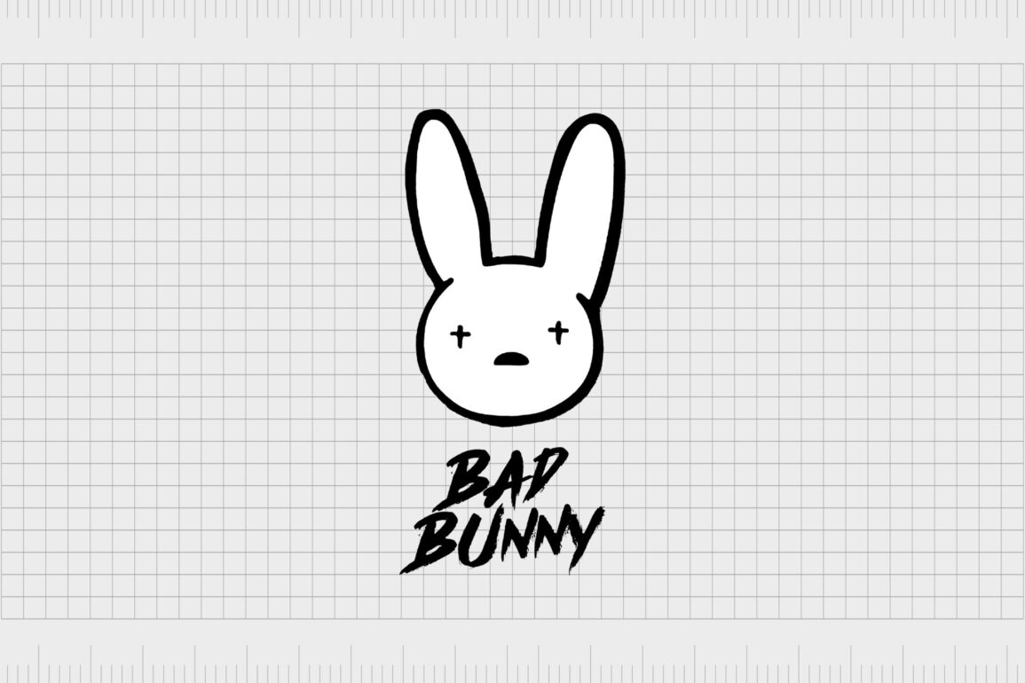
The visual appeal of the Bad Bunny symbol today is bright, fun and exciting, with a touch of edginess to it. While the Bunny looks pretty cute at first glance, the crosses for eyes hint at something a little more sinister, specifically when matched with the graffiti style Bad Bunny font.
The Bad Bunny logo: Bad Bunny evolution
Unlike some other musical groups on the market, Bad Bunny has refrained from changing his logo over the years. The design is the same today as it has been since the launch of the singer’s brand in 2016.
The classic, unique, and sleek logo combines the Bad Bunny symbol (the rabbit), with a unique wordmark to create an immediate visual impact.

The logo works because it’s simple and engaging. The rabbit itself is a very basic design which works well on any screen and at any resolution. The long ears represent the ears from Benito’s childhood, while the simple semi-circle nose and unusual plus-sign eyes draw attention.
The minimalist image makes for a strong contemporary visual, which reflects the interesting story of the rapper.
In full size, and on close inspection, it’s easy to see the contoured lines of the bunny are a little worn in places, as though they’ve been drawn free hand by a permanent marker or sprayed with spray paint. This hand-drawn element makes the icon look more personal and authentic.
The lines used on the Bunny’s ears are also a little thicker than the ones chosen for the face, perhaps to highlight the importance of the story behind the Bad Bunny name.

The wordmark accompanying the Bad Bunny icon is similar in style, with a quick, hand-drawn essence to it. The lines in the typography are rougher than the ones used for the bunny, and much thicker too – as though they’ve been drawn with a thick paint brush.
One of the things making the Bad Bunny logo so appealing to a new era of music lovers is how easy it is to recreate. Anyone can share their love of the rapper by drawing the bunny icon wherever they choose. Some have even gone as far as to get the logo tattooed onto them.

Bad Bunny logos: Font and colors
Sometimes referred to as the Bad Bunny eye logo, thanks to the unique plus-sign shapes of the rabbit’s eyes, the Bad Bunny logo has taken on many styles over the years. The colors of the emblem can change depending on where they’re used, but the most common colors are black and white.
Though the font and basic elements of the design for the Bad Bunny logo remain the same in all iterations, they can sometimes show up in different formats. For instance, you might see the Bad Bunny wordmark written on the ear of the rabbit, rather than placed separately.
Bad bunny logo colors
As mentioned above, the colors of the Bad Bunny logo might differ depending on where you see the design. Different versions have appeared on merchandise and marketing campaigns, but the fundamental colors are black and white.
The colors stand for power and innovation, while also representing the raw creativity of pen on paper.
Bad bunny font
The font for the bad bunny logo is just as engaging as the icon. This unique font created specifically for the logo appears to be a hand-drawn style typography. The name of the rapper is in all capital letters, a testament to his bold and engaging attitude.
There’s also a lot of sharpness in this logo, as though it was written quickly with a spray can on a wall.
Together, the elements of the bad bunny logo create an image combining general universal appeal and experimentation, with artistic confidence and power. This eye-catching logo is both friendly and rebellious at the same time, capable of attracting all kinds of music lover.
If you want to check out the bad bunny logo in all of its glory, you can find a Bad bunny logo PNG here and a Bad Bunny logo vector here.
The Bad Bunny logo today
At first glance, the Bad Bunny logo is a simple and easy-to-replicate image with a unique visual appeal. The various parts of the logo seem hand-drawn, which highlights the authentic and creative nature of the artist behind them.
After all, it’s Bunny’s innovative spirit and hard work responsible for turning him into such an icon in the music scene.
The winner of multiple awards today, the Bad Bunny logo has become a symbol for music lovers everywhere. People are countlessly recreating the logo with their own unique styles and colorways, paying homage to the artist in the process.
Although Bad Bunny hasn’t been around for nearly as long as some of the other famous musicians we’ve covered during our logo insight articles, he’s definitely making waves.
The Bad Bunny logo is an excellent example of how the right artist can turn something as simple as the image of a bunny into a powerful representation of creative style.
Fabrik: A branding agency for our times.
Clarity starts with a conversation.
Thanks—we’ll get back to you shortly.
Whether you're navigating a rebrand, merger, or simply need a clearer identity—we’re here to help. No hard sell, just honest advice from people who know the sector.
Let’s start with a simple question…
Prefer to email? Drop us a line.
Fabrik’s been helping organisations rethink and reshape their brands for over 25 years. We’ve guided companies through mergers, rebrands and new launches. Whatever stage you’re at, we’ll meet you there.


