The world’s most famous companies with crown logos

Companies with crown logos send an important message to their target audience. Globally recognized, the crown is a symbol of prestige, authority, and opulence. It demonstrates not just a brand’s authority, but a commitment to creating a truly excellent product or service.
Logos with crowns come in various shapes and styles throughout the business world. Some crown symbols are simplistic, geometric, or modern, while others are more traditional.
Additionally, while many crown logo designs use the color gold to build on their luxurious appearance, crowns can be depicted in a range of shades depending on the company’s core message.
As a powerful tool for conveying a leading brand identity, the crown symbol can appear in virtually any industry. In fact, crown logos are everywhere in the modern world, throughout the automotive, beverage, and even fashion sectors.
Today, we’re going to take a closer look at this iconic symbol of luxury and the most famous companies using crowns in their brand mark.
Why do companies use crowns in their logos?
The best company logos aren’t just distinctive symbols; they’re tools for conveying meaning to customers, partners, and employees alike. An effective logo highlights the core values, mission, and personality of a brand, helping to elevate a company in the eyes of its customers.
This is why so many companies leverage graphic elements, alongside evocative color palettes and typeface choices, to give further depth to their logos.
A crown is an instantly recognizable image, and something most communities have been familiar with for hundreds of years. When we see a crown, we don’t just see a fancy hat; we see a symbol of luxury, leadership, and authority.
Professional logo designers place crowns in company logos to tell audiences that the company behind the image is a powerful, commanding organization. Owners of crowns have always been leaders in society, making the crown symbol a valuable tool for brand positioning.
The royal theme also fits well with the luxury landscape. Crowns can often be seen as a mark of wealth or affluence. This means the design blends perfectly with the images conveyed by a leading fashion brand, car brand, or manufacturer of luxury foods.
What famous companies have crown logos?
Crowns are easily recognizable and evocative symbols. This makes them a common choice for countless companies striving to send a meaningful message to their target audience. Take some time assessing the brand market in your region, and you’re sure to notice plenty of crown logos.
Some crown design elements are instantly obvious and unmistakable, while others are more subtle, blending into the rest of the brand mark.
Here are some of the best-known examples of companies with crown logos.
1. Royal Mail
The International Distributions Services (IDS) company, formerly Royal Mail, is one of the best-known British postal and courier companies in the world. It was initially established as a government department in 1516 and uses a crown logo to symbolize this heritage.
While the Royal Mail may have been privatized in recent years, it spent decades operating as a service for the UK government, and monarchy. Unlike other well-known companies, Royal Mail has preserved some of the complexity of its logo, refusing to simplify its image.
The colors of red and yellow used in the Royal Mail logo are evocative of passion, luxury, and quality.
2. KLM
KLM, otherwise known as KLM Royal Dutch Airlines, is another example of how logos with crowns can showcase a company’s heritage. The unique and somewhat modern emblem of the flagship carrier of the Netherlands retains allusions to the Dutch monarchy.
The current crown logo used by KLM is similar in style to a brand mark created by a British Designer, Henri Kay Henrion, in the 1960s. It features a simple, flat design with a light blue color palette to demonstrate reliability and trust.
The straightforward symbol provides valuable insight into the company’s origins and values.
3. Corona
One of the world’s largest Mexican beer brands, Corona is a brand imported to various markets worldwide. The brand’s most popular product is the Corona Extra pale lager, which currently stands as one of the top-selling beers worldwide.
Corona’s logo aims to showcase the luxury and authority of the company. According to some sources, the company took its image from a statue of the Virgin Mary, wearing a crown in Mexico. The word “Corona” also translates to “Crown” in Spanish.
Powerful and colorful, the Corona logo combines its crown image with a gothic, decorative font.
4. Rolex
Rolex is probably the best-known example of a company with a crown logo. The Swiss watch designer and manufacturer was officially founded in 1905 with the name “Wilsdorf and Davis.” The brand quickly adopted the crown logo as a key part of its brand identity.
Originally in black, the logo was designed by the company’s founders. Over the years, the iconic Rolex logo took on a new color palette, with a golden crown and a green typeface. However, the luxurious element in the emblem remained.
The somewhat abstract five-pointed crown insignia fits perfectly with the company’s identity, built on sophistication and elegance.
5. Hallmark
Known for its movies, television channel, and greeting cards, Hallmark has long used the image of a crown as part of its brand identity. The organization has only made a handful of tweaks to its brand mark over the years, focusing on an elegant image.
Alongside an iconic five-pointed crown, the Hallmark logo also includes a script-style wordmark designed to look like traditional calligraphy. Many versions of the Hallmark logo also include purple coloring, a shade commonly associated with luxury and royalty.
For Hallmark, the crown is a way to symbolize excellence, authority, and accomplishment.
6. Starbucks
Certainly, one of the most recognizable logos in our list, the Starbucks emblem, is an excellent insight into how a subtle crown can still elevate a brand image. Starbucks is named after a character in Moby Dick and has long retained a nautical theme in its branding.
The official Starbucks mascot, a siren, has been tweaked a few times through the years. However, the mermaid imagery is intended to represent the endearing call of delicious coffee.
The crown within the Starbucks logo features four points, with a star in the middle, to symbolize authority and accomplishment.
Find out more about the Starbucks logo here.
7. Royal Canin
Although Royal Canin has no royal connections to speak of, its brand image has long revolved around authoritative symbolism. The company is a French manufacturer of pet foods for both cats and dogs, and was originally established in 1968.
Up until the 1970s, the company used a relatively old-fashioned logo, featuring gothic text in a ribbon, as well as a detailed image of a crown. However, in recent years, the organization has simplified its logo, choosing a more modern design.
The image today features a somewhat abstract-looking crown logo consisting of red dots and curved lines.
8. Alfa Romeo
With so much going on in the Alfa Romeo logo, it might be easy to miss the crown element at first. Unlike other logos with crowns, Alfa Romeo uses its royal symbolism in a more subtle way. The image on the automotive manufacturer’s badge features a man being devoured by a snake.
Throughout numerous updates to the logo, the crown has become more simplified and less noticeable, but it still appears above the snake creature. The image is based on the Biscione, a traditional symbol associated with the Visconti family.
This symbolism is actually relatively common among companies from Milan, particularly those with a long-lasting heritage.
Find out more about the Alfa Romeo logo here.
9. Scania
A major Swedish automotive brand, Scania focuses on producing commercial vehicles, such as heavy lorries, buses, and trucks. It also manufactures marine, industrial, and diesel engines. The Scania logo is based on a griffin, a mythological creature.
It comes from the coat of arms for the official province of Scania, showcasing the company’s commitment to its heritage and history. The griffin wears a rather traditional-looking crown, with three separate elements depicted in silver.
10. Premier League
The Premier League combines a few evocative images in its logo. First, we have the iconic symbol of the crown, demonstrating the leadership position of the league as the highest football league system in the United Kingdom. Secondly, we have an image of a lion, often associated with the UK.
The Premier League logo is relatively modern, consisting of bold lines and contours alongside a simple, dark purple color palette. Alongside the noble lion imagery, we see a straightforward wordmark set across two lines in a sans-serif font.
The lion’s crown in this logo features five triangular peaks, matching the trend in many crown logo brand marks.
11. Pandora
The modern logotype of the jewelry company, Pandora offers an insight into how subtle and simplistic a crown symbol can be. Pandora is a Danish jewelry manufacturer, first established in 1982. It’s best known for its charm bracelets and designer accessories.
Like many jewelry companies, Pandora has updated and refined its logo a few times over the years. Still, the image of the crown has remained relatively consistent, sitting above the “O” in the wordmark.
Though relatively small, the Pandora black crown remains a powerful symbol of excellence, highlighting the company’s commitment to its craft.
12. Ritz Carlton
Moving over to the hospitality industry, the Ritz Carlton hotel chain uses a relatively traditional brand mark to highlight its position in the hotel sector. The image features a lot of elements that seem to come directly from a coat of arms.
The highly elaborate illustration of a crown, topped with the head of a lion, is an excellent way for the company to demonstrate its history and heritage. The combination of a crown and a lion creates a more regal emblem, consistent with the company’s luxury positioning.
The simple black and white design also includes an inscription of the brand name, depicted in a sleek, serif-style font.
13. HMRC
Crown logos are relatively common among government groups, particularly in countries with monarchies, such as the United Kingdom. The visual identity of HM Revenue and Customs, otherwise known as HMRC, has almost consistently used a crown symbol.
The logo in use today by the brand features a simplistic crown design set in a black circle above the group’s name. Though the design is relatively modern and straightforward, the crown itself has a lot of small elements to demonstrate tradition and heritage.
The image is further refined by the use of a sleek, sans-serif inscription.
14. Moet Chandon
You don’t have to be a jewelry or car manufacturer or a member of a government group to create a compelling crown logo. The Moet Chandon emblem is an example of one of the most well-known and popular crown logos in the world, belonging to a Champagne company.
Like many crown logos, the symbolism here is intended to highlight the excellence and luxurious ideals of the company. The gold crown symbol supports the company’s focus on luxurious, somewhat opulent products for affluent customers.
The traditional heraldic symbol also matches the sleek serif inscription perfectly.
15. Royal Jordanian Airlines
The flagship carrier of Jordon, Royal Jordian Airlines, was first established in 2007 and provides travel over four continents from its primary base in the Queen Alia International Airport. It’s unsurprising that this company uses a crown logo.
The company’s name and branding revolve around the concept of “loyalty.” Even the brand’s frequent flyer program is named the Royal Club.
This crown logo features a rather intricate crown design placed on the right-hand side of an inscription, showing the company’s name in a matching gold font.
16. Bombay Sapphire
One of the more complex logos on this list, the Bombay Sapphire emblem, belongs to a brand of gin distilled by the Bombay Spirits Company. The brand was initially launched in 1986 and has retained a traditional looking logo for some time.
The image features a stylized wordmark in a decorative, serif-style font. The two words of the brand name are separated by a sapphire gem, with a golden crown situated on top. The symbol showcases the luxurious nature of the company and represents its name.
The crown itself is classical in design, with various ornate and decorative elements.
17. Correos
Another postal service with a distinctive crown logo, Correos, is the state-owned company responsible for postal solutions in Spain and some other European regions. The origins of the company date back to 1716, when the postal service in Spain was first introduced.
Like many organizations on this list, Correos has updated its design over the years to create a more modern, simplified image. The crown today is drawn in thick blue lines, with several arches and a small cross placed above it.
The image looks beautifully abstract and unique, helping immediately capture customers’ attention and differentiate the brand.
18. Emilio Pucci
While there are versions of the Emilio Pucci logo today that feature only the brand name, the official brand design also features a unique symbol. The symbol is a stylized monogram, using “E” and “P” to create a butterfly effect.
The crown on this company’s logo is extremely ornate, with several unique details helping to set it apart from other organizations in the fashion landscape.
The unique design features high and elegant ornate peaks sharpened in a variety of different directions. This crown logo design gives the brand a sense of history and heritage.
19. Warsteiner
Another example of evocative crown logos from the beer industry comes from Warsteiner. This beer brand was first launched in 1753 and is currently the largest privately-owned brewery in Germany. It also ranks fifth among the best-selling breweries in Germany.
The badge of the Warsteiner brand is quite complex when compared to the brand marks of other well-known beer companies. It features a compelling circular emblem with words inscribed around the outside of the image.
The crown, with its various decorative and ornate elements, sits on top of the badge, depicted in the colors of black and gold.
20. Canada Dry
While we often associate crown logos with luxury, they can also be used by companies that don’t target a particularly affluent market. Canada Dry, the brand of soft drinks owned by the Keurig Dr Pepper, has long used a crown in its emblem.
The design of the Canada Dry logo is relatively traditional, featuring a shield-like emblem in gold with a green outline. The name of the company is depicted on top of this design, in a bold, red font, with shortened serifs.
The crown symbol sits atop the shield, demonstrating excellent authority for the long-lasting soft drink brand.
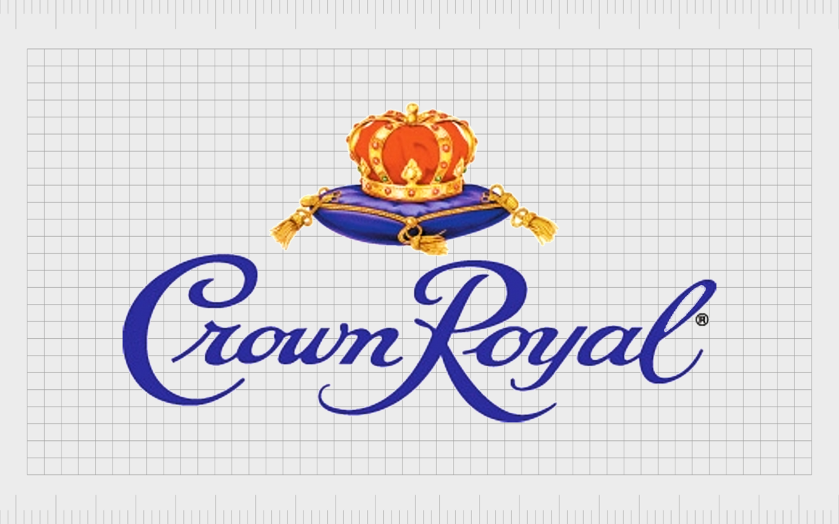
21. Crown Royal
Perhaps the most old-fashioned logo on this list, the Crown Royal emblem, is a symbol of history. Crown Royal is a whisky brand established by the Seagram company. It was first introduced to the market in 1939 and has grown in popularity since.
In the United States, Crown Royal now stands as the bestselling brand of Canadian whisky, and it’s also one of the most popular brands in Canada.
The Crown Royal logo, depicted in a range of luxurious colors, features a script-style inscription, with a crown in red and gold sitting on a cushion above the wordmark.
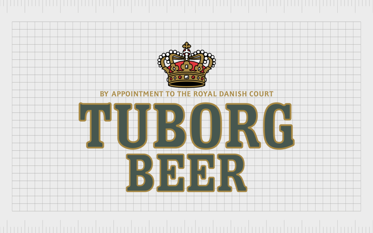
22. Tuborg
Another beer brand with an iconic crown logo, Tuborg is a Danish brewing company which was first founded in 1873. Since 1970, it has operated as part of the Carlsberg Group.
Interestingly, the name “Tuborg” comes from “Thuesborg,” or “Thue’s Castle,” a Copenhagen inn from the 1960s, which was located in the same area as the brewery. The Tuborg brand mark features an ornate, classic crown with a gold tagline underneath.
The crown is highly detailed, depicted in colors of red, black, and gold, with various circular and square gems decorating the image.
Why do expensive brands have logos with crowns?
As noted above, crown logos aren’t exclusively reserved for companies with expensive products or a more affluent target market. Crown symbolism appears in virtually every industry today, elevating automotive brands and car logos, beer brand logo designs, and more.
However, the natural connotations crown images have with luxury and wealth mean they often work well for companies targeting a more high-end audience. When we see crown images, with think of gold, royalty, and authoritative people.
We also see an expensive accessory made with precious metal and jewels. These are all components we associate with the luxurious world.
Crowns also help to demonstrate the leadership position of a brand, creating equity for a company that helps to establish its value with its customers. The more detailed and luxurious the crown looks, the more likely it is to resonate with affluent buyers.
Learning from companies with crown logos
Companies with crown logos show us that even the most simplistic symbols can have a direct impact on a brand’s relationship with its target audience. Crown logos are evocative of strength and power, but they also demonstrate affluence, luxury, and excellence.
Logos with crowns use globally recognizable imagery to connect with consumers on a deeper, more emotional level and increase brand equity. Whether they’re simple images, like the Pandora logo crown, or something more complex, they have incredible impact.
If you’re inspired by the companies with crown logos above and want to create your own royal brand emblem, reach out to Fabrik Brands today. We help companies create business logos that demonstrate authority, elegance, heritage, and power.
Fabrik: A branding agency for our times.
Clarity starts with a conversation.
Thanks—we’ll get back to you shortly.
Whether you're navigating a rebrand, merger, or simply need a clearer identity—we’re here to help. No hard sell, just honest advice from people who know the sector.
Let’s start with a simple question…
Prefer to email? Drop us a line.
Fabrik’s been helping organisations rethink and reshape their brands for over 25 years. We’ve guided companies through mergers, rebrands and new launches. Whatever stage you’re at, we’ll meet you there.


