


The most famous jewelry brand logos and names
Designed to exude beauty and class, Jewelry brand logos can be just as dazzling as the products these companies create. Around the world, there are countless examples of famous jewelry logos with a place in the hearts of sparkle fans, from Tiffany & Co to Chanel.
Many of the most famous jewelry brand logos have various elements in common, from a focus on sophisticated wordmarks, to the use of black and white coloring. However, it’s fair to say each company has its own unique appeal.
Today, we’re going to be taking a closer look at some of the better-known jewelry logos and names from around the world, focusing on their unique approach to branding.
In the list below, you’ll learn find plenty of inspiration in the form of jewelry designer logos, ranging from high-end brands to more affordable fashion jewelry.
Jewelry company logos: Luxury jewelry brand logos
Perhaps the most recognizable jewelry company logos of all are those belonging to high-end companies. Many of these iconic emblems have evolved with companies over a number of decades, helping them to differentiate themselves from other major players in the accessories landscape.
The following high-end jewelry brand logos belong to companies primarily known for selling expensive products, often made with sought-after materials like diamond, platinum and gold.

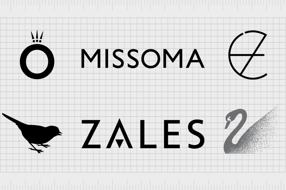
Zales
Best known as “The diamond store”, Zales is an iconic high-end jewelry brand focused on selling stunning diamond-based products. The Zales Corporation is well known throughout America for selling beautiful, luxurious pieces, crafted with care.
The design of the Zales logo is beautifully minimalist, with a sleek sans-serif font for the wordmark, accompanied by a contrasting serif tagline. The Diamond Store’s logo also includes a triangle shape in the place of the line for the “A” intended to represent a diamond.
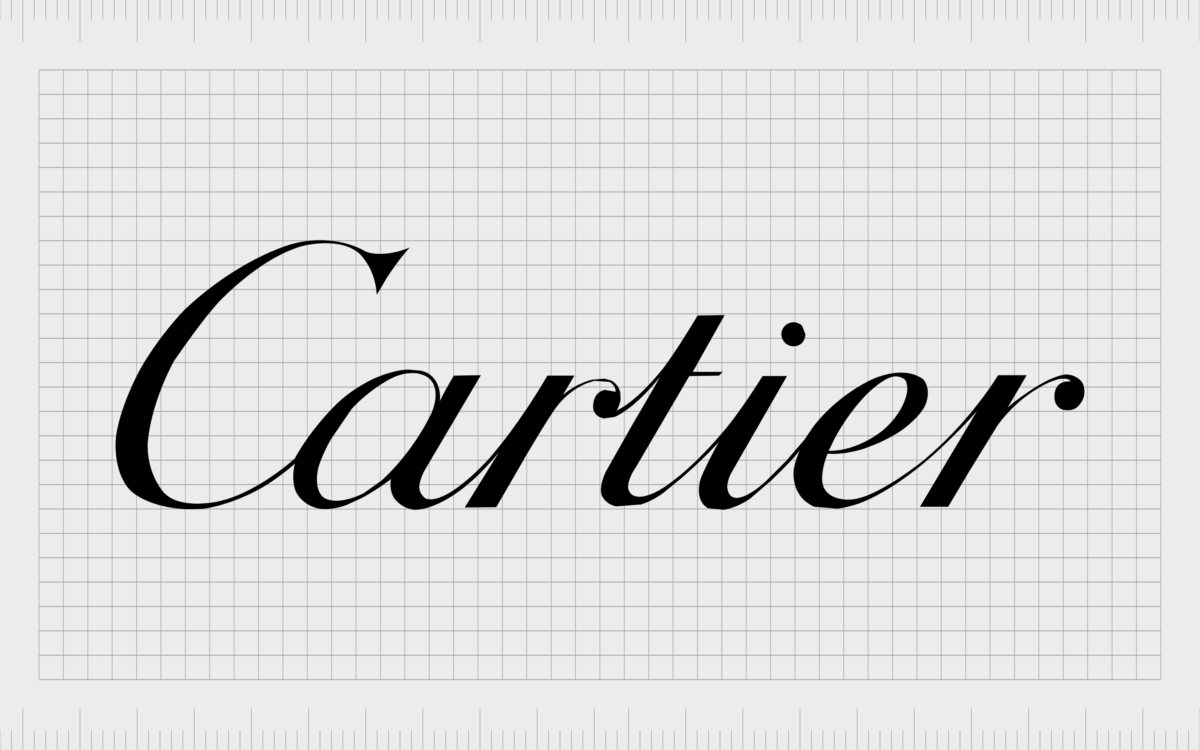
Cartier
One of the world’s best-known French jewelers, Cartier produces a huge selection of high-quality jewelry, leather goods and watches. The company actually first launched in 1847, more than 175 years ago, making it one of the most historical brands on this list.
The Cartier logo is brimming with sophistication and elegance. The design features a cursive wordmark, written in a simple black font, with a robust edge on the top of the “C”. This beautiful but simple script logo exudes luxury.
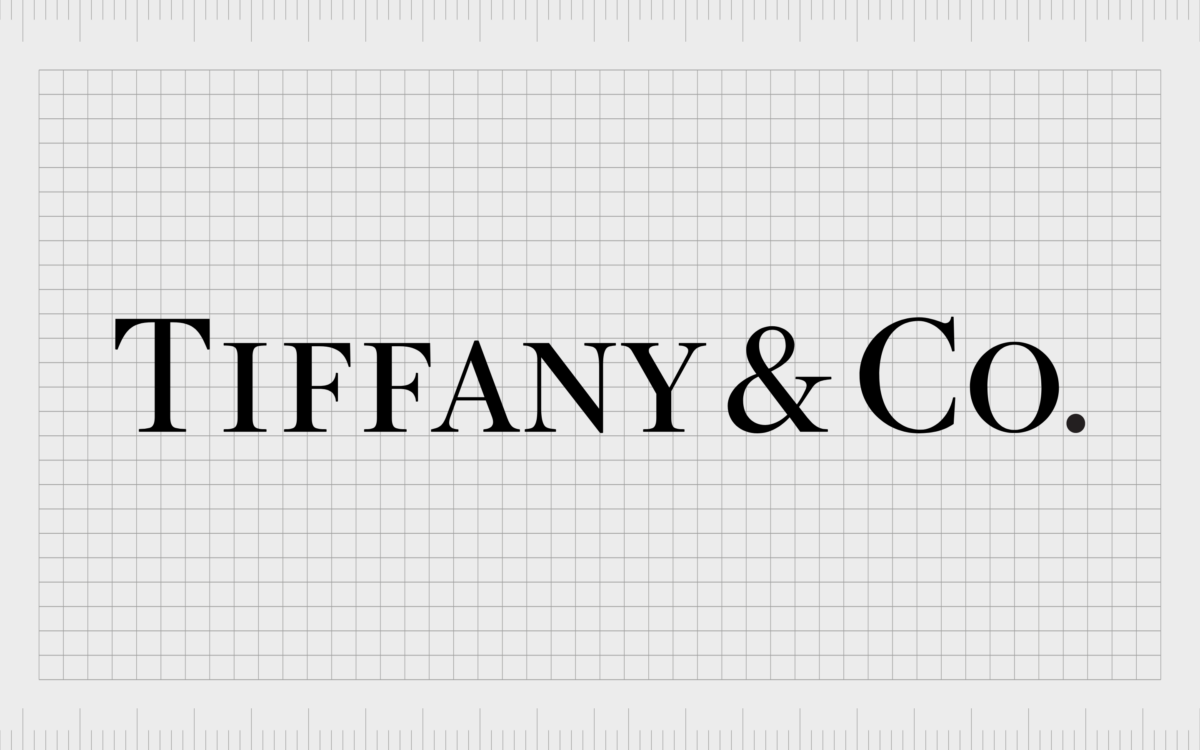
Tiffany & Co
It’s hard to find anyone not familiar with Tiffany & Co. One of the most famous jewelry brand logos in the world, the Tiffany & Co emblem belongs to a brand which first came to life in 1837, more than 184 years ago.
Tiffany’s logo is pristine and elegant, featuring a simple serif font wordmark, with slender, but prestigious-looking lines.
The Tiffany logo is often accompanied by the famous Tiffany blue coloring. Combined, these brand elements convey the image of a company with clear heritage in the jewelry space.

Bulgari
Stylized as BVLGARI, the Bulgari brand is an Italian luxury company known for producing a huge range of fragrances, watches, and accessories. The company launched in 1884 and has been taking the jewelry world by storm ever since.
Following in the footsteps of a multitude of high end jewelry brand logos, the Bulgari emblem is a simple wordmark written in authoritative serif font. The design is depicted all in black, with the use of a “V” shape instead of the standard “U” to define the company as an innovator.

Harry Winston
Experts in both jewelry and watchmaking, Harry Winston is an American luxury jewelry manufacturer, specializing in Swiss timepieces and jewels. The brand was founded originally in New York city by a man known commonly as the “King of Diamonds”.
Designed with an interesting flourish on the “R’s”, the Harry Winston wordmark adds an element of fun to the otherwise common serif style used by many luxury jewelry brands. In some cases, this logo also features an emblem with the letters “HW” depicted inside.

Van Cleef and Arpels
Another famous jewelry logo from France, Van Cleef & Arpel’s emblem follows a similar style to many of the top jewelry brands on the market today. However, the slim-line design of the serif letters in this wordmark gives the company a more contemporary appeal.
Many of the Van Cleef & Arpels jewelry pieces contain unique elements, like flowers, animals, and fairies, and the logo of the company helps to convey this slightly more experimental nature.

Boucheron
Popular for producing both stunning watches and jewelry, Boucheron is actually a sub-brand of the large Kering Company. The “House of Boucheron” is actually a French family dynasty, which may provide some insight into why the company chose such a prestigious-looking wordmark.
This logo design is similar in a lot of ways to many luxury jewelry companies, prioritizing a serif font for an air of sophistication and elegance. The use of a tagline showing where the company initially came from also adds to the brand’s heritage.

Buccellati
Buccellati Holding Italia is an Italian watch and jewelry company formed by the merger of previous companies, created by a father and son duo: Mario Buccellati and Gianmaria Buccellati.
The current brand as it stands today was only launched in 2011, which may be one of the reasons why the logo used looks more modern.
This jewelry logo features a sans-serif font, which creates a more minimalist and contemporary aesthetic for the brand. The image also includes a unique flower-style shape, giving the design an extra element a lot of other jewelry brands overlook.

Kering
Another example of luxury jewelry brand with a more modern aesthetic, Kering is a French-based multinational corporation specializing in luxury products. The company was founded in 1964, and has quickly created a number of subsidiaries, including the Balenciaga and Brioni brands.
Kering’s logo is unique in the jewelry industry thanks to its use of an owl-style design. The shape underneath the sans-serif logo is intended to convey a sense of wisdom and discovery.

Dior
Better known by most as a luxury fashion house, Dior sells a wide range of products, including high-end jewelry. The company is well-known around the world for its haute couture creations. Dior is also responsible for the LVMH organization.
The Dior logo is a unique serif wordmark, written in all lowercase letters, except for the capital “D”. The larger capital letter gives the brand a sense of authority and impact. Though simple, this logo is instantly recognizable.

Chanel
Boasting one of the most famous jewelry logos and names in the market, Chanel is a company with an impactful presence all over the world. The Chanel company, launched in 1910, sells a variety of luxury goods and accessories, as well as haute couture.
Chanel’s logo is immediately bold and impactful. Like many jewelry logos, this design is a simple wordmark written in all black, but the company uses a sans-serif all-capital font to convey modernity.
The balanced spacing of the letters give the logo a simple grace.
Find our more about the Chanel logo here.

Piaget
An iconic Swiss luxury watchmaker and jewelry company, Piaget was created in 1874, by Georges Piaget. The organization evolved over the years to sell a variety of different time pieces and accessories to locations all around the world.
The Piaget logo has a unique appeal to it, thanks to the way the letters are shaped and placed in the wordmark. Like most jewelry logo designs, the wordmark is in a serif font, but the “T” and “P” are designed to frame the rest of the word.

Martin Katz
Taking a slightly different approach to jewelry logo design, the Martin Katz logo stands out with a unique color scheme, and an eye-catching typography choice. The jewelry brand, hailing from California (Beverley Hills) certainly has a sense of Hollywood glamour.
This logo features a white wordmark on a deep blue background, highlighting the elegance and sophistication of the company. The most eye-catching element of the logo has to be the swooping “R”, which conveys the creativity of Martin Katz.

De Beers
Specializing in diamond mining, De Beers has earned quite a name for itself over the years. The company is active in a huge range of mining areas and sells high-quality diamonds to companies all over the globe.
The De Beers Jewelers brand is one of the most revered in the industry.
Simple and elegant, the De Beers logo features the name of the company in all capital letters, though the first letters of each word are slightly larger than the rest. The use of a mixture of sans-serif and serif fonts demonstrates both authority and modernity.
Fashion jewelry brand logos
While opinions differ when it comes to determining which jewelry brand logos fit into “fashion” or “high end” categories, some options are slightly less expensive, and don’t have the same heritage as some of the companies mentioned above.
Here are some jewelry logos and names more likely to be associated with the fashion industry…

Swarovski
Swarovski is an Austrian company, best-known for producing crystal glass jewelry and accessories. The company is one of the best-known around the world for crystal production, with stores located all over the globe.
Eye-catching and elegant, the Swarovski logo is a combination mark connecting a sophisticated serif-style wordmark, with the image of a swan. The swan design is textured to make it look as though it’s made up of millions of sparkling crystals.

Pandora
Easily one of the best-known fashion jewelry companies on the market today, Pandora is well-known for selling a huge range of custom charm bracelets, designer rings and earrings. The organization has engaged in a variety of collaborations and partnerships with leading companies around the world.
Modern and simple, the Pandora wordmark is an all-capital sans-serif design, intended to highlight the contemporary nature of the brand. The crown on the “O” brings a sense of luxury and prestigious appeal to the brand’s image.

Missoma
Missoma is a relatively new company in the jewelry landscape, well-known for producing a range of contemporary products for eco-conscious consumers. The brand is one of the more sustainable and responsible jewelry creators in the current market.
Considered a demi-fine jewelry brand, Missoma embraces elements of the luxury jewelry branding trends, with a modern twist. The Missoma wordmark is a black and white creation, depicted in all capital letters with a sans-serif font.

Olivia Burton
A London-based jewelry company with a focus on creating feminine, more affordable jewelry, the Olivia Burton brand has a unique brand image. This up-and-coming brand features the same serif-style lettering as many more luxurious companies, with a twist.
In the Olivia Burton logo, we see evidence of where the company came from, as well as a small bird image, intended to highlight the playful and creative nature of the organization.

Calvin Klein
Both a fashion house and a jewelry designer in one, the Calvin Klein company is well-known for producing modern and funky accessories for a contemporary audience. These products, while high-quality, are generally more affordable than the products created by some luxury brands.
The Calvin Klein logo is simple but effective, leveraging the trend of using a simple black and white wordmark for instant recognition. The sans-serif typeface is great for creating a more modern aesthetic.
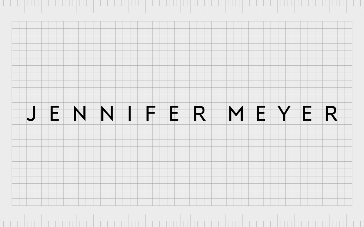
Jennifer Meyer
Created by ex-wife of Tobey Maguire, Jennifer Meyer, the self-named jewelry company has gained a lot of attention in recent years, offering a wide range of high-quality pieces for collectors. Today, Jennifer Meyer’s jewelry pieces have appeared in a number of Hollywood films.
Sleek and stylish, the Jennifer Meyer logo is a sophisticated wordmark, written in a soft grey tone, perhaps to form a connection with materials like platinum and silver. Again, this fashion jewelry brand uses a sans-serif typeface for a contemporary finish.

Kate Spade (New York)
Kate Spade New York, otherwise known simply as Kate Spade, is an extremely popular American fashion house and luxury design company. Best-known for producing hand bags and clothing, the company also offers a wide range of different jewelry products.
The Kate Spade logo is wonderfully accessible and universally appealing, with a soft serif font choice. The design includes a reference to where the company came from (New York). Interestingly, the name “Kate Spade” is all in lowercase letters, perhaps to make the brand feel more friendly.

Anni Lu
One of the most popular modern fashion jewelry companies on the market today, Anni Lu creates a range of gold, silver, and sparkling crystal pieces. These creations are often worn by everyday people, as well as celebrities, and fashion personalities.
Anni Lu jewelry is modern and creative, so it’s no surprise the brand’s logo is a world apart from many of the other companies we’ve covered so far. This simple and sleek sans-serif word mark is designed in a coral pink color, often associated with caring and femininity.

Mejuri
Known for creating “everyday” fine jewelry pieces, Mejuri makes high-quality accessories more affordable for the masses. The company is also well-known for delivering limited-edition drops, for people who want jewelry completely unique to them.
The Mejuri Jewelry logo is modern and eye-catching, with a simple sans-serif font, well-spaced to create legibility. The “M” has a unique flourish to highlight the creativity of the company.
There’s also a badge version of the logo which features an incomplete “M” in a circle border.

Astrid & Miyu
A more recent addition to the jewelry industry, the Astrid and Miyu Company produces a host of modern and stackable accessories, intended to support self-expression. The logo for this company has a few iterations, including a badge-style version which contains all of the elements in a slim circle.
The most common Astrid & Miyu logo features a sans-serif wordmark, with a minimalist version of diamond ring encircling the ampersand between the two words. The image is both modern and eye-catching, with a playful appeal.

Jenny Bird
A company best-known for selling minimalist contemporary designs and unique statement pieces for the fashion world, Jenny Bird is a relatively new contender in the affordable jewelry space. The company aims to sell more affordable pieces women can use to express themselves.
With Jenny Bird, we see a very similar jewelry branding scheme to many of the other contenders on this list. The company embraces a simple sans-serif wordmark for its primary image, depicted in all capital letters.
The spacing makes it look as though the two words are connected.

N-UE
Part of the growing sustainable fashion and design movement, N-UE is a company committed to selling more eco-friendly pieces at affordable prices to people around the world. The price of many of these products aren’t cheap, however, as they do include high-quality materials.
N-UE brings a modern edge to its branding with a sans-serif wordmark written in all lower-case. The design is simple but effective, portraying a transparent, authentic, and no-frills company. The overall image matches a lot of the jewelry company logos we’ve already looked at.

Ettika
Ettika is an interesting company gaining significant attention in recent years for it’s cost-effective and affordable jewelry. The company specializes in products intended to take advantage of current trends, with a wide range of materials on offer, including gold and pearls.
Ettika is one of the few companies on our list of jewelry brand logos to use a cursive-style wordmark, rather than simple sans-serif or serif.
The design is depicted in a grey shade, rather than the more traditional black, and is all in lower-case letters, perhaps to make the company seem more approachable and friendly.

Eijing Zhang
Eijing Zhang is a popular jewelry brand committed to designing unique statement pieces with sustainable materials. The company has been gaining a lot of attention among influencers and younger crowds in recent years, for its intuitive approach to design.
The logo for Eijing Zhang is a good insight into the company’s innovative nature. The brand chose a simple sans-serif wordmark combined with a unique shape made out of the letters at the beginning of both parts of its name “E” and “Z”.
This interesting combination mark helps to set the company apart and give it a unique image for both offline and online use.
Exploring jewelry brand symbols today
There are plenty of examples of jewelry brand logos on the market today, from a range of different kinds of company. The closer we look at these jewelry brand symbols, the more we begin to see patterns emerge in their design choices.
For instance, high-end jewelry brand logos are more likely to feature serif font wordmarks intended to represent their heritage and authority. Alternatively, more contemporary fashion jewelry brand logos are usually set in sans-serif typefaces.
The colors black and white are common throughout the entire industry, as is a focus on simple symbols and images, intended to convey a timeless sense of appeal. Hopefully, this insight into the top jewelry company logos has given you some inspiration for your own upcoming designs.
As always, you can find additional insights into more incredible emblems and symbols on Logofile.
Fabrik: A branding agency for our times.

Clarity starts with a conversation.
Thanks—we’ll get back to you shortly.
Whether you're navigating a rebrand, merger, or simply need a clearer identity—we’re here to help. No hard sell, just honest advice from people who know the sector.
Let’s start with a simple question…
Prefer to email? Drop us a line.
Fabrik’s been helping organisations rethink and reshape their brands for over 25 years. We’ve guided companies through mergers, rebrands and new launches. Whatever stage you’re at, we’ll meet you there.