eBay logo history and evolution

Today we’re going to explore the eBay logo history, from the old eBay logo to the more recent eBay logo change, and everything in between. If you’re ready, let’s get started!
Probably one of the best-known websites in existence today, eBay stands as the ultimate environment for digital auctions. People all over the world can sell any variety of products through the platform, and connect with buyers anywhere, at any time.
The eBay logo has emerged as an unforgettable icon in an era of online shopping. Though the design has changed a little over the years, many of the aspects remain consistent, like the choice of bright colors, similar to the Google logo.
Here’s what you need to know about the eBay logos over the years.
The history of eBay
To begin our journey into the history of the eBay logo, let’s start with a look at the eBay brand. The concept for eBay began in 1995, when a man wanted to create a website where people could trade collectable Pez dispensers.
Notably, eBay’s original name was actually “AuctionWeb”, which would have led to a much different logo in the years to come.
As the idea evolved, the man, Pierre Omidyar, began to recognise the potential it had to become an international marketplace for selling and buying needs. Omidyar joined forces with Jeff Skoll, as well as Meg Whitman (a friend from Harvard), to create the foundations of the eBay brand.
Within the first 3 years of its operation, eBay had around 30 employees and more than half a million website visitors. When eBay went public, it made Jeff and Pierre into billionaires within 7 months.
Today, eBay is the best-known and most profitable auction platform on the web. With a presence all around the world, the Company reached a valuation of over $27.2 billion by 2018.
eBay logos through the years
The old eBay logo created for “AuctionWeb” was rapidly updated after the Company officially changed its name in 1997, just two years after the Company first appeared.
The name apparently standards for “Echo Bay Technology Group”, which was the name of Omidyar’s firm. Because the website name “echobay.com” was already taken, the team stuck with eBay.
1995

Since the beginning, the original eBay logo used a wordmark to define and differentiate the brand. This was even true with the AuctionWeb logo.
The AuctionWeb logo was a simple monochrome badge which featured the word “Auction” in black on a white background, followed by the word “web” in white on a black background. The typeface was a bold sans-serif, though it looked quite pixelated on most computer screens.
1997
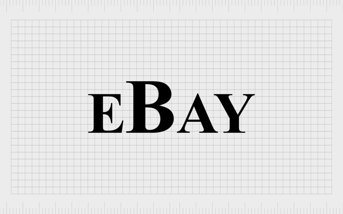
When the eBay Company was first established, the team didn’t think much about the logo. The first design for the official eBay wordmark was just the name in a black serif font. The font is actually Times New Roman – the most common font in the world today.
There’s no frame or additional details to draw attention to the logo here. The main defining feature is the capital “B” being enlarged.
1999
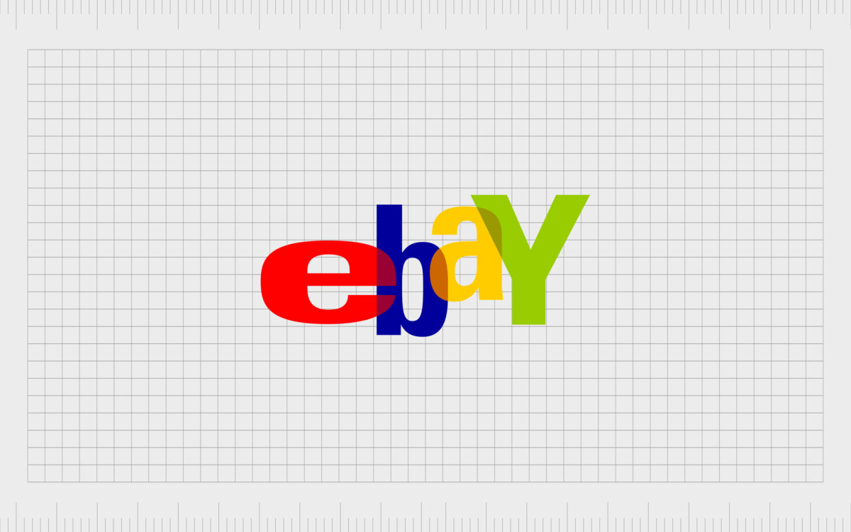
At the turn of the millennium, eBay decided it was time to update its logo. The new eBay logo looked nothing like the original eBay logo. Indeed, the design for 1999 marks the biggest eBay logo change in the Company’s history, as it involved adding new colors into the mix.
The redesign brought a colorful emblem into the marketplace, replacing the lowercase “y” with a capital, and removing the capital “B”.
Each letter of the inscription was in a sans-serif block font, with slightly transparent colors so they could overlap. The colors of red, blue, yellow, and green demonstrated the diversity of the business, while the uneven spacing and placement of the letters made the emblem look fun and buoyant.
2012
eBay’s iconic and boisterous logo remained the same for several years, until the 2010s, when a number of technology companies began simplifying their emblems for a more minimalist future.
Although there are still some people who ask, “why did eBay change their logo?” many agree the new design is a lot crisper and cleaner.
The 2012 version of the eBay logo design is still in use today, featuring the same red, blue, yellow and green color palette of the previous icon. The wordmark chose a different typography this time around, still in sans-serif, but a lot sleeker and more straightforward.
The traditional sans-serif typeface places the letters close to each other without overlapping.
The newer eBay logo also removed the capital “Y”, which a lot of designers felt didn’t really make sense. None of the letters in the new symbol are floating around on the page, and they all look uniform and even, allowing for a more professional image.
Who designed the new eBay logo?
The latest version of the eBay logo was designed by Lippincott, to replace the older, more quirky typography designed by CKS Partners (and Elissa Davis).
The most recent eBay logo font might not be quite as exciting as the one before it, but this one is a lot more in line with technology logo trends.
Interestingly, eBay is one of the few companies known for operating without any real logo to begin with. The simple black lettering of the original “icon” wouldn’t be classed by many as a logo in today’s world.
When Elissa Davis from CKS partners was asked to design the new logo, she noted she had been inspired by the Apple logo at the time, and the fun movement of the game Twister. According to Davis, the overlapping characters demonstrated a sense of community.
You can find eBay logo resources here.
eBay logo icon
The official eBay logo icon is simply the name “eBay”, which can be spelled either with the capital E “Ebay” or the lowercase e and capital B, “eBay.”
eBay logo font
The first ever font chosen for the eBay logo was Times New Roman. Since then, the Company has switched to a friendlier, sans-serif alternative. The most recent eBay logo is a thin version of the Univers font.
eBay logo colors
The colors of the eBay logo weren’t always as exciting as they are today. Initially, the logo was just black and white. Today, the eBay logo features red, blue, yellow, and green, perhaps to indicate the variety of products on the marketplace.
eBay symbol meaning
Throughout the years, eBay logo designers have said their inspiration for the logo was to convey a sense of fun, freedom, and connectedness. The closely linked letters of the logo in the recent symbol, and the overlapping in the previous icon helped to build a sense of community.
Celebrating the eBay logo
The eBay logo today might not be as quirky as it was in the 2000s, but it still stands as one of the most memorable symbols in the world. The Company found its identity when experimenting with fonts and colors during the 90s and 2000s and have held onto this sense of fun ever since.
Today, the color palette reminds us of the wide range of products eBay users can find on the platform, while drawing to mind connotations with technology brands like Google and Microsoft.
The much sleeker and simpler logo created in 2012 also works a lot better in the minimalist digital world, where apps and smartphones reign supreme.
To learn more about some of the most iconic logos in the world and where they came from, check out some of our other guides on logofile.
Fabrik: A branding agency for our times.
Now read these:
—Your guide to the Hewlett Packard logo
—The Microsoft logo history and evolution
—Understanding the Nintendo Switch logo
—An in-depth look at the Fortnight logos
—The story of the Pokémon logo symbol
—Explaining the Van Halen symbol
—The story of the Rolling Stones logo
—Exploring the Stranger Things logo
—The LA Lakers logo and symbol
—KC Chiefs symbol and its meaning
—Evolution of the Amazon Alexa logo
Check out these fantastic logo design resources:
Clarity starts with a conversation.
Thanks—we’ll get back to you shortly.
Whether you're navigating a rebrand, merger, or simply need a clearer identity—we’re here to help. No hard sell, just honest advice from people who know the sector.
Let’s start with a simple question…
Prefer to email? Drop us a line.
Fabrik’s been helping organisations rethink and reshape their brands for over 25 years. We’ve guided companies through mergers, rebrands and new launches. Whatever stage you’re at, we’ll meet you there.


