


Logos of multinational companies: The world’s biggest multinational company logos
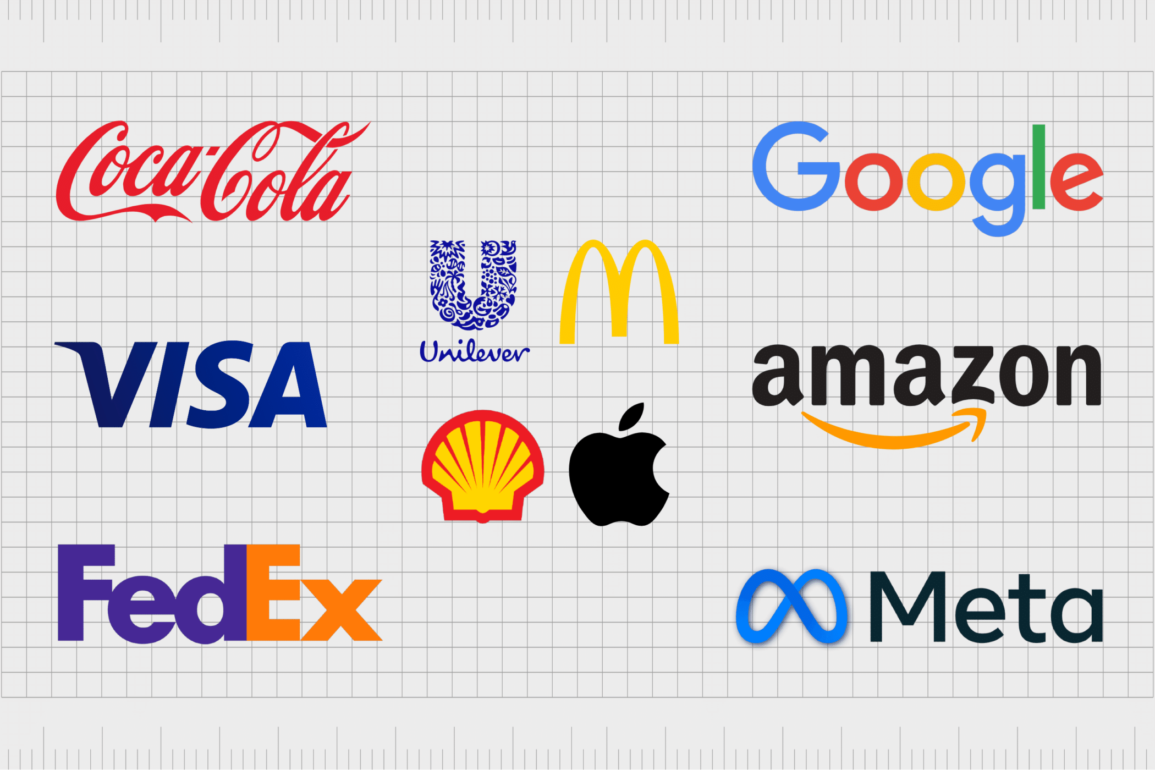
The logos of multinational companies are everywhere. In today’s age of rapid digitization and globalization, multinational brands have evolved to become a mainstay of the modern market. You’re probably familiar with a multinational company logo or two already.
Brands ranging from Coca-Cola to Amazon and Apple have a presence that spans multiple geographies, cultures, and groups, allowing for phenomenal, consistent growth.
Although multinational companies aren’t exactly a new concept in the business landscape, they have become more common in recent years, thanks to innovation on a global scale.
Today, it’s much easier for major brands to sell to consumers from around the globe with minimal effort and investment.
While the world’s richest brands are constantly getting richer, new organizations are beginning to emerge from the sidelines, expanding their geographical footprint through eCommerce, software as service sales, and distribution partnerships.
So, what does it take to create a logo that transcends geographical and cultural borders? Today, we will be taking a closer look at the logos of multinational companies and how they effectively capture their audience’s attention.
How do you identify a multinational company?
A multinational company doesn’t necessarily need to be one of the world’s most profitable ventures. Although many of the world’s richest brands are also multinational companies, all you really need to be included in this group is a presence that spans more than one country.
The definition of a “multinational company” can vary depending on who you ask.
Some leaders suggest any business with operations in more than one country is a multinational corporation. Others say around 25% of a company’s revenue needs to be generated outside of the organization’s home country for it to fall into this category.
Either way, a multinational brand will need offices, facilities, factories, and sales solutions located in numerous countries around the world (at least 2). Most of these organizations have a centralized headquarters in their home country, too, responsible for global management and coordination.
World’s richest brands: Understanding the logos of big companies
As you’ll see from the logos of the multinational companies we cover below, there’s really no one-size-fits-all method to creating an impactful logo for these brands. The most important factor the world’s richest brands need to consider is versatility.
Big brand logos must be designed to capture the attention of a broad and diverse audience across multiple landscapes and cultures.
This means business leaders need to do additional research to ensure the colors, fonts, and even symbols they choose resonate with all kinds of groups – not just their local audience. The visual brand identity of a larger, multinational organization needs to be timeless and versatile.
Here are some of the other key elements you’ll find in a multinational logo:
Simplicity
When you’re attracting a wide audience, it’s important not to go too complex with your logo. The more complicated a design is, the more likely it is to alienate or confuse certain members of your audience.
Think of brands like Apple and Google; their logos are straightforward and elegant, with no confusing components.
Memorability
All companies should ensure the logos they use are immediately eye-catching and memorable. An evocative, engaging logo is crucial to grab the attention of any audience and showcase the unique components of your brand identity.
Think about how you can make your emblem stand out in a versatile market.
Timelessness
Because multinational companies often grow quickly, they need a logo capable of scaling and evolving with them. As such, most multinational brands will avoid any logo which connects their company to a specific time period or landscape.
Logos of multinational companies: What are the biggest multinationals?
There are thousands of multinational companies operating throughout the world today. Some are a little smaller, operating in just one or two countries outside of their own. Others have spanned the entire globe, increasingly attracting new customers over the years.
Today, we’re going to take a look at some of the logos of multinational companies belonging to the biggest brands worldwide.
Let’s dive in.

Unilever
Though technically a British company at its core, Unilever is a multinational consumer goods company with exceptional reach.
Launched in 1929, the organization has expanded to include a number of different products in its portfolio, from niches like food, beverages, pharmaceuticals, beauty, personal care, and even pet food.
The Unilever logo aims to convey the versatility of the brand in a simple, but unforgettable image. The large blue “U” is made up of a multitude of different symbols, representing the various types of items the company sells.
What’s more, Unilever uses a handwritten wordmark, to connect with customers on an emotional level, and show compassion and authenticity.

Samsung
Another of the world’s biggest brands selling across multiple countries, Samsung started life in Korea and now has a presence in countless countries across the world. Today, Samsung is the eighth most successful company in the world in terms of brand value.
Launched in 1938, the brand focuses primarily on electronics, technology, and appliances.
The Samsung logo is simple but innovative. Like many multinational companies attempting to convey an essence of reliability and credibility, the company has chosen blue as its core color.
At its heart, the logo is a wordmark, but it includes a stylized “A,” made to look like an arrow pointing upwards, to symbolize forward progression and innovation.
Find out more about the Samsung logo here.

Microsoft
Perhaps the best-known multinational company in the world for technology consumers, Microsoft’s emblem has spanned virtually every country over the decades.
One of the world’s richest brands, Microsoft was launched in 1975 and focuses primarily on the technology landscape, producing a host of gaming consoles, operating systems, and software tools.
Modern and evocative, the Microsoft combination logo leverages a simple wordmark written in a sans-serif grey font alongside a multi-colored square. The square consists of four colors, green, yellow, blue, and red/orange, intended to highlight the core components of the company’s portfolio.
Find out more about the Microsoft logo here.

McDonald’s
At this point, the McDonald’s logo has become one of the better-known symbols around the globe. The company is the world’s second-largest private employer and one of the biggest brands in the world, serving over 69 million customers a day.
The brand was first launched in 1940 and had been growing ever since, with multiple franchise deals.
The McDonald’s logo has evolved a few times over the years, becoming increasingly more simplistic to match the trends of the current landscape. Today, the golden arches logo consists of a large, bright yellow “M” to represent the name of the organization.
The logo stands out perfectly on road signs and across multiple other advertising mediums.

Often referred to as one of the most valuable and powerful brands in the world, Google is an American multinational company focused on cloud computing, artificial intelligence, advertising, and search engine technology.
The parent company of Google, Alphabet, is also considered one of the biggest American IT companies worldwide.
Launched in 1998, Google has refined and updated its logo over the years to appeal to a younger, modern audience. The current emblem is a simple sans-serif wordmark consisting of 4 different colors, representing the core components of the company’s portfolio, similar to Microsoft.
Google also supports designers in showcasing their variations of the logo on the search engine.
Find out more about the Google logo here.

Walt Disney
The Walt Disney Company, otherwise known as Disney, is a mass media entertainment conglomerate with a presence across the globe. First introduced in 1923, the company has become one of the biggest in the world, producing a host of shows, pictures, products, and theme parks across the decades.
Despite a long history, a few aspects of the Disney logo have been changed through the years.
Today, the Walt Disney logo is primarily made up of a simple wordmark designed to look like the handwriting of one of the famous founders, Walt Disney. The signature style logo features numerous swirls and decorative elements to make it appear more authentic and human.
The fun and eye-catching logo is now present on a host of Disney products.

Apple
When it comes to the famous logos of multinational companies, it’s hard to overlook one of the biggest technology brands in the world. Apple is an American multinational company with the largest revenue in the world as of 2022.
It’s also the biggest company by market capitalization worldwide. The company was first launched in 1976 by a collection of IT innovators.
Although Apple has experimented with a few different logos over the years, it has always focused on simple, evocative emblems. The current design features the silhouette shape of an apple, in black, with a leaf on the top and a bite taken out of the side.
The logo is intended to convey nourishment, innovation, growth, and simplicity.

Amazon
Another of the world’s largest multinational companies, Amazon, was first introduced in 1994 under the name “Cadabra” before the moniker was updated. The organization sells a range of different products, ranging from cloud computing to digital streaming tools.
It’s also one of the world’s most valuable brands and one of the biggest economic forces in the world.
The disruptive Amazon brand chose an evocative and relatively straightforward emblem for its logo. The image features the name of the company in all lowercase letters to convey a friendly personality.
The arrow from “A” to “Z” highlights the versatility of the product collection while also creating an image similar to a smile.

Coca-Cola
This multinational company logo is one virtually every consumer will be aware of. The Coca-Cola brand, first founded in 1886, started life selling a single beverage before it evolved to become a massive organization with multiple product lines.
Today, coke products are sold in hundreds of countries worldwide, and it’s one of the world’s most well-known brands.
Similar to some other well-known multinational brands, Coca-Cola uses a wordmark as its core logo, written in a decorative font with numerous swirls and embellishments. The design is made to look a little like human handwriting, intended to convey the compassionate nature of the company.
The color red symbolizes passion and power.

Meta
Formerly known as “Facebook,” Meta is one of the most significant technology conglomerates in the world. The company owns a host of different social media channels, as well as numerous software solutions.
It’s currently ranked as one of the most valuable companies in the world and one of the most powerful IT brands in the United States.
Compelling and straightforward, the Meta logo combines a wordmark with a simple infinity symbol designed in blue.
The infinity symbol aims to draw attention to the company’s focus on consistent innovation and growth, while the overall logo portrays the brand as a modern, forward-thinking business.

Johnson & Johnson
Best known for selling medical devices, consumer packaged goods, and pharmaceuticals, Johnson & Johnson was originally introduced in 1886.
The company is a common stock component for the Dow Jones Industrial Average, and it’s one of the largest companies in the United States in terms of revenue.
It’s also one of the only companies with a credit rating higher than the US government.
Though relatively straightforward in style, the Johnson & Johnson logo is meaningful and emotional. The color red symbolizes passion and vitality, while the handwritten font style makes the company appear more friendly and compassionate.

FedEx
Like many of the famous logos of multinational companies, the FedEx emblem originally began gaining attention in America before expanding across territories. The FedEx Corporation, launched in 1971, focuses on the areas of freight, transportation, and business services.
The name of the brand is an abbreviation of the larger name, Federal Express.
This multinational company logo is often referenced in conversations about white space due to the arrow shape made between the “E” and the “X” in the wordmark.
FedEx has a bright and compelling logo, in the colors purple, for compassion and orange for creativity and energy.

Alphabet
Another of the world’s biggest technology companies, Alphabet is the multinational technology brand responsible for major businesses like Google. It’s the world’s third-largest technology company, even though it was only launched a handful of years ago, in 2015.
Alphabet is responsible for innovating and creating new technologies in the IT sector.
Compared to other leading logos of multinational companies, Alphabet’s emblem is extremely straightforward, with no decorative elements. The streamlined wordmark uses a similar font to the Google logo, though it’s depicted entirely in bright red, to symbolize strength and passion.

Visa
Best known for transforming the financial landscape, Visa is a multinational financial services corporation headquartered in California.
Introduced in 1958, the business is responsible for managing electronic fund transfers throughout the world. It’s one of the most valuable companies around, and its symbol is commonly used throughout the commerce landscape.
The Visa logo, like many leading emblems, is an eye-catching wordmark depicted in color blue to symbolize credibility and trustworthiness. The sharp angle on the top of the “V” highlights the speed of the brand’s payment processing capabilities.

Nestlé
Swiss multinational food company, Nestlé first made its way into the market in 1866 with the introduction of a condensed milk brand.
Since then, the gigantic business has evolved into selling a variety of products, ranging from baby food to medical food, breakfast cereals, pet foods, snacks, and bottled water.
About 29 of the company’s brands have sales of more than $1 billion.
Interestingly, the logo used for Nestlé actually stems from a family crest for the Nestlé brand. The compelling emblem, depicted in a soft grey shade, showcases both the name of the company and the image of a bird feeding her young chicks.
The image highlights ideas of compassion, family, and nurture.
Find out more about the Nestlé logo here.

Sony
One of the biggest technology companies in the world, the Sony Corporation, started life in Japan and still has a headquarters in Tokyo today. It is currently one of the largest video game manufacturers in the world, as well as a major provider of electronic products for professionals and consumers alike.
Sony keeps things relatively simple with its logo design, opting for a serif-style wordmark in black to convey ideas of professionalism, strength, and stability. The letters are all depicted in uppercase, which adds to the overall power of the brand’s image.
Sony also has a number of subsidiary brands with their own unique logos under its wing.
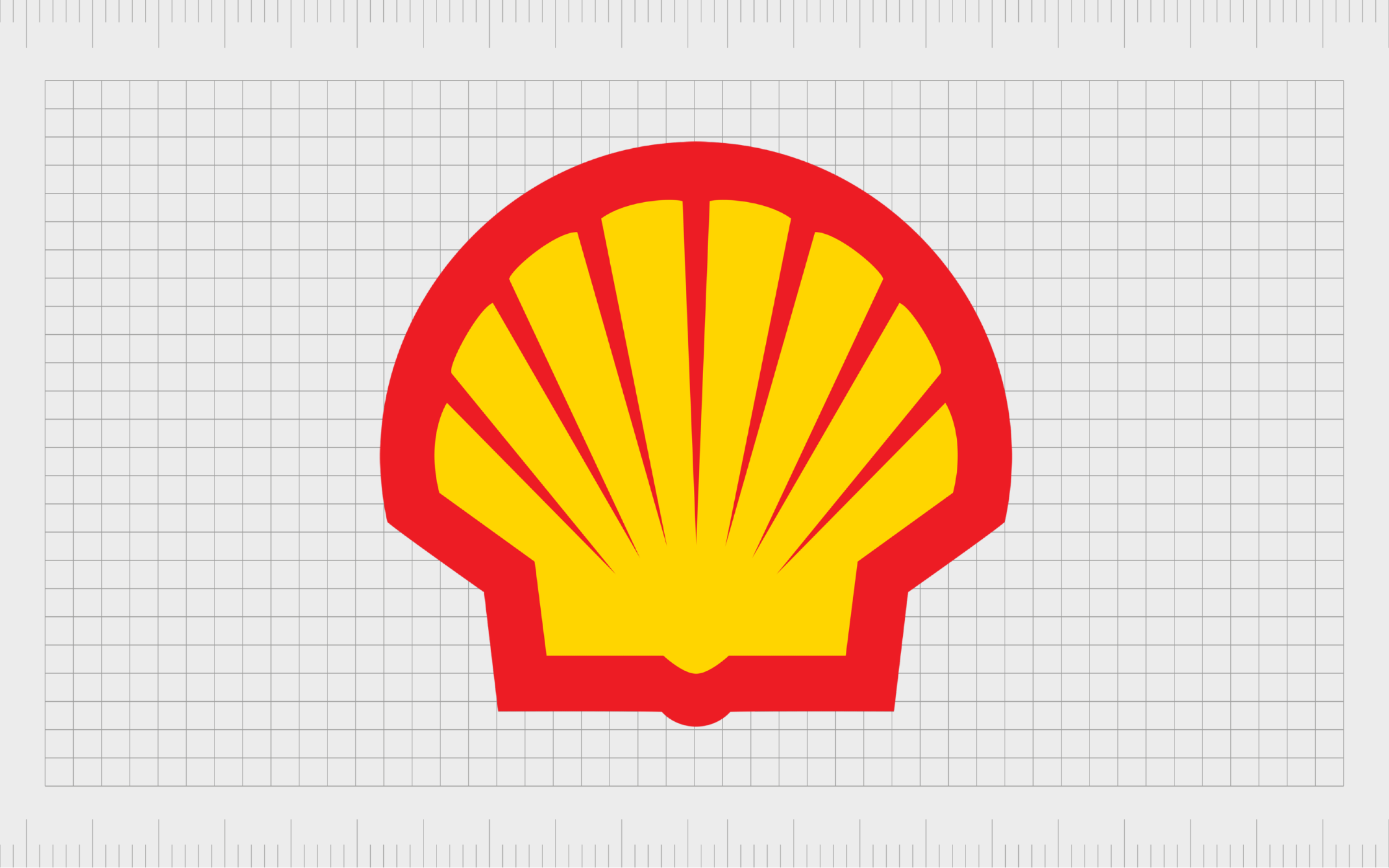
Shell
A British multinational gas and oil company, Shell is a public limited company with a huge impact on the fueling sector.
The company stands as one of the biggest brands by revenue in any industry. However, it has also faced some controversy as one of the largest producers of greenhouse gas emissions through the fuels it sells and its own operations.
Shell was one of the seven sisters which dominated the global petroleum industry in the 1900s. Today, its logo symbolizes strength and vitality with a combination of bright yellow and red shades.
The logo requires no wordmark, as the image of a shell alone is enough to capture the attention of its target audience.

Intel
Like many of the logos of multinational companies we’ve looked at today, the Intel emblem belongs to a major technology brand. First launched in 1968, Intel is responsible for producing some of the most important components for computers and technology products around.
It’s the world’s largest semiconductor chip creator by revenue.
Though relatively straightforward in style, the Intel logo is difficult to overlook. The eye-catching wordmark combines two shades of blue to create a highly credible and trustworthy image, ideal for the modern landscape.
The light blue dot above the “I” in “Intel” is also intended to be a reference to the chips the company produces.

IBM
Known throughout the world for its hardware, software, and middleware services, IBM was originally founded in 1911 as the International Business Machines Corporation. The brand now sells in more than 175 countries worldwide and is one of the largest industrial research organizations anywhere.
Very few changes have been made to the IBM logo over the years. The current emblem reflects the core letters of the company’s name in blue stripes, intended to demonstrate innovation and forward movement.
The eye-catching wordmark helps to set the technology business apart from its competitors and highlight its pioneering personality.
Tips for creating a multinational company logo
As you can see from the logos of multinational companies listed above, there are countless ways to design an eye-catching and memorable image for a leading global brand.
Many of the world’s richest brands ensure their logos capture the attention of their audience by working with professional designers. Some of the logos of big companies worldwide cost millions to create.
However, if you’re producing an eye-catching multinational company logo on your own, there are a few steps you can consider to improve your chances of success.
Know your audience
Perhaps the most important thing you can do when designing any logo is to ensure you’re familiar with your target audience.
This might require more research for a multinational brand, but it ensures you can choose colors, shapes, and even fonts that can resonate with a wider collection of potential customers.
Understand the competition
There are competitors in any industry, no matter how big your brand becomes. Even the biggest multinational companies have competitors to think about. Examining other brands in your industry can be a good way to make sure you design a logo that’s unique and compelling.
Experiment with colors
While some of the big brand logos mentioned above use a relatively simple monochrome emblem for their logo, many take advantage of color psychology. Knowing which shades resonate with your target audience and align with the personality you’re trying to create is crucial.
Know your typography
Although some major brands don’t use any wordmarks in their logos, some of the top companies around the world rely on typography to connect with their audience. Experiment with sans-serif, serif, and even handwritten styles to determine what kind of style is best for highlighting your identity.
Make it scalable
Finally, ensure any logo you create for your multinational brand can scale across geographies and cultures.
Doing extra due diligence to determine what certain symbols and colors actually represent in various parts of the world can save you a lot of effort in the future and may prevent you from having to rebrand too quickly.
Learning from the logos of big companies
The logos of multinational companies are versatile, eye-catching, and highly memorable designs created to span across geographies and break down cultural borders.
Although many of the multinational company logo examples above come from companies who have updated their image over the years, these businesses have always taken the right care when choosing their emblem.
If you’re struggling to create a logo that can compete with the designs of some of the biggest multinational companies, the best thing you can do is seek help from a professional.
Remember, the big brand logos best known worldwide today weren’t designed by accident. The best solutions come from careful planning and expertise.
Fabrik: A branding agency for our times.

Clarity starts with a conversation.
Thanks—we’ll get back to you shortly.
Whether you're navigating a rebrand, merger, or simply need a clearer identity—we’re here to help. No hard sell, just honest advice from people who know the sector.
Let’s start with a simple question…
Prefer to email? Drop us a line.
Fabrik’s been helping organisations rethink and reshape their brands for over 25 years. We’ve guided companies through mergers, rebrands and new launches. Whatever stage you’re at, we’ll meet you there.