Tidal music logo and history

How familiar are you with the Tidal music logo? Simple but effective, the Tidal logo has a significant presence in the musical industry, particularly among streaming fans.
Since the Tidal service first emerged in 2014, it’s been capturing the attention of audio aficionados around the world.
While the logo for the Tidal Music Company might seem pretty basic at first glance, this minimalist image has played an important role in the evolution of the Company, and its ability to thrive in a changing marketplace.
The simple selection of four black diamonds known as the Tidal symbol is an emblem of musical creativity and streaming innovation.
Today, we’re going to give you a behind-the-scenes look at the history of Tidal Music, and its logo.
The history of Tidal Music
The Tidal Music story
Before we cover the basics of the Tidal Music logo, let’s explore the history of the Brand and where it originally came from.
Compared to some other brands with iconic logos, Tidal hasn’t been around for very long. The Tidal Music Company launched in 2014, and in 2015, the Project Panther Bidco brand took ownership of the service.
Jay-Z (Otherwise known as Shawn Corey Carter) became the head of Tidal Music, and the face behind the Company. The rapper and producer from New York has actually had a part to play in the development of many projects over the years.
Though the ownership of the Tidal business might have changed over the years, the transformation of the Brand hasn’t been evident in the Tidal logo.
The symbol for Tidal Music has remained consistent throughout multiple transitions, from Tidal’s birth as a Norwegian startup branching off from the WiMP streaming service to rapper-backed global ecosystem for creators.

The Tidal Music logo: Identifying the Tidal symbol
When Tidal first launched, it was a digital service for accessing music, similar to Apple Music or Google Music. Today, it still stands as one of the most popular music streaming services around, branching across 60 countries worldwide (or even more with a VPN).
Available through a range of platforms, Tidal Music has evolved drastically in the last 5 years, particularly with the help of Jay Z, and an investment from telecommunications company Sprint in 2017.
However, the most consistent part of the business is still the logo, which has remained the same since its first introduction in 2014.
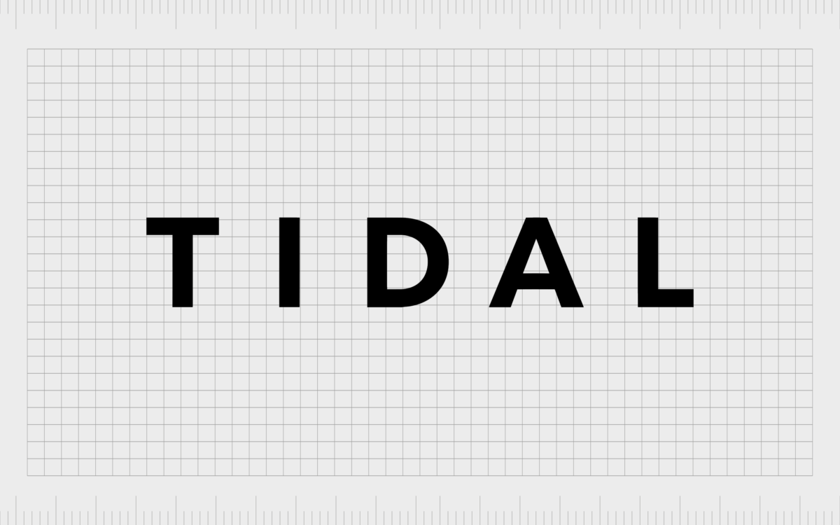
A simple black and white emblem combined with a wordmark, the Tidal Music logo might not be the most exciting symbol you’ve seen, but it’s definitely memorable. The staggered geometric diamonds of the Tidal emblem appear to form two shapes at once.
First, you get the obvious T depicted by the alignment of the four diamonds. When you consider the white space around the black diamonds, you also get a downward-pointing arrow, perhaps to remind people of “downloading” music.
The wordmark is the other major component of the first and only Tidal logo. Usually placed on the right-hand side of the Tidal Music symbol, the word features a simple, sleek sans-serif type. The design is similar to the font found on the “Keep Calm” UK propaganda posters.

The Tidal music logo font, color, and meaning
The Tidal symbol is minimalist, engaging, but also meaningful. First, we have the “T” shape created by the geometric shapes in the symbol. Clearly, this is to remind users of the name of the Brand.
So, why not use a standard letter “T”? The decision to use not just four diamonds, but four angled squares is important here.
While the diamond shape demonstrates quality, the square is a shape often associated with stability and reliability. The decision to use squares conveys an idea of trust and stability from the Tidal business – important factors for a digital streaming service.
Some designers would also argue the decision to tilt the squares is meaningful – demonstrating a sense of playfulness and a passion for thinking outside of the voice.
The simplistic Tidal Music font could also be falsely described as “generic” at a glance, but it’s actually a carefully chosen typeface. Clear and easy to read in any environment, the sans-serif font is great for the digital age.
It’s also crisp and clear enough to compete with other leading technology fonts, like that of Google and Apple.
You can find some examples of the Tidal music symbol elements here.
What does the Tidal Music symbol mean?
The Tidal symbol and wordmark combination is an excellent, straightforward design intended to remind customers of the Tidal brand. The geometric “T” design represents the name of the Company, while conveying ideas of fun, reliability, and even luxury.
What color is the Tidal Music logo?
The first and last Tidal Music logo is black and white. Some examples of the design have inverted the colors over the years, using white squares on a black background and so on. However, the black and white shades are the official colors.
What font does the Tidal Music logo use?
The font used by the Tidal Music logo is a unique typography designed specifically for the brand. However, most people compare it to the “Keep Calm” font on British propaganda posters from the war.
The success of the Tidal logo
While most technology companies have changed their logo several times over the years, Tidal is one of the few companies to maintain a consistent image.
Though the ownership of the business has evolved over the years, and the number of services offered has increased, the image of the Brand remains consistent.
Perhaps this is simply a commendation to the first design created for the Company, and how effective it is at making the right lasting impression.
Today, Tidal continues to grow as a brand, and gain customers around the world. The development of the service into a multi-media hi-res streaming service for podcasts and audio makes it a powerful contender in the digital marketplace.
Connections with names like Jay Z and powerful marketing strategies have also helped Tidal to gain a lasting position in the industry, despite high competition. Today, Tidal competes with the likes of Qobuz, Pandora, Spotify, and Apple Music.
There’s no denying various factors have contributed to the success of the Tidal Music ecosystem over the years, but the simplistic and effective logo definitely has a part to play. Who knows how long Tidal will continue to preserve the image it’s held onto for the past five years?
Want to learn more about the Tidal logo?
Here are some resources to help:
Fabrik: A branding agency for our times.
Now read these:
—Understanding the Nintendo Switch logo
—An in-depth look at the Fortnight logos
—The story of the Pokémon logo symbol
—The old eBay logo to the present day
—Evolution of the Amazon Alexa logo
—Explaining the Van Halen symbol
—The story of the Rolling Stones logo
—History of the Gucci logo and symbol
—Exploring the Stranger Things logo
Check out these fantastic logo design resources:
Clarity starts with a conversation.
Thanks—we’ll get back to you shortly.
Whether you're navigating a rebrand, merger, or simply need a clearer identity—we’re here to help. No hard sell, just honest advice from people who know the sector.
Let’s start with a simple question…
Prefer to email? Drop us a line.
Fabrik’s been helping organisations rethink and reshape their brands for over 25 years. We’ve guided companies through mergers, rebrands and new launches. Whatever stage you’re at, we’ll meet you there.


