Swedish Fish logo history throughout the years

How much do you know about Swedish Fish logo history? As a fan of the flavorful fish, you may know their branding and packaging last updated only 5 years ago, in 2016. Before, the company held onto the same traditional logo for decades: an emblem of its heritage.
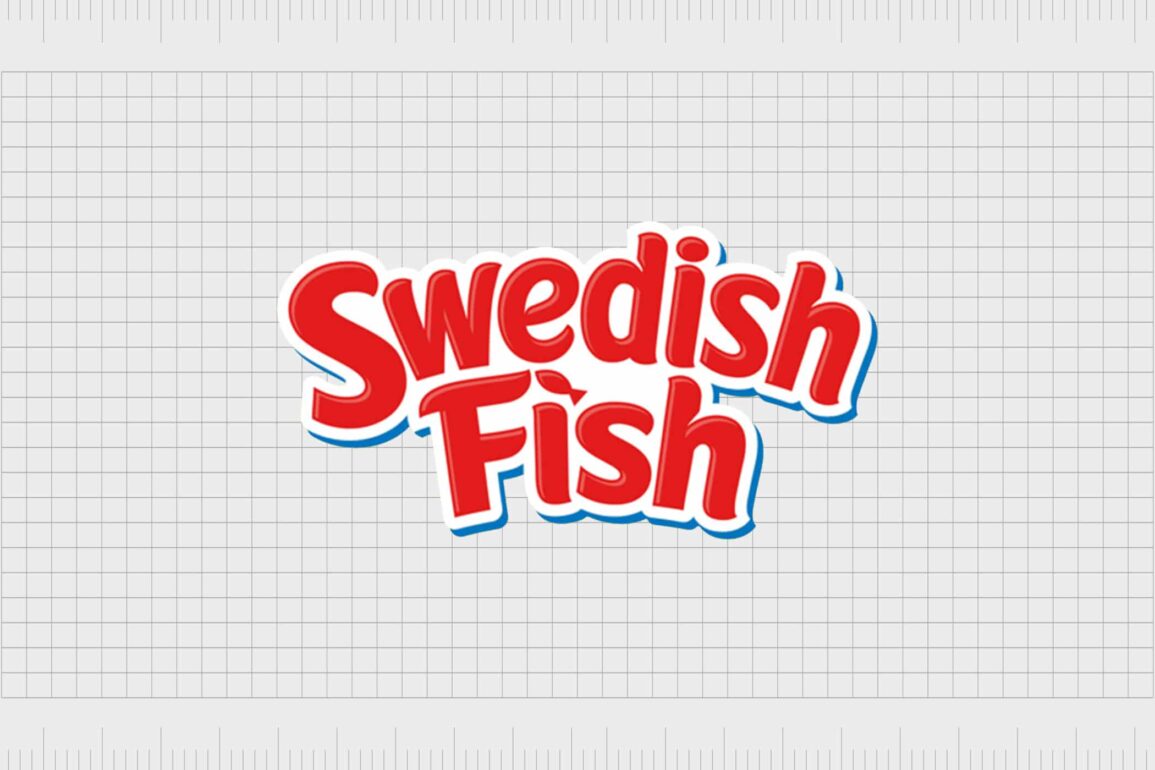
The Swedish Fish logo is a playful, dynamic, and beautifully simple wordmark, created by the “Bulletproof” branding company. Today, we’re going to give you a behind-the-scenes look at the transformation of the Swedish Fish candy logo, so you can join us in celebrating a candy icon.
The Swedish fish candy logo
Swedish Fish, more commonly known as “Pastellfiskar”, arrived in America in the 1950s, and quickly developed a cult following among candy enthusiasts. The unique sweets were very different to much of the treats available in the US at the time.
The product introduced kids and adults to flavors like “lingonberry” which were common in Sweden, but almost unheard of in the US.
When the Swedish Fish brand first emerged in Sweden, they were created by Malaco, a Swedish confectionary company looking to expand sales into North America. The group partnered with Cadbury on the development of a candy capable of reflecting Swedish culture.
The fish shape of the gummy candy (meant to represent Sweden’s love of fishing), and the lingonberry flavor perfectly created an “exotic” new product for the US market.
With such a unique item to sell, it’s little surprise the Malaco and Cadbury company went simple with their choice of logo, which originally used the name “Swedish Fish”, and the image of a fish. Today, the updated logo created in 2016 continues to focus on the use of a wordmark to define the candy.
Swedish fish logo history
The Swedish fish logo history is relatively short, as there haven’t been many changes to the design over the years. When the first version of the Swedish Fish product was introduced into the US market in the early 1950s, the “original” logo was a simple wordmark accompanied by a cartoonish fish.

1953
Like many logos of the time, the Swedish Fish icon was simple and straight to the point. The name “Swedish Fish” appeared in a slightly slanting sans-serif font, with shading to make the letters seem almost three dimensional.
The majority of the logo’s coloring was in a bright, primary red, which coated both the word mark, and the cartoon fish included within the icon.
The words “The Original”, at the top of the logo highlighted the heritage of the brand, while the “Soft & Chewy Candy” component described exactly what children could expect.

1978
The next update to the Swedish Fish sweets logo didn’t happen until 1978, when the image most people associate with the brand today became the new norm. In this version of the logo, the words “The Original” were removed, though the descriptive “soft & chewy candy” remained.
The logo also updated its font, this time using serif typography, still in red, and outlined with white and dark blue borders.
In some versions of the Swedish Fish logo, you’d see the added descriptor “a fat free food”. Two water droplets appeared above the “W”, to represent the splash of a fish jumping into water. The cartoon fish was also updated, this time featuring more detail, and a shape similar to the fish candies themselves.

2016
When the new owners of the Swedish Fish brand, Mondelez International, approached Bulletproof branding for their logo redesign in 2016, the focus was on updating a somewhat “old-fashioned” appearance.
The company wanted something which looked more modern and playful – for a modern audience. However, they also wanted to keep the heritage of their existing brand identity.
The new Swedish Fish brand logo features the same bright red coloring we’ve associated with Swedish Fish throughout the years. The white and blue outlines remain, but the overall shape of the wordmark has changed, bowing into a curve.
The font itself is different too, sans-serif and bold enough to look much thicker, and more playful on the page.
The dot of the ‘I’ on the word “Fish”, in this logo features the basic shape of the fish, while the cartoon character previously accompanying the lettering has disappeared entirely.
Swedish fish font, image, and colors
Over the years, the Swedish Fish candy logo has only changed a couple of times. However, in both of these transformations, the company has maintained a lot of its existing appeal. The Swedish Fish colors have stayed the same for more than 50 years, while the image and font have changed around them.
The latest version of the Swedish fish logo, created by Bulletproof branding, builds on the highly recognizable previous brand mark. There’s still the bright red coloring, and the image of the fish (though it’s much smaller).
This logo, however, does have a lot more motion in it.
Swedish fish colors
The most recognizable Swedish Fish color has to be the bright primary red, which matches the color of the first flavor of the Swedish Fish sweets. Other colors commonly associated with the company include white and blue (for the borders on the wordmark), and bright yellow/gold, for the packaging of the candy.
Swedish fish font
Over the years, the Swedish Fish font has changed from informal and sans-serif, to serif, and back again. Today, the font is a custom design by Bulletproof branding. It’s a slightly curved sans-serif type, with a bold weight.
Swedish fish image
The Swedish fish image today is still the original fish mascot, though it’s much less recognizable than it once was. Today, there’s a small fish over the “I” in the word “Fish”, and many iterations of the logo also come with a picture of an actual Swedish Fish sweet attached to it.
Swedish fish resources
Here you can find the Swedish Fish png, and Swedish Fish vector.
The Swedish fish logo: Something to chew on
Swedish Fish is an excellent example of a company with very few changes to its brand image throughout the years. Over decades, Swedish Fish has only changed its logo twice. Today, the modern version of the logo still maintains a lot of the unique character of the original emblem.
Brimming with life and unexpected character, the Swedish Fish logo is just as quirky and engaging as the brand itself.
Fabrik: A branding agency for our times.
Now read these:
—Famous car brand logos and meanings
—Understanding the Nintendo Switch logo
—An in-depth look at the Fortnight logos
—The story of the Pokémon logo symbol
—The old eBay logo to the present day
—Evolution of the Amazon Alexa logo
—Explaining the Van Halen symbol
—The story of the Rolling Stones logo
—History of the Gucci logo and symbol
—Exploring the Stranger Things logo
Clarity starts with a conversation.
Thanks—we’ll get back to you shortly.
Whether you're navigating a rebrand, merger, or simply need a clearer identity—we’re here to help. No hard sell, just honest advice from people who know the sector.
Let’s start with a simple question…
Prefer to email? Drop us a line.
Fabrik’s been helping organisations rethink and reshape their brands for over 25 years. We’ve guided companies through mergers, rebrands and new launches. Whatever stage you’re at, we’ll meet you there.


