


Feeling blue: A history of Bluetooth and the story behind the Bluetooth logo
Sometimes, a logo becomes so deeply embedded in our culture, that we consider it a natural part of our surroundings. In fact, a brandmark can become so iconic, that you can forget it belongs to a brand at all.
If you own a laptop, a smartphone, a computer, or any other electronic device, then there’s a good chance that you’ve seen the “Bluetooth” symbol lingering on your screen from time-to-time. The Bluetooth logo is so ubiquitous in the technology world, that it’s almost impossible to find someone who doesn’t recognise it.
However, just because Bluetooth benefits from incredible customer awareness, doesn’t mean that its customers know much about it. In fact, there are countless happy Bluetooth users out there that don’t know anything about the history of Bluetooth, where its unforgetable name came from, or who’s responsible for the technology.
In a world where the narrative behind a brand is almost as important as it’s product or image, we thought it was time to pull back the curtains on the history of the Bluetooth name, and where its memorable logo began.
Here you’ll discover the unique origins of the Bluetooth brand story, and what can you learn from this technology marvel when you’re building your very own company.
The history of the Bluetooth name: The king of wireless tech
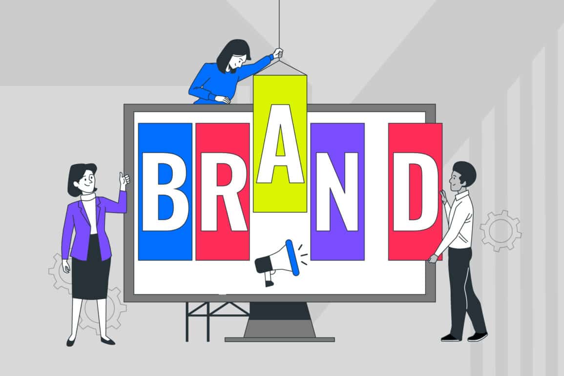
If you want to be a successful company, then you need a good brand name.
“Bluetooth” is a word synonymous with wireless technology and connectivity.
Even before you know what the term stands for, it grabs your attention because it’s unusual. For the uninitiated, “Bluetooth” doesn’t sound particularly techy, which makes it a little more complex than the standard brand name. However, the people behind the title were clearly willing to think outside of the box – something that’s crucial to gaining brand awareness.
The more you learn about Bluetooth, the more intriguing the brand becomes. For instance, many people still don’t know that the Bluetooth logo bears the initials of a 10th century Danish King – Harald Bluetooth Gormsson.
Why King Harald had the nickname “Bluetooth” is up for debate. Some say that it’s because he loved eating blueberries, while others say it’s because he had a dead or “blue” tooth. Much of Harald’s life as the king of Denmark remains immersed in mystery. However, what we do know is that he was the son of the first Danish king recognised by history – Gorm the Old. Much of the history available on Harald comes from a selection of ancient rune stones that were designed to help him consolidate his rule.
The question is, why would a technology company name their innovation after a long-dead king?
Choosing the name “Bluetooth”…
The history of the Bluetooth name begins with a collaboration between the designers of the Bluetooth wireless communication device. In 1998, the “Bluetooth Special Interest Group” came to life, with investments from Nokia, Intel, Ericsson, Toshiba, and IBM. Before the “SIG” group was formed, each of these technology groups was working on their own short-range radio technologies. Ericsson was building something called the “MC-Link”, while Intel was working on something called “Business-RF”. After a while, they decided that it would be better to work on a single short-range standard together, instead of creating several competing options.
During the summer of 1997, Jim Kardach of Intel met with Sven Mattisson of Ericsson for a drink at a local pub. While they were together, the two started talking about history, and Mattisson brought up a book called “The Longships” in which he had learned about King Harald. After this meeting, Kardach went home and learned more about king Bluetooth, and how he had been able to unite various parts of Scandinavia together – building connections between dispersed groups.
When the title of “Bluetooth” was suggested by the Special Interest Group, it was intended only as a place-holder. Of course, the term was such an instant hit, that the organisation decided that they wouldn’t change it after all.
Today, the Bluetooth brand has a global recognition rate of 92%. That means that almost the entire world can recognise the Bluetooth logo. When it comes to great branding, there’s no other company out there quite like Bluetooth.
Making a connection: A little more Bluetooth history
While “Bluetooth” might not be the name you’d automatically choose for a technology company, it makes a lot of sense. This name, though thousands of years old, brings a sense of long-standing heritage to the history of Bluetooth, and makes the brand instantly more appealing.
Those who know the history of the Bluetooth name are sure to see the connection between a king who united armies, and a connectivity standard that unites modern devices. In other words, the name “Bluetooth” isn’t just effective because it’s unique – it’s also powerful because it has depth and meaning.
A great name doesn’t just catch customers off guard, it gives them something to think about. The more powerful the story behind the brand, the more likely it is that you’ll build deep, emotional connections with your audience. What’s more memorable than the story of a blue-toothed Scandinavian king?
When Bluetooth was first created, it was designed to replace the wires present in everyday items like mice and keyboards. Of course, today, it’s capable of so much more than that. Modern Bluetooth connections can link cars to phones, and printers to computers. The system opens up opportunities that weren’t possible with wired connections. Bluetooth technology can allow a person to monitor their speed, steps, and pulse through wearable devices.
Today, thousands of companies are working on innovative new products to make it easier for devices to work together, and all this links back to a brand story about a king uniting people across a continent.
While the technology behind Bluetooth has evolved, the logo and name with origins dating back thousands of years have remained the same. This is a conscious choice from the people behind the technology, to remind customers what their purpose is as a brand. No matter what you might use your Bluetooth link for today, it will always be a technology devoted to making connections.
Learning from Bluetooth: Why names should have history
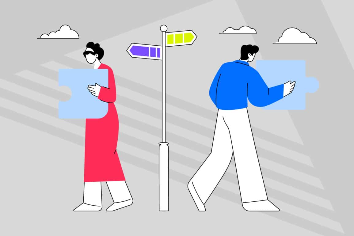
A brand name is a complicated thing. There are so many different and competing companies on the market today, that it’s difficult for organisations to find titles that are timeless, unique, and meaningful.
While it’s often tempting to go with the first name that comes to mind, the truth is that names with a great story are often more valuable. After all, today’s customers want to build relationships with the companies they do business with.
What’s more, by choosing a name with heritage, you can show your customers that you’re not just another copy-and-pasted generic brand. Today’s customers like organisations that are willing to shake things up and think outside of the box. That’s one of the reasons why disruptive brands are so effective.
The story in your name can become an important part of your brand story, giving your organisation the depth, character, and personality that pave the way for customer connections. Bluetooth isn’t the only brand that uses this tactic. Here are just a few famous names with history.
1. LEGO
Danish carpenter “Ole Kirk Christiansen” was the man behind Lego – everyone’s favourite building block. He purchased the name “Lego” in 1934 for his manufacturing company at the time which originally made ironing boards, stepladders, wooden toys, and stools.
The name comes from a Danish phrase “Leg Godt” which roughly translates to mean “I Assemble” in Latin, and “Play Well” in English. While the organisation didn’t start making their colourful bricks until 1949 – it’s easy to see why the name stuck around.
2. Starbucks
Coffee sensation “Starbucks” was founded in 1971 by Gordon Bowker, Zev Siegel, and Jerry Baldwin. The name was chosen after Bowker’s business partner mentioned that any word starting with the letters “ST” were powerful in marketing. For a brief time, the company was almost called “Starbo” after an old mining spot on the Cascade Range.
However, Bowker remembered that Captain Ahab’s first mate “Starbuck” was an avid coffee lover in the film adaptation. The founders behind Starbucks also considered the name of Captain Ahab’s ship “Pequod”.
3. Apple
When it comes to answering the question “Where did the “Apple” in Apple computers come from?” there’s a great deal of speculation on the web. Some people assume that Apple was named after the Beatles record label “Apple Corps” because Steve Wozniak and Steve Jobs were huge fans of the band. Others believe that original apple logo was a tribute to Alan Turing – the father of the computer system. In 1954, Turing committed suicide using cyanide, and a half-eaten apple was found beside his body.
Whether you prefer the darker rumours, or the lighter ones, the truth is much simpler. Steve Jobs revealed in an interview that the name “Apple” was chosen in homage to the orchards he had worked in when he was younger. Jobs felt that the name “Apple” was good for the company because it was spirited and fun, plus, it reminded Jobs of his favourite type of Apple – the Mcintosh.
4. Haagen-Dazs
It might surprise you to learn that the term “Haagen-Dazs” has nothing to do with ice cream. The confectionary mastermind Reuben Mattus named his organisation “Haagen-Dazs” as a tribute to how Denmark looked after Jewish people during the second world war.
In an interview, Mattus said that the only country that had tried to save Jews during World War 2 was Denmark. As a result, he decided to make up a completely unique Danish name and get it registered for his business.
5. Sony
During its first ten years of life, the company that would soon be responsible for the PlayStation, the Walkman, and many other tech innovations was called the “Tokyo Telecommunications Engineering Company.” Obviously, this wasn’t much of a catchy name, which might have been why the company founders felt that they needed to shake things up if they were going to grab the attention of markets like the United States and Europe.
In an attempt to appeal to a wider audience, the company founders chose the word “Sony” as a combination of the common colloquialism “Sonny-Boy”, and the Latin word “Sonus” which means sound.
6. Samsung
Finally, telecommunications company founder Lee Byung-Chull wanted his business to last forever when he first established it in 1938. That’s why he decided to pick the name “Samsung” which translates roughly to “TriStar” or “Three Stars” in Korean.
The reference to the stars highlighted Lee’s desire to create something big, powerful, and everlasting in Korean culture.
Defining the Bluetooth image: From fonts to runes
Before the founders behind Bluetooth chose to stick with their unique name, they considered Personal Area Networking (PAN) or RadioWire instead. The “PAN” option won a board meeting vote, but eventually, the company had to give up on the title because it would have been impossible for them to trademark.
Fortunately, not only does Bluetooth make a great name, it also offers a fantastic opportunity for logo design too. The squiggle of shapes in the bright blue brandmark comes from the runes in the Roman alphabet representing “H” and “B”. In other words, they’re the initials for Harald Bluetooth.
In technical terms, the Bluetooth logo is a “bind-rune”. This simply means that it’s an image made up of two runes merged together. Runes have been in circulation for thousands of years now, which gives even more history to the Bluetooth image.
Since we all know that logos are the key to a lasting image, let’s take a look at each aspect of the Bluetooth logo in closer detail.
1. The “shape” of the Bluetooth logo
One of the most creative logos in history, this highly professional brandmark is instantly recognisable across the world. As mentioned above, the graphic combines the Nordic Runes for “H” and “B”. Not only does this reference the king which gave Bluetooth its name, but the merging of the two letters also serves to represent how Bluetooth creates a connection between two devices.
The great thing about the bind-rune used for the Bluetooth logo is that it combines futuristic and historical elements to create something entirely new. The runes themselves have their place in history. After all, human beings have used runes for centuries in countries across the globe. This makes the Bluetooth logo instantly more universal. The runes ensure that the image is historical and cultural, just like the story of the brand’s name.
At the same time, the harsh angles and shapes of the runic letters were also highly modern for the time. The image is interesting enough to grab attention, yet simple so that it can still be seen easily on a tiny pixelated screen. The group behind the Bluetooth brand were careful to choose an image that was versatile, timeless, and modern – that’s what makes the logo so powerful today.
2. The colour of the Bluetooth logo
Blue is the most obvious colour for brand that has that very colour in its name. However, as you may already know, the right colours in a brand image can change the way customers feel about the company. Combined with the white of the bind-rune, it creates a sense of reliability that you might notice elsewhere in the technology world, with companies like Facebook, or Twitter, for instance.
Colour has a significant effect on the human psyche. While red raises the heart rate, shades like blue can calm and reassure. Choosing the right colours to represent your brand is an important step in making sure that you have the right impression on your audience.
Colours can help to convey the perfect personality for a brand or organisation. You may notice that the particular “Bluetooth” shade is neither too dark or too light. This is because pale blue often has connotations with youth, and faith, where dark blue is associated with expertise, depth, and stability. By lingering in between dark and light with a brighter shade, the Bluetooth logo symbolises both modernity and history.
In its entirety, the Bluetooth logo is made up of two interconnected runes drawn in white, against a blue background. The name of the technology can be written in black towards the right-hand side of the logo mark. This choice of colours symbolises the simple stress-free reliability of the technology, as well as the strength, heritage, and innovation of the brand.
3. The font of the Bluetooth logo
Just as the right colours can help to depict a brand’s personality, so too can the fonts chosen by the organisation. The typography you choose for your logo can either support or detract from the image that you’re hoping to create for your brand. Serif fonts are some of the oldest typefaces in history. These flourished options are reliable, respectable, and dependable. That’s why serif fonts are often used by banks and automobile companies.
Bluetooth uses a sans-serif typeface to be clean, simple, and contemporary. Sans-serif fonts create a neutral personality, which is ideal for a technology like Bluetooth, which was designed to be shared across the world. Additionally, these easy-to-read fonts can have a futuristic essence about them, perfect for new innovations.
The word “Bluetooth” is sometimes written alongside the icon on branded products. The font is always in black – demonstrating sophistication and professionalism. The name of the typography is “Gothic Medium Condensed” – an altered form of the “Gothic Medium” script created by Steve Jackaman.
The Bluetooth brand story and the rise of meaningful brands
No matter which industry you’re in, or what kind of product you’re selling, a great brand is the key to success. With the right image, a great name, and a powerful story, you can not only earn the attention of your target market but build an affinity that ensures your customers are less likely to run off with your competitors.
The only problem is, choosing the perfect image and title for your company is no easy task.
Entrepreneurs and startups across the globe constantly struggle to find their identity in a world where it appears every name and logo has already been taken. It’s no wonder that so many organisations rely on branding agencies to help them build their presence in this competitive marketplace.
Bluetooth has achieved the goals of countless ambitious companies, by creating a sustainable brand that both attracts customers, and outshines the competition. In fact, Bluetooth is so successful in its branding efforts, that it’s become an unforgettable part of its industry. No matter how the technology sector grows and changes, Bluetooth will always be a part of the space’s history.
While part of Bluetooth’s success is obviously owed to its USP as the fundamental connectivity solution for countless devices, there’s something to be said for its great branding strategy too. Bluetooth is more than just a headset or a tech device, it’s a:
- Unique name: The story behind the Bluetooth name will keep people talking about the company for generations. This gives the brand a sense of “top of mind awareness” that ensures no-one will ever forget about it. What’s more, the story also makes Bluetooth more interesting as a brand, improving the relationship the organisation has with its customers.
- Amazing logo: There’s more to a successful brand than an effective logo, but you need a good mark if you want to earn recognition in your space. The colours, fonts, and shapes of the Bluetooth logo make it easy to recognise and difficult to overlook.
- Great history: Many of the most powerful brands in the world have gotten to where they are today because they have a memorable story. As a growing company, your story is what makes your personality more authentic – transforming customers into loyal fans.
The next time you need some help creating a brand with real potential, it might be worth looking into the history of brands like Bluetooth for some tips on thinking outside of the box.
If you enjoyed this article, you might enjoy these too:
— How iconic brands are born, and why they thrive
— Creating a healthy company, the Vega way…

Clarity starts with a conversation.
Thanks—we’ll get back to you shortly.
Whether you're navigating a rebrand, merger, or simply need a clearer identity—we’re here to help. No hard sell, just honest advice from people who know the sector.
Let’s start with a simple question…
Prefer to email? Drop us a line.
Fabrik’s been helping organisations rethink and reshape their brands for over 25 years. We’ve guided companies through mergers, rebrands and new launches. Whatever stage you’re at, we’ll meet you there.