


Aveda logo: the history of the Aveda symbol and its meaning
Fans of the modern beauty industry are sure to be familiar with the Aveda logo. The question is, how much do you know about the history of Aveda, and where the Aveda logos actually came from?
Sophisticated, modern, and eye-catching, the Aveda beauty brand logo depicts a cutting-edge company leading the way to a new era for the industry. However, many people would be surprised to learn the Aveda corporation has actually been around for more than 40 years.
These days, Aveda is one of the better-known beauty and skincare brands in the world, with a particularly strong presence in the United States, where the company was first created.
Today, we’re going to take a closer look at the background of the Aveda brand, and its eye-catching logo.
Aveda background: Where did the Aveda brand come from?
Before we take a closer look at the Aveda symbol and brand colors, let’s start with a brief insight into the company itself. The Aveda Corporation is a cosmetics company from America, founded by Horst Rechelbacher in 1978.
If we take a trip into Aveda history, we discover an interesting story about the meaning behind the brand name. According to the company, Horst went on a trip to Indian in the 1970s, where he was introduced to the science of Ayurveda – a Hindu traditional system of medicine and wellbeing.
Exploring the power of Ayurveda gave Horst the idea to create a new skincare and beauty company, focused more heavily on holistic wellness. The first product created by Rechelbacher was a testament to his vision – a clove shampoo made with all-natural ingredients, and the help of Ayurvedic doctors.
The word “Ayurveda” isn’t the only inspiration for the Aveda name. The word “Aveda” is Sanskrit for “all knowledge” and encompasses the idea of holistic treatment. It’s this unique name, and the modern approach to health and skincare which also helped to form the Aveda logo.
Today, Aveda belongs to the Estée Lauder Company, which purchased the brand during 1997 for $300 million. Horst also sold his chain of salons to his successor, David Wagner.
The Aveda symbol: Aveda logos over the years
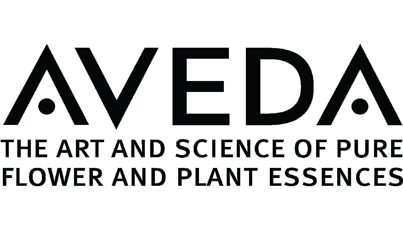
Despite over 40 years of history in the cosmetics industry, Aveda hasn’t made any changes to its logo. The design continues to be a minimalist, yet impressively modern wordmark, depicting the name of the company.
In this wordmark, Aveda uses all capital letters, and a careful degree of kerning, to create an essence of balance.
The Aveda logo, which has remained consistent throughout the life of the brand, is almost geometric in style. The design of the “A” is intended to look like an upside down “V”, and the whole image looks to be constructed of carefully-chosen lines, shapes, and curves.
Perhaps to convey the “holistic” nature of the products produced by the brand, the Aveda logo replaces the lines in the “As” with two black dots. The circular shape is a symbol of balance, harmony, and completion.
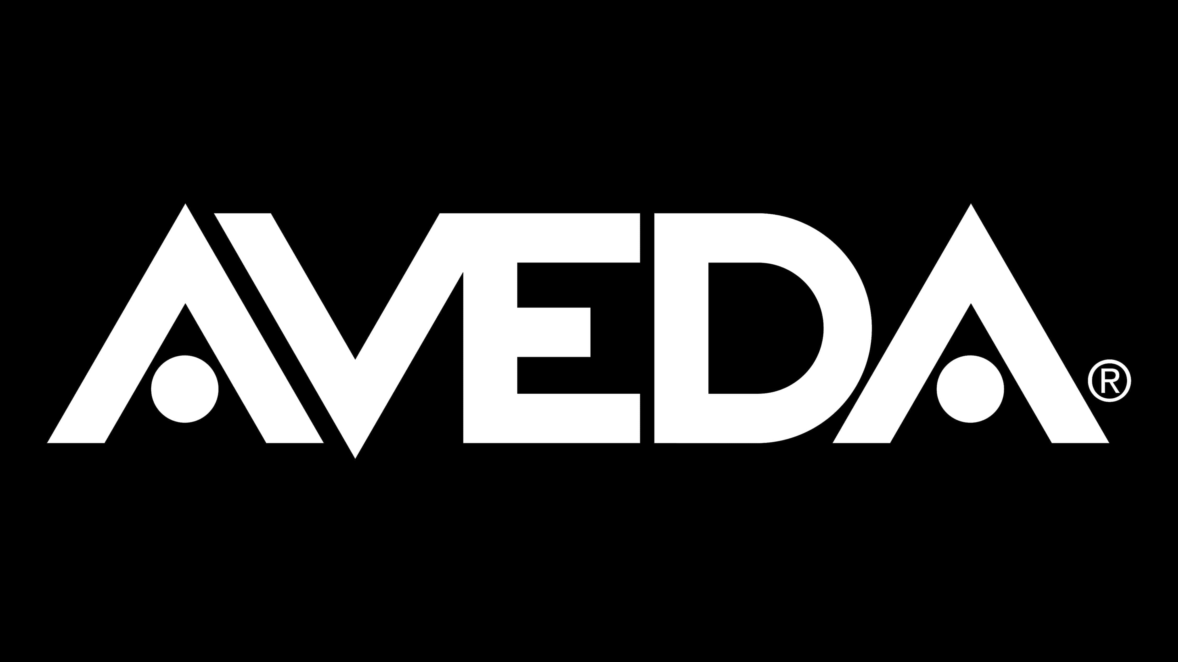
Variations of the logo in inverse colors have appeared over the years. When shown in white font on a black background, the Aveda type can seem thicker and bolder than the traditional design. In this variation, some of the letters (the V and the E) seem to almost blend together.
Aveda meaning and Aveda logo elements
The Aveda logo is clearly derived from the background of the company, and Horst’s experience with holistic, Ayurvedic medicine. The word “Aveda” in Sanskrit, means all knowledge, which highlights the company’s focus on considering all of the needs of the body with their product line.
Aveda’s products are about balance, wellness, and harmony – something we see a lot in the Aveda logo. The design is simple and minimalist, like the natural ingredients in the company’s products. At the same time, each element seems to hold its own meaning.
The symmetry in the A and V shapes creates a sense of reflection and synergy. The dots in place of the lines within the “A”s symbolize global inclusion and community.
You can find some more Aveda logo resources here:
What font does the Aveda logo use?
The Aveda logo font is the most eye-catching part of the brand identity – and the core of the logo. The design is unique to the brand, written entirely in uppercase, to demonstrate the strength and confidence of the company.
The sans-serif typography is composed in a way to demonstrate balance and harmony. The As are identical to an inverted “V” shape, with no inner bar. Instead of horizontal stripes, we see two entirely black dots, helping to separate the logo from other font types.
The non-standard typeface ensures we know exactly what to expect from this unique business.
What color is the Aveda logo?
As mentioned above, the Aveda logo colors can sometimes invert, depending on where we see the branding. In most cases, Aveda uses a black wordmark on a white background, designed to symbolize cleanliness, sophistication, and simplicity.
The inverted version of the logo looks sleek and modern, with a slight edge to it.
The Aveda logo is also adapted to match the specific color variations of its product range. In instances like this, the logo may appear in a dedicated color.
The use of black as the central Aveda logo color places the company alongside a number of other cosmetics and beauty brands who use the same strategy. Black and white is a common color palette for this industry, because it’s inclusive, timeless, and stylish.
Used correctly, black, and white can convey confidence and strength. The color choice also means Aveda can place its logo on a wide range of different packages and materials easily.
Celebrating the Aveda logo today
The Aveda logo is an excellent insight into how beauty brands can find timeless and sophisticated branding opportunities with just a spark of inspiration. The Aveda logo was chosen to represent the meaning not just behind the company’s name, but its values too.
Aveda has stuck with the same consistent logo year after year, and it’s unlikely the design will change any time soon. Perfectly chosen with a focus on beautiful, geometric elements, the Aveda logo is timeless, and unapologetically confident.
To learn more about how simple logos like the Aveda symbol can help to transform the identity of a business, check out some of our other Logofiles.
Fabrik: A branding agency for our times.

Clarity starts with a conversation.
Thanks—we’ll get back to you shortly.
Whether you're navigating a rebrand, merger, or simply need a clearer identity—we’re here to help. No hard sell, just honest advice from people who know the sector.
Let’s start with a simple question…
Prefer to email? Drop us a line.
Fabrik’s been helping organisations rethink and reshape their brands for over 25 years. We’ve guided companies through mergers, rebrands and new launches. Whatever stage you’re at, we’ll meet you there.