Reese’s logo history and meaning
Are you familiar with Reese’s logo history? A sub-brand of the iconic Hershey Company, Reese’s has made quite a name for itself over the years. Today, the Reese’s logo appears in stores all over the globe and has millions of dedicated fans.
Few companies have had the same impact on the confectionary industry as Reese’s.
Known for changing the way we think about chocolate and peanut butter, Reese’s has taken the world by storm with not only it’s amazing peanut butter cups, but a range of other popular products, like Reese’s Pieces, and the Nutrageous bar.
The brightly colored Reese’s symbol is an excellent insight into the identity of the candy company, but few people know exactly where this image came from. Let’s take a look at Reese’s logo history, and the story behind the logotype.
Reese’s history: When was Reese’s invented?
Before we begin our exploration of the Reese’s Candy logo, let’s take a closer look at the history behind the brand. The H.B. Reese Candy Company was established in the basement of H.B Reese’s home in 1923.
Initially a dairy farmer, Reese started his candy company as a way of making money for his family – with 16 children, he had a lot of mouths to feed.
Reese found incredible success with his Reese’s Peanut Butter Cups – a unique product combining chocolate and peanut butter.
When Reese passed away, he passed his company onto his six sons. In 1963, the Reese brothers merged forces with the Hershey Chocolate Corporation. Only six years after the merger, the Reese’s Peanut Butter Cups stood as a top seller for the Hershey’s Company.
Hershey’s continues to stand as the Reese’s parent company today. Reese’s also continues to create a wide range of new products and offerings for its customers, from cereals to new candy bars.
The Reese’s logo is based on the name of the company, which was chosen for the name of the founder. The logo in use today has been present in the company since 1972.
Reese’s logo history: Reese’s logo over the years
Almost 100 years old today, the Reese’s Company has a lot of history and has experimented with a number of logos. However, unlike its parent company, the Hershey’s brand, Reese’s logo has only transformed a handful of times.
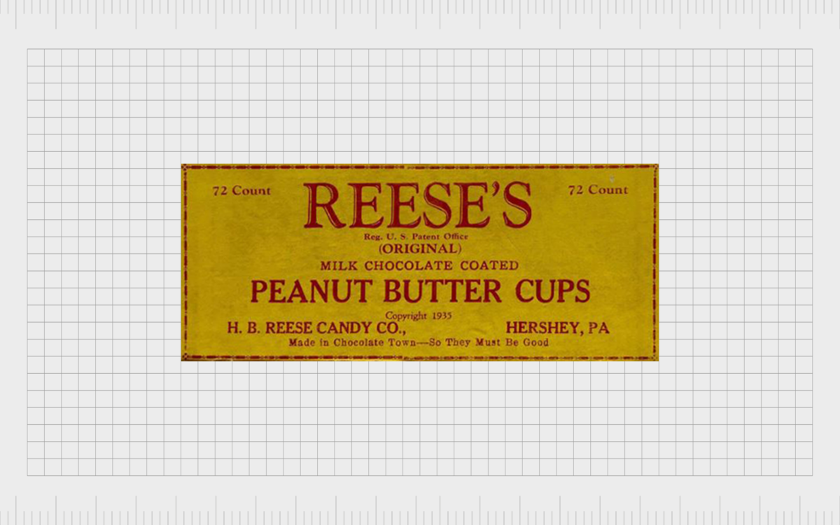
1929
The design for the original Reese’s logo was a simple, serif wordmark, written in red on a yellow background. The design was similar to what most confectioners were using at the time, with almost no additional flourishes or elements.
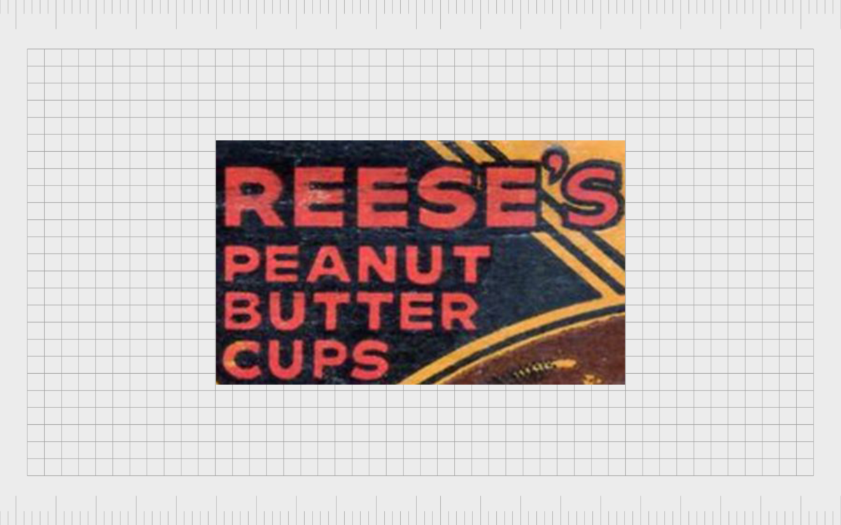
1932
In 1932, the design of the Reese’s logo updated slightly. This time, the company chose a sans-serif font, written in all capitals, with a much thicker design. The bold red letters took on a black outline, to help the name of the confectionary stand out.
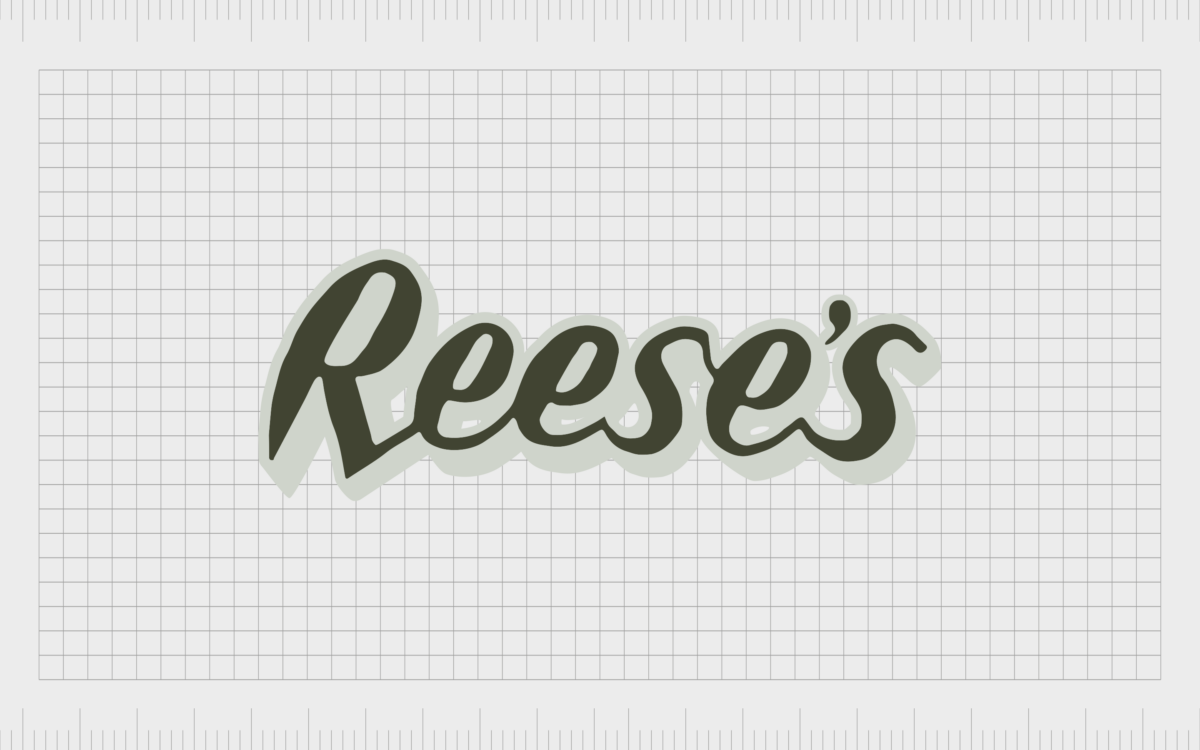
1934
During 1934, the Reese’s Peanut Butter Cups logo evolved again, this time replacing an all-capital wordmark, for something a little softer, in sentence case. The new logo looked similar to a handwritten signature, which helped to create a friendlier vibe for the brand.
This new, more informal logo would inspire the following Reese’s logos in the years ahead, and eventually lead to the creation of the new Reese’s logo.
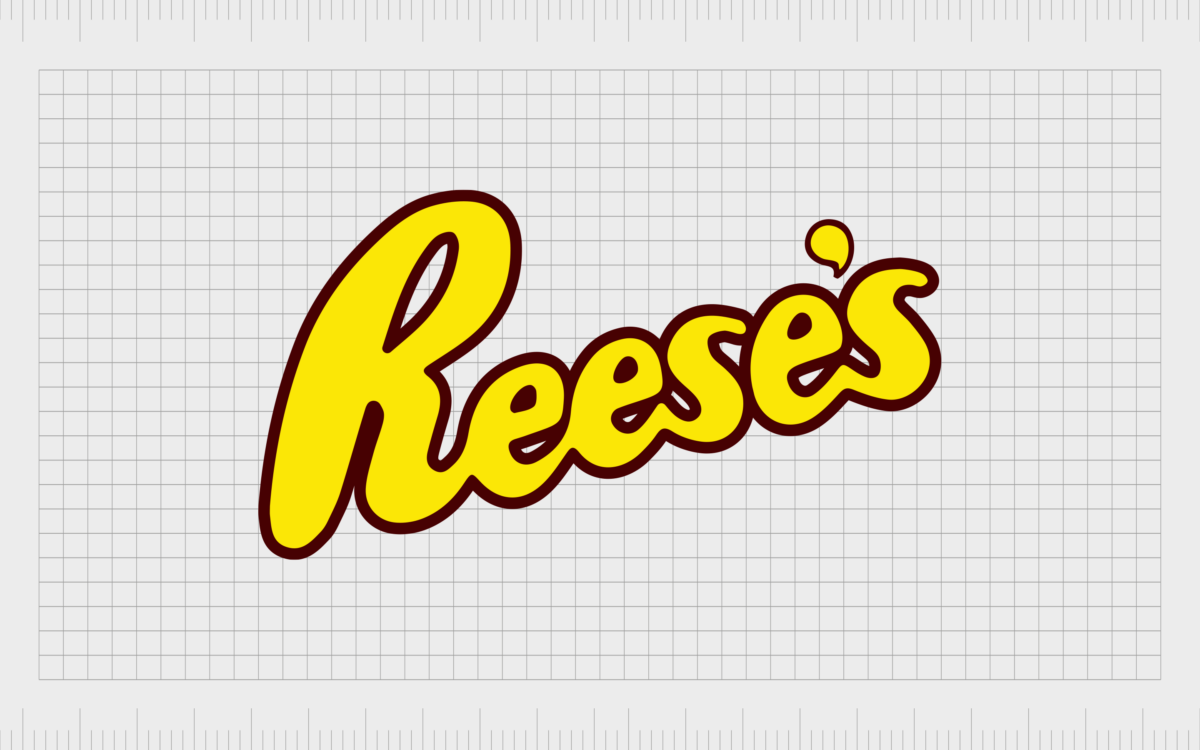
1947
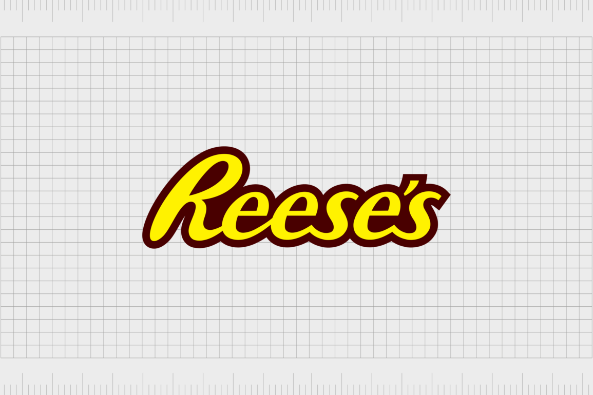
In 1947, a logo quite similar to the one most of us know today was introduced, featuring a yellow wordmark in a handwritten, bold font, surrounded by a deep brown outline.
The use of yellow and brown in the color palette was intended to remind customers of the yellow coloring of peanut butter, and the deep brown of chocolate.
1972
During 1972, Reese’s introduced the version of the Reese’s logo we know today, the wordmark was refined, and lost its slanting design, to be placed all at the same level. The yellow in the font became much brighter and more eye-catching, while the brown outline became thicker.
Around the brown outline on the new Reese’s logo, the company also added a bright orange border, which helped to make the design more engaging and fun. It also draws the mind to the crispy shells on Reese’s Pieces – one of the better known candies from the company.

Variations of the Reese’s logo
Variations of the Reese’s logo have appeared on multiple versions of the brand’s products over the years. The company generally uses the same yellow wordmark with a brown outline on all products.
However, depending on the nature of the packaging, it’s not always possible to see the orange outline.
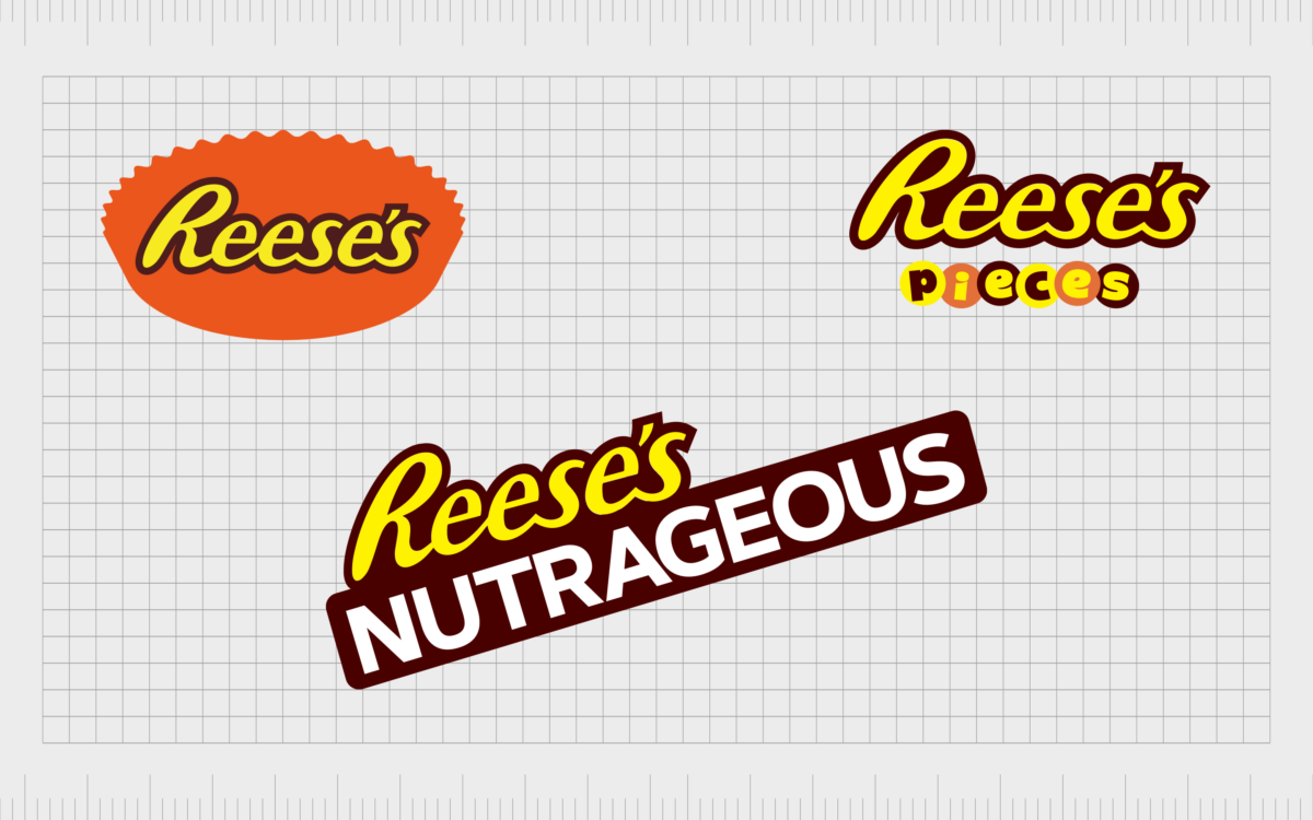
The Reese’s Peanut Butter Cups logo, for instance, replaces the orange outline with the shape of a Reese’s cup depicted in orange.
Similar to the Reese’s cup logo, the logo for Reese’s Pieces also eliminates the orange outline in most cases, as the design is often placed on an orange background. Usually, the standard Reese’s logo for this design is accompanied by the word “Pieces” in jaunty letters.
The “Pieces” wordmark places the individual letters of the word into colored circles, designed to represent the “pieces” candy.
The Reese’s Nutrageous bar logo uses the yellow and brown version of the Reese’s logo on a bright orange background, similar to many of the products in the Reese’s line. For the purpose of this product, the additional word “Nutrageous” also appears on the packaging.
The word “Nutrageous” is written in all capital letters, featuring a white font with a thick black outline. This bold design is intended to draw attention to the chunky nature of the bar.
Reese’s logo elements
Today, the Reese’s logo is present all over the world, in various formats. As Reese’s continues to roll out new product options for its line, we continue to see variations of the Reese’s logo, with additional elements and components.
While the various products from Reese’s might have their own branded elements connected to the logo, the bright yellow wordmark with its brown outline always remains the same. Notably, the logo is almost always placed on a bright orange background.
What color is the Reese’s logo?
The Reese’s logo color has changed a few times over the years as the company has worked on discovering and refining its brand identity.
The yellow and orange in the Reese’s logo are excellent for representing excitement, fun and creativity, while the brown reminds the consumer of chocolate.
The official Reese’s logo colors today are:
International orange:
HEX: #FE5200
RGB: 254, 82, 0
Seal brown:
HEX: #551E0A
RGB: 85, 30, 10
Aureolin:
HEX: #FDEF14
RGB: 253, 239, 20
What font does the Reese’s logo use?
Like the colors of the Reese’s logo, the Reese’s logo font has changed a handful of times over the years. The design today is a beautiful, cursive-style typeface, in bold, sans-serif letters. The font is unique to the company, but it’s similar in style to the “wild ride” font.
Some additional resources for the Reese’s logo can be found here:
Celebrating the Reese’s logo today
The Reese’s logo today is a testament to the heritage and strength of the company. Over the years, this logo has evolved to become an eye-catching image, strong enough to capture the hearts and minds of customers across the globe.
The Reese’s logo has stayed the same for almost 50 years today, making it one of the more long-standing logos in confectionary history. Although variations of the design may appear from time to time, the iconic wordmark is always present.
It’s amazing to think such a significant worldwide brand started with a man in his basement simply trying to find extra ways to support his family.
Fabrik: A branding agency for our times.
Now read these:
—American chocolate bar brands
—Hershey logo history and meaning
—Indulge in the Dove Chocolate logo
—Exploring the Lindt Chocolate logo
Clarity starts with a conversation.
Thanks—we’ll get back to you shortly.
Whether you're navigating a rebrand, merger, or simply need a clearer identity—we’re here to help. No hard sell, just honest advice from people who know the sector.
Let’s start with a simple question…
Prefer to email? Drop us a line.
Fabrik’s been helping organisations rethink and reshape their brands for over 25 years. We’ve guided companies through mergers, rebrands and new launches. Whatever stage you’re at, we’ll meet you there.


