Hershey logo history and meaning

One of the best-known commercial symbols in America, and an icon worldwide, the Hershey logo is an image you won’t soon forget. However, most people don’t know much about Hershey logo history. More than a century old, the Hershey Company and its symbol go back further than you’d think.
Known for popular Hershey’s milk chocolate bars, Hershey’s Kisses, and countless other confectionary creations, Hershey’s has grown into a huge organization over the years. The Hershey brand is even responsible for several other confectionary brands, like Reese’s and KitKat.
Named after the founder, Milton S. Hershey, the company has built an image of heritage, trustworthiness, and even reliability around the world.
Today, we’re going to take a closer look at the Hershey logo, and its history.
Hershey history: The Hershey Company logo
The Hershey Company, otherwise known as Hershey’s, is a multinational company from America, and one of the largest manufacturers of chocolate in the world. The company also produces a wide range of baked goods, like cakes and cookies, and sells various beverages worldwide.
The Hershey Company logo is based on the name of the brand, which came from its founder when the organization emerged in 1894. Over more than 100 years, the Hershey’s logo has grown to become an icon worldwide, with a presence in all six continents.
Hershey’s current logo may or may not feature the “Hershey Company” element underneath, depending on the nature of the branding. For the most part, Hershey chocolate bars and other products featuring the Hershey symbol will simply show the wordmark of the brand.
Hershey logo history: Hershey logos over the years
As one of the oldest companies still going strong in America, it’s probably no surprise the Hershey’s logo has changed a number of times over the years. The focus of the company’s brand image has usually remained heavily on the use of certain types of font and lettering.

1890
When Hershey’s first launched in the 1800s, the chocolate bars of the time were sold under the name of “National Chocolate Tablets”. The rectangular logo for this product was a simple wordmark, designed with a number of flourishes, in the colors of brown, red, and a cream / white background.

When the company first embraced the original Hershey logo, it chose a wordmark yet again but simplified the typography into a bold serif font. This version of the Hershey’s logotype was inscribed in red, with an arched design intended to bring volume to the logo.

1900
In the 1900s, Hershey’s updated the Hershey symbol to something closer in style to the “National” logo. The logotype was changed to a standard sentence case structure, with very spaced-out letters, written in a sophisticated, custom serif font. The design was initially depicted in gold.

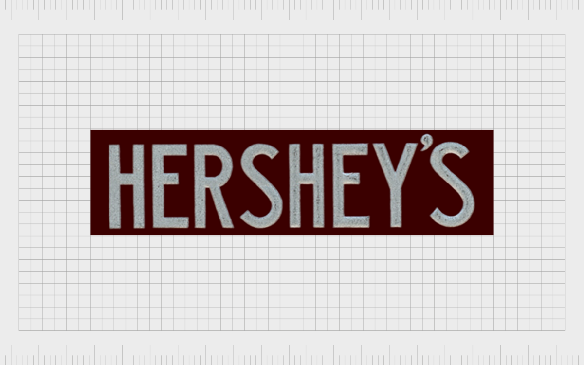
Over the years, the size of the letters and colors of the background for the Hershey’s logo changed a couple of times. In 1906, the logo officially changed color from gold font to silver. The background for this logo was a red / brown shade, similar to rich chocolate.
In this version of the Hershey’s symbol, the contours of the letters became narrower, which made the badge look somewhat more elegant. The company also added a few additional elements, like the “PAT. OFF”, and “REG.US” inscriptions.

1910
In 1910, the old Hershey logo was replaced with something closer to the design we know today. The color scheme remained very similar to the previous design, but in this version, the font was changed completely to a block, sans-serif option, in capital letters.

During the 1900s, the image was refined a number of times, with the letters becoming somewhat thinner and more delicate, while the background was made darker to help add contrast to the image. This was the start of a far more modern look for the Hershey’s brand and Hershey logo font.

1936
In the 1930s, Hershey’s refined its typeface yet again, making the letters shorter and thicker than in previous versions, though the color palette remained the same.

For a short time between 1940 and the 1950s, the color choices of the Hershey bar logo changed a little, with the bright silver lettering taking on a pink sheen. The typeface was also updated again, with sharper, more refined edges.

1968
By 1968, the Hershey logo was much closer to its finished design, with the block letters modified and cleaned to convey modernity. A lighter shade of grey in the logo helped to improve the contrast between the company’s logotype and its background.

In 1973, the shading of the background changed a little, becoming darker and closer in color to the standard chocolate bar. The combined colors created an elegant and sophisticated design.

In 1976, Hershey’s updated its brand color palette again, adding a slightly warmer shade to the grey, to help make the design more friendly and appealing. Later, for the arrival of the 2000s, this logo would be further refined to add a 3D element.

The new Hershey logo
The “new” Hershey logo as we know it today was created in 2010, and it turned the brown image upside down. Though most of the elements of the Hershey’s logo font remained the same, certain flourishes were added, like the curve on the bottom of the “R”, which leads into the “S”.
The logo also changed colors, with the deep maroon-brown now appearing in the logotype, rather than the background. The background color was switched to white. This design helped Hershey’s to keep up with an emerging trend towards flatter, more simplistic logos.

The minimalist wordmark features the “The Hershey Company” subheading in some branding elements – but this isn’t the case on all Hershey designs. This version of the logo also includes a simplistic image of a Hershey’s Kiss – one of the famous chocolates from the brand.
For the Hershey’s bar logo, the design has remained similar to the previous creation from the early 2000s, featuring a silver/grey font on a brown background. The wordmark was flattened once again, removing the gradients which gave it a 3D appearance for a short time.
The elements of the Hershey logo
The Hershey logo we know today was created in-house by the Hershey Global Design Company, although the brand did get some extra help from the Alexander Design Associates and GoDutch companies to make sure their brand image was perfect.
Perhaps the most significant addition to the most recent Hershey’s logo is the introduction of the shape of the Hershey’s Kisses brand chocolate. This helps to attract attention to some of the iconic products Hershey’s continues to produce.
Unfortunately, some people believe the Hershey’s Kiss looks a little too similar to something other than chocolate, which has led to many jokes in recent years.
What color is the Hershey logo?
The Hershey logo color has changed several times over the history of the brand. Today, the Hershey logo colors are intended to convey a sense of minimalism, luxury, and sophistication. The deep, warm brown colors are excellent for reminding customers of chocolate.
For the Hershey Bar logo, the use of silver demonstrates the modernism of the brand, and its forward-thinking approach to business.
The colors are:
Brown:
Hex: #35000C
RGB: (53, 0, 12)
Grey:
Hex: #A8A9AD
RGB: (168, 169, 173)
What font does the Hershey logo use?
The Hershey logo font is apparently a similar design to the Helvetica Extra Compressed font. The actual font is apparently called “Milton”, a custom font which was named after the founder of the brand. This is a sans-serif, all capital font, focused on heavy weights, and thick, bold letters.
You can find some extra Hershey logo resources here:
Celebrating the Hershey logo
The Hershey logo is an excellent insight into a how a brand can find its image over the years, often with regular experimentation and refinement. For years, the Hershey company has been enhancing and optimizing its logo to create the best possible image for its brand.
Today, the Hershey logotype is a recognizable symbol all around the globe, and an image which continues to capture the hearts and minds of millions.
Fabrik: A branding agency for our times.
Now read these:
—American chocolate bar brands
—Your guide to Reese’s logo history
—Indulge in the Dove Chocolate logo
—Exploring the Lindt Chocolate logo
Clarity starts with a conversation.
Thanks—we’ll get back to you shortly.
Whether you're navigating a rebrand, merger, or simply need a clearer identity—we’re here to help. No hard sell, just honest advice from people who know the sector.
Let’s start with a simple question…
Prefer to email? Drop us a line.
Fabrik’s been helping organisations rethink and reshape their brands for over 25 years. We’ve guided companies through mergers, rebrands and new launches. Whatever stage you’re at, we’ll meet you there.


