Macy’s logo history: An enduring symbol of American retail

The Macy’s logo is probably one of the most recognizable emblems in the retail landscape. Even outside of America, where Macy’s stores primarily appear, the symbol has captured the attention of countless consumers, appearing in pop culture references worldwide.
But where did Macy’s logo history begin, and how did the emblem evolve?
Macy’s iconic star logo symbolizes excellence, passion, and customer-centric branding. The American chain of high-end department stores is now one of the most commonly recognized companies in the world, both inside and outside of America.
While on the surface, the Macy’s logo might seem relatively simple, it has been carefully crafted and refined over the years to ensure the company can resonate with its target audience.
Today, we will look closer at the transformation of the Macy’s logo over the years and why it remains such a powerful symbol today.
Why is Macy’s logo a star? An introduction to Macy’s
Before we begin our exploration of Macy’s logo history, let’s start with an introduction to the company itself. Macy’s, as many people know, is an American chain of department stores. It was first founded in 1858 by a man named Rowland Hussey Macy.
By 1994, it had become a division of the Cincinnati-based federated department stores.
Over the years, Macy’s has evolved into an American retail staple. There are more than 500 stores located across the country and 130,000 employees working for the Macy’s brand. The organization is also well-known for hosting a world-renowned Thanksgiving Day Parade in New York City.
The origins of Macy’s began when Rowland Hussey Macy opened a selection of four retail dry goods stores, starting in 1843, including the original Macy’s store in Massachusetts.
While Macy’s original stores failed to be successful, the founder quickly learned from his mistakes and began building a new identity for the company. Interestingly, until 1858, the primary branding for the store included an image of a Rooster. The red star only appeared in 1862.
Over the years, Macy’s rapidly expanded, using themed exhibits, illuminated window displays, and unique solutions for customer service to attract a wide audience. Today, Macy’s stands as one of the most successful retail chains in the world.
What was Macy’s called before?
Before it was called “Macy’s,” the retail company was known simply as “Federated Department Stores” Inc. The holding company changed its name officially to Macy’s Inc in 2007. However, before this, many of the department stores owned by the brand were still known as Macy’s.
Macy’s logo history: The evolution of the star
Today, the red five-pointed star is probably the most well-known aspect of the Macy’s brand identity. However, the company hasn’t always used a star in its branding. Officially, Macy’s logo history started in 1920, when a specific emblem was introduced.

However, before this, various Macy’s stores still had their own branding. For a while, the company used a rooster as its primary brand asset, followed by a five-pointed star, starting in 1862.

1920
One of the oldest official Macy’s logos was introduced for the first time in 1920. The emblem replaced previous store signage, which often featured a rooster or a five-pointed star. The official logo featured the name of the company, based on the founder’s own name.
The simple but traditional logo design included calligraphy-style script font, placed across two levels, in black.

1932
During the 1930s, a new, bolder version of the Macy’s logo was introduced.
The updated design removed a lot of the descriptive elements from the previous signage to focus only on the word “Macy’s.” This three-dimensional wordmark placed the letters of the inscription white, with a bold black shadow behind each character.

1938
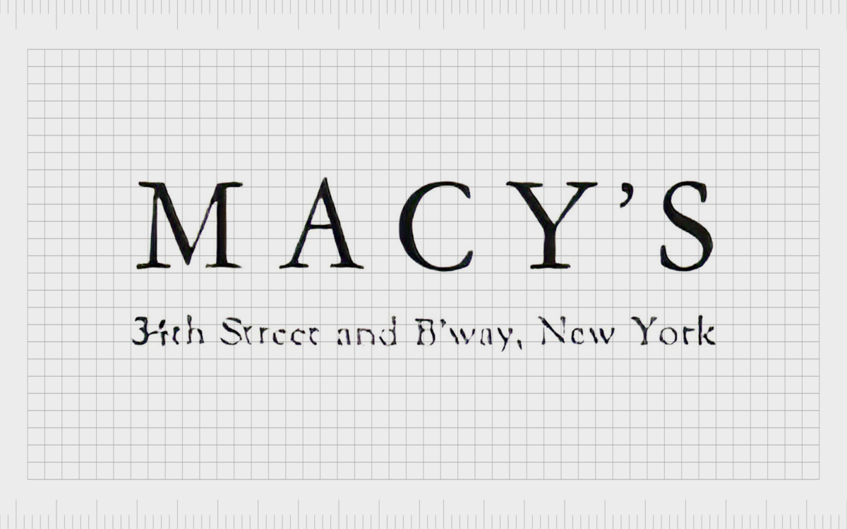
Towards the end of the 1930s, the Macy’s logo was refined again. A new, serif-style typeface was introduced, creating a more sophisticated look for the business. The address of the flagship store for the company also appeared on a level below the company’s name.
The use of all uppercase letters for the brand wordmark was intended to portray the business as professional and sophisticated.

In the 1940s, Macy’s introduced the first version of its official logo, which featured the star component. The simple serif-style typeface remained but was made bolder, with less spacing between the characters.
Instead of an apostrophe, a five-pointed star in black separated the “Y” and “S” letters. This motif remained with the brand for the majority of its life.

1961
In the 1960s and 70s, Macy’s made a few changes to its logo, still focusing on the wordmark as the core component of its visual identity. In 1961, the company introduced a variation of its previous logo, which reduced the spacing between the letters further and used uppercase characters.

In the 1970s, this emblem was replaced with a red wordmark, with even less spacing between the characters, and the apostrophe-star removed. The font style was also altered heavily, featuring more rounded, softer letters. In the late 1970s, Macy’s built on this logo to create a new emblem.

The black and white version of the Macy’s logo improved the legibility of the design somewhat by increasing the spacing between the letters again. At this time, the star in the emblem was still absent.

During the 1980s, Macy’s revived its star motif, adding the five-point shape back to the gap between the “Y” and “S” in its emblem. The font choice used for this design was based on the previous, simplistic typography, though the letters were a lot thinner.

At the start of the 21st century, Macy’s decided to draw greater attention to the star in its emblem. Rather than simply placing a five-pointed star in the place of an apostrophe in its wordmark, the company introduced a red version of the shape on the left-hand side of the inscription.

2019
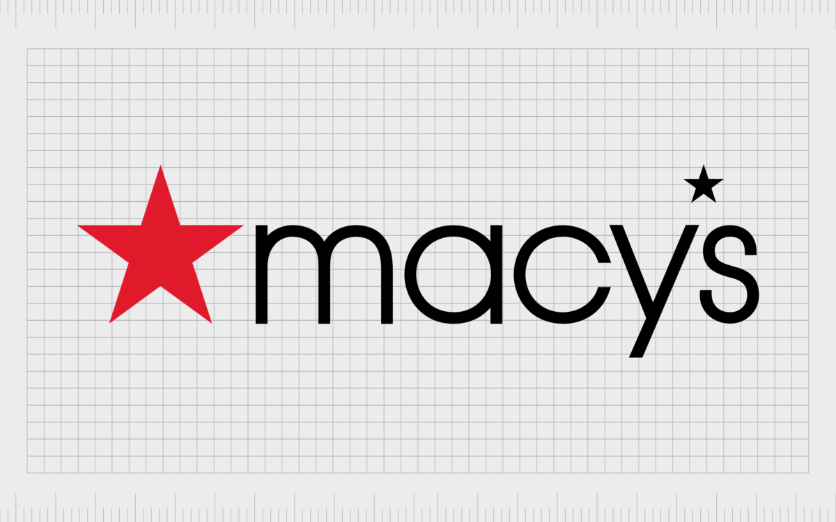
Today’s Macy’s logo was introduced in 2019 and is based on the previous design used by the business. The simplistic font style remains here, although the letters have been made bolder and more powerful to improve legibility and strengthen the brand’s image.
Once again, we see the red, five-pointed star to the right of the image, although it occasionally appears on its own or above the Macy’s wordmark. The star as the apostrophe still remains in this design, too, referencing Macy’s history.
The Macy’s logo: Fonts and colors
Over the years, the Macy’s logo has grown increasingly more modern and refined. The company experimented with a number of different font and typography choices, aiming to deliver excellent legibility while also showcasing the personality of the brand.
Although the Macy’s star has vanished from the emblem a few times over the years, it has long been a crucial part of the Macy’s visual identity.
Today, the Macy’s logo features a star in two places. There’s the red shape on the left-hand side of the wordmark and the smaller, black star located in the place of the apostrophe between the “Y” and “S” letters.
What color is the Macy’s logo?
Today, most people consider the primary Macy’s logo color to be a bright shade of red, which appears in the Macy’s symbol, as well as the Thanksgiving Day banners created by the brand. However, for a long time, Macy’s logo color palette consisted mostly of black and white.
At present, the official Macy’s logo includes a combination of the black font on a white background (in most cases), with the red star located either above or to the side of the wordmark. The red coloring, #Е11A2B, symbolizes the passion, strength, and vitality of the company.
What font does the Macy’s logo use?
Macy’s logo font has changed a few times over the years, becoming cleaner, more modern, and increasingly refined. The logo typeface is similar to Avant Garde Gothic Extra Light, a form of round sans serif typography.
However, some of the lines and shapes have been changed to help make the characters appear more symmetrical.
The powerful Macy’s symbol
The Macy’s logo is one of the most recognizable emblems in retail.
The iconic five-pointed star is perhaps the company’s most significant brand identity component. This shape has remained with the company for several years, even before the organization developed an official logo for its stores.
Today, the bright-red five-pointed star, combined with the soft typeface used in the Macy’s wordmark, establishes the brand as one committed to passion, accessibility, and friendliness.
Fabrik: A branding agency for our times.
Clarity starts with a conversation.
Thanks—we’ll get back to you shortly.
Whether you're navigating a rebrand, merger, or simply need a clearer identity—we’re here to help. No hard sell, just honest advice from people who know the sector.
Let’s start with a simple question…
Prefer to email? Drop us a line.
Fabrik’s been helping organisations rethink and reshape their brands for over 25 years. We’ve guided companies through mergers, rebrands and new launches. Whatever stage you’re at, we’ll meet you there.


