LA Dodgers logo history and evolution

Today, we’re going to be taking you on a journey into LA Dodgers logo history, complete with insights into the meaning and heritage of the unforgettable icon.
Sporting logos tend to have a unique kind of power. They unite entire communities of people over a shared passion. Many people don’t just recognise popular sporting logos, they wear them like a badge of honor. With custom stickers and branded products, fans show their pride wherever they go.
This is certainly the case for supporters of the LA Dodgers – one of the most well-known baseball teams in the United States.
Like many groups, the Dodgers have changed their logo over the years, adapting to suit new styles as the sporting world evolved.
The history of the LA Dodgers logo
Understanding Dodgers logo history means starting with a brief introduction to the Dodgers themselves. The Los Angeles Dodgers, or LA Dodgers, are one of the most renowned baseball teams in America.
Established as Brooklyn Atlantics in 1883, the group only moved to LA in 1958, at which point, the name, and the logo changed drastically.
The history of the LA Dodgers, and the various different Dodgers logos used throughout the years split into two categories: before and after the move to Los Angeles.
The old Dodgers logo, when the team was still in New York, tended to focus mostly on the letter “B” for Brooklyn. After the team moved to Los Angeles, they needed to shake up this design with something new.
The more recent Dodger’s logo includes the inscription “Dodgers” on the icon. Over the years, designers have also added a flying baseball image to the logo. You’ll find this emblem on many fan items today.
The original Dodgers logo
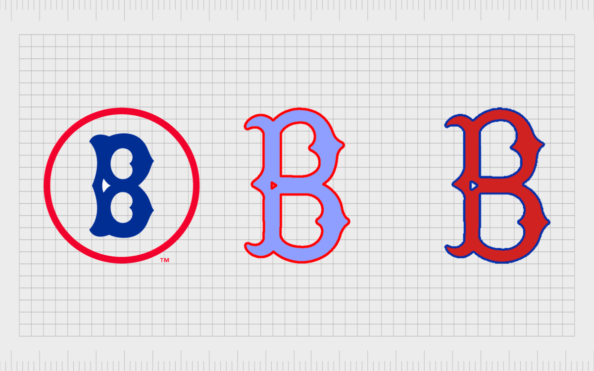
Let’s start our exploration with a look at the original Dodgers logo when the team were in Brooklyn New York. The first logo focused heavily on the Brooklyn origins of the group, with a gothic-style capital B in an extremely extravagant font.
The letter B was in red from 1899 to 1901, but it quickly switched to a deep blue in 1902 to 1908. The color blue has remained a signature of the Los Angeles Dodgers logo since.

In 1909, the LA Dodgers logo changed the style of the B. Although the font was still ornate, it was far less complex and gothic than the previous type. The smooth curves seemed to make the design more approachable.
In 1910, the company also placed a diamond shape around the B. The diamond symbolized the shape of a baseball field. In this logo, the font darkened slightly.

In 1914, the Dodgers logo changed again, removing the diamond outline, and making the font itself a lot bolder. This design stayed with the team for a while, until 1925, before reverting back to the diamond-encased, thinner B from the years before.

Throughout 1928 to 1930, the Los Angeles Dodgers logo saw some significant changes. The blue diamond changed to become a red circle. In 1929, the Dodgers ditched the circle entirely, and changed the color scheme, using font in a light blue with a red outline.
In the 1930s, the logo coloring switched again, this time showing a red B with a blue outline.

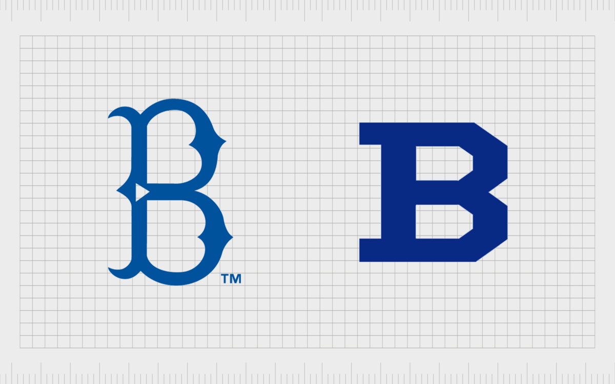
By 1932, the Dodgers returned to their old classic – the ornate blue B, this time with a “TM” mark next to it. This icon remained in place until 1936, when the company experimented with a new block-style B, much bolder than the previous.

The new Dodgers logo: The Dodgers logo change
By 1937, the Dodgers logo design was ready for a complete overhaul, as part of the group’s move to LA. The group had to leave behind their “B” emblem, in favor of a less location-focused design.
In 1938, the first official LA Dodgers symbol emerged. This logo featured the word “Dodgers” in swirling, ornate font, with a kind of underline stemming from the S.
The script lettering featured a lot of flourishes, which helped to give the logo a more classical appearance. The logotype was written in a dark blue, often on a white background, and the word always slanted upwards and to the right diagonally.

Moving to a new city meant the Dodgers now had another chance to experiment with logo design. From 1952 to 1957, the group used a version of their script font, this time placed on a brown diamond background.
A baseball icon was also added above the “G”. Between 1958 and 1968, the design changed again, removing the brown background but keeping the font.
Once again, in the 1958 logo, the font tilted slightly upwards. The baseball design was maintained here, but made bigger, and given red lines beneath it to help convey speed and movement. This emblem was one of the first examples of the logo that people are familiar with today.

In 1968, the LA Dodgers experimented with their emblem a little more. The Dodgers logo font became thicker and more intense. The colors also appeared a little brighter. Over time, up to 1979, the color blue gradually became darker as the team refined its image.

The LA Dodgers emblem today is a beautifully refined version of the previous logo, with slightly thinner font, closer to the original design we saw in 1958. The coloring is bold and powerful, with red highlighting speed and passion, while blue shows reliability and professionalism.

LA Dodgers font, colors, and meaning
Though the LA Dodgers emblem has changed quite a few times over the years, various elements have persevered, such as a focus on script-style writing for the font and the red and blue color choices.
You can find various examples of the LA Dodgers logo here if you’re looking for tools to make your own Dodgers logo wallpaper or something similar.
Notably, the Dodgers logo also includes a Cap insignia, which uses the classic blue colors of the team in a simple serif font. This insignia places the A of “LA” over the L, so the L can cut through the center of the capital “A”. The design is simple and memorable.

Dodgers logo font
The LA Dodgers logo font today is a slanted script font, designed specifically for the team. The design is similar to things like Ballpark script and Philly sport. For the cap mark, you have a simple serif font with large serifs.
Dodgers logo colors
The Dodgers logo colors are traditionally blue and red, although the company has experimented with other shades over the years. The official club color of the LA Dodgers appears to be blue – conveying loyalty, professionalism, and reliability.
Dodgers symbol meaning
The meaning of the Dodgers symbol probably feels different to whoever you ask. On the surface, the simple wordmark is just an easy way to describe the team. The script font, however, shows an air of class and sophistication.
These days, you can find the LA dodgers logo in almost every part of the world – even outside of the USA. The team has gained a huge following full of people keen to paste their icon into LA Dodgers logo wallpaper, or onto Dodgers POP! Funko toys.
Just like some of the best iconic logos throughout history, the Dodgers emblem has become a symbol of a thriving athletic community. You can even get your own custom Hawaiian shirts specifically for Dodgers fans.
Check out our other Logofile posts for insights into more designs capable of changing the world.
Fabrik: A branding agency for our times
Now read these:
—Famous car brand logos and meanings
—Understanding the Nintendo Switch logo
—An in-depth look at the Fortnight logos
—The story of the Pokémon logo symbol
—The old eBay logo to the present day
—Evolution of the Amazon Alexa logo
—Explaining the Van Halen symbol
—The story of the Rolling Stones logo
—History of the Gucci logo and symbol
—Exploring the Stranger Things logo
Clarity starts with a conversation.
Thanks—we’ll get back to you shortly.
Whether you're navigating a rebrand, merger, or simply need a clearer identity—we’re here to help. No hard sell, just honest advice from people who know the sector.
Let’s start with a simple question…
Prefer to email? Drop us a line.
Fabrik’s been helping organisations rethink and reshape their brands for over 25 years. We’ve guided companies through mergers, rebrands and new launches. Whatever stage you’re at, we’ll meet you there.


