


Deadpool logo history: Diving into the iconic Deadpool symbol and its meaning
If you’re an avid comic book and movie fan, you may be familiar with the Deadpool logo. But how much do you know about Deadpool logo history? Unlike other comic book heroes, Deadpool may not have as significant of a following, thanks to the adult themes in his stories.
Deadpool is a character created for the Marvel universe. He started as a parody of another character known as Deathstroke. Over the years, the hero has gained quite the cult following thanks to a range of fantastic comic books and movies.
Like many well-known superheroes, Deadpool doesn’t have a conventional logo but is associated with various typographies and symbols. Today, we will be taking a closer look at some of the elements of Deadpool’s brand identity.
What does Deadpool symbolize? An introduction
Before we dive into an overview of Deadpool logo history, let’s take a closer look at the character himself. Deadpool is a fictional hero created by Marvel Comics. He was originally conceived by Rob Liefeld and Fabian Nicieza and was introduced in the New Mutants comic of 1990.
Compared to other characters throughout the Marvel universe, Deadpool is somewhat controversial. He has been depicted as both a supervillain and a hero, as well as an “anti-hero.”
Deadpool is the alter-ego of Wade Wilson, a mercenary who acquires superhuman regenerative healing abilities after being subjected to a series of experiments to cure his cancer.
The character is depicted as having multiple personalities, as well as a unique ability to break the fourth wall and joke with the reader in comic books. The growing popularity of the hero has led to him being featured in various forms of media.
Ryan Reynolds depicts the character in a number of different movies, including Deadpool and Deadpool 2.
What’s the meaning of Deadpool?
Deadpool’s name comes from the term “Deadpool” or “death pool,” used in the colloquial world. It’s a game of prediction which involves guessing when someone might die. Usually, the game is played as a bet, where money is wagered by each individual.
Deadpool logo history: A look through the years
For a comprehensive look at the Deadpool logo history, we need to start by examining some of the comic book elements used to depict the character. Deadpool is a relatively new addition to the Marvel universe, first appearing in 1997.
.png)
.png)
The first versions of the Deadpool comic book logo featured a simple wordmark placed on two levels. The name “Deadpool” was separated by a hyphen for a short while.
In most iterations of the comic book titles, the font is a blocky, serif-style option, with three-dimensional elements created through the use of shadow. However, there are sans-serif versions too.
.png)
.png)
In 2008, a 2-dimensional version of the Deadpool logo appeared. This design was often depicted in a shade of red, but it could be either bright or dark in tone. The letters in the typeface are bold and blocky, with squared serifs.
They’re also all in uppercase. In this version of the logo, the hyphen has been removed to make Deadpool all one word.
.png)
In 2013, the three-dimensional elements were added back to the Deadpool logo, with grey and black components which make it appear as though we’re looking up at the design.
_logo.png)
In more recent versions of the Deadpool comics, additional accessories have been added to the mix. These wordmarks look similar to those introduced in 2008, with a 2-dimensional effect. They also appear to have blocky, bold serifs.
In the two variations above, a crown has been added in gold to the corner of the “D” in Deadpool.
Deadpool name logo: The Deadpool sign in movies
The logos introduced for the Marvel Cinematic Universe are very similar in style to the designs chosen for the comic books. The wordmarks for the title cards of both Deadpool’s first movie, and the second iteration feature blocky, serif fonts with a three-dimensional essence.
In some cases, the title cards used for the movie also include the symbol for Deadpool in a red circle, which we’ll discuss further below.
The Deadpool 2 movie logo is similar in a lot of ways to the first, but the shadow has been inverted on the glyphs, so it appears toward the bottom instead of at the top. The red coloring is also a little brighter here. Versions of movie posters featuring Deadpool lying on top of the wordmark have also been introduced by the marketing team.
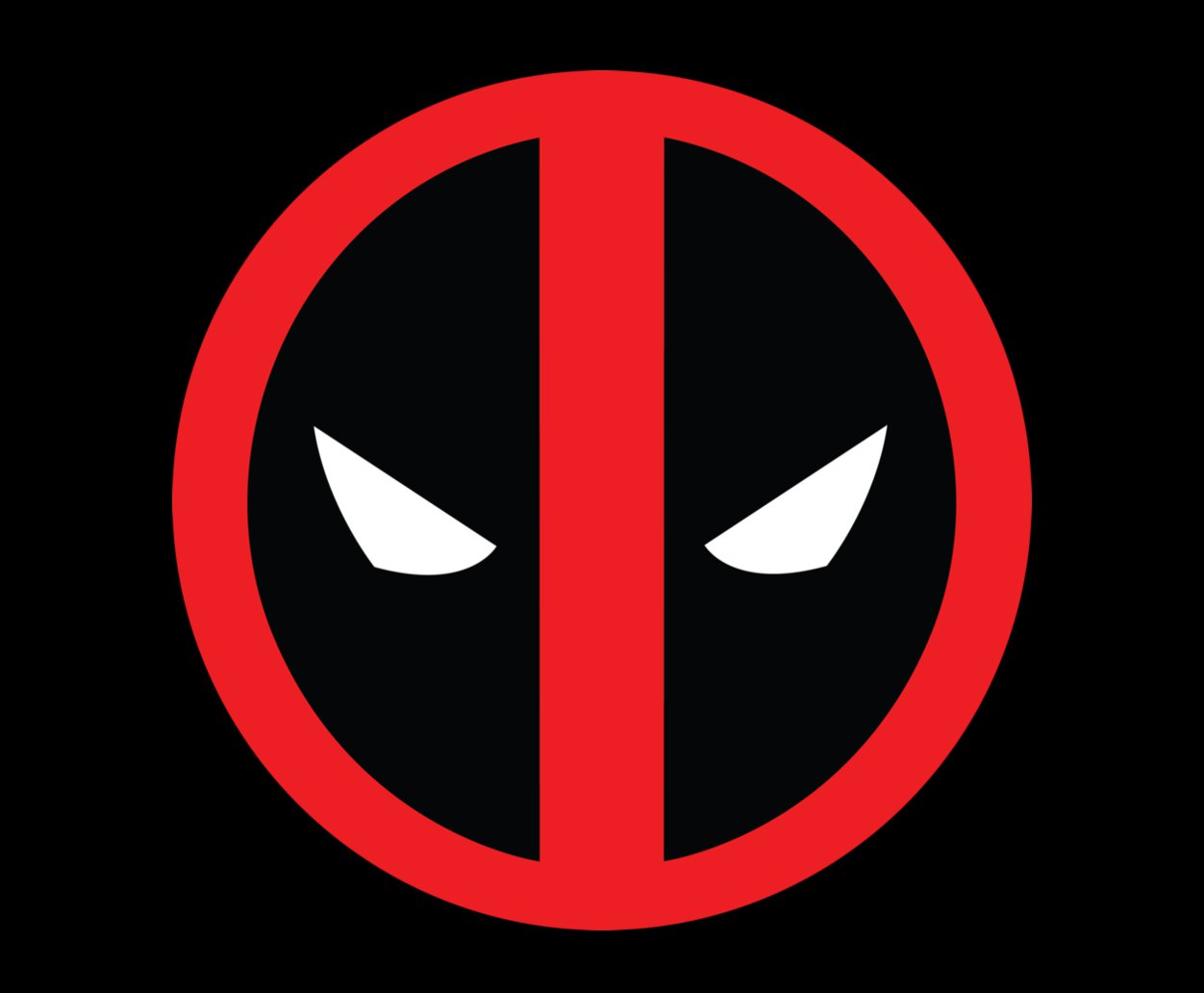
The Deadpool symbol
While there are numerous font choices and wordmarks often associated with the Deadpool logo, most people are more familiar with the iconic Deadpool symbol. Alongside the blocky wordmarks, the symbol is one of the key defining assets of the Deadpool brand.
Interestingly, this symbol wasn’t introduced for the character for some time because, originally, Deadpool was intended to be a parody of the DC character Deathstroke. Eventually, the symbol was created based on the buckle on the character’s suit.
However, the new artist couldn’t fully remember what the buckle looked like. This led him to create a slightly different image, which looks like a red circle, with Deadpool’s eyes placed on either side of a red line.
Later, the artist shared he was relatively happy with the fact that he had made this mistake with the design, as it allowed for the creation of a new style of the Deadpool logo.
The Deadpool logo: Fonts and colors
Throughout the years, there have been numerous iterations of the Deadpool logo produced by designers and creatives. However, while aspects of the Deadpool brand identity have evolved, there have been a number of consistent components too.
The colors red and black are almost consistently present in all Deadpool brand assets.
Additionally, if we look at some of the typography choices chosen over the years, we can see Deadpool is commonly connected with blocky, serif-style fonts with a lot of square edges. The font is almost novel in style, which helps to draw attention to Deadpool’s playful nature.
If you’d like to see the Deadpool logo in closer detail, you can find some useful resources here:
What color is the Deadpool logo?
Since there are multiple elements to Deadpool’s brand image, it’s difficult to share the exact hex codes for the Deadpool logo colors. However, looking through the history of the character’s visual identity, we can see the colors black and red are common for the anti-hero.
In some cases, there are also white elements used in Deadpool’s design to symbolize the eyes on his costume.
What font does the Deadpool logo use?
While the Deadpool symbol doesn’t have any font associated with it, there is a typography that often appears in the title cards and comic books for the character. The most commonly recognized Deadpool logo font is similar to Rogue Hero by Iconian fonts.
The typeface is specific to the character and features blocky, bold letters with square serifs.
The memorable Deadpool logo
Looking at the Deadpool logo history, we can see clear consistencies in the visual assets used to depict the character. The font choices for this individual have almost always been blocky and bold, with squared edges for the serifs.
The typeface appears fun and playful, with a hard image, similar to the character’s personality.
The colors red and black are also consistently connected with Deadpool and several other Marvel characters. These colors were likely chosen to bring Deadpool in line with the DC character he was parodying. However, they’re also representative of the Marvel logo colors.
Fabrik: A branding agency for our times.

Clarity starts with a conversation.
Thanks—we’ll get back to you shortly.
Whether you're navigating a rebrand, merger, or simply need a clearer identity—we’re here to help. No hard sell, just honest advice from people who know the sector.
Let’s start with a simple question…
Prefer to email? Drop us a line.
Fabrik’s been helping organisations rethink and reshape their brands for over 25 years. We’ve guided companies through mergers, rebrands and new launches. Whatever stage you’re at, we’ll meet you there.