The Microsoft Windows logo history: A world famous software icon

It’s safe to say most people are familiar with the Microsoft Windows logo. Since Microsoft launched its operating system in 1985, it has become one of the most recognizable software solutions in the world. But, how much do you know about Windows logo history?
As the Windows operating system has evolved over the years, the Windows emblem has transformed too. Each new version of the Windows software came with its own logo, often designed to correlate with the visual brand of the larger parent company, Microsoft.
Though it might seem like a relatively simple icon at a glance, the Windows logo is compelling, evocative, and robust. Today, we’re taking a closer look at the evolution of this world-famous symbol, and how it rose to fame.
The Microsoft Windows symbol: Introducing Windows
Before we explore Microsoft Windows logo history, let’s take a moment to introduce Windows itself. Microsoft Windows is a group of proprietary operating system solutions developed by the Microsoft brand. Each “Windows” family in the collection caters to a specific customer segment.
For instance, Microsoft Windows NT is the solution for consumers, while Windows IoT is designed for embedded systems. The first version of Windows was introduced in 1985, as a graphical OS for shell for the MS-DOS solution.
Windows became one of the core products in Microsoft’s portfolio immediately, and remains one of the best-selling solutions offered by Microsoft, alongside its wide variety of productivity tools, software solutions, and hardware.
Currently, Windows is the most popular desktop operating system worldwide, possessing a 70% share of the market as of 2023. However, it’s currently not the most-used operating system overall, as Android has taken over a massive portion of the mobile operating system landscape.
Windows logo history: The evolution of the Windows logo
Just like many software and technology companies, Microsoft has updated the Windows logo a number of times over the years. Each new version of the operating system has featured its own distinctive logo, leading more than 15 versions of the emblem (at the time of writing).
While every Windows computer logo has been unique, they all feature one consistent component – the stylized image of a window.

1985
The “Old” Windows logo, first introduced by the brand in 1985, was surprisingly modern. It was a combination mark, consisting of an icon, made up of four sky-blue blocks, with rounded edges. Each block in the design was a slightly different shape and size, giving the brand a modern appearance.
On the right of the design, we see the “Microsoft Windows” wordmark, executed in a thin and elegant serif typeface, similar to the font used in the Wikipedia logo today.
1990
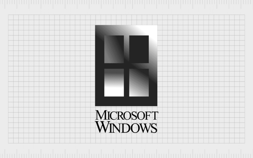
In 1990, Microsoft’s Windows logo was redesigned for the launch of Windows 3.0. The new Windows emblem featured a very realistic image of a Window, executed in gradient shades. This gave the design an almost mysterious edge.
The wordmark included in this Windows logo was similar to the previous design, featuring a serif font depicted in all uppercase letters.

1992
One of the most recognizable Windows operating system logos for many consumers, the 1992 emblem launched the “flag” era for the company. Although the icon in this design was still based on a window, its curved edges often made it look a little more like a waving flag.
The image featured the four colors of the “Microsoft” logo, and a variety of block shapes stemming from the left-hand-side of the design. In this variation of the Windows symbol, the typeface from the previous logo was retained.

A variation of this logo was also produced in 1993, for the “NT” Windows operating system (intended for consumers). It was almost exactly the same in every way, except for the addition of the “NT” lettering.

1994
The various elements of the flag-style Windows logo were redrawn in 1994. The icon was enlarged, and shifted slightly on its axis, to give it a more dynamic appearance. The squares extending from the image were also refined slightly, with a little more white space.
The Windows wordmark changed here too. The word “Windows” was depicted in a much larger font, with the characters stretched vertically. The word “Microsoft” appeared alongside the name of the operating system, in a vertical format.

1995
The introduction of Windows 95 came with a refreshed emblem for the Windows operating system. The icon remained almost exactly the same as it was in the prior design. However the wordmark was very different. The serif font was replaced with a bold sans-serif alternative.
The lines and contours of the characters in “Windows” were thickened, leaving less white space between them.
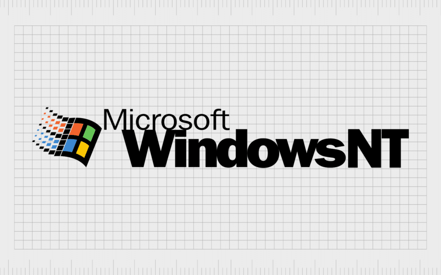
A year later, a variation of the logo for the Windows NT service was introduced, which featured all of the same elements, but switched the numbers “95” for the bold characters “NT”.
1998
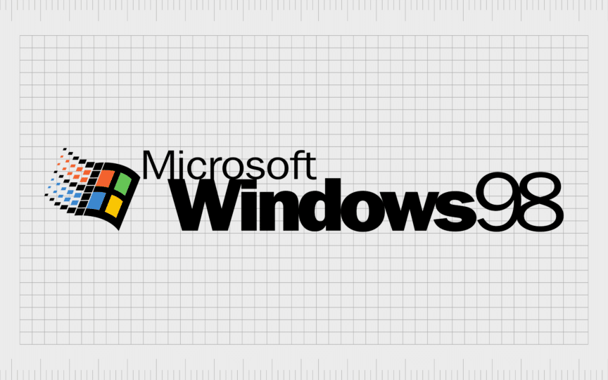
Microsoft retained the same aesthetic for its Windows logo when the operating system was updated again in 1998. All of the elements of the previous design remained the same, but the “95” component was simply replaced with “98” instead.
2000
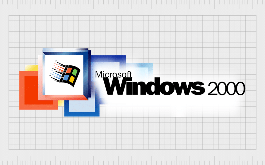
The year 2000 marked an interesting change in Windows logo history. The Microsoft team started experimenting with more complex, creative designs. Two new symbols were introduced during this period. The first featured the Microsoft Windows wordmark, in a design similar to the one used in 98.
The Windows “flag” icon also remained, but was surrounded by a number of colorful blocks, overlapping each other in the background.

The “Millennial Edition” of Windows 2000 was a little simpler. It still featured the Windows icon on a white background, surrounded by a square, but only two additional colored squares were present in the background. The letters “Me” were added in a handwritten font on the left, in the color green.
2001
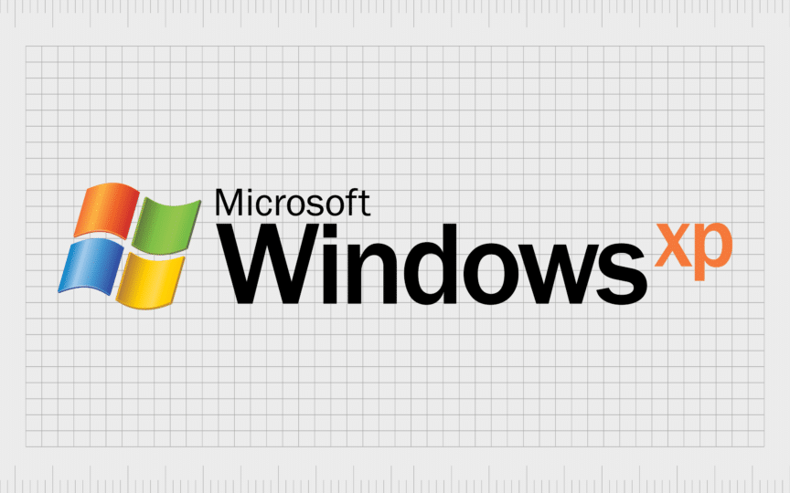
Though released at a similar time to Windows 2000, the logo used by the Windows XP operating system was a lot simpler. The black frame and numerous additional squares were removed from the icon, leading only four wavy squares, in Microsoft’s core brand colors.
The wordmark was also refined. The characters of the word “Windows” were streamlined, and more white space was placed between each letter. The word “Microsoft” was also enlarged. The letters “XP” placed on the end of the wordmark, were also elevated, and depicted in orange.
2006
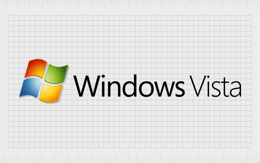
Microsoft welcomed Windows Vista to its product collection with a simpler emblem. The design was a lot flatter and more modern than the previous image, although the colored “flag” design still featured gradient colors, giving it extra depth.
The word “Microsoft” was also interestingly removed from the logo for the first time. This gave the image a more minimalist, professional aesthetic.
2009
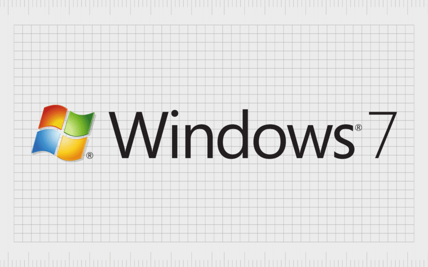
The new Windows logo for “Windows 7” followed the same design guidelines as its predecessor. The emblem was enlarged slightly, but the overall design remains consistent. The wordmark retained the same font and spacing, however the word “Vista” was replaced with the number “7”.
2012
In 2012, Microsoft moved into a new era for its visual identity. The wavy lines in the Windows icon were eliminated, making the design look once again like a window, instead of a flag. The company also made its font for “Windows” bolder, and updated the color palette.
For both Windows 8, and Windows 8.1, Microsoft used a single color for their design, a sky-blue shade, matched by the blue in the Microsoft logo.

2015
The design for the Windows 10 logo took a similar approach to its predecessor. The font style and positioning of the characters were almost exactly the same. The shape and style of the Windows icon remained consistent too.
However, the color palette was altered slightly, from a light shade of blue, to a deeper, darker tone, with a more professional edge.
Interestingly, when Windows introduced Windows 10X in 2020, it reverted back to some of its old design elements. While the same shade of blue from the other design is still present, the icon now features gradient tones, making it look brighter and fresher.
2011
The most recent Windows logo, created for Windows 11, follows Microsoft’s new focus on “flat” and modern design trends. There’s a single shade of blue used throughout the emblem, and the font in the wordmark has been made slightly bolder.
The icon now represents a very simple window shape. It’s a basic shape, with no angling. This gives the Microsoft product a more robust, reliable, and professional image.
The meaning behind the Windows emblem
The most recent Windows logo might seem simple, but every icon created by the Microsoft company has been steeped in meaning. The Windows logo has always been intended to convey the professionalism and strength of the operating system, and the wider Microsoft brand.
Notably, while some of the initial versions of the Windows icon have been described as “flags”, Microsoft never actually wanted to create a specific “flag” shape. The icon has always been a stylized version of a traditional window, intended to represent the brand’s name.
The window design is intended to draw attention to Microsoft’s vision of the future, and its unique view of the technological landscape. In shape psychology, the square, seen four times in the new Windows logo, is often associated with reliability and stability.
The Microsoft Windows logo: Fonts and colors
Though relatively straightforward, the Windows logo is one of the most recognizable emblems in the world. It appears not just on Microsoft products, but on a host of different devices too. For instance, many keyboards include a “Windows” key.
With its flat, modern design and its fresh color palette, the Windows logo conveys ideas of reliability, trustworthiness, and sophistication. You can find some examples of the Windows logos through the years listed below:
What color is the Windows logo?
Through the years, the Windows logo colors have changed a number of times. The emblem has featured a multitude of different shades, from black and white, to blue, red, green, and yellow. Today, the current version of the Windows logo features only a dark blue shade.
The official Windows logo color can also be seen in the coloring used for Microsoft’s own logo. Each aspect of the company’s product portfolio aligns with a specific shade.
What font does the Windows logo use?
Just like the Windows logo color has changed over the years, the Windows font has been updated a number of times too. Starting with Windows 8, the typography used by the company has been similar in style to the Segoe font.
The unforgettable Windows computer logo
Exploring Windows logo history gives us a unique insight into the evolution of the product’s visual identity throughout the years. Microsoft has consistently updated its logo and branding, to ensure each new version of its software had the right impact on its target audience.
Ever since the original logo was created by Bill Gates, Paul Allen, and Simon Daniels, the Windows emblem has been refined and enhanced to resonate with an evolving group of consumers.
Today, whether you love the Microsoft Windows logo or not, it’s impossible to ignore the resounding impact it has had on the computing industry.
Fabrik: A branding agency for our times.
Clarity starts with a conversation.
Thanks—we’ll get back to you shortly.
Whether you're navigating a rebrand, merger, or simply need a clearer identity—we’re here to help. No hard sell, just honest advice from people who know the sector.
Let’s start with a simple question…
Prefer to email? Drop us a line.
Fabrik’s been helping organisations rethink and reshape their brands for over 25 years. We’ve guided companies through mergers, rebrands and new launches. Whatever stage you’re at, we’ll meet you there.


