The Mercedes F1 logo history: From silver arrows to star

If you know anything about motorsports, you’re probably familiar with the Mercedes F1 logo. However, how much do you know about Mercedes F1 logo history? Over the years, the Mercedes brand has updated its Formula One logo to suit an ever-evolving audience.
Mercedes-Benz has been a common competitor in the Formula One landscape for decades. Since 1954, Mercedes has introduced numerous teams and cars to the racing championships. Additionally, they’ve won a great number of titles throughout the years.
Mercedes has set records for the most wins in any season and the most consecutive constructor titles.
Like many F1 team logos, the emblem used to represent Mercedes AMG combines elements of the larger Mercedes brand identity with additional components based on sponsorships. Today, we will examine the Mercedes AMG F1 logo and how it has changed over the years.
An introduction to the Mercedes F1 logo
Mercedes has been both a team owner and engine manufacturer for the Formula One landscape since 1951. Today, the team is known as the “Mercedes-AMG Petronas F1 team” and is situated in England, with a German license.
As of 2022, it’s owned primarily by the Mercedes company, although Toto Wolff also holds significant shares.
Throughout its history, Mercedes has consistently played a part in the emerging motorsports landscape. Even before Formula One, Mercedes-Benz was competing in Grand Prix races during the 1930s, where the team was often referred to as the “Silver Arrows.”
Prior to the second world war, Mercedes competed in the European championship and won three titles before debuting in the Formula One landscape in 1954. The team won its very first race in the 1954 French Grand Prix, and the driver went on to win another three titles in quick succession.
Despite incredible success, Mercedes did withdraw from F1 for a while after 1955, following the 1955 Le Mans disaster. In 1994, the company returned to Formula One as an engine manufacturer in collaboration with an engineering company named Ilmor.
In 2005, Ilmor was rebranded as the Mercedes AMG High Performance Powertrains company.
Why is Mercedes F1 called Petronas?
The “Petronas” component of the Mercedes F1 logo may be confusing to some people, but it’s actually just a reference to the organization’s current long-term sponsor.
The sponsorship deal made with Petronas in 2009 led to the use of Petronas branding in all of the subsequent logos used on the cars to follow. Petronas is a global energy company considered one of the largest corporations among the Fortune Global 500.
Mercedes F1 logo history
There are very few versions of the Mercedes F1 logo which don’t include a reference to Petronas as the team’s sponsor. Looking back at the Mercedes F1 logo history, we can see the company used a simplified version of the Mercedes logo for only one year, between 1954 and 1955.

This emblem is very similar to the primary Mercedes brand logo, though it was typically depicted in black and white, with a simple, two-dimensional design. The Mercedes logo has largely remained a consistent part of the Formula One team’s imagery through the years.

However, there have been instances wherein the team has chosen to use a simple wordmark instead of the emblem in their design.
Between the years 2010 and 2011, the Mercedes AMG logo was a two-level wordmark. The design simply featured the “Petronas” logo underneath the words “Mercedes GP” in a green and grey color palette.
This design also included the words “Formula One Team.” However, when Mercedes switched from “Mercedes GP” (Grand Prix) to Mercedes AMG,” the design was updated slightly.

Between 2012 and 2014, the Mercedes AMG F1 logo was a redesigned version of the previous design, with the letters “AMG” alongside Mercedes in an angular font. The words “Formula One Team” were also a lot smaller here.
The Mercedes AMG Petronas logo
Since 2009, when Petronas began sponsoring Mercedes, virtually all of the logos produced by the Formula One Team have included a reference to the brand. The Petronas wordmark is typically depicted in a teal green font, which is a reference to the coloring used in the Petronas official emblem.
After 2010, there were very few major changes to the Mercedes F1 logo. The colors remained largely the same in all designs. However, there were a few stylistic alterations.

2015
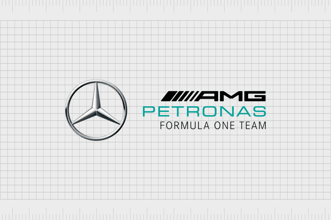
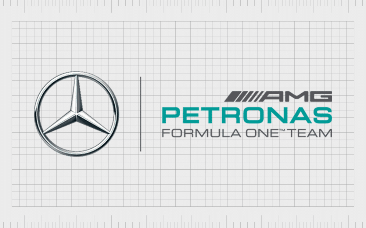
In 2015, Mercedes re-introduced their own iconic brand mark into the AMG logo. The Mercedes-Benz symbol appeared alongside the three-tier wordmark in a metallic silver color. The image was designed to look almost three-dimensional.
The AMG Petronas wordmark was positioned to the right, with a series of lines next to the letters “AMG” to symbolize motion and speed.

2017
This logo was updated only very slightly in 2017 when the company changed the coloring of the AMG wordmark from grey to black. In this variation, the Petronas wordmark was made thinner and more elegant, and the words “Formula One Team” were removed.
Instead, we saw the word “Motorsport” in a sans-serif, spaced-out font.

In 2020, Mercedes updated the “Motorsport” section of the design again, returning to the words “Formula One Team” in a similar typeface.
The Mercedes AMG F1 logo: Colors and fonts
Unlike many F1 teams, Mercedes hasn’t made a lot of significant changes to its motorsport logo over the years. This could have something to do with the fact that the company has maintained the same sponsor for so many years.
Most Formula One teams update their branding to match the colors and identity of the organization that chooses to sponsor them.
Mercedes’ long-lasting sponsorship has meant it has maintained a relatively consistent image throughout the years, which could make it more recognizable to many fans.
The imagery is sleek and modern, featuring elements of both the primary Mercedes and Petronas visual identities.
If you want to take a closer look at the Mercedes AMG F1 logo, you can find some useful resources here:
What color is the Mercedes logo for F1?
The Mercedes logo colors appear heavily in the Formula One team’s logo.
For most people, the colors primarily associated with Mercedes are silver and grey. Not only can we see those shades here, but we also see a representation of the three-dimensional Mercedes emblem. The Mercedes logo color choices in the F1 design also includes a reference to the Petronas company.
Alongside the sleek shades of grey, silver, and black, we see a soft teal green shade in the Petronas wordmark. This matches the color palette used in the Petronas brand logo. The exact shade of green is tiffany green, which exudes an air of sophistication and growth.
What font does the Mercedes logo use?
The Mercedes logo font used in the F1 logo is a very simple, streamlined, and modern sans-serif typeface. The design is similar to Eurostile, and it’s used across all of the company’s brand assets – not just the team’s logo. Team numbers, player names, and jerseys also feature the same font.
The choice of the font makes the overall image look contemporary and clean. The highly spaced-out letters are easy to read from a distance, too, making them ideal for signage.
Learning from the Mercedes F1 team logo
Looking at the Mercedes F1 logo history, the group has maintained a relatively consistent brand identity throughout the years. While elements of the current logo have been refined and optimized for a modern audience, there are very few fundamental changes.
Since Mercedes accepted Petronas sponsorship and funding, the company’s branding has appeared within the team logo, often presented in sleek, sans-serif teal green font.
Alongside that, we see all elements of the Mercedes brand identity and crucial contextual cues, such as the letters AMG and Formula One Team.
Fabrik: A branding agency for our times.
Now read these:
—Which car companies own which car brand?
—The Red Bull racing logo, a symbol of power
—Exploring the revered Scuderia Ferrari logo
—Branding a winner, the Williams F1 logo history
—A guide to the iconic McLaren logo and symbol
—What you need to know about the Haas F1 logo
—The Alfa Romeo F1 logo, history and meaning
—From Scuderia Toro Rosso to the AlphaTauri logo
—A look back at the iconic Aston Martin F1 logo
—Racing through time, the Apline F1 logo story
Clarity starts with a conversation.
Thanks—we’ll get back to you shortly.
Whether you're navigating a rebrand, merger, or simply need a clearer identity—we’re here to help. No hard sell, just honest advice from people who know the sector.
Let’s start with a simple question…
Prefer to email? Drop us a line.
Fabrik’s been helping organisations rethink and reshape their brands for over 25 years. We’ve guided companies through mergers, rebrands and new launches. Whatever stage you’re at, we’ll meet you there.


