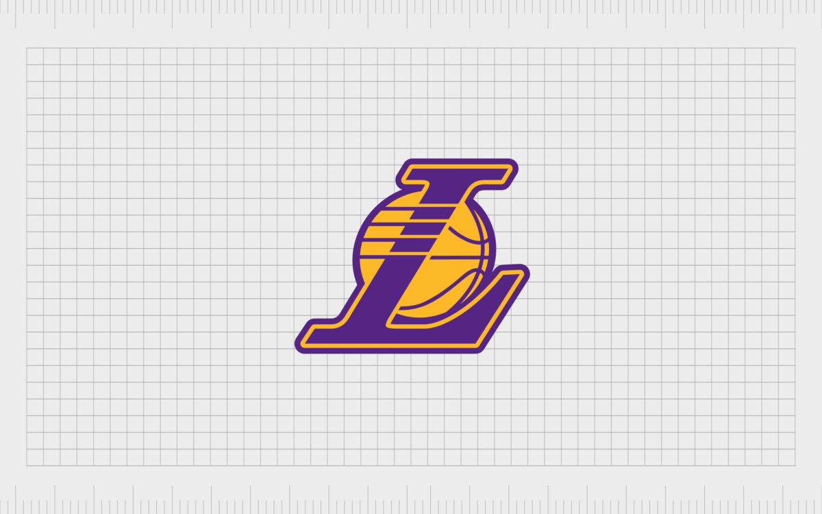
The LA Lakers logo and symbol

If you’re a basketball fan in LA, you’ll be familiar with Los Angeles Lakers logo. But, while many people recognize the iconic Lakers logo, few know where it came from, or why it was chosen to represent one of the best-known teams in the US.
Today, we’re going to delve into the history of the Lakers logo and symbol.
Boasting around 17 NBA championships, the Los Angeles Lakers are currently among the top successful teams ever to play in the National Basketball Association. With 17 victories, the Lakers are tied with another group called the Boston Celtics for the highest wins in NBA history.
The LA Lakers franchise began decades ago, in 1947, and the Group has been refining its image ever since, with a series of memorable logos and icons.
Get ready to explore the Los Angeles Lakers logo history…
LA Lakers logo history
The Los Angeles Lakers logo
The Los Angeles Lakers symbol has changed a few times over the years, as the Group has built its image as a professional basketball team. Originally, the LA Lakers was formed in 1947, following the purchase of the Detroit Gems.
The new team started playing in Minnesota, and originally called themselves the Minneapolis Lakers.
Starting as a member of the NBL, the Lakers went on to win the 1948 championship, before they joined the Basketball Association of America, where they won five of six championships in a row, with the help of star player, George Mikan.
During their time in Minnesota, the Lakers had a very different emblem to the one we know today. This icon featured the words “MPLS Lakers”, with a set of two yellow stars next to MPLS.
The earliest image featured a white map of Minneapolis on a brow and black basketball. It’s hard to find exact versions of this logo today.

After struggling to build funding in the 1950s after Mikan’s retirement, the Lakers relocated to Los Angeles, and have been the LA Lakers since.
Evolution of the Los Angeles Lakers logo
Los Angeles Lakers history began in earnest in the 50s, when the team found their home in Los Angeles, and a Lakers alternate logo was created.
The original LA Lakers logo as comprised entirely of words. The word “Lakers” was written in capital letters on the bottom of the Basketball uniforms, with the words “Los Angeles” making an arrow above it.

In 1967, the first version of the LA Lakers emblem similar to the one we know today emerged. The words “Los Angeles Lakers” appeared over the top of a golden basketball. For this logo, the font was written in a reddish purple.
The typography was serif, with fully capitalized letters.
Some argued the basketball in this version of the LA Lakers symbol was more green than gold. However, the design made LA Lakers history, as the first to include the characteristic streaks on the font, indicating speed.
This image became the prototype of the following LA Lakers logos, which are recognized around the world today.
The next edition of the Los Angeles Lakers logos featured an image very similar to the icon we have today. The basketball image in the background acquired a black outline, which helped to make the design much clearer, and the hues were modified.
The ball became a light orange/yellow color, while the red purple was replaced by a much lighter purple shade.

The current LA Lakers logo and Laker emblems
The Lakers symbol today has upgraded again, this time using a much darker shade of purple, though the design of the serif typography remains the same.
Since the original design from the end of the 1960s, the Lakers font has also retained the dash lines throughout the letters, along with a slightly italicized image, indicating speed.
The wordmark is still the visual center of the current emblem, placed on top of the orange/yellow basketball. The black outline has also stayed the same, helping to improve the overall clarity of the image.
The image sometimes appears on a purple background but can also be used on white.

There’s another Lakers alternate logo available using the same colors and stylistic elements of the emblem above. This, much smaller logo, is often used in spaces where room is scarce, such as when printing on smaller pieces of merchandise.
You can find an LA Lakers logo PNG of the alternative image here. This features an italic serif L in the standard Lakers font, written in dark purple.
The outline of the L is in the same orange/yellow hue of the basketball behind it, while as second purple outline defines the basketball and the overall shape of the icon. The angled image helps to create the sense of speed associated with the Lakers.
Because this version of the logo doesn’t have the same “motion lines” common with the standard logo, there’s a set of four orange and purple logos cutting through the L at the top of the basketball.

LA Lakers colors, symbol, and font
Today, the LA lakers emblems are well-known around the world for their bright colors and eye-catching design. The Lakers new logo has remained consistent in the basketball world for some time now since its creation in 2001.
The Lakers logo colors go back even further than this. You can find downloadable version of the Los Angeles Lakers new logo here.
Defining features of the Lakers logo include:
Lakers logo font
The wordmark for the Lakers is written in a custom serif font, with unique stretched lines and serifs. The lines going through the typography in the iconic Lakers logos symbolize the speed of the players.
This visual element first appeared in the 60s.
Lakers logo color
The colors of Lakers have been an orange/yellow shade and dark purple since the Lakers logo redesign in early 2000s. Previous color choices have included lighter purples, red purples, and gold/green shades.
Lakers logo symbol
The most defining factor of the LA Lakers symbol is the basketball in the background behind the wordmark or “L” letter. Some people also believe that the speed lines between the letters in the logo also represent one of the most meaningful visual assets of the current brand.
Lakers logo resources
If you want to see the LA Lakers logo in all of its glory, you can find the Los Angeles Lakers logo png here. Alternatively, why not show your appreciation of the incredible players with a dedicated LA Lakers logo hat?
Celebrating LA Lakers logo history
One of the most recognizable sporting logos in the world, the LA Lakers logo icon has captured the hearts of people all around the globe.
The latest generation of Lakers fans follow the team every year, wearing their logo on their clothing, buying branded items to show their support, and even decorating their homes with artwork from memorable games.
Though the LA Lakers logo has changed a little over the years, it’s maintained many of the same elements since the Lakers first made their transition into Los Angeles.
Today, this icon is the badge of honor worn by one of the most successful basketball teams in the history of the NBA.
Fabrik: A branding agency for our times.
Now read these:
—KC Chiefs symbol and its meaning
—Understanding the Nintendo Switch logo
—An in-depth look at the Fortnight logos
—The story of the Pokémon logo symbol
—The old eBay logo to the present day
—Explaining the Van Halen symbol
—The story of the Rolling Stones logo
—Exploring the Stranger Things logo
—Taco Bell logo history and meaning
Check out these fantastic logo design resources:
Clarity starts with a conversation.
Thanks—we’ll get back to you shortly.
Whether you're navigating a rebrand, merger, or simply need a clearer identity—we’re here to help. No hard sell, just honest advice from people who know the sector.
Let’s start with a simple question…
Prefer to email? Drop us a line.
Fabrik’s been helping organisations rethink and reshape their brands for over 25 years. We’ve guided companies through mergers, rebrands and new launches. Whatever stage you’re at, we’ll meet you there.


