The BBC Sounds logo: An evolving musical emblem

For music fans in the UK landscape, the BBC Sounds logo is an iconic and instantly recognisable emblem. However, many people still don’t know much about BBC Sounds logo history. Like many of the well-known streaming platforms in the world today, BBC Sounds has changed its image and identity over the years, to connect with an evolving audience.
Today, the BBC Sounds logo is best-known among audio lovers, who rely on the British Broadcasting Company to deliver access to new artists and tunes from the UK landscape and beyond.
With this “walled garden” streaming service, users can access everything from audio on demand, to podcasts, and live radio streams, produced by the BBC.
If you’ve ever wanted to learn more about how the BBC Sounds icon has transformed throughout the years, you’re in the right place.
Today, we’re going to take a closer look at this memorable streaming brand, and the unique approach the company has taken for logo design.
Why has BBC Sounds changed over time?
BBC Sounds is an exclusive media and audio download service, available to users throughout the United Kingdom. The solution provides access to live radio, podcasts, and various forms of audio on demand, supporting a host of devices, from smart televisions to mobile phones and tablets.
Initially, the BBC was responsible for the “iPlayer Radio” brand, a similar UK service aimed at radio and music lovers within the British landscape. However, BBC Sounds replaced the iPlayer service in 2018, as part of the BBC’s strategy to create a more recognisable and consistent brand.
The BBC continued to support the iPlayer app service until 2019, when it was officially decommissioned. Today, the BBC Sounds app has expanded its reach, offering international services to audiences around the globe, keen to listen to UK radio and tunes.
While BBC Sounds delivers most of the same features as the previous iPlayer service, there are some distinct differences. For instance, BBC Sounds also provides a place where original podcast material made for the BBC can be shared with listeners online, such as the “Beyond Today” podcast.
Though the BBC Sounds app has sparked some controversy over the years, with some users complaining the solution didn’t offer the same functionality as the previous app, it has become a popular choice among many listeners.
BBC Sounds logo history: An evolution
As mentioned above, BBC Sounds logo history begins with the iPlayer Radio service, the previous app used by the BBC to deliver streaming content to international consumers.
As the oraganisation and its service has evolved, the BBC produced a brand-new image to accompany its new identity.

2012
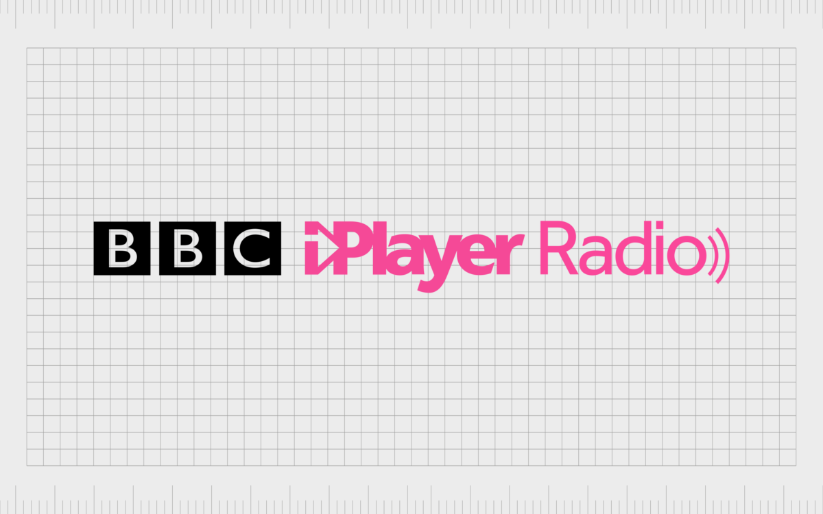
The first iPlayer Radio logo was similar in a lot of ways to the design which would eventually become the last image for the app.
The image featured a stylized letter “I” at the beginning of the “iPlayer” inscription. The two points of the lowercase “I” are connected to create the universal symbol of a triangle pointing to the right – similar to a play button.
The design was depicted in a bright shade of pink, with the first word produced in a much thicker font than the accompanying “Radio” inscription. At the end of the word “radio” we also see two curved lines, intended to look like sound waves.

In 2014, the BBC made a very slight change to its original logo, adding its own brand logo to the beginning of the wordmark. The “BBC” component features the letters of the broadcasting company’s acronym, written in white sans-serif font on a series of black squares.
This addition was perhaps intended to remind customers of the owner of the iPlayer brand.

2018
When the BBC updated its brand in 2018, choosing a new name for the “iPlayer” app, the design of the logo changed drastically The BBC element remained as a core component of the image, placed above the word “Sounds” written in a stylistic sans-serif font.
The letters of “Sounds” are all wonderfully balanced, with a lowercase “n” used to create a sense of consistency in the image. The two “S” characters feature an interesting design, where the two halves of the letter are split into two sections.
This was intended to show the connected portfolio of audio services offered by the brand, from radio streams to podcasts.
A new colour palette was also introduced for this icon, with the bright pink switching to a bold orange shade, to demonstrate creativity and vitality.

2021
In 2021, the BBC transformed its logo yet again, producing two variations of a new emblem, with a similar colour palette. The first version of the BBC Sounds icon made the “BBC” component much larger, drawing attention to the core brand behind the company.
The “Sounds” inscription was simplified, using a straightforward sans-serif font, with no unique elements. The letter “N” has also been updated to match the uppercase characters in the rest of the word. The image is sleek, simple and professional.

The BBC also introduced a version of its logo which removed the “BBC” element entirely. Instead, we see a series of three orange blocks, in slightly different shades on the left-hand side of the wordmark.
The blocks, which grow in size from left to right, are intended to symbolize volume or sound. They also match the colour palette of the emblem perfectly.
In some instances, the three blocks appear on their own, as a favicon or standalone icon for the BBC Sounds website and downloadable smartphone and tablet app.
The BBC Sounds logo: Fonts and colours
Throughout BBC Sounds logo history, we can see the company hasn’t just changed its image, but its entire identity, with a new moniker intended to highlight the larger BBC brand.
The new image is simple but effective, highlighting the creative nature of the company, its commitment to evolution, and its authority in the broadcasting space.
The sleek sans-serif wordmark works well across a range of channels, while the bright colouring helps to set the BBC apart from a variety of other streaming companies in the world today. You can see some excellent examples of the BBC Sounds logo in the resources here:
What colour is the BBC Sounds logo?
The BBC Sounds logo colours have changed slightly over the years, since the company adopted its new name. Initially, the iPlayer logo used a completely different colour palette, focused primarily on shades of pink.
When the first BBC Sounds logo colour was introduced, it was a bright shade of orange, designed to showcase innovation and creativity.
Today, the core orange colour of the BBC Sounds logo is slightly less vibrant, but still compelling, particularly when matched with the BBC Sounds icon, which features various shades of orange. The new design features numerous shades of orange, with a perfect level of balance.
What font does the BBC Sounds logo use?
The BBC has its own dedicated typeface for its “BBC” inscription, known as “BBC Reith”. However, the BBC Sounds logo font is a little different to this core typography. It’s a simple sans-serif font, depicted in all uppercase letters. It’s similar in many ways to the Calibri font family.
Celebrating the BBC Sounds icon
Looking back at BBC Sounds logo history, we can see the company has made some significant changes to both its image and identity over the years.
Since the BBC switched the name of the solution from “iPlayer” to “BBC Sounds”, the colour palette, font choices, and even the placement of some of the logo components have evolved.
Today, the BBC Sounds logo is an eye-catching emblem, intended to grab the attention of music loving audiences around the world. It’s compelling collection of orange shades immediately sets the design apart from other similar logos in the industry, highlighting concepts like creativity and warmth.
Fabrik: A branding agency for our times.
Clarity starts with a conversation.
Thanks—we’ll get back to you shortly.
Whether you're navigating a rebrand, merger, or simply need a clearer identity—we’re here to help. No hard sell, just honest advice from people who know the sector.
Let’s start with a simple question…
Prefer to email? Drop us a line.
Fabrik’s been helping organisations rethink and reshape their brands for over 25 years. We’ve guided companies through mergers, rebrands and new launches. Whatever stage you’re at, we’ll meet you there.


