Racing through time: The Alpine logo history and symbol meaning

If you’re familiar with Formula One racing, you might have some basic knowledge of Alpine logo history. For instance, you might know the company is better known to some as Alpine-Renault, as it’s owned and operated by the larger Renault corporation.
However, despite its connection to the Renault organization, Alpine F1 has maintained its own visual identity in recent years. The Alpine team was extensively rebranded in 2021 to help promote the new sports car brand that Renault produced with the same name.
If you’ve ever wondered about the history and heritage of famous Formula 1 team logos, or you’ve just found yourself questioning the Alpine brand identity, you’re in the right place. Today, we will examine the Alpine F1 team logo and how it’s evolved over the years.
What is the Alpine logo? Introducing Alpine in F1
The Alpine F1 team, not to be confused with the “Alpine” sub-brand of Renault, is a Formula One constructor which first made its debut at the beginning of the 2021 Formula One World Championship. Before then, the organization was better known as the Renault F1 team.
Although the Alpine brand is relatively new, the accompanying team has a relatively long history in Formula One racing. The group first competed in 1981 as the “Toleman” brand, when it was based in England.
Following an acquisition by the Benetton group, the team changed its name and competed under its new title. As Benetton, the team won the 1995 Constructor’s Championship.
The team’s driver, Michael Schumacher, also won two driver’s championships between 1994 and 1995. By the 2000 season, Renault had officially purchased the team, changing the name to the “Renault F1” team.
When the team raced under the Renault brand, they won the Constructor’s Championship in both 2005 and 2006. During these same two years, driver Fernando Alonso also won the driver’s championship. In 2011, Lotus cars joined the group as a sponsor.
For a while, the team changed its name to Lotus Renault GP, though it mainly referred to itself as Renault. By 2012, when Genii Capital took a majority stake in the team, the group’s name evolved to “Lotus F1”. However, Renault soon took over again in 2015.
What brand owns Alpine?
Alpine is owned by the French Groupe Renault company. Before 2021, the F1 team was known as Renault F1 before the parent company decided to update the name. The name “Alpine F1” was chosen to promote the new Renault sports car brand.
The Alpine logo history: The evolving Alpine symbol
Alpine logo history in the F1 landscape is a little complex, simply because the team has undergone so many different changes over the years, both in its name and its operation.
During its early years, in 1977, the company used the Toleman brand symbol, as well as the emblem of the Benetton group, before it was eventually purchased by Renault.
Let’s take a closer look at some of the changes to the Alpine F1 team logo since Renault took over as the parent brand for the group.

2002
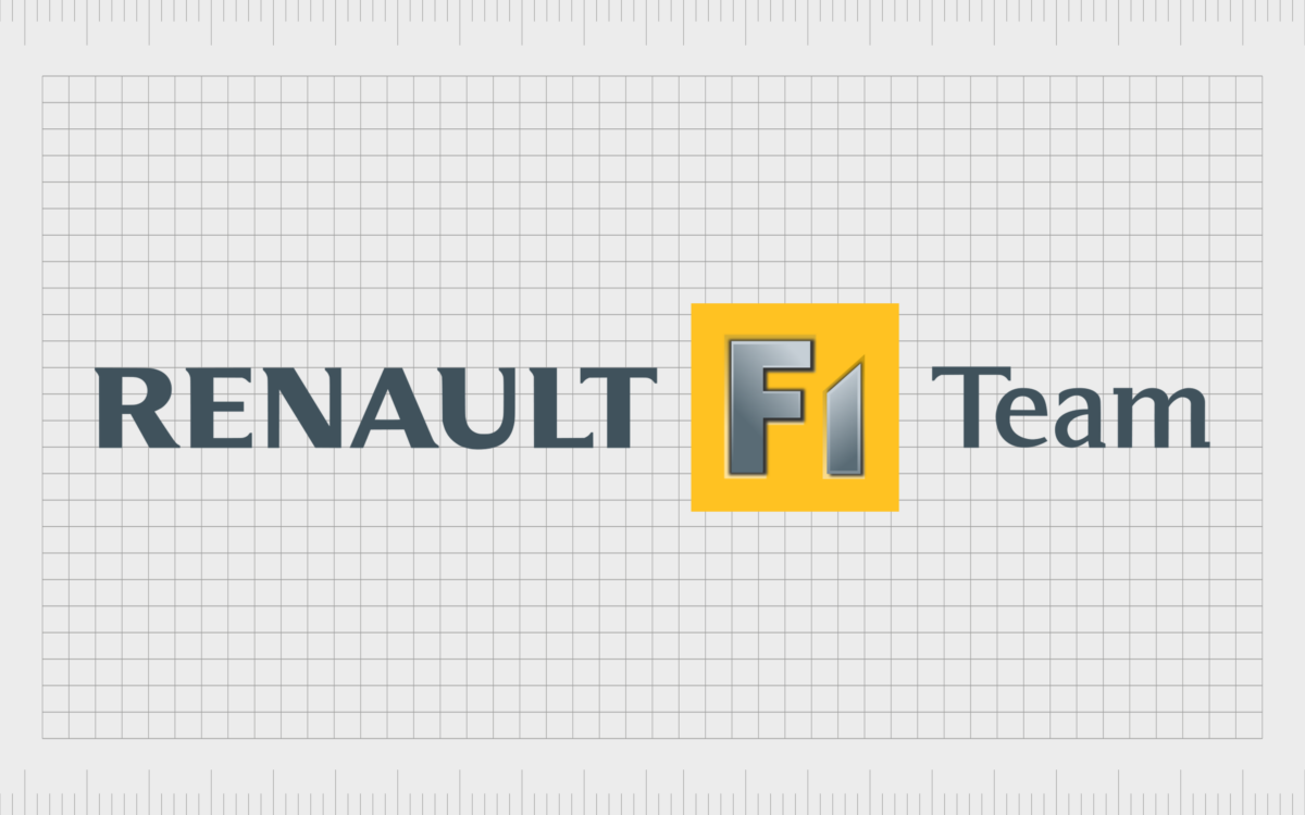
Between 2002 and 2006, the Renault F1 team, as it was called at the time, used a relatively simplistic logo featuring the branding of the Mild Seven company (a sponsor). The name Renault was present in a bold, serif font, though we didn’t see the iconic diamond emblem.
The letters “F1” in this logo were also placed in a yellow box to make them stand out.

2007
From 2007 to 2008, ING took over as the main sponsor for the Renault F1 brand, leading to a change in the team’s primary branding.
Once again, the Renault F1 Team wordmark was present, though the yellow box was switched to a warmer shade of gold. Above this branding, we saw the ING wordmark with its accompanying golden lion.

2008
In 2008, the first primary era of the Renault F1 team began, with no input from sponsors influencing the brand identity.
This meant the emblem for the racing team became a lot simpler, showcasing just the “Renault F1 Team” word mark from the previous design on a white background. The lettering was depicted in a sophisticated grey color.

2011
When Lotus took the helm in 2011, the Renault F1 Team was rebranded as the Lotus F1 Team, leading to a very different visual appearance. The color palette changed to black and gold, and for the first year, Renault and Lotus shared the spotlight on a wordmark banner alongside the letters GP.

In 2012, the Renault branding was removed, leaving just the Lotus wordmark behind, with the phrase “F1 Team” underneath. The full Lotus brand logo was included to the left of the typeface.

2016
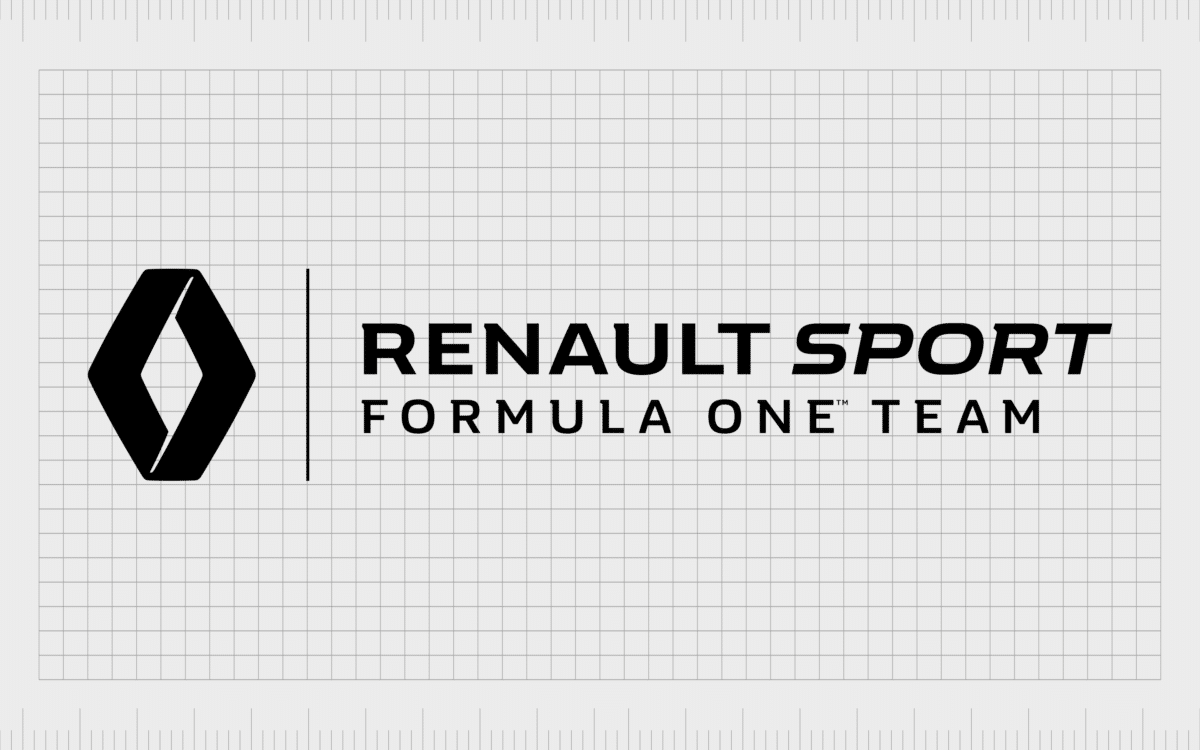
When Renault took control of the Alpine F1 Team once again in 2016, they doubled down on making their brand stand out. The word “Sport” was added next to Renault for two years, with the phrase “Formula One Team” written underneath.
This was also one of the first times we saw the Renault diamond in the banner.

In 2018, the design was simplified. The tagline became “F1 Team”, and the “Sport” element was removed. However, the diamond emblem became a lot larger.

In 2020, the Renault DP World logo emerged, similar in style to the previous design, but with reference to the DP World sponsorship placed just below the initial wordmark.

2021
2021 marked the very first year the “Alpine” logo was introduced to the Formula One team’s visual history. The logo matches the style of the larger Alpine brand, with a stylized “A”, with a slash across the center intended to look like a road.
The letter leans slightly to the right to convey an idea of speed and movement.
The word “Alpine” is also positioned just below the larger emblem, with “F1 Team” just beneath that. We can also see a small French flag on the design, referencing the heritage of the team.
The Alpine F1 team logo: Colors and fonts
The Alpine F1 team logo is one of the newest designs to emerge in the Formula One landscape. Although the Alpine logo for the larger automotive company does date back a little further, it wasn’t introduced into the motorsport world until 2021.
Additionally, though the team now races as “Alpine,” it’s still managed primarily by the Renault brand.
Today, the Alpine F1 logo, similar to the larger Alpine logo, is a symbol of speed and creativity. The stylistic A, featuring a number of harsh lines and a slight tilt to the right, conveys movement and power.
The large wordmark underneath the emblem adds to the overall sense of stability delivered by the brand. The addition of the French flag is a great nod to the heritage of the group and the French origins of Renault.
If you want to take a closer look at the Alpine F1 logo, you can find some useful resources here:
What color is the F1 Alpine logo?
The F1 Alpine logo colors are a little different from the colors used for the standard Alpine logo. The core Alpine logo, belonging to Automobiles Alpine, which merged with Renault Sport in 1976, featured a dark blue A, with a similar design to the image used by the F1 team today.
Alternatively, the Alpine F1 Team logo is often depicted primarily in black. However, the colors of the French flag do appear just beneath the “F1 Team” tagline. In some cases, the Alpine logo color for the F1 team can also be switched to a dark shade of blue.
What font does the Alpine logo use?
While the Alpine logo font for the official automotive company didn’t have a wordmark, the F1 team logo does. The word “Alpine” is written in all uppercase letters in a sans-serif font. The words “F1 Team” beneath also share a similar typeface.
The typography is similar to Idlewind, Akron Bold, and Ruby Sans Extra Exp Bold.
The large “A” in the Alpine logo is a unique design without a specific font. The design is similar in some ways to Howie’s Funhouse Regular, but it has sharper edges and curved components too.
Does the Alpine F1 team still exist?
Looking at the Alpine logo history for the F1 team, we can see several changes to this iconic group over the years. The Alpine F1 team as we know it today is still relatively new, only emerging after a rebrand in 2021.
However, the logo in use by the group is very similar to the long-standing design embraced by the Alpine automobile brand.
Today, the Alpine F1 Team logo symbolizes strength, speed, precision, and power.
The bold and eye-catching emblem is both simple and effective. It also offers a slight nod to the origins of Renault and the older Alpine company, which merged with Alpine sport. Both of these organizations originated in France.
Fabrik: A branding agency for our times.
Now read these:
—Which car companies own which car brand?
—The Red Bull racing logo, a symbol of power
—The Mercedes F1 logo, the silver arrows
—Exploring the revered Scuderia Ferrari logo
—Branding a winner, the Williams F1 logo history
—A guide to the iconic McLaren logo and symbol
—What you need to know about the Haas F1 logo
—The Alfa Romeo F1 logo, history and meaning
—From Scuderia Toro Rosso to the AlphaTauri logo
—A look back at the iconic Aston Martin F1 logo
Clarity starts with a conversation.
Thanks—we’ll get back to you shortly.
Whether you're navigating a rebrand, merger, or simply need a clearer identity—we’re here to help. No hard sell, just honest advice from people who know the sector.
Let’s start with a simple question…
Prefer to email? Drop us a line.
Fabrik’s been helping organisations rethink and reshape their brands for over 25 years. We’ve guided companies through mergers, rebrands and new launches. Whatever stage you’re at, we’ll meet you there.


