


Renault logo: The car brand with the diamond logo
The Renault logo is an excellent example of how a simple shape can transform into a timeless emblem with the right approach to branding. Like many automotive companies, Renault has made several changes to its logo over the years in an attempt to connect with an ever-evolving audience.
At present, the Renault symbol is a simple but compelling design, often associated with concepts like quality, reliability, and excellence.
Even if you’re not a die-hard Renault car fan, you may have wondered how the car brand with the diamond logo first emerged in the automobile landscape.
Today, we’ll introduce you to everything you need to know about Renault history and how the company ended up with its iconic logo.

Renault: Brand overview
| Founded: | 1899 |
| Founder: | Louis, Fernand, and Marcel Renault |
| Headquarters: | Boulogne-Billancourt, France |
| Website: | www.renaultgroup.com |
| Logo downloads: |
One of the better-known French car companies today, Renault or Groupe Renault, was established in 1899. The company produces a wide variety of vans and cars and has previously created a host of coaches, tanks, tractors, and aircraft engines.
The Renault company was initially founded by Louis Renault and his brothers, Fernand and Marcel.
Louis was an intelligent engineer who had already built several prototype vehicles before eventually teaming up with his brothers, who had developed their business skills working in their father’s textile company.
Marcel and Fernand managed the business, while Louis handled production and design. Louis eventually took complete control of the company in 1906 after Marcel was killed in a racing accident, and Fernand retired for health reasons.
Today, Renault is one of the biggest automotive companies worldwide, and as part of the Renault-Nissan-Mitsubishi alliance, it is one of the world’s biggest sellers of light vehicles.
Renault logo history: The Renault logo evolution
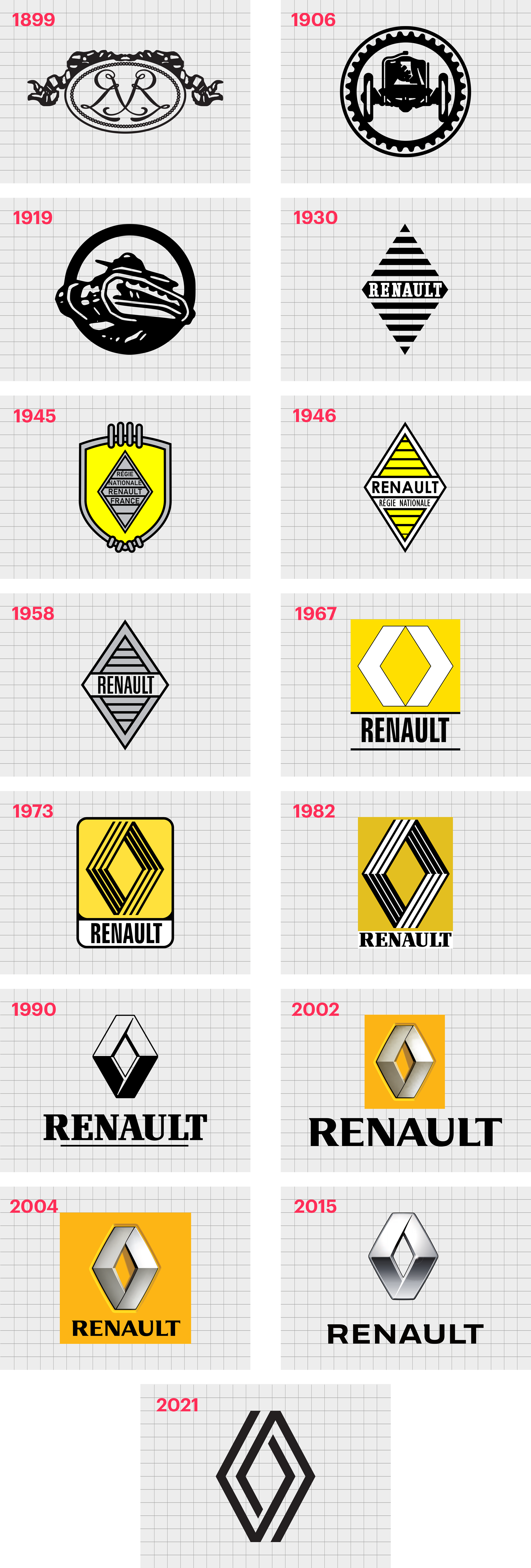
The original Renault car symbol was created in 1900, around a year after the business was originally established. The design initially chosen for the logo was an elegant design intended to highlight the “R” in the Renault name. Since then, there have been several different Renault logos.
1900
The first Renault car logo was a traditional image composed using the initial “R” of the Renault brothers. The two R shapes placed back-to-back were engraved on an oval-shaped medallion with curling ribbons on top.
1906
In 1906, the Renault symbol evolved from an image of finesse to one focused on stability and strength. The more industrial emblem featured the outline of a car placed in a circular gear frame.
In 1919, the company updated its image slightly to focus on the construction of tanks for World War 1. The round emblem and the overall design were similar to the previous iteration.
1923
A simplistic but effective Renault car logo appeared in 1923, celebrating the grille on the front of the car. The round icon placed the wordmark “Renault” in all capital letters in the middle.
1925
In 1925, Renault took inspiration from its previous grill-style design but updated the image’s shape to a diamond. This was the first iteration of the diamond image within the old Renault logos and marked a transition to a new image for the brand.
A slightly altered version of this Renault emblem was also introduced in 1930, making the lines of the grill in the diamond much bolder, and the central wordmark more refined. The thick white serif font chosen for Renault in this variation of the logo gave the company a bold and sophisticated image.
1945
In 1945 came the introduction of some new colors and shapes for the Renault logo. The diamond was redrawn in gray with thin black lines and the full name of the Renault company in the middle. The “France” location was also included.
In this version of the logo, Renault’s diamond appeared on a yellow shield-style background with a classic grey border.
In 1946, Renault removed the shield image again and combined the new coloring and some of the styles from the previous logo to create a more straightforward emblem. The Renault diamond once again became the single symbol for the brand, with the color yellow symbolizing light and joy.
By 1958, Renault had adjusted its color scheme again, returning to a monochrome image. The font style changed to a finer sans-serif wordmark, and the lettering underneath the central Renault name was removed.
1967
In 1967, Renault introduced a new concept for the Renault visual identity, placing a yellow diamond within a white pentagon, on a yellow rectangle. Underneath the geometric image was the brand’s name, depicted in an all-capital sans-serif font.
1973
Renault hired famous artist Victor Vasarely to re-design its logo in 1972, and he created a three-dimensional emblem based on the yellow diamond from previous years. This dynamic and clean symbol looked fantastic and kept the company’s name underneath the central diamond.
Renault updated this version of the logo again in 1982, maintaining a lot of the image while adjusting the yellow tone slightly. The wordmark for the Renault brand evolved again here, returning to the serif design seen on much older versions of the symbol.
1990
During the 1990s, the Renault emblem was modernized again, with refinements to the three-dimensional diamond and a return to a monochrome color palette. The Renault symbol became bolder and more robust, and the bold serif font highlighted the brand’s sophistication.
2004
In 2004, Renault added new textures and gradients to the Renault logo to give it an even more three-dimensional shape. The diamond was placed on a yellow background, with shadowing to make it look like it was popping out of the background.
The Renault wordmark’s serifs also became much smaller and more subtle here.
The logo was updated again in 2004 to place the wordmark within the same yellow square as the diamond symbol.
2015
In 2015, Renault removed the yellow background from its image and added more texture to the Renault diamond, to make it look as though it was crafted from shining metal. The wordmark for the logo changed slightly again, becoming much broader and more confident.
The diamond was placed to the left of the wordmark rather than above it.
2021
2021 marked the release of a new Renault logo, created without the previous wordmark or any of the textures of the most recent symbol. This logo variation harks back to designs we see in the 1970s but features only two thick lines instead of 3.
Renault logo meaning and features
Renault’s logo today is a modern, minimalist, and powerful symbol of brand identity. The design builds on the iconic Renault diamond shape, which has remained a consistent part of the Renault logo since the 1920s.
The diamond was introduced in 1923 as Renault’s team looked for ways to make its brand look more luxurious and high-class.
Initially, the diamond was only used on the luxury sports vehicles created by Renault, but as the company’s identity evolved, the shape became the center of Renault’s branding.
According to the Renault team, the diamond was one of the most recognizable symbols of the time and something most people associated with sophistication and quality, making it a practical choice for the Renault brand.
What font is the Renault logo?
There’s no official Renault logo font, as the diamond symbol is usually depicted without any wordmark. However, the larger Renault Group does use a wordmark with a simple sans-serif font, similar in style to Calibri.
Renault logo colors
The company’s only official Renault logo color today is black (often depicted on a white background). The business experimented with several colors through the years, including various shades of silver and grey, as well as bright yellows.
Today, the color black as the primary color for Renault helps to establish the brand as a sophisticated, professional, and timeless brand.
Celebrating the Renault logo today
The Renault logo is one of the simpler emblems in the automotive landscape, often depicted as nothing more than a diamond created out of a set of two thick black lines. However, this unique logo is brimming with heritage and meaning for the company.
It’s also a wonderfully memorable image for customers and fans of Renault.
The Renault logo has evolved several times since it was originally introduced over 100 years ago. However, the diamond shape has been one of the most consistent parts of the company’s identity for most of its life.
Fabrik: A branding agency for our times.

Clarity starts with a conversation.
Thanks—we’ll get back to you shortly.
Whether you're navigating a rebrand, merger, or simply need a clearer identity—we’re here to help. No hard sell, just honest advice from people who know the sector.
Let’s start with a simple question…
Prefer to email? Drop us a line.
Fabrik’s been helping organisations rethink and reshape their brands for over 25 years. We’ve guided companies through mergers, rebrands and new launches. Whatever stage you’re at, we’ll meet you there.