


Anastasia Beverly Hills logo history and meaning
How much do you know about the Anastasia Beverly Hills logo? Better known by some fans as “ABH”, Anastasia Beverly Hills is an American cosmetics company, popular for producing a range of high-quality eyebrow products.
Launched in 1997, Anastasia Beverly Hills hasn’t changed its logo much over the years. The company is still in the early stages of growth compared to some beauty brands.
However, looking at the emblem today gives us a useful insight into some of the trends and styles involved in branding cosmetics companies.
Whether you’re a fan of the Anastasia brand, or you just like learning about the creativity and skill involved in designing a beautiful logo, you’re in the right place.
Here’s your guide to the Anastasia Beverly Hills logo…
Anastasia Beverly Hills history
Before we dive into an exploration of logos and branding, let’s start with a simple question: “Who created Anastasia Beverly Hills?” The company is an American cosmetics company founded by the Romanian-born Anastasia Soare, in Beverly Hills California.
Soare opened her first flagship salon in Beverly Hills in 1997 and released her first product line in 2000. The company quickly became well-known for its high-quality eyebrow products, and brow-shaping service available to customers.
Anastasia Beverly Hills introduced the “Golden Ratio Eyebrow Shaping Method”, which aims to find balance and symmetry in eyebrows.
Since launch, Anastasia Beverly Hills has grown to sell more than 485 products in its line, in 2000 stores around the world, including leading locations like Sephora and Macy’s. Anastasia is also sold in more than 25 countries.
The daughter of Anastasia, Claudia Soare, is currently the president of the company, which frequently collaborates with a range of well-known celebrities on new collections.
What is the Anastasia logo? Anastasia logo history
As a relatively new brand, the Anastasia Beverly Hills logo hasn’t undergone many changes over the years. The makeup brand, established at the end of the 1990s, has retained the use of two primary logos throughout its product range and branding.
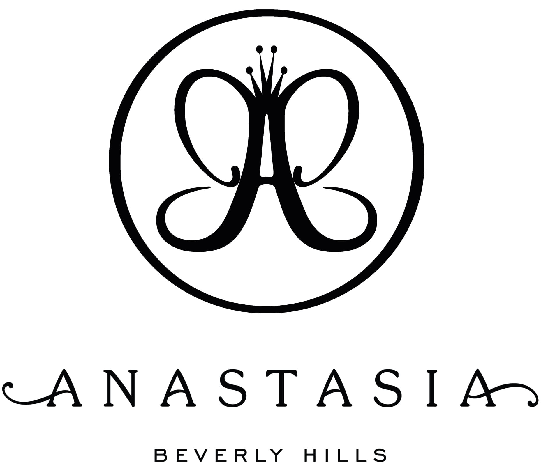
The first Anastasia logo is the version which includes both the circular monogram, and the wordmark for the organization. Depicted in black and white, this ABH emblem appears on a wide selection of Anastasia products, including brow pomades and eyeshadow.
In this version of the logo, we see a number of different elements. First, we have the stylized “A” in the middle of a black circle. The circle is a shape usually used in logos to convey a sense of inclusivity and global accessibility.
In the middle of the circle, the stylized “A” uses large swooping curves to make an image almost like a butterfly – a creature often associated with grace and beauty. The design also appears to have a crown sitting on the top of the A, indicating royalty and prestige.
The Anastasia logo wordmark
Underneath the monogram in the first variation of the logo, we see the Anastasia wordmark. The Anastasia brand occasionally uses the wordmark without the included emblem as an alternative brand image.
The wordmark uses a sophisticated serif font, with the horizontal bars of the last and first letters elongated and sweeping to the sides. The curves in the bars of the “A’s” curl in opposite directions, to convey the balance associated with the Anastasia unique brow shaping method.
Elegant and feminine, the Anastasia Beverly hills logo wordmark immediately captures attention for all of the right reasons. Underneath the wordmark, the words “Beverley Hills” are presented as a tagline, written in simple, and modern sans-serif font.
The contrast between the two kinds of font in the wordmark logo helps to convey a sense of modernity and youthfulness. Both variations of the logo symbolize ideas of beauty, femininity, balance, and creativity.
Anastasia logo meaning and elements
The Anastasia Beverly Hills logo is a simple but effective piece of branding, intended to convey beauty, sophistication, and modernity. Whether presented with the monogram element or not, the Anastasia logo is brimming with timeless femininity, and a classic sense of style.
The decision to use swooping and curling lines in the logo makes the image seem more creative and passionate. At the same time, elements like the “Beverly Hills” tagline remind us of the heritage of the brand.
The use of black and white coloring creates a sleek and prestigious aesthetic.
You can find more Anastasia logo resources here:
What font does the Anastasia logo use?
The Anastasia logo font is a unique typeface designed for the company, similar to many of the popular logos in the beauty industry today.
There are actually two fonts within the Anastasia Beverly Hills logo. The first is the type used for the main part of the name, which is a swirling, feminine script, with serif elements.
The secondary font in the logo is for the tagline, which uses modern sans-serif typography to showcase the youthful and cutting edge nature of the brand.
The swooping lines of the script font make the image look almost hand-written, as though it was drawn by a creative and passionate person – the same person responsible for creating the brand. The second part of the logo is fun, fresh, and easy to read.
What color is the Anastasia logo?
The Anastasia Beverly Hills cosmetics brand keeps things simple with its choice of colors. While many beauty brands in the past have experimented with naturally “feminine” colors like pink and purple, the Anastasia emblem goes against this trend.
The official Anastasia logo colors are simply black and white. There aren’t any additional shades in use with this design, though you may see extra colors brought into the branding through packaging and box choices.
The use of black as the main Anastasia logo font is a great choice by the company. Black and white are timeless colors which work well in wide range of different environments, and on different mediums.
With this logo, Anastasia Beverly Hills creates a timelessly sophisticated image.
Celebrating the Anastasia Beverly Hills logo
The Anastasia Beverly Hills logo might not have had the same number of changes and edits made to it as some other cosmetics logos, but this doesn’t make it any less interesting. This emblem is an excellent example of the timeless visual identities beauty brands can create.
Designed to combine classic elements of elegance and femininity, with components of a more modern and youthful company, Anastasia’s logo perfectly appeals to its target audience. The simple design also comes with a number of components which can be mixed and matched for different purposes.
Remember to explore our other articles for more useful insights into the amazing logos of companies around the world.
Fabrik: A branding agency for our times.
Now read these:
—Cosmetic and beauty brand logos
—The benefits of the Benefit logo
—Exploring the Bobby Brown logo
—The history of the Avon logo

Clarity starts with a conversation.
Thanks—we’ll get back to you shortly.
Whether you're navigating a rebrand, merger, or simply need a clearer identity—we’re here to help. No hard sell, just honest advice from people who know the sector.
Let’s start with a simple question…
Prefer to email? Drop us a line.
Fabrik’s been helping organisations rethink and reshape their brands for over 25 years. We’ve guided companies through mergers, rebrands and new launches. Whatever stage you’re at, we’ll meet you there.