The YouTube Music logo and how the icon has changed over time

When it comes to recognizable emblems of streaming services, few images are better known than the YouTube Music logo. A sub-section of the YouTube IP, the YouTube Music brand promises easy access to a host of amazing artists and playlists. However, if you take a closer look at YouTube Music logo history, you’ll notice the emblem has undergone a handful of changes.
Like many music streaming services, YouTube has updated its Music brand’s visual identity through the years, refining its choice of colors, fonts, and other components.
While the emblem has always been relatively modern and on-brand for the YouTube company, it has grown more sophisticated throughout the decades.
Today, we’re taking a closer look at the evolution of the YouTube Music logo, to provide you with a behind-the-scenes guide to the transforming brand image.
The YouTube Music icon: Introducing YouTube Music
Before we explore YouTube Music logo history, let’s define the brand. YouTube Music is a music streaming service, developed by the well-known YouTube content platform.
The solution offers access to a tailored interface, specifically designed for music streaming. Users can browse through songs and videos based on recommendations, playlists, and genres.
Alongside a free service, customers can also choose to subscribe to a premium plan, which delivers benefits like ad-free playback, audio-only background content, and the ability to download songs and listen to them offline.
These benefits are also available to subscribers of the wider “YouTube Premium” service, which covers the entire YouTube content portfolio.
Initially, the YouTube Music app was introduced in 2015, alongside the new YouTube Premium service (previously known as YouTube Red).
Over the years, YouTube has updated its offering, introducing new features like a redesigned mobile app, web-based desktop players, and dynamic recommendations based on Google artificial intelligence.
The music available on the channel includes many releases from mainstream artists, as well as videos categorized as music on the larger YouTube platform. In 2023, YouTube Music also launched Radio Builder, a free web service for building custom radio stations.
YouTube Music logo history: The evolution
Though YouTube hasn’t made many huge changes to its visual identity over the years, there have been some interesting refinements introduced throughout YouTube Music logo history.
For the most part, the company has stuck with similar shapes and color palettes, but the positioning of various logo elements has changed, and color combinations have been altered over time.
2015
When first introduced in 2015, YouTube chose a relatively simple logo for its music service, combining the official YouTube emblem at the time with the word “Music”. The image included the iconic YouTube wordmark, where the “Tube” section of the name is separated in its own oval box.
The “Music” component, created in a stylish sans-serif font, appears in large, eye-catching letters. All of the letters appear to be written in uppercase, except for the “I”.
Alongside the official logo, YouTube introduced a stacked version of its emblem, which places the YouTube banner above the “Music” inscription in a balanced format.
Additionally, a favicon was also created, showcasing a red and black record, with the red center of the circular emblem featuring a white triangle. The triangle pointing to the right is a common symbol for YouTube, as well as a universal representation of the “play” button on audio streaming apps.
The triangle appears to extend to the left of the circle, casting a shadow over a portion of the red circle, and converting the dark grey border into a light grey shade on the outside circle.
2017
In 2017, YouTube refined its image slightly for the Music service. The new official YouTube logo replaced the previous emblem, showing the word “YouTube” in sans-serif letters, alongside a play button (white triangle) in a red rectangle with curved edges.
The typeface for the “Music” inscription was changed to match the style of the YouTube logo, and was now depicted in grey instead of black.
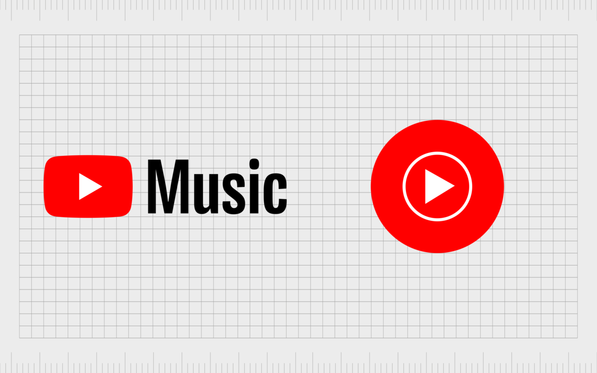
Similarly, the alternative versions of the YouTube Music icon were also altered. The record-style favicon became a simple red circle, with a white triangle in the middle, surrounded by a thinner white border.
The icon variant eliminated the name “YouTube”, and simply placed the rectangular play button image next to the word “Music” instead.
2019
Finally, in 2019, YouTube Music changed its image for the third time. The alterations to the official logo were relatively subtle. The YouTube play button icon remained on the left-hand side of the image, followed by the words “YouTube Music”, in very similar typefaces.
The “Music” inscription was changed from grey to black, and appears to have a slightly thinner overall appearance than the “YouTube” wordmark.
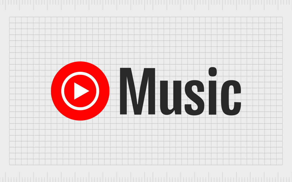
The new icon for the company was built on the favicons from previous designs, placing the red circular symbol from 2017 alongside the word “Music”.
The YouTube Music logo: Fonts and colors
Heavily inspired by the evolution of the YouTube logo, the YouTube Music emblem and icon conveys core components of the wider company’s brand identity, in a unique way. The image today is a bold and refined badge, which looks both professional and timeless.
The color palette of red, black, and white not only reflect the core colors of the YouTube brand, but also convey ideas of passion, strength, and clarity.
Though many of the changes to the YouTube Music symbol have been relatively simple, they all helped to further refine and enhance the overall presence of the YouTube brand.
You can find some examples of the YouTube Music logo in the resources below:
What color is the YouTube Music logo?
Throughout its history, the YouTube Music logo has leveraged the same color palette as the wider YouTube brand. However, there have been some slight changes to the use of the iconic colors of red, white, and black throughout the years.
Initially, shades of grey were used in the favicon for the design, to give the image a sense of depth. Today, the icon is far more simplistic and two-dimensional.
Today’s YouTube Music logo colors are a simple combination of black, white and red, with the red and black elements taking up the majority of the design. The official YouTube Music color of red has the following qualities:
Hex color: #ff0000
RGB: 255 0 0
CMYK: 0 100 100 0
Pantone: PMS Bright Red C
What font does the YouTube Music logo use?
The YouTube Music logo font has gone through slightly more significant changes over the years. Originally, the company chose a relatively quirky and bold sans-serif font for their design. As time passed, the team opted for a more professional and contemporary alternative.
Initially YouTube Music logo features two very similar typefaces. The word “YouTube” is based on the Alternative Gothic FS #2, and is unique to the YouTube brand.
Alternatively, the word “Music” appeared in a font style similar to Euclid Flex. Today, the two components of the logo are a lot more balanced, featuring a custom font specific to the YouTube company.
How has the YouTube Music logo evolved over time?
Looking back through YouTube logo history, it’s easy to assume the design hasn’t gone through many major changes. The color palettes have remained relatively consistent, and the emblems have always referenced the wider YouTube brand.
However, throughout the years, YouTube has taken significant steps to make their image appear more refined, sophisticated, and professional. Today, the iconic emblem is bold and powerful.
It’s versatile enough to work well in a variety of formats, and effectively highlights the unique personality of the company. The bold red elements and the compelling sans serif font highlight concepts like strength, passion, and authority.
Fabrik: A branding agency for our times.
Clarity starts with a conversation.
Thanks—we’ll get back to you shortly.
Whether you're navigating a rebrand, merger, or simply need a clearer identity—we’re here to help. No hard sell, just honest advice from people who know the sector.
Let’s start with a simple question…
Prefer to email? Drop us a line.
Fabrik’s been helping organisations rethink and reshape their brands for over 25 years. We’ve guided companies through mergers, rebrands and new launches. Whatever stage you’re at, we’ll meet you there.


