


Exploring Lindt chocolate logo history and Lindt meaning
Elegant, sophisticated, and luxurious, the Lindt chocolate logo is an excellent insight into the confectionary brand’s unique identity. Though there haven’t been many Lindt logos over the years, the designs created by the company have always had an impressive impact.
When you think of the Lindt symbol today, you probably imagine the luxurious cursive wordmark showcasing the Lindt name in soft, graceful gold. Perhaps you also visualize the famous Lindt dragon – a creature which has appeared within the brand’s image since the company launched in 1845.
Today, we’re going to be taking a journey through the history of the Lindt Chocolates logo and how the company found its timeless image.
Lindt history: Where did Lindt chocolate originate?
Lindt is a Swiss chocolate manufacturer which originally started life more than 150 years ago, in 1845.
The origins of the company date back even further, to 1836, when David Sprüngli-Schwarz and his son Rudolf purchased their confectionary shop in the town of Zurich, producing chocolates under the name Sprüngli and Son.
Before moving to Paradeplatz in 1845, David and his son purchased a small factory, where they began producing their chocolates. When Rudolf retired in 1892, he passed his business on to his two sons in equal parts, David Robert, and Johann Rudolf.
David received two confectionary stores which he branded with the name Confiserie Sprüngli, while Johann received the chocolate factory.
Eventually, Johann converted his private company into Chocolat Sprüngli AG in 1899, the same year he purchased the chocolate factory of Rodolphe Lindt. The company subsequently changed its name to Lindt & Sprüngli, which is when the first iteration of the brand’s logo was born.
In 1994, the Lindt & Sprüngli brand also purchased the Austrian company Hofbauer Österreich. In 1997, Lindt purchased the Italian chocolatier Caffarel, and the American chocolatier, Ghiradelli (which remains a popular brand to this day).
A history of Lindt logos: Lindt logos over the years
Unlike other confectionary and fast food companies, Lindt hasn’t changed it’s logo very much over the years. There’s actually still a version of the Lindt logo available which uses the Lindt & Sprüngli brand name, though this is rarely adopted for the company’s branding.
1845
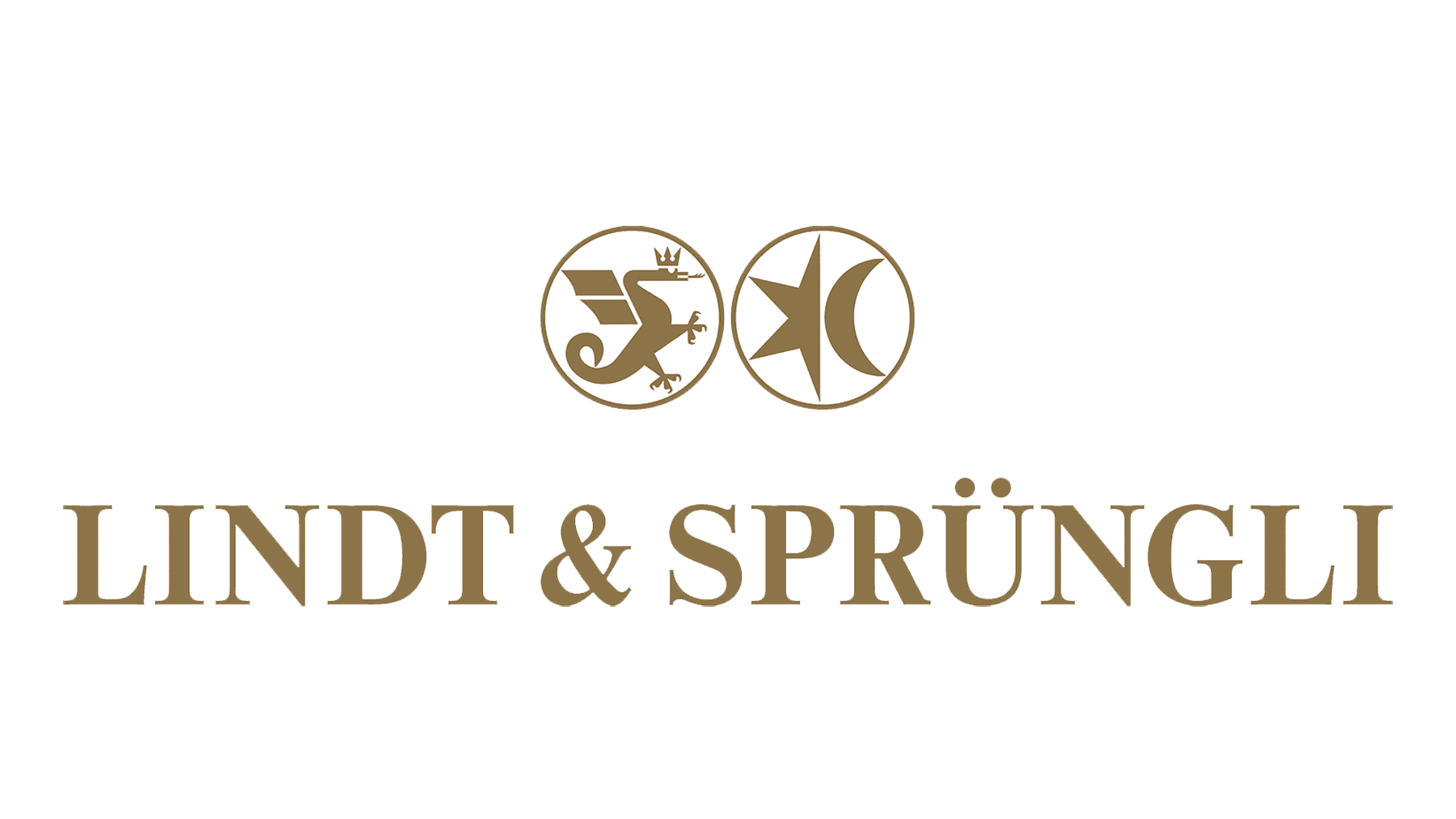
The first official Lindt Chocolates logo was introduced in 1845, when the name of the company was still officially Lindt & Sprüngli. The title referred to the merger of two major chocolate factories at the time, while the design highlighted the nature of both brands.
This version of the Lindt logo used a darker version of the golden coloring we know today, and a serif font, to convey ideas of sophistication and professionalism.
The image also featured a much simpler version of the Lindt brand dragon, designed to face towards another icon featuring half of a star and a crescent moon.
While the other part of the emblem has disappeared over the years, the dragon on the Lindt logo continues to be a significant part of the brand image today.
1899
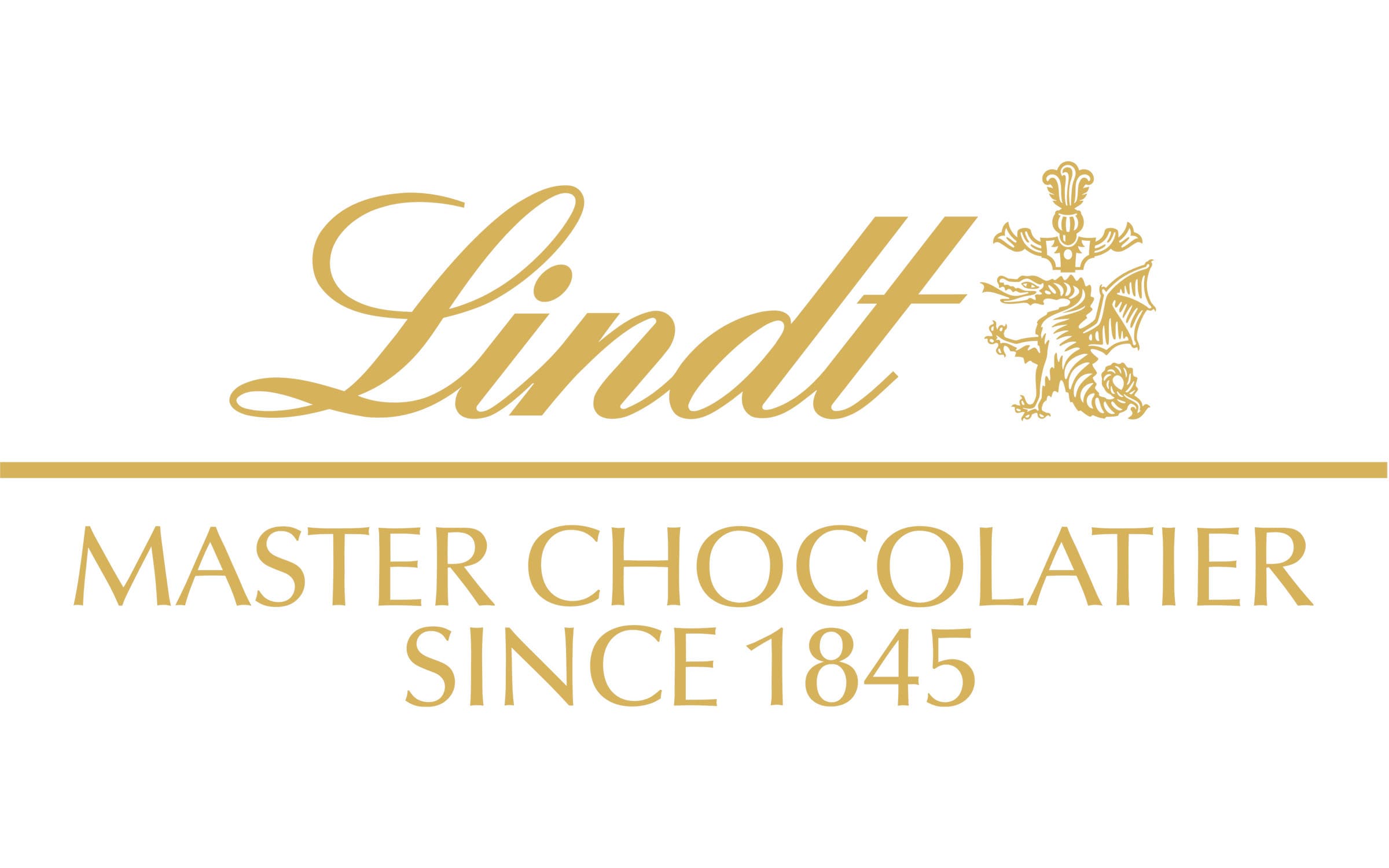
The Lindt Chocolate logo most of us know today was introduced in 1899, with the evolution of the brand. The brand image here features the name of the business in a lighter gold than the previous coloring.
The script has transformed from a serif font into a cursive design, with a sans-serif inscription underneath.
Today, the Lindt logo’s font is one of its most eye-catching features, with the distinctive curl in the “L” at the beginning of the word. According to the company, the flowing, italicized letters are designed to represent the liquid flow of melted chocolate.
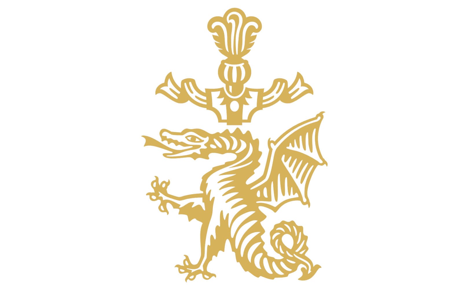
Lindt meaning: Defining the Lindt dragon
The name “Lindt” comes from the name of the founder of the Lindt factory, which was purchased by Johann Rudolf in 1899. The Lindt dragon is a part of the family’s coat of arms; however, it also has a deeper meaning, according to the brand.
As mentioned in brand messages from the company over the years, the dragon is facing towards the swirling letters of the Lindt font, holding the chocolate black from flowing too far away. The dragon is there to keep everything controlled, precise, and perfect.
The brand also says the dragon is there to convey a sense of control. You can feel free to indulge in Lindt chocolate without “losing control”.
Though the meaning behind the Lindt symbol might be a little odd, it helps to add something special to the long-standing heritage of the company.
Lindt brand elements: Lindt logo color and font
The Lindt brand has several distinctive elements in its logo, including the incredible dragon which acts to hold the flow of chocolate back from the Lindt wordmark.
If you’re interested in the Lindt logo, you can find some handy resources here:
Outside of the iconic dragon, the most memorable parts of the Lindt logo are probably its color choices, and the phenomenal use of cursive font.
What color is the Lindt logo?
The Lindt logo colors haven’t changed much over the years. The brand has always attempted to convey a sense of luxury, prestige, and quality with the use of gold in its wordmark.
However, previous iterations of the logo did use a slightly darker shade of gold.
Today, the much lighter coloring helps to make the company seem friendlier and more engaging. The slightly yellower tones also create connotations with things like happiness and joy.
The single Lindt logo color is known as “old gold”:
Old gold
Hex: #D7B14A
RGB: (215, 177, 74)
CMYK: 0, 0.176, 0.655, 0.156
This gold shade also has a more metallic nature to it, which may help to remind customers of luxurious items and precious metals more than the duller shade of the previous symbol.
What font does the Lindt chocolate logo use?
The Lindt logo font is another part of what makes the brand image unique. Initially, the Lindt team used a serif font for their logo, perhaps to create a sense of sophistication, professionalism, and class.
Serif logos are excellent for conveying heritage, which is something the Lindt company definitely achieved in spades over time.
When the Lindt logo updated before the turn of the century, the company decided to switch to a custom sans-serif font in cursive. The italicized typography makes the letters of the wordmark look as though they’re flowing from one to another.
According to the branding team for Lindt, the choice of an italic font was specifically to draw the mind to the image of flowing chocolate. This is also why the dragon sits at the end of the Lindt name with its claw up, to stop the flow from going too far.
The swooping curl on the “L” of the Lindt name helps to highlight the artistic and creative nature of the brand.
Interestingly, Lindt actually uses two distinctive fonts in its logo. Outside of the custom-made italic font, there’s also the sans-serif font in all capitals which defines the company as home to “Master Chocolatiers Since 1845”.
This sans-serif font is also a custom creation for the brand, chosen to highlight the timeless success of the company.
Celebrating the Lindt chocolate logo
A timeless image designed to stand the test of time; the Lindt chocolate logo has become an icon in the branding world over the years.
From the golden dragon, created to hold back the “flowing” letters of the Lindt chocolate wordmark, to the swooping cursive in the typography, there’s a lot to love about the Lindt symbol.
Today, the Lindt logo continues to stand out as a memorable icon for heritage, class, and sophistication. It’s a great insight into how the right emblem can serve a company for countless years.
Don’t forget, you can always learn more about iconic logos with the other Logofiles from Brand Fabrik!
Fabrik: A branding agency for our times.
Now read these:
—American chocolate bar brands
—Hershey logo history and meaning
—Your guide to Reese’s logo history
—Indulge in the Dove Chocolate logo

Clarity starts with a conversation.
Thanks—we’ll get back to you shortly.
Whether you're navigating a rebrand, merger, or simply need a clearer identity—we’re here to help. No hard sell, just honest advice from people who know the sector.
Let’s start with a simple question…
Prefer to email? Drop us a line.
Fabrik’s been helping organisations rethink and reshape their brands for over 25 years. We’ve guided companies through mergers, rebrands and new launches. Whatever stage you’re at, we’ll meet you there.