


Lamborghini logo history and symbol meaning
Are you familiar with Lamborghini logo history? Lamborghini is the name of one of the most famous luxury car manufacturers in the world. The Lamborghini emblem has become a symbol of style, sophistication, and automobile elegance.
Lamborghini is a European luxury car manufacturer, with a presence across the globe. Commonly associated with sleek designs and stunning, sporty aesthetics, Lamborghini is an icon in the niche.
The company produces high-performance cars considered to be some of the fastest and most impressive in the world. Let’s take a closer look at Lamborghini logo history.
Lamborghini history: The Lamborghini logo today
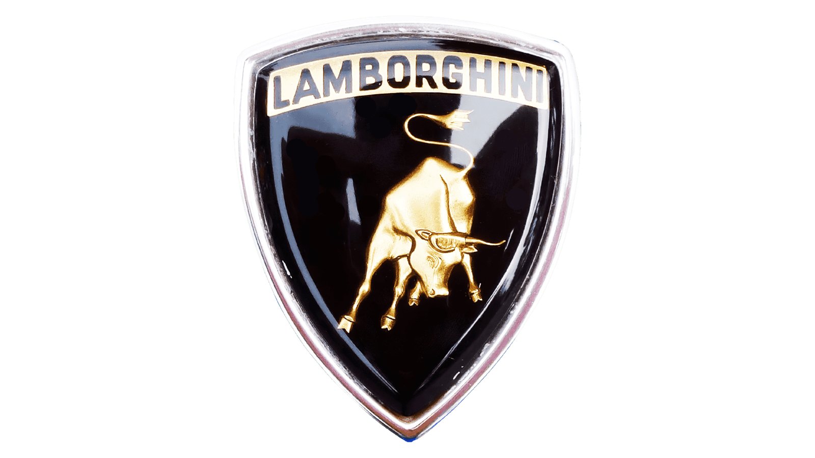
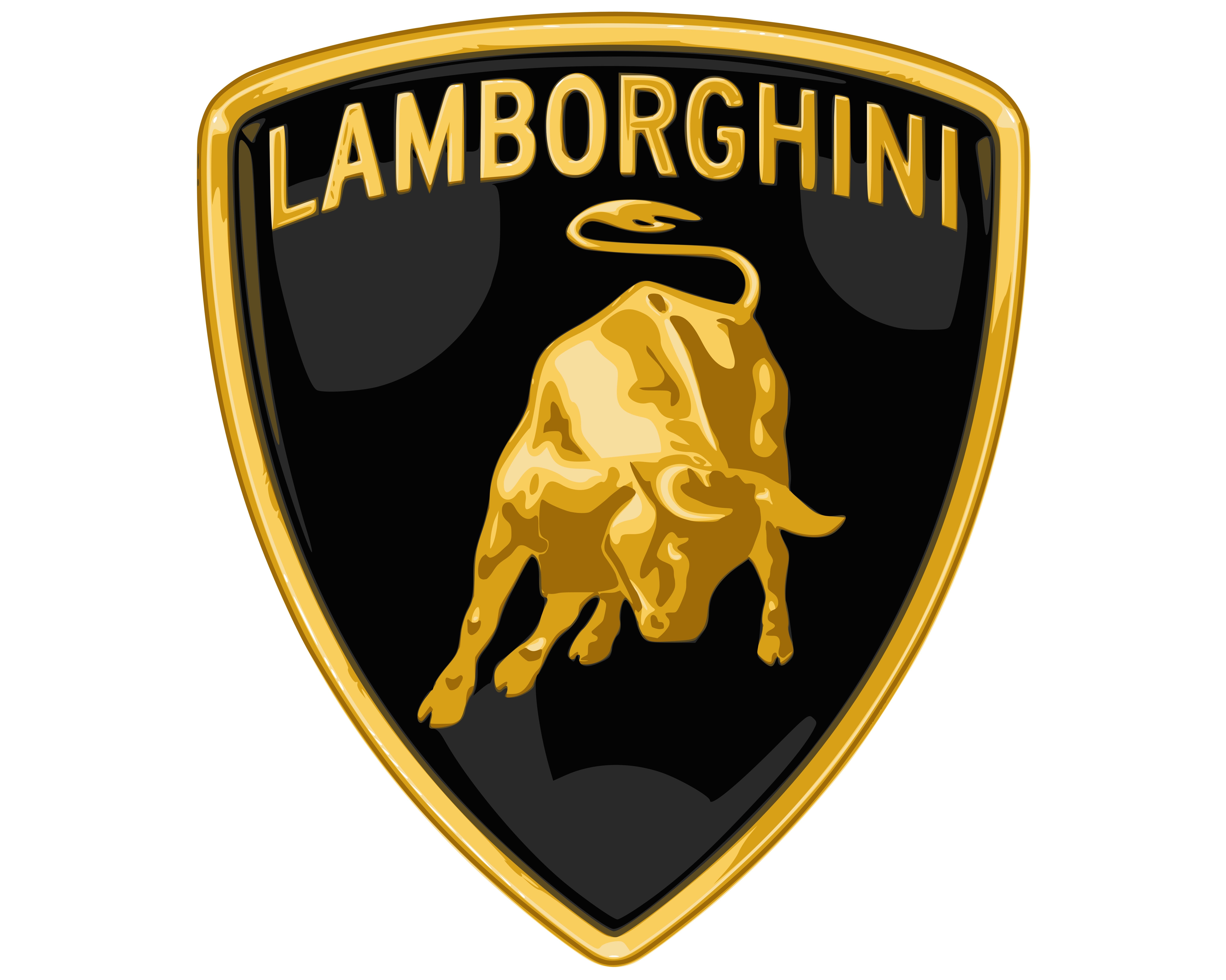
The Lamborghini car logo is easily recognizable. The emblem begins with the shape of a shield in black which is outlined in gold. Across the top of the shield, we see the name of the brand in all-capital letters, also in gold.
Perhaps the most memorable identifying feature of the Lamborghini emblem is the bull, a sign of power, grace, and incredible performance. The Lamborghini car symbol is neither the most complex, nor the simplest logo on the market today, but it is one of the most memorable.
The image of the bull central to the black Lamborghini shield is carefully designed to convey motion. With its head dipped and its hooves poised, the Lamborghini mascot is ready for action.

Lamborghini: Brand overview
| Founded: | 1963 |
| Founder: | Ferruccio Lamborghini |
| Headquarters: | Sant’Agata Bolognese Emilia-Romagna, Italy |
| Website: | www.lamborghini.com |
| Logo downloads: |
Lamborghini is an Italian company responsible for manufacturing luxury SUVs and sport cars around the world. Currently, Lamborghini belongs to the Volkswagen Group, via the Audi subsidiary.
The Lamborghini brand was created by Ferruccio Lamborghini, and originally earned attention in the industry with its unique approach to car development, featuring a rear-wheel, rear mid-engine drive layout.
The company grew significantly during the first decade of the business’ growth, but sales plunged in the financial crisis of 1973.
Over the years, Lamborghini added new lines and models to its portfolio, to help attract a wider range of buyers. Today, the Lamborghini logo is one of the most recognizable in the world, associated with class, sophistication, and style.
Lamborghini logo evolution: Lamborghini symbols
The Lamborghini insignia has only changed a couple of times over the years. The old Lamborghini logo was very different from the one we know today. However, once the Lamborghini team found its true visual identity, it held onto the image for as long as possible.
1953
When Lamborghini was first established, the logo was a simple monochrome pyramid, with three separate triangles within. Each triangle had its own block capital letter assigned to it, F, L, and C. The letters were in a simple sans-serif typeface.
1963
1963 introduced the world to the first version of the new Lamborghini logo, with its iconic bull. The emblem is similar to the Lamborghini car symbol we know today, featuring the bull in motion, and the memorable shield background.
The image started with a monochrome bull on a red shield, with the name “Lamborghini” written in an elegant sans-serif lettering. The lettering was conducted in silver, with sharp, thick lines, and a lot of curves.
1972
In 1972, the prototype of the current visual identity for the Lamborghini logo was introduced, including the gold and black color options. The name “Lamborghini” was positioned above the running bull in the shield.
We also saw a change to the typography, which was now in capital sans-serif letters, rather than a handwritten-style font.
Lamborghini created a slightly different variation of this logo again in 1974, this time focusing on monochrome colors, and a bold sans-serif wordmark in sentence type underneath.
1998
The Lamborghini logo as it stands today is a modernised version of an emblem, we’ve seen multiple times throughout Lamborghini’s history. The detail in the golden bull is now more significant, with shadow and highlights demonstrating the strength and muscle of the animal.
The golden elements of the logo used a number of gradients to make them appear more realistic and vivid, conveying Lamborghini’s inherent energy of motion.
The inscription today is an all-capital golden version of the Lamborghini name, designed for excellent clarity and consistency. Against the black background, the gold font and bull are the perfect representation of luxury. There’s also a gold outline around the black shield.
Lamborghini symbol meaning: Lamborghini emblem
While there are multiple components to the Lamborghini car logo, the most memorable part of the emblem is the “Taurus”, or bull. The use of animals to represent passion and speed is common in the automobile industry, and there are a few reasons why Lamborghini chose the bull as its mascot.
According to the team behind Lamborghini today, the company’s founder was born in Taurus, and had a passion for bullfighting.
Lamborghini apparently attended a number of bullfighting events during his life, and believed the bull was a powerful and elegant creature – the perfect symbol for an automobile brand.
There’s another reason for the Lamborghini symbol being a bull too. The company believed the bull animal shared a number of characteristics with the designs of their cars, including power and speed.
The bull has a number of connotations throughout the world with power. It’s even the symbol of Zeus, the leader of all Gods in mythology.
The shape of the bull, poised for action in the Lamborghini logo, has remained almost exactly the same for the entire history of the brand. Today, the mascot helps to capture the unique identity of the brand, setting it apart from competitors.
Lamborghini logo colors
The Lamborghini logo color choice has changed a couple of times over the years. Most of the time, the company has experimented with monochrome versions of its logo. Occasionally, the brand looked at shades like red and white as a way to highlight passion and strength.
The most common Lamborghini logo colors, however, are black and gold. The black of the shield behind the bull symbolizes sophistication, power, and status. It’s an extremely strong color choice.
The golden elements of the Lamborghini logo are of course linked to luxury and wealth. They can also be connected with ideas of prestige and beauty.
Lamborghini logo font
What font is the Lamborghini logo?
The Lamborghini logo font is unique to the car brand, like most of the logo typography we see throughout the world today. The font has changed a little over the years, with various iterations appearing in sans-serif variations.
Lamborghini has also experimented with showing its name in both all capitals and sentence type.
Today, the Lamborghini logo is best known as “La Macchina” when we’re talking about the wordmark which sometimes appears on the vehicles themselves, and their marketing campaigns.
The Lamborghini font placed above the bull in the logo emblem is a very different sans-serif font written with all capital letters. This font is a little harder to identify. Both capture the attention of the viewer with feelings of power and class.
However, the italic logo is more connected with luxury than the all-caps version.
Celebrating the Lamborghini logo
The Lamborghini logo has earned its place as one of the most memorable designs in history, best associated with ideas of luxury, sophistication and style. While the golden color of the logo helps to highlight excellence and indulgence, the black shades are all about power and strength.
The use of the bull or “Taurus” as the emblem for the Lamborghini logo is extremely meaningful, as it helps to draw connections between the company and ideas of power and performance. Today, it’s hard to find anyone who couldn’t instantly recognize the Lamborghini logo.
Now read these:
—Which car companies own which car brand?
—Famous car brands, their names and logos
—The ultimate list of French car brand logos
—The 50 best-known car logos with wings
—The definitive guide to German car logos
—Famous car logos and emblems with stars
—Top American car brands and their logos
—Your ultimate guide to Italian car brands
—American car companies that went bust
—The conclusive guide to British car logos
—The essential list of Japanese car logos
—A decisive guide to car logos with circles
Fabrik: A branding agency for our times.

Clarity starts with a conversation.
Thanks—we’ll get back to you shortly.
Whether you're navigating a rebrand, merger, or simply need a clearer identity—we’re here to help. No hard sell, just honest advice from people who know the sector.
Let’s start with a simple question…
Prefer to email? Drop us a line.
Fabrik’s been helping organisations rethink and reshape their brands for over 25 years. We’ve guided companies through mergers, rebrands and new launches. Whatever stage you’re at, we’ll meet you there.