


The ultimate guide to insurance company logos and names
Insurance company logos and names are among the most valuable resources for any brand in the insurance landscape. These assets are often the first components a consumer interacts with when choosing a brand to protect their finances, future, or livelihood.
Great insurance company logos and the right names convey a sense of trust and credibility to consumers. They help clients determine whether they can depend on an organization while convincing prospects to learn more about the company.
These tools are also an essential way for business leaders to differentiate themselves from the competition.
Whether you’re trying to select your logo and moniker for an emerging brand, designing insurance logos for clients, or simply had a passion for branding, you’re in the right place.
Today, we will take a closer look at some of the most compelling insurance company logos and names from around the world.
Let’s dive in.
An introduction to insurance company logos and names
Like the financial or healthcare sectors, the insurance landscape is a particularly complicated area for branding. When seeking out insurance, consumers aren’t just looking for fun, entertainment, or basic products; they’re searching for protection and peace of mind.
As a result, insurance companies need to ensure they’re instantly delivering the right message to their customers from the moment they first encounter the brand. Insurance company logos and names are chosen with extreme care and caution.
They’re specially designed to make a brand appear friendly, compassionate, professional, and trustworthy.
While there are many different types of insurance company logos out there, you may notice some key themes embodied by many brands, such as:
Stability
Insurance is a lot like an investment. It’s something we pay for over years or decades consistently. This means consumers want to know they’re spending their money with a stable, secure, and consistent brand.
Conveying “stability” in an insurance logo often means using bold shapes, strong typography, and specific colors, such as black, blue, white, and grey, to suggest professionalism.
Community
Investing in insurance can be daunting, particularly when it’s connected to complex topics like life and health. As such, many insurance companies choose logos and names which help them appear more friendly, warm, and compassionate to their target audience.
You’ll notice many organizations using suggestive trademarks which revolve around community, connectedness, and reliability.
Credibility
One of the most important things any insurance logo or name should communicate is credibility. Consumers want to be reassured they’re working with a trustworthy brand capable of looking after them and their assets.
Companies often use names connected to excellence and logos with traditional colors such as red and blue to create a sense of trust.
Depending on the type of insurance company and the message they’re attempting to convey, a name and logo may also include other elements. Some brands use designs, words, shapes, and colors meant to convey friendliness, innovation, or vitality.
Amazing examples of life insurance company logos
One of the things that make insurance company logos and names so diverse is that countless different forms of insurance are available. “Life insurance” is often regarded as one of the most important forms of protection a customer can access.
Many life insurance companies use their names and logos to convey ideas of safety, growth, and vitality.
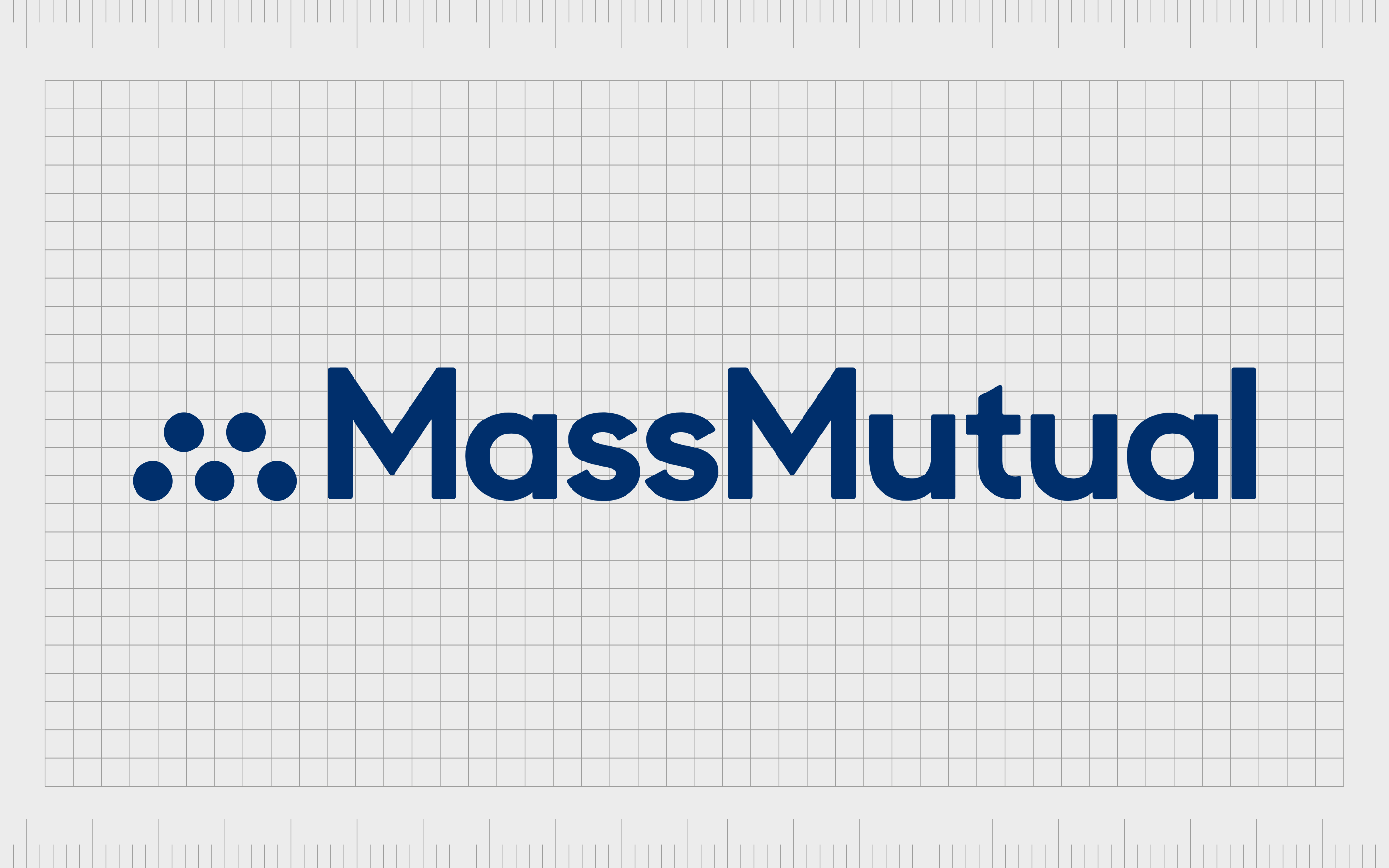
MassMutual
Otherwise known as the “Massachusetts Mutual Life Insurance Company,” MassMutual is a financial services brand first launched in 1851. The shortened name “MassMutual” is designed to make the company appear more modern.
It also gives the company a sense of strength and presence, with the word “Mass” while the word “mutual” conveys shared benefits.
MassMutual’s logo is a simple wordmark written in a sans-serif dark blue font. The color blue conveys ideas of reliability and credibility. The five dots next to the wordmark are intended to represent the company’s core pillars, reliability, trustworthiness, and community.

Protective
Known to some as “Protective Life”, the “Protective” brand chose perhaps one of the most compelling names for its company. Launched in 1907, this insurance company provides life insurance to consumers throughout America.
The word “Protective” tells consumers they can trust the brand to defend them, their assets, and family.
Protective uses a purple combination mark to convey compassion and community in its logo and luxury. A simplistic image of two people, with their arms linked, is also intended to demonstrate Protective’s approach to helping their audience.
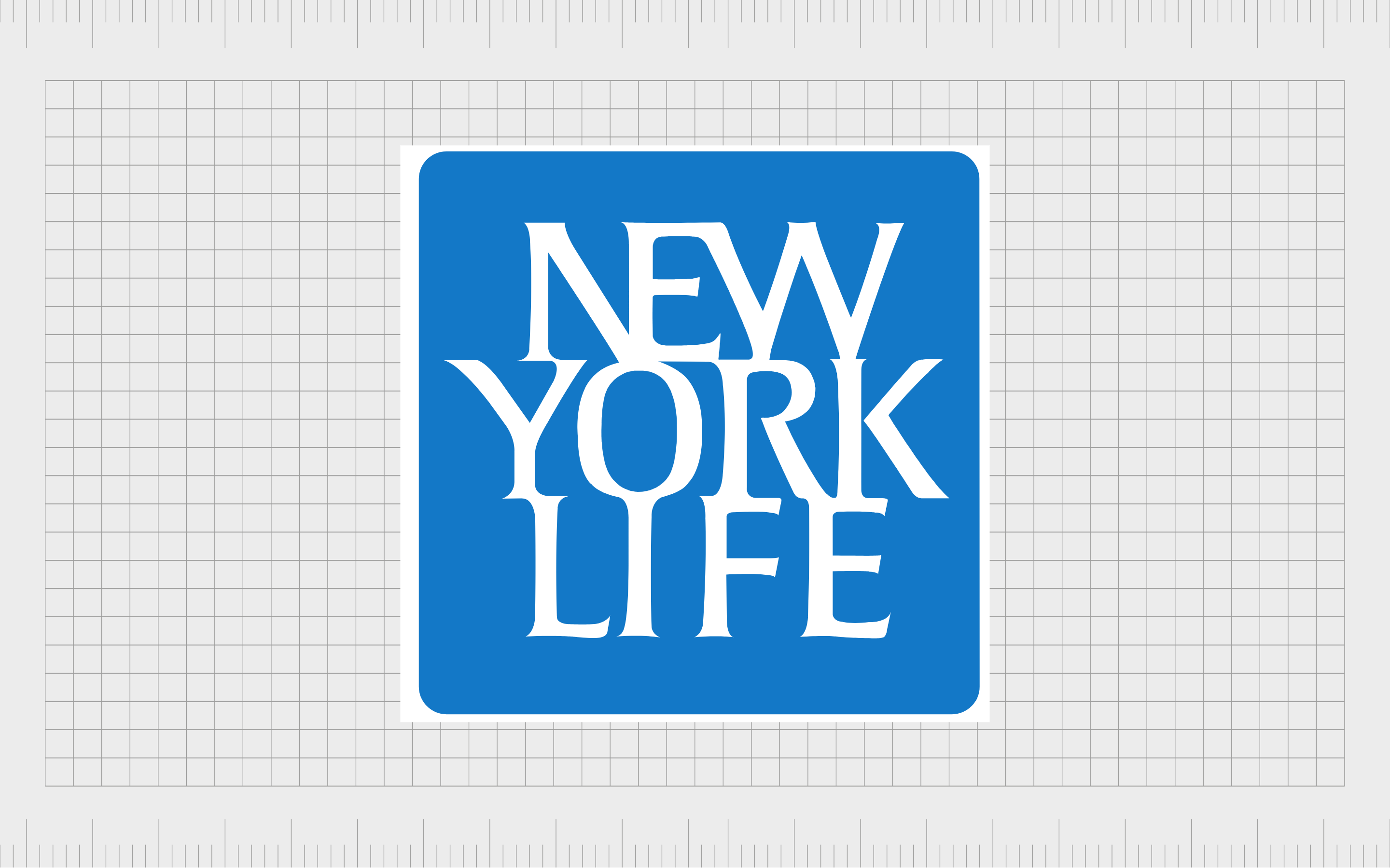
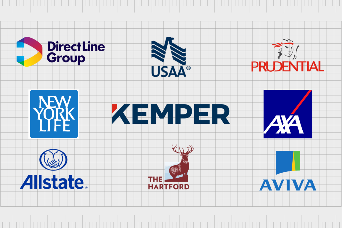
New York Life
The New York Life insurance company is the third-largest insurance brand in the financial states focusing on life insurance. Launched in 1845, this long-lasting company has achieved excellent growth, despite its relatively simple, descriptive name.
The logo for this brand is as straightforward as its title. The emblem is a wordmark on a blue square, written in white, serif font. The three-tier wordmark conveys a sense of stability and strength for the brand, as well as reliability and trustworthiness.
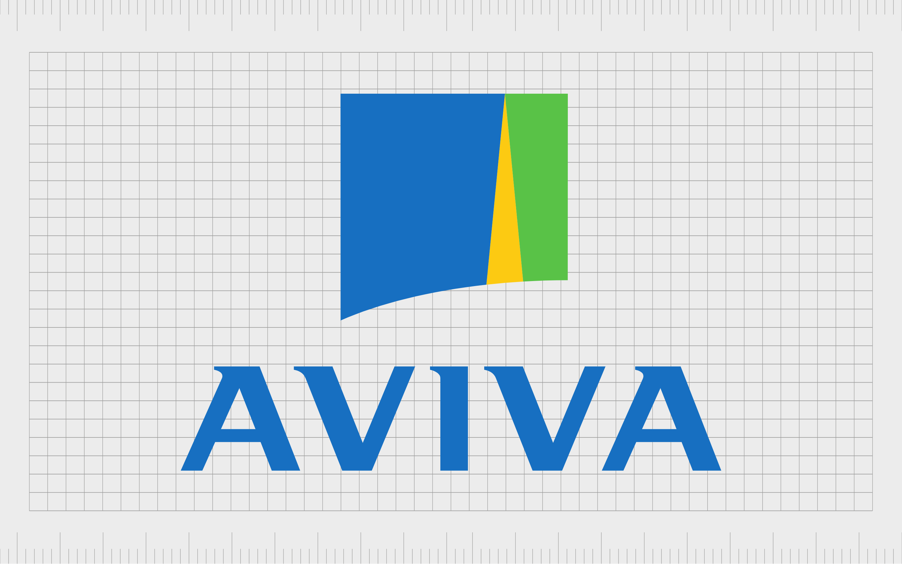
Aviva
Aviva is an interesting insurance company from the UK, with a compelling name. Created in 1969, the organization first had the name “Hand in Hand Fire and Life Insurance”, until the company shareholders chose to transform the name to “Aviva.”
The moniker is an invented palindrome, taken from the Latin word for “Alive.”
The Aviva logo is a simple combination mark, featuring a blue wordmark in serif font, with a geometric shape placed above in yellow, green, and blue. The overall image is intended to make the company appear modern, and innovative.

Guardian
Ranked as one of the world’s largest mutual life insurance companies, Guardian was launched in 1860 and now has more than 8,000 employees in the US. The company chose a fantastic title for its life insurance brand, focused on the concept of protection and defense.
The name “Guardian” makes consumers feel they’re working with a company that protects their interests.
The Guardian logo, depicted in green and blue, uses a bold wordmark to highlight its strength alongside a G which looks like two links in a chain, further enhancing the brand’s focus on security.
Health insurance company logos
Similar to life insurance company logos and names, health insurance brand assets focus heavily on concepts like reliability and vitality. They attempt to position brands as valuable sources of support, offering consumers excellent peace of mind.
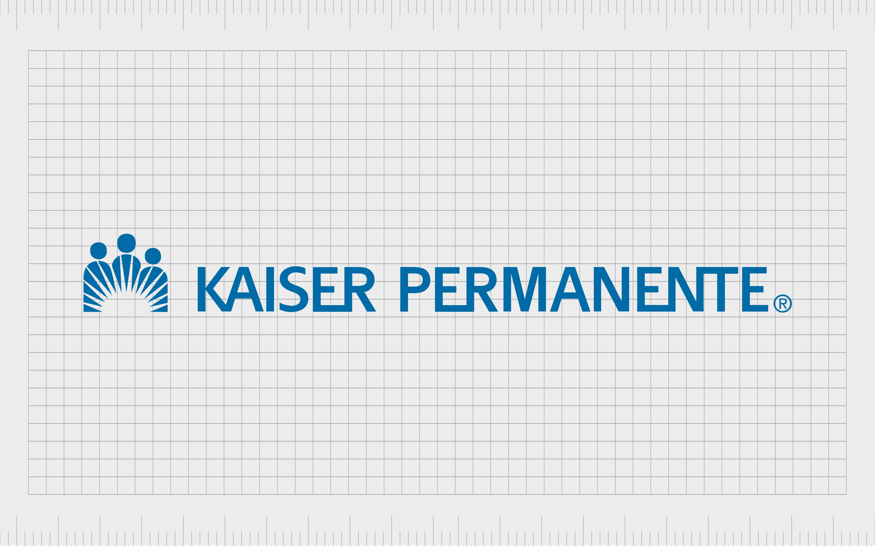
Kaiser Permanente
Otherwise known as Kaiser, or KP, Kaiser Permanente is an American health insurance and managed care consortium. It’s one of the largest non-profits in the US, with more than 12 million members. Each medical group operates as a separate for-profit partnership.
The Kaiser Permanente logo focuses heavily on the idea of community and support. The three people in the image show a group commitment to caring for consumers. Additionally, the shape of the sun reminds us of vitality and good health.
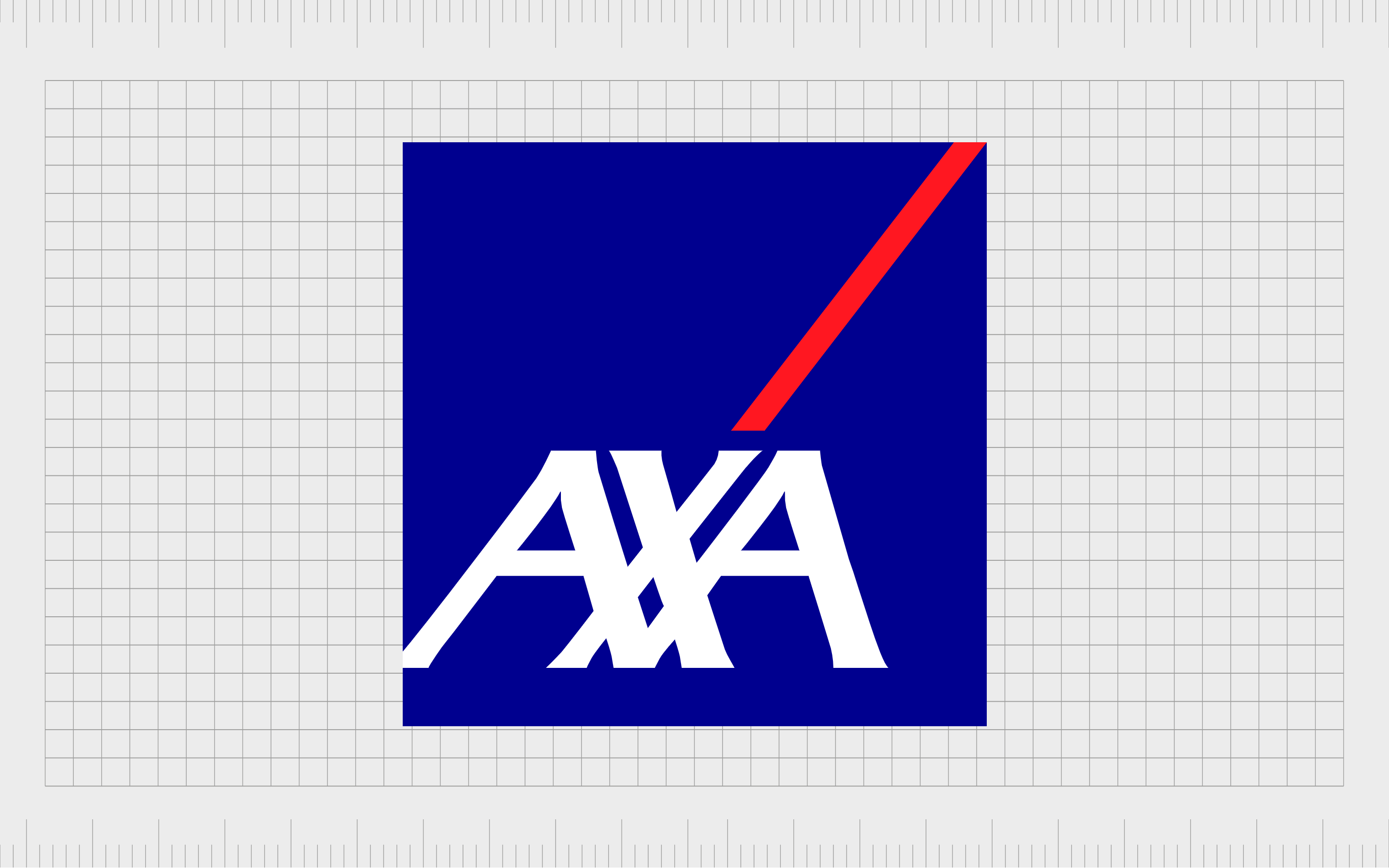
AXA
AXA is a French multinational insurance company offering support in the areas of health insurance, life insurance, and many other sectors. First launched in 1816, the company is one of the largest in the world, with locations all around the globe.
AXA has a compelling logo featuring a blue square, with the letters “AXA” placed in an overlapping position on the left-hand side. A stripe of red pointing up towards the corner of the logo is intended to represent confidence and growth.
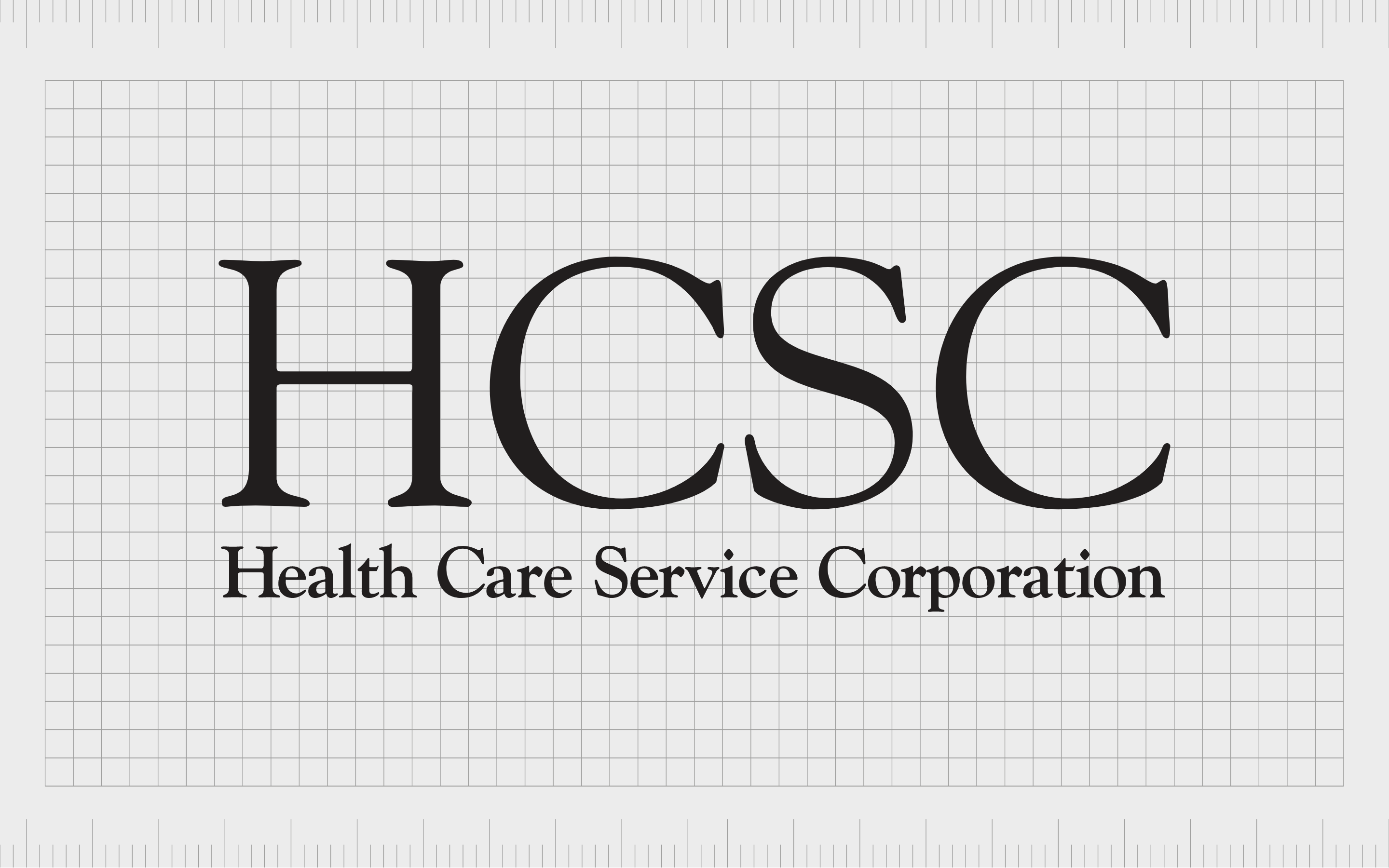
HCSC
The HCSC company is a member-owned health insurance company based in the United States. Founded in 1936, the organization now stands as the fifth largest health insurance brand in the US. It serves around 16 million members across the country.
HCSC keeps things simple with its insurance company logo and name. The straightforward title is conveyed in serif-font in black on a white background. This gives the company a sense of professionalism, sophistication, and credibility.
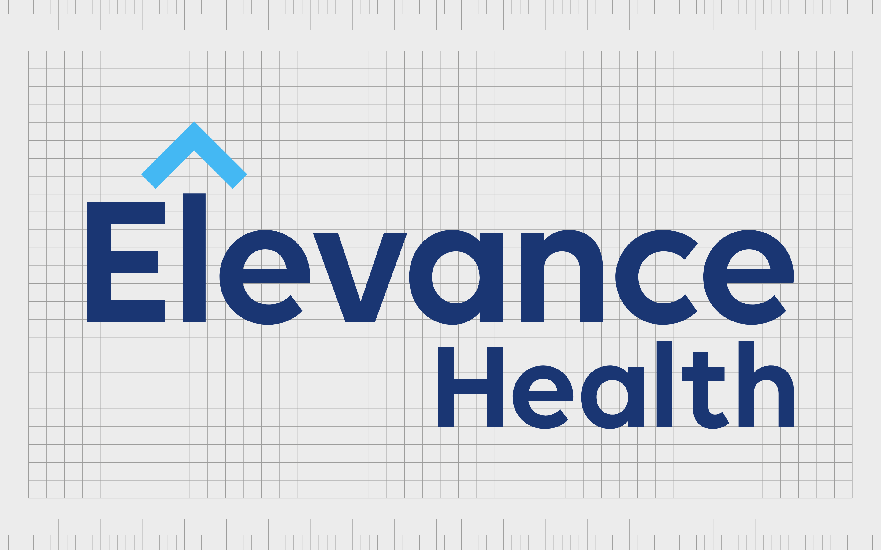
Elevance Health
Another relatively well-known example for our list of insurance company logos and names is Elevance health. This American insurance provider was launched in 2004, making it a relatively modern addition to the landscape.
The word “Elevance” reminds us of the term “Elevate”, which connects to concepts like vitality and ambition.
The Elevance health insurance logo is simple but effective. Depicted in reliable dark and light blue colors, this wordmark is engaging and modern. It also includes an upward-pointing arrow above the I to indicate growth.
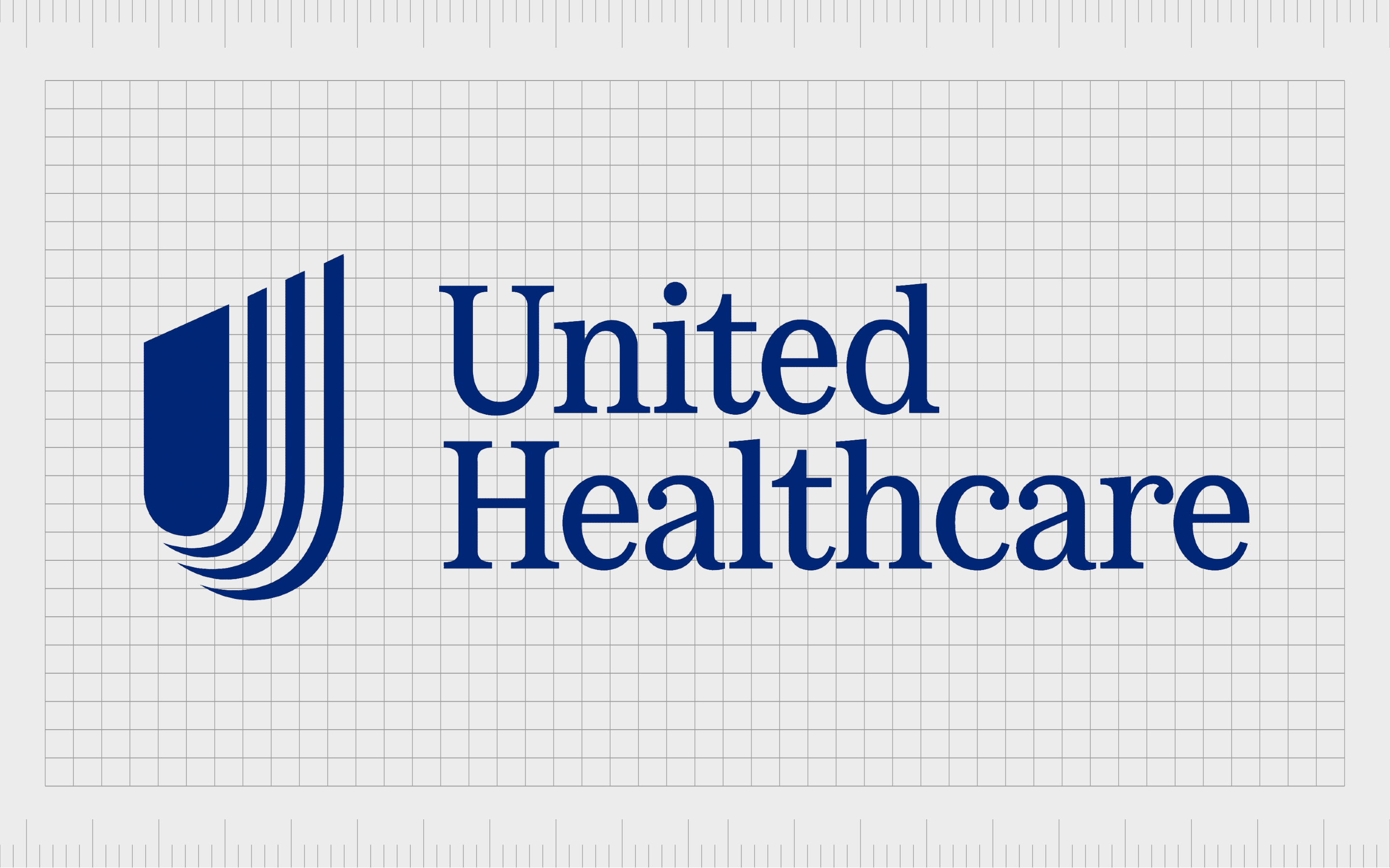
UnitedHealth
The UnitedHealth Group is an American-managed healthcare and insurance company and the world’s seventh-largest brand by revenue. UnitedHealth’s phenomenal yet simple name makes us think of compassion, community, and care.
The straightforward but meaningful title is enhanced by UnitedHealth’s logo, a simple wordmark in the popular dark blue shade. The letters are all in uppercase to depict strength and stability, and they’re in a sans-serif font to maintain a modern vibe.
Car insurance company logos
There are many great car insurance company logos to explore if you’re involved in the automotive industry. Most of the time, these logos are designed specifically to convey ideas of movement, reliability, and strength.
Auto insurance logos can come in various designs, depending on the nature of the brand.
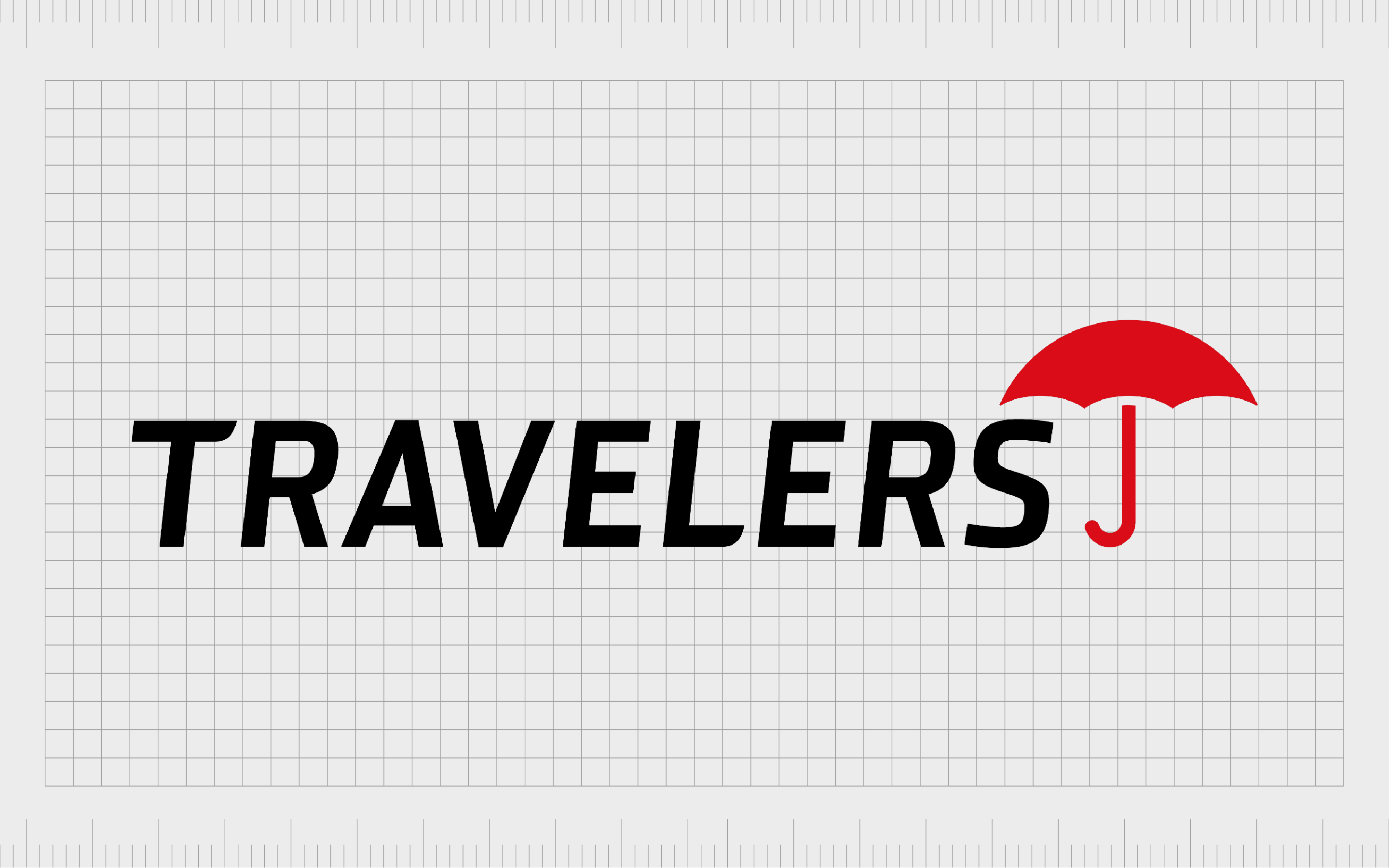
Travelers
The Travelers Insurance company is an American brand that provides property and car insurance. The organization first launched in 1853 with the name “St Paul Fire and Marine.” However, it eventually changed its name to “Travelers.”
The name “Travelers” makes us think of forward motion and exploration. The Travelers logo, depicted in all uppercase letters conveys courage and strength. The red umbrella is a symbol of protection, designed to make the brand appear more credible.
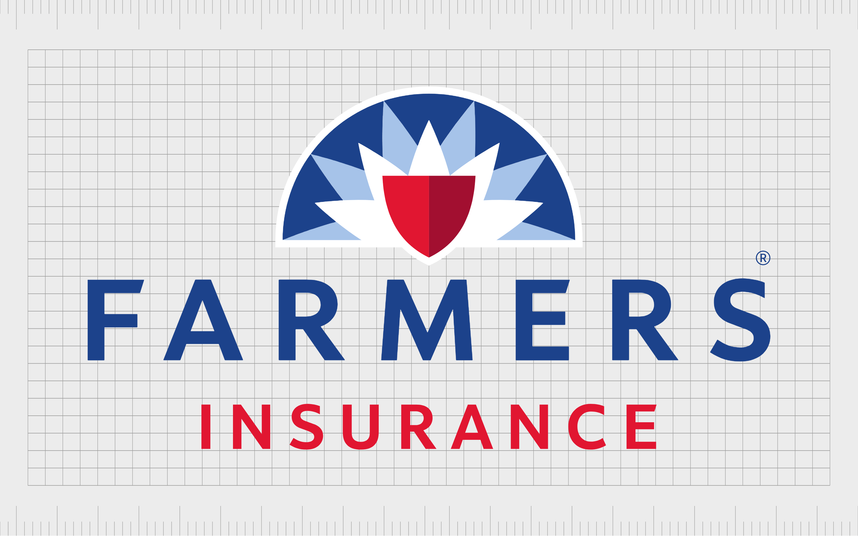
Farmers Insurance
Like many auto insurance companies, the Farmers insurance brand offers a wide range of policies for various kinds of protection. The name “Farmers Insurance” makes us think of the community and everyday people.
The Farmers Insurance logo is a fantastic choice for the brand. It combines the colors blue and red to show passion and reliability. The starburst design in the image’s background conveys energy and movement, while the shield makes us think of strength, courage, and protection.
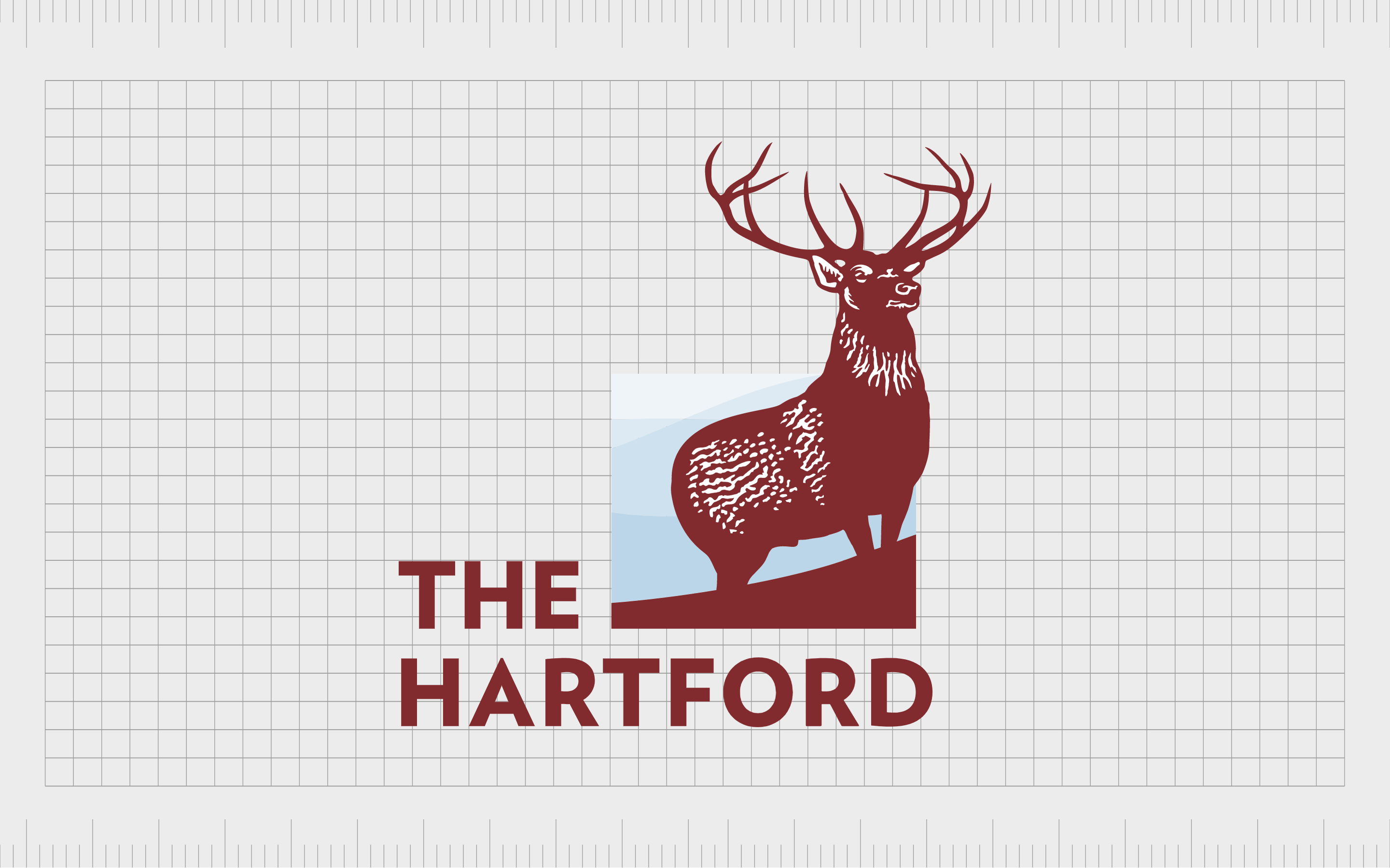
The Hartford
Launched in 1810, the Hartford Financial Services group, known as “The Hartford,” is an insurance and investment company. The brand offers various types of insurance, including support for automotive owners.
The Hartford brand is named after its headquarters in Hartford. The logo features a male elk, which was once referred to as a “Hart.” This gives the company a sense of heritage and history. The company chose its image to show respect for nature.
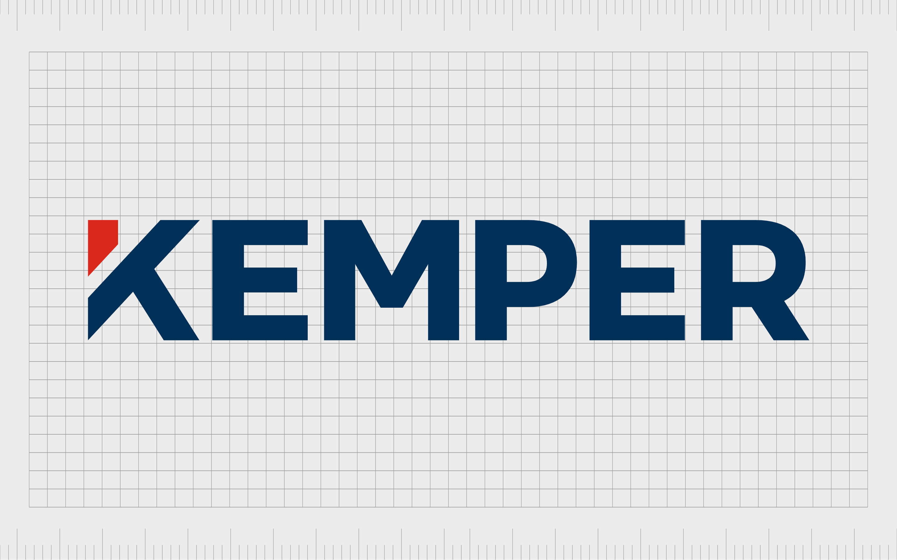
Kemper
The Kemper Insurance Company is an American brand with over $15 billion in assets. The organization offers insurance to individuals, businesses, and families. Kemper offers insurance for property, health, and automotive vehicles.
The word “Kemper” means someone who strives for superiority, or “champion.” The Kemper logo is a simple but eye-catching wordmark, written in the shades of red and blue. It features a geometric-style “K” which helps the brand to appear modern and compelling.

Amica
Amica is an interesting insurance company, offering home, life, and auto coverage. Formed in 1907, the brand was originally named the Automobile Mutual Insurance company of America. This name was then shortened to just “Amica.”
The Amica logo is quite different from many other insurance company logos we’ve looked at. It features a friendly script-style font and green coloring. This connects the brand to concepts like wealth, luxury, and growth.
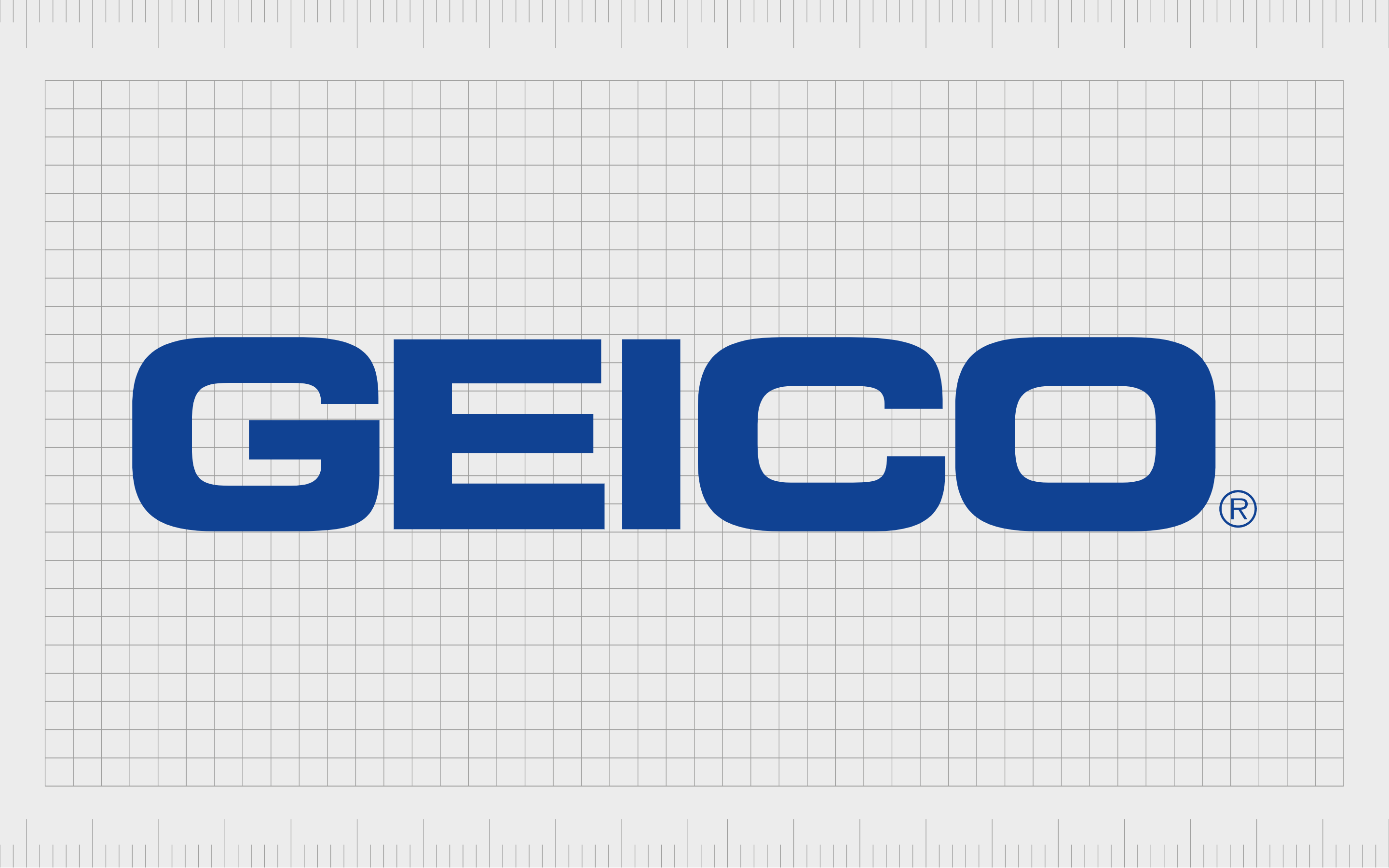
GEICO
GEICO is a private American auto insurance company, and one of the largest insurance brands in the United States. The brand is owned by Berkshire Hathaway, and offers coverage for more than 24 million motor vehicles as of 2017.
GEICO’s name stands for “Government Employees Insurance Company.” However, it reminds many people of the word “Gecko” which may be why the brand chose this creature as its mascot. The GEICO logo today is a robust blue wordmark, written in bold capital letters to symbolize strength.
US insurance company logos
As you can see from the various insurance company logos and names mentioned above, the emblems and titles for insurance brands can vary drastically from one sector to the next.
While there are many insurance brands all over the world, most people will be particularly familiar with insurance companies in the US, as they’re often extremely large.
Let’s take a look at some American insurance company logos and names.
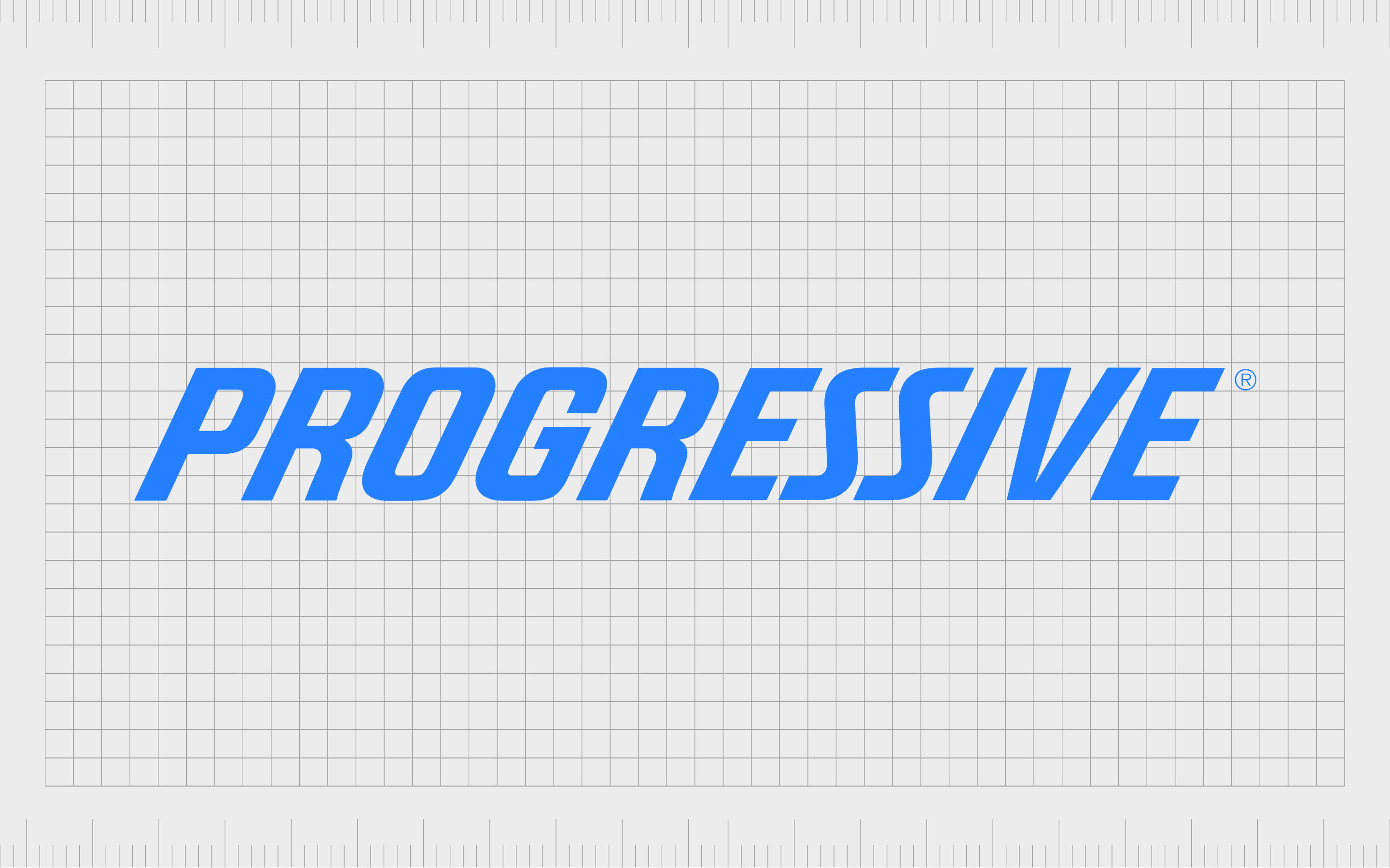
Progressive
Progressive is one of the biggest American insurance companies out there. In fact, it’s the number one commercial auto insurer in the US. Founded in 1937, Progressive chose its name to highlight its focus on innovation and growth. These values can also be seen in the organization’s logo.
The Progressive insurance company logo is a simple wordmark in bright blue, uppercase letters. The sans-serif wordmark tilts slightly to the right to highlight forward motion and progress.

USAA
Another well-known automotive insurance company from the United States, the USAA, or United Services Automobile Association, offers various insurance services. It also delivers financial products to people who served in the United States Armed Forces.
The USAA logo features the brand’s name under a stylized eagle shape, intended to demonstrate patriotism. The eagle depicts the brand as sophisticated and innovative, while the blue coloring highlights ideas of reliability and trustworthiness.
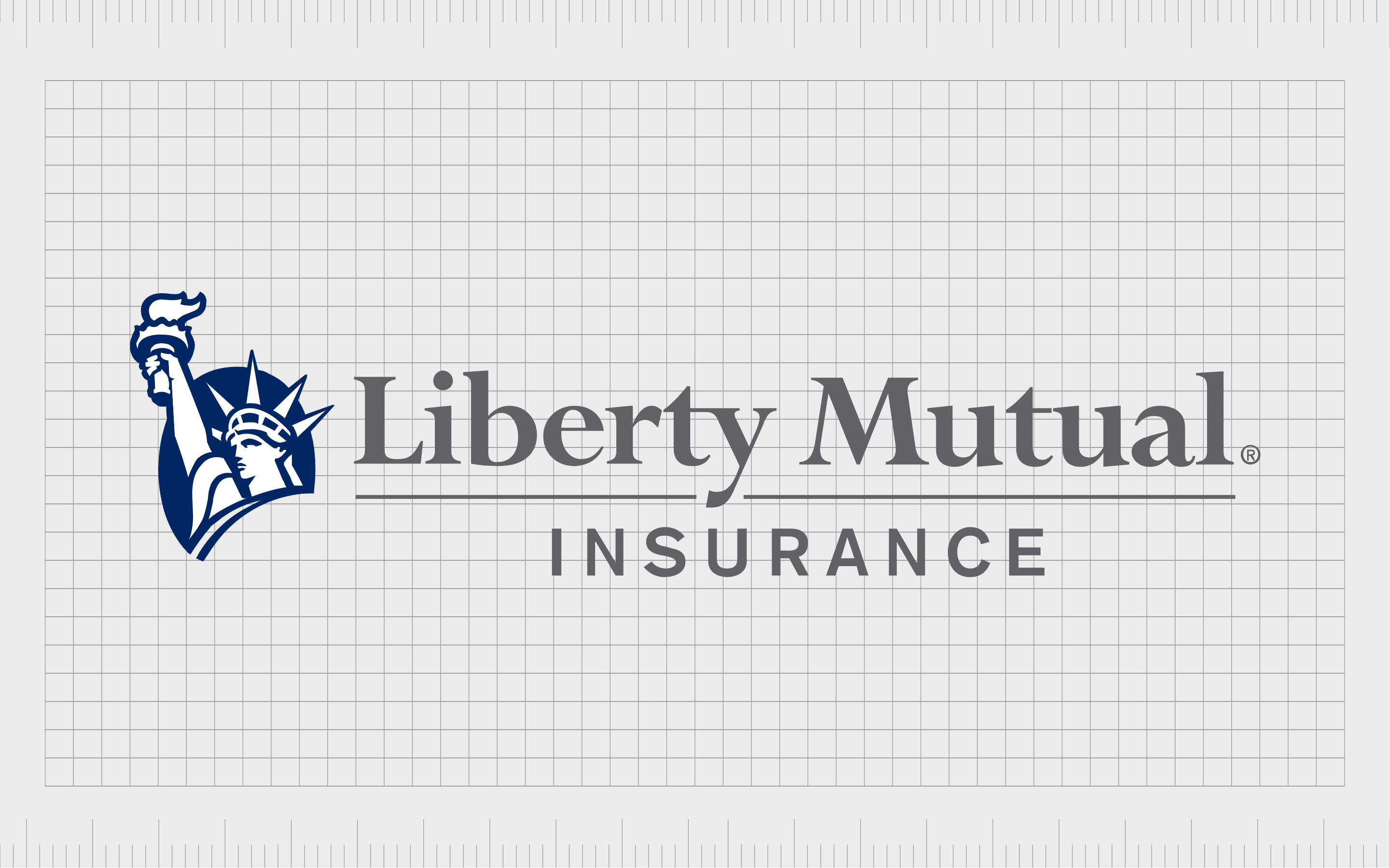
Liberty Mutual
Liberty Mutual, the sixth largest property and casualty insurance company in the US, was launched in 1912. Today, the business offers a range of insurance products and services, including automobile, homeowners, commercial, and general liability insurance.
The Liberty Insurance logo is a simple and effective combination mark, featuring the statue of liberty (to highlight the brand’s name), and a serif-style wordmark. The image, depicted in white, grey, and blue, conveys professionalism, expertise, and authority.

Allstate
Another of the best-known American insurance companies, Allstate was founded in 1931. This brand now offers various financial services and insurance products and frequently uses the “Are you in good hands” tagline for marketing.
The hands in the Allstate logo remind us of the company’s commitment to serving and supporting its customers. The image is intended to be reassuring and professional at the same time. The slight angle to the “A” in the wordmark also depicts progression and forward movement.

State Farm
Most people familiar with American insurance companies and their logos will be aware of State Farm. The brand is one of the largest in the sector, serving a range of customers nationwide. It’s also one of the biggest organizations in the world.
State Farm has an iconic bright-red logo, intended to demonstrate passion and strength. The bold logo features three red oval shapes, which were chosen to highlight the company’s focus on optimism, empathy, and community spirit.

Nationwide Insurance
The Nationwide Insurance Company shouldn’t be confused with the Nationwide financial services brand. The company operates throughout the US and has a strong presence in the industry as one of the world’s best companies to work for.
The Nationwide Insurance brand uses a large letter “N” above the word “Nationwide” in its logo. An image of a flying eagle is also included in the emblem to convey concepts of strength, vitality, and exploration.
UK insurance company logos
British insurance companies are another significant part of the landscape. The chances are, even if you aren’t located in the UK, you’ll be familiar with a few well-known British insurance logos.
Let’s look at some of the most popular insurance companies in the UK and their names and logos.
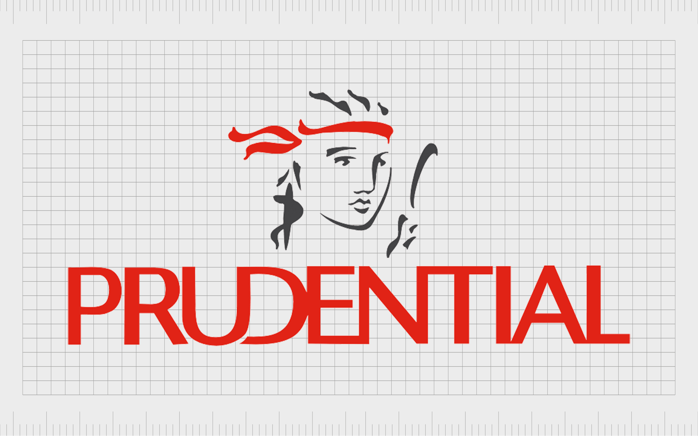
Prudential
Prudential is a British multinational insurance company offering various insurance services to consumers throughout the UK. The company launched in 1948 with the name “Prudential,” intended to convey care, forethought, and strategy.
When it comes to insurance companies in the UK, Prudential is one of the market leaders. It’s logo conveys passion and stability, through a red word mark, with a unique image of a person on top.

Admiral
Admiral is a British financial services company in the UK, best known for offering protection services, particularly in the automotive landscape. The brand also owns insurance brands like “Veygo.” The name “Admiral” makes us think of excellence and authority.
The Admiral Insurance Group logo is relatively simplistic but still eye-catching. It features the name of the organization written on a blue background. The white and blue colors convey reliability, trustworthiness, and credibility.
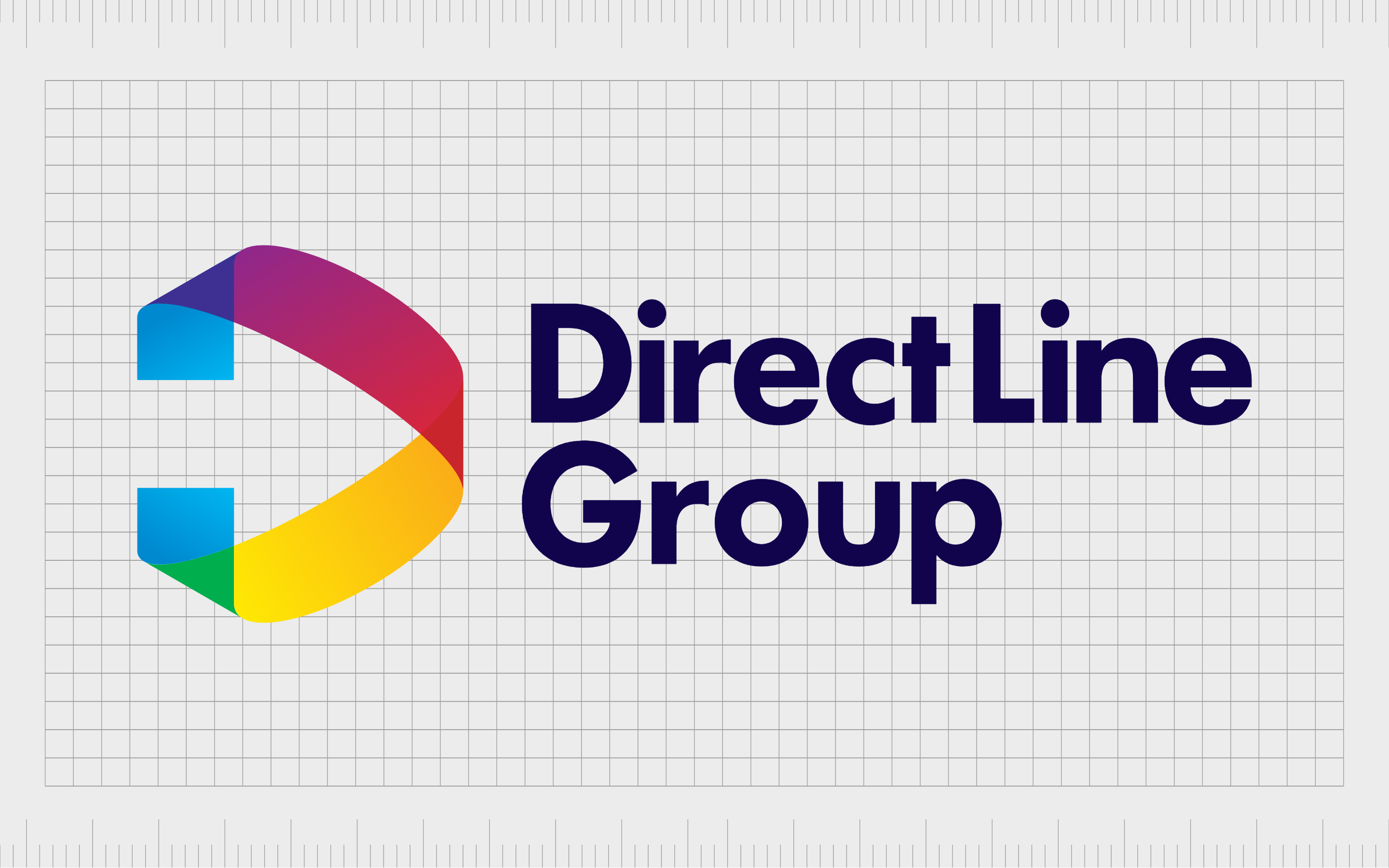
Direct Line
Launched in 2012, the Direct Line Group is a British insurance company, formed by the Royal Bank of Scotland Group. The company offers a range of different kinds of insurance, and was the first company in the UK to offer service specifically over the phone, hence the unique name.
The Direct Line logo includes the name of the company, written in a simple sans-serif font. Alongside the wordmark, we can see an attractive multi-colored version of a stylized “D.” The multiple colors remind us of concepts like joy, vitality, and versatility.
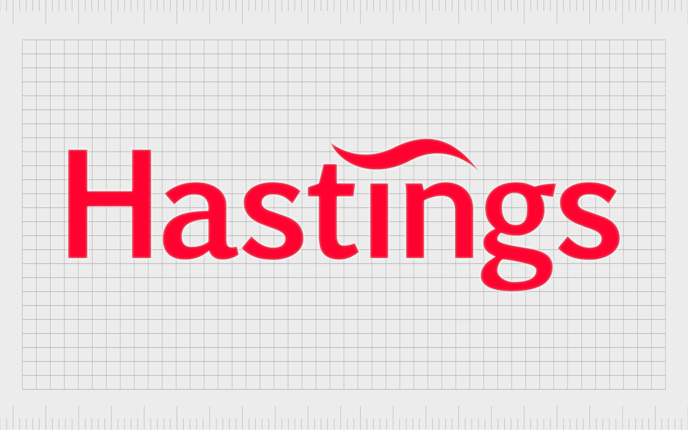
Hastings Direct
Otherwise known as Hastings Insurance Services, Hastings is a UK insurance company specializing in serving its customers over the phone, online, or via mobile app. The company offers a range of different types of coverage options for virtually everything you can think of.
Hastings uses an orange/red wordmark for its logo, with a curved line above the “I” to make us think of innovation and flexibility. The eye-catching logo captures the audience’s attention and sets the brand apart from its competitors.
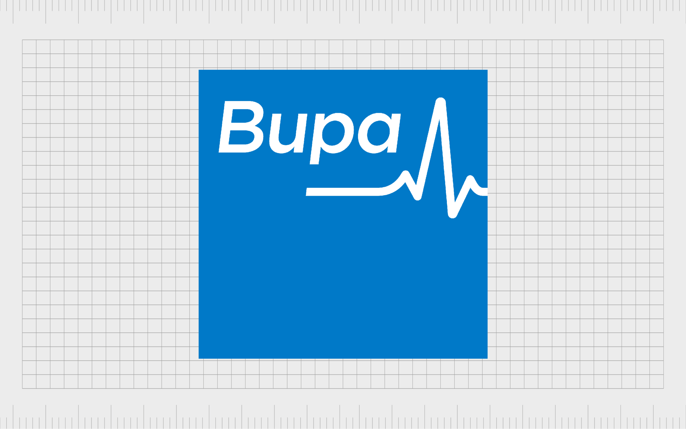
Bupa
Bupa, the British United Provident Association Company, is an international UK health insurance and healthcare company. The shorter moniker chosen by the company helps to make its title more memorable and fun.
The Bupa logo is a simple image, consisting of a blue square, with the name “Bupa” written in sans-serif font. The title tilts slightly to the right to show forward progression, and sits above a jagged line, similar to those seen on a heart rate monitor.
Learning from insurance logos and names
When it comes to choosing the best insurance logos and names, there is no shortage of great options out there. As you can see from the examples above, insurance brands have chosen various names and images to help them connect with their target audience.
In most cases, it’s best to stick with simple, eye-catching logos that help demonstrate the brand’s unique personality. Most insurance company logos are built around a focus on credibility, strength, stability, and compassion.
If you need help choosing the perfect insurance logos and names for your business, you can best reach out to a professional with the right experience. Contact Fabrik Brands today to learn more.
Fabrik: A branding agency for our times.
Now read these:
—How to start and grow an insurance agency
—Brilliant insurance marketing strategies
—The essential guide to insurance branding
—Your guide to naming an insurance company

Clarity starts with a conversation.
Thanks—we’ll get back to you shortly.
Whether you're navigating a rebrand, merger, or simply need a clearer identity—we’re here to help. No hard sell, just honest advice from people who know the sector.
Let’s start with a simple question…
Prefer to email? Drop us a line.
Fabrik’s been helping organisations rethink and reshape their brands for over 25 years. We’ve guided companies through mergers, rebrands and new launches. Whatever stage you’re at, we’ll meet you there.