


The Hulk symbol: A look at the Hulk logo history
How much do you know about Hulk logo history?
If you’re a fan of superhero movies or comic books, you’re guaranteed to have a basic knowledge of the Hulk. One of the most popular characters introduced into the superhero landscape, the Hulk is a character with phenomenal strength and size, capable of smashing through virtually any obstacle.
The Hulk has developed quite a visual identity over the years. While, like many superheroes, he may not have a conventional logo, he does have a relatively consistent image. The Hulk is often portrayed by the color green, the symbol of a fist, and sometimes the use of bold, blocky fonts.
If you’ve ever wondered how comic book and movie creators create brand identities for their characters, read on. Today, we will take a closer look at the Hulk logo throughout the years and how the superhero is depicted on the page and screen.
The Hulk logo: An introduction to the Hulk
The Hulk, otherwise known as the alter-ego of Dr. Robert Bruce Banner, is a superhero appearing in comics and movies produced by Marvel Comics. Created by artist Jack Kirby and writer Stan Lee, the character first appeared in a debut issue of a comic named “The Incredible Hulk” in 1962.
In his comic book appearance, the character with dissociative identity disorder is presented as a green-skinned, muscular humanoid with almost limitless strength. The Hulk seems similar in style to the classic character of Jekyll and Hyde. His two egos are exact opposites.
While one is small and brainy, the other is muscular and huge, though not particularly bright.
Bruce Banner became the Hulk after being exposed to gamma rays when saving a man from the detonation of an experimental bomb. Banner is transformed into the Hulk whenever he’s subjected to emotional stress.
The transformation frequently leads to destructive rampages. The Hulk has also been represented with numerous alter-egos, often depicted in different colors.
Why did the Hulk turn grey?
Initially, Stan Lee wanted the Hulk to be grey. However, due to ink issues in the printing world, the color turned grey. This was explained by saying the grey Hulk was actually the original Hulk, which appeared when Banner was first hit by the Gamma bomb.
However, following Banner’s repeated use of gamma radiation projectors, the green Hulk emerged. The grey Hulk also appears from time to time in the comic book series as an alternative personality.
Hulk logo history: The Marvel Hulk logo through the years
To take a closer look at the Hulk logo history, we need to first examine some of the wordmarks introduced with the “Incredible Hulk” in the comic book landscape.
1962
The first iteration of the “The Incredible Hulk” logo appeared in 1962. It featured none of the green elements we associated with the character today. However, the blocky font choice is relatively consistent throughout the hero’s history.
The typography chosen here is intended to look like bricks to represent the character’s ability to smash through solid walls.
2000
In the year 2000, a new version of the Hulk typeface was introduced, featuring green coloring. The letters in this piece look a lot rougher and more textured. There are no brick components, but the glyphs still appear to be bold and blocky. The “The Incredible” section appears handwritten.
2011
The logo introduced in 2011 for the comic book series is similar in a lot of ways to the designs we associate the Hulk with today. The image includes a bright-green font, written in bold, blocky glyphs, all in upper case. There’s a gradient in use here to make the design look as though it’s shining.
Other Hulk logos
Throughout the years, various versions of the “Hulk” logo were introduced in the comic book landscape, which didn’t include the “The Incredible” aspect. These often followed a similar style to the initial “Incredible Hulk” logo, with various brick-like fonts and blocky glyphs.
Various color palettes were used here, including red, grey, and green.
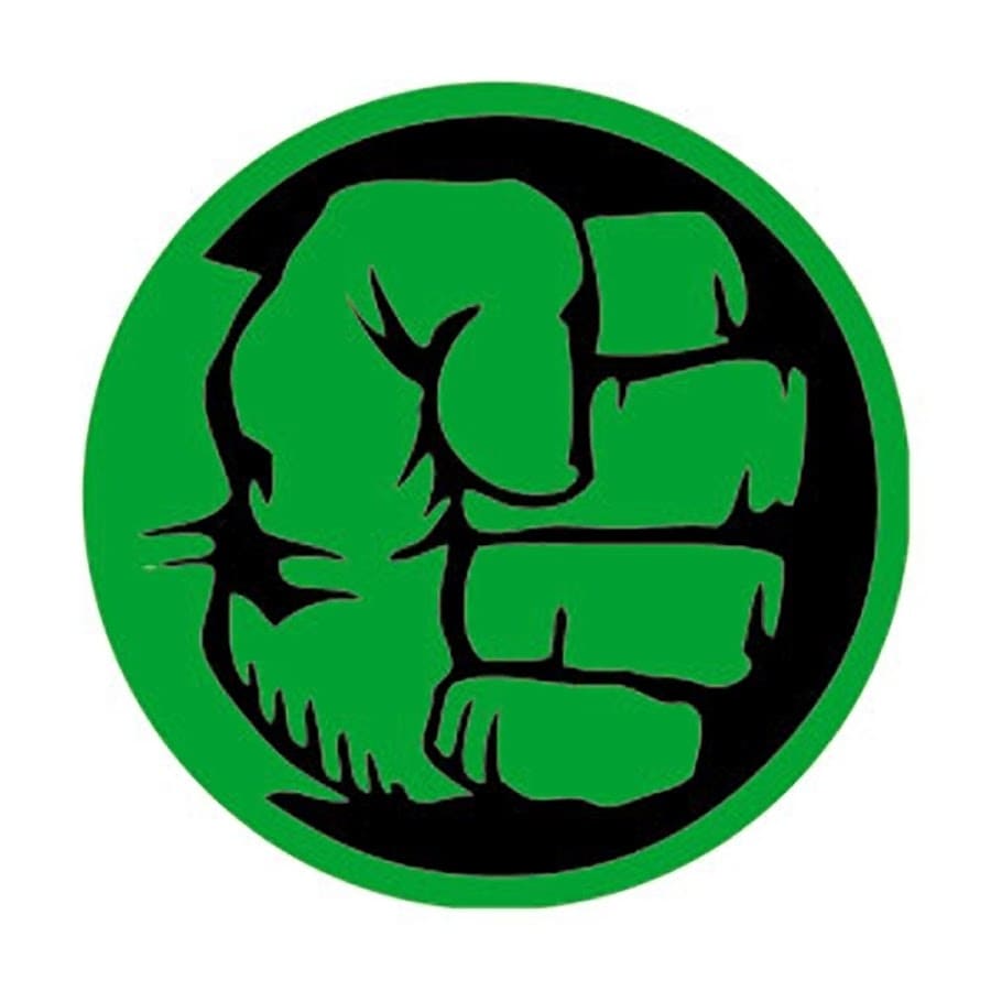
What is the Hulk’s symbol: The Hulk smash logo
Outside of the comic book and cinematic landscapes, the Hulk has also adopted another symbol. The Hulk symbol commonly associated with the character is a simple image of a fist made to look like the hand of the iconic character.
The emblem sometimes appears on its own and can also be combined with a wordmark, similar to the style of the fonts we saw above.
The fist symbol, also known as the “Hulk Smash logo,” is a cell-shaded design that appears extremely modern and simplistic. The image includes the fist of the Hulk inside of a black circle in most cases. However, there are different variations of this image.
In some cases, the fist is depicted in black on a green background. There have also been monochrome versions of the piece introduced throughout the years.
The Incredible Hulk logo: Movie symbols
There have been a few different variations of the Hulk logo introduced in the cinematic universe. While the most recognized version generally just includes the word “Hulk” in green, metallic font, newer variations have been produced by Marvel Studios, which include no green.
The first logo produced for the screen is based heavily on the more recent “Incredible Hulk” logos introduced in the comic book landscape. It features a green gradient font with a black outline, which makes the glyphs look a little like metal.
The Incredible Hulk logo, introduced in 2008, is a little simpler in style. It doesn’t feature any of the green, but the font style is very similar. The large, squared sans-serif font reminds us of the sheer size and strength of the titular character.
In this version, the phrase “The Incredible” is overlaid on top of the name of the hero in black font.
The Hulk symbol: Colors and fonts
While there have been many different variations of the Hulk logo on the page and screen over the years, there are some consistent elements present in the character’s brand identity.
From a typography perspective, the Hulk is constantly associated with large, bold, and blocky fonts. The glyphs are often designed to look like stronger materials, such as bricks or metal. They can also have a 3D element to them in most cases, which helps them to stand out from the screen or page.
Additionally, the Hulk is commonly associated with the color green.
However, this shade hasn’t appeared in all of the title cards and movie images used for the design. The use of grey in more recent versions of the Hulk logo could be a reference to the initial desire to make the Hulk a grey character.
If you’d like to take a closer look at the Hulk logo, you can find some useful resources here:
What color is the Hulk logo?
As you can see from our overview of the Hulk logo history above, there have been numerous colors associated with the Hulk over the years, including grey, yellow, and red.
However, the most common color associated with the Hulk is green, thanks to the color of his skin. In the Hulk symbol and in some of the wordmarks created for the hero, a bright green shade is used.
The Hulk logo colors can vary slightly, but they almost consistently include some colors of green and elements of black.
What font does the Hulk logo use?
Just as the Hulk logo color choices have varied over the years, there have been many different typography options too. Most Hulk logo font choices are wide, bold, and blocky, with no serifs. They’re designed to appear bold and strong and may even be illustrated to look like bricks.
In most cases, the more recent Hulk logos are relatively simplistic wordmarks with a slight shine to the letters to make them look like metal.
Smashing through the Hulk logo
Looking at the Hulk logo history, we can see how designers and creators can use unique emblems and fonts to depict important information about a character. The fonts used for the Hulk title cards and comic book covers are consistently bold and blocky to represent the size and strength of the hero.
The Hulk symbol, also known as the Hulk smash logo, refers to the character’s incredible strength and fighting abilities.
Fabrik: A branding agency for our times.

Clarity starts with a conversation.
Thanks—we’ll get back to you shortly.
Whether you're navigating a rebrand, merger, or simply need a clearer identity—we’re here to help. No hard sell, just honest advice from people who know the sector.
Let’s start with a simple question…
Prefer to email? Drop us a line.
Fabrik’s been helping organisations rethink and reshape their brands for over 25 years. We’ve guided companies through mergers, rebrands and new launches. Whatever stage you’re at, we’ll meet you there.