


Annual review design: Your guide to the success snapshot

When it comes to creating visual assets for a company, most business leaders spend so much time concentrating on marketing campaigns and branding programmes that they forget one crucial component: annual review design.
Your annual review is a vital aspect of your brand’s story, created to present crucial information to key stakeholders, investors, and partners at the end of each year. A well-planned annual review helps your company’s message to shine through in the form of financial progress and mission accomplishments. Yet countless brands continue to underestimate the power of the review process.
As dedicated branding and marketing experts, we know first-hand that design is crucial to making a lasting impression. Whether you’re demonstrating data to your non-profit sponsors, or convincing investors that they’ve made the right choice by engaging with your business, you need the right combination of functionality and style.
The good news is that coming up with engaging annual review design ideas doesn’t have to be an intimidating process. Regardless of how dry your yearly information seems, or how little you know about the basics of graphic design, all you need is an annual review design agency and the right strategy for success.
Welcome to your exclusive guide to annual review design inspiration.
What is annual review design?
Before we start looking at annual review design examples and strategies, let’s begin by exploring what your yearly review needs to accomplish.
On the surface, annual review design is a process that allows you to organise complex financial information and achievements into an easy-to-follow visual experience. Using everything from charts to infographics, companies can display not only the most important numbers for their brand in the year, but also the progress that they’ve made towards their mission or goals.
Ultimately, annual review design is the perfect example of how sometimes, it’s not what you say that counts, but how you say it.
The best annual review design examples bring unique aspects of the brand’s identity into the documentation, through things like carefully-chosen colour schemes and intuitive formatting. However, there are also some essential elements that go into almost every annual review, including:
-
Copywriting: The inspiring words and insights that give context to your accomplishments over the last 12 months.
-
Infographics: Your opportunity to convey complex information in a simple and easy-to-follow design.
-
Charts: Snapshots of information displayed in a single image.
-
Interviews and presentations: Additional information provided by business leaders and executives.
Ultimately, great annual review design isn’t just about choosing the right graphics; it’s about bringing a variety of elements together for a more effective report. With the right annual review design ideas, you can give greater depth to your integrated communications strategy, highlighting the parts of your brand story that make you truly stand out.
Think of your annual review as a way to simultaneously sell the benefits of your company and reinforce the characteristics of your brand. For investors, this document provides more than just a list of your latest financial accomplishments. People who put money into your brand want to assess your growth rate, the progress you’re making in your brand mission, and the potential of your management team.
According to studies by FutureValue, providing your community with this information is valuable, as the quality of a company’s annual review correlates directly with the performance of its share price. It’s not surprising when you consider the impact these reports have. Good narrative helps investors to see the potential your business has for success.

Annual review design inspiration: Your checklist for 2019
One of the biggest mistakes that modern companies make is ignoring the search for annual review design inspiration until the last minute. As daunting as the annual review can be at first, the truth is that it’s a flagship document for your brand and not something you can rush. Annual review designers often start putting concepts together for brands months before their report is due.
The more prepared you are, the less likely it is that you’ll see this graphic design experience as a digital drag. There are plenty of ways that you can not only ensure that your annual review design ideas are engaging, but also that they’re fun and exciting too!
To give you plenty of time to prepare this year, we’ve put together this checklist for annual review design inspiration.
1. Plan ahead to collect compelling quotes
The best annual review design gives you a fantastic format through which you can sum up your year and highlight critical accomplishments made by your business. To make sure that your memorable moments aren’t lost on your audience, make sure that you maintain a theme throughout your document that’s reinforced by the right collection of graphics, images, and quotes.
Since collecting brand photography, data and quotes from executives and groups throughout your enterprise can be tough; it’s a good idea to tackle the process over time. When you start writing content and building a folder of resources for your annual review from day one, you’re more likely to end up with a compelling piece of material.
2. Find your style
As your annual review designers will tell you, there’s no “one-style-fits-all” approach to the perfect report – no matter what you might think. Many organisations create their reviews using formal language and dry formatting because they think that’s what’s expected of them. However, the truth is that an annual review is a great time to let your personality shine through.
Investors and shareholders are people, just like your customers, and they want to have fun when they’re reading your report. Using the same tone of voice that you’d use in your other content helps to prevent your reviews from being boring or worse – full of industry jargon.
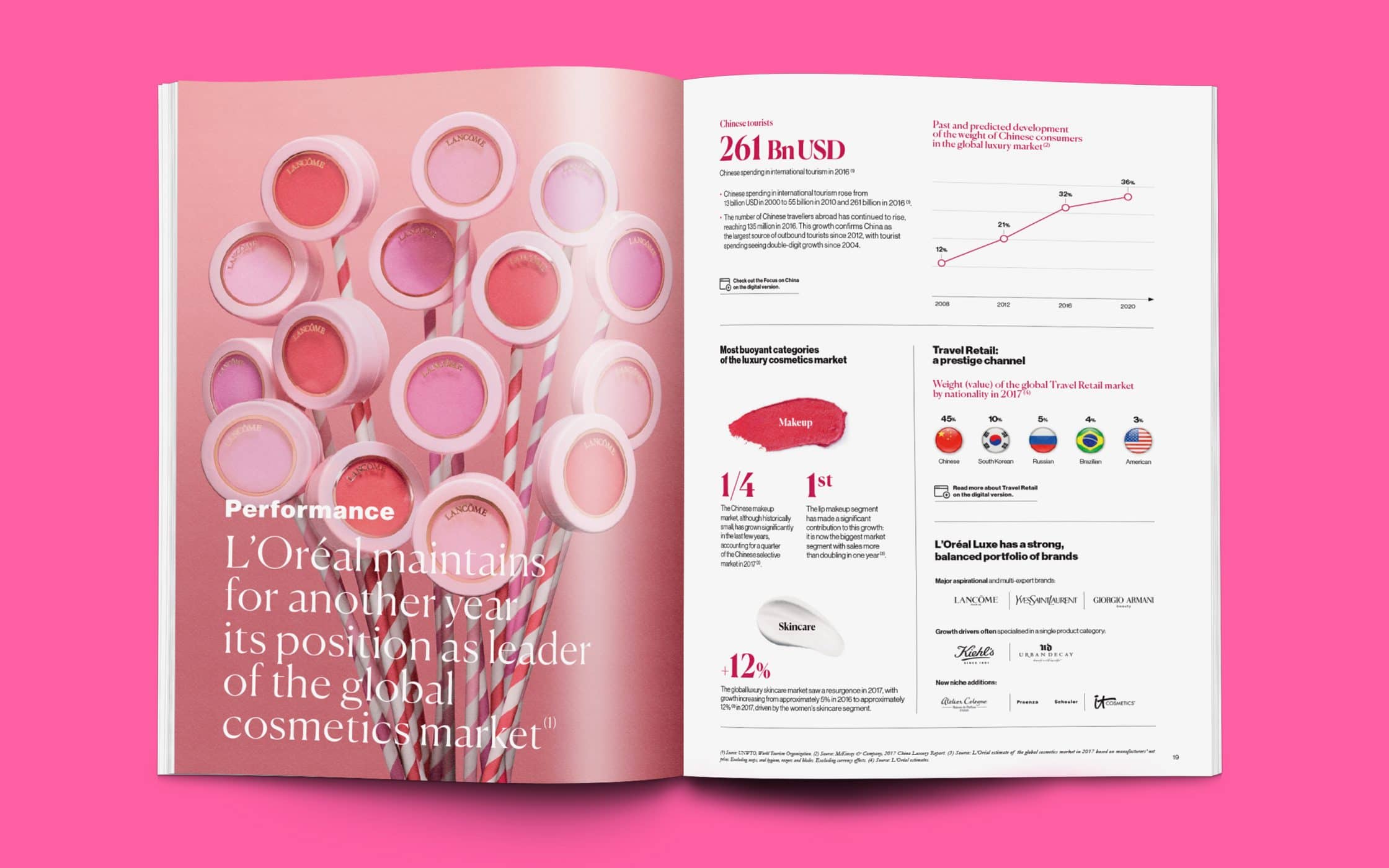
Remember, to get your style right; you’ll need a clear idea of who you’re writing for. Don’t try to please too many audiences when you’re selecting the perfect approach to your annual review design, as this can result in you connecting with nobody. For most companies, the primary audience in a yearly report will be your investors. However, other audiences like suppliers and customers are essential too. Check out L’Oreal’s annual review – it’s brimming with evidence that you’re dealing with a leader in the beauty industry.
3. Bring your data to life with design
The average annual review design will often include a lot of quantitative data that can be highlighted and showcased in millions of different ways. However, many companies forget to focus on visual impact when they’re creating shareholder documents.
If you want to inspire your audience and build stronger relationships with each reader, then make sure that they come away from your report feeling engaged and informed. Data visualisations presented in the form of graphs and charts ensure that your numbers appear front-and-center most effectively. If you’re not sure which design elements will work best for your brand, then you can always speak to your annual review design agency for some extra inspiration.
Ideally, you will aim to choose a design strategy that defines and reinforces your brand image. For instance, it makes sense for a modern digital design company to use an interactive online report that’s packed full of responsive graphics. On the other hand, a traditional bank might go for a more in-depth and formal report style.
4. Embrace different mediums
Whoever said that there had to be a single channel for the annual review design? A lot of companies assume that a print-out report is the standard option, there’s nothing to say that you must stop there. As annual review design ideas become more complex, brands of all shapes and sizes are beginning to embrace the review to build brand awareness and refine their online presence. When you distribute your report in digital format, you can even drive additional website traffic.
While there’s always the option to print off physical brochures for your offline shareholders and investors, don’t underestimate the power of creating an online version of your annual review too. When your report is available online, you can link to it from case studies, or include it with clickable CTAs to show potential new investors what they can expect to see when they get involved with your brand. It’s a great way to start inspiring additional support without formal meetings with new shareholders.

Look at GE’s annual report for instance. It’s more like a micro-site than a standard review. The website covers everything from a letter from the CEO to available downloads for those who want additional information. You can even choose which part of the business you want to learn more about.
Annual review design examples: A reporting revelation
Now that you know what yearly review design means to your business, and how you can ensure you include the right elements in your report, it’s time to get some inspiration. Every year, more forward-thinking companies break the mould with their annual review design ideas, introducing new and exciting ways for brands to display otherwise under-whelming information.
Since the team at Fabrik are passionate fans of all-things design, we’ve spent some time putting together a collection of some of our favourite annual review design examples from the last couple of years, to help motivate you.
1. AB InBev
The first stop on our list of annual review design examples comes from AB InBev. The reason that we like this report so much is that its designed to be highly interactive and engaging. Rather than just giving you a booklet full of information, the company provides an easy-to-navigate digital micro-site where you can seek out the data that’s relevant to you.

You can simply browse through the online brochure at your leisure, or you can choose to jump straight to the most exciting or relevant parts of the report. What’s more, thanks to subtle animations, it feels as though you’re being guided from one page to the next, reducing the risk that you’ll get bored halfway through.
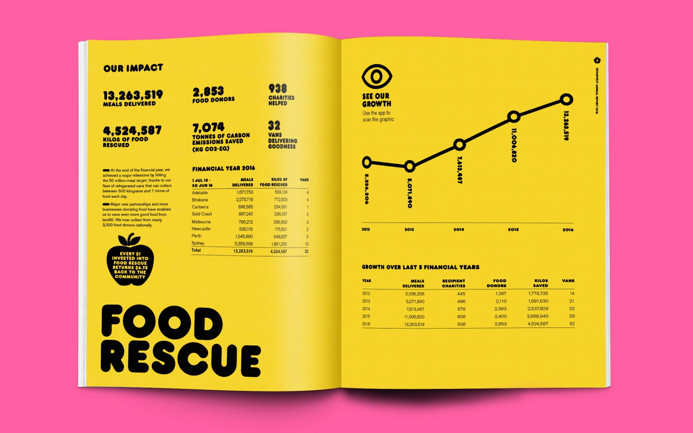
2. Charity: Water
Charity: Water blends appealing aesthetic design with simplicity in their annual review. As you browse through the downloadable PDF document, you get everything you need to make meaningful inferences about the business, including brand photography, quotes, and statistics.
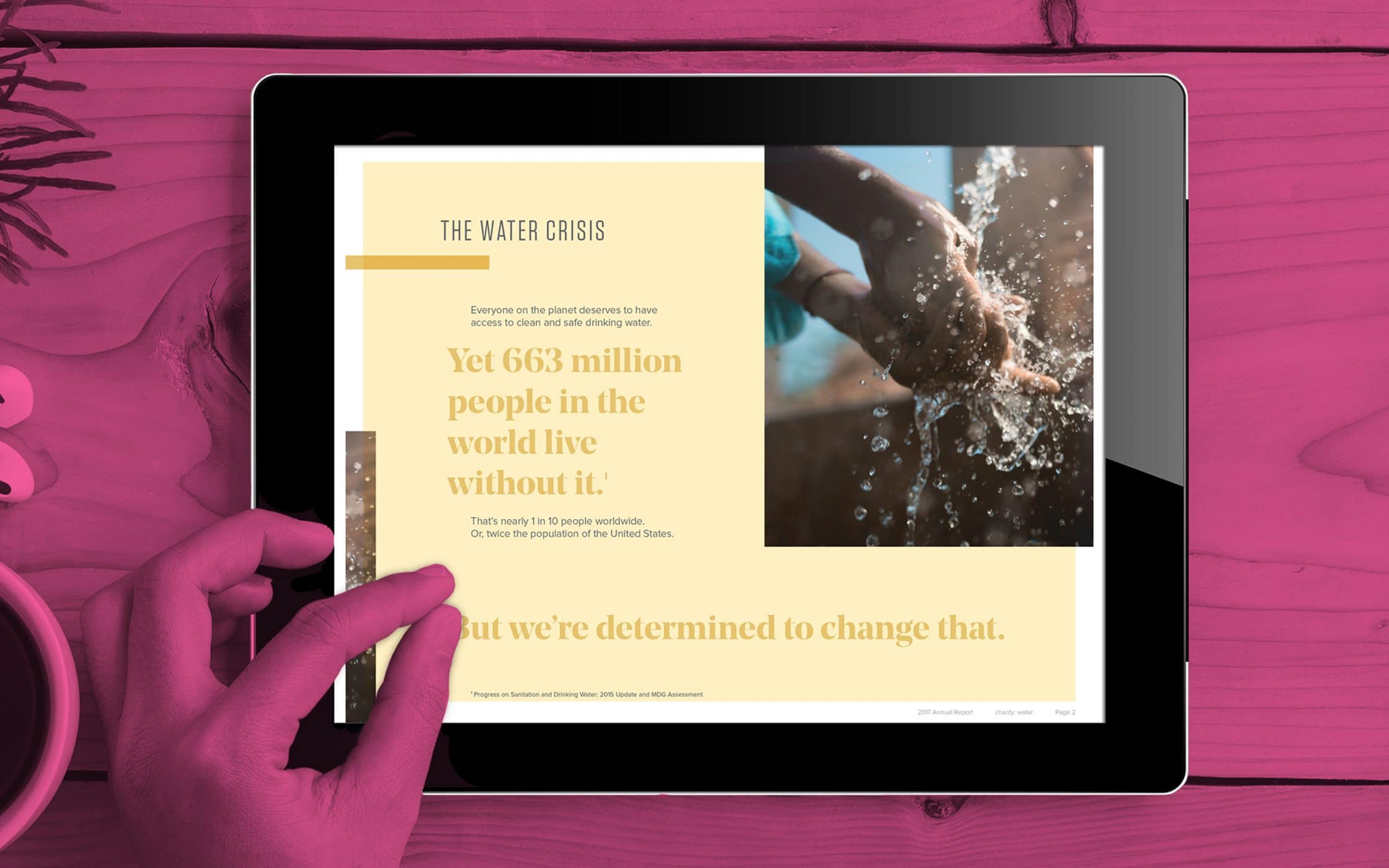
Crucially, to make sure that they connect with their investors and donors on a deeper level, Charity Water opens their report with an insight into the problem that they’ve been facing, and a reminder of what they’re there to accomplish. By reminding people of their brand mission, the non-profit ensures that shareholders go into the report with a clear vision of what’s at stake.
3. MailChimp
Sometimes, to inspire your people with your annual review design ideas, you need to break all the rules. MailChimp, one of the world’s favourite sources for email marketing management, certainly takes reporting to the next level with their yearly review. The “Year in Review” micro-site is a flashing, colour-changing and dynamic experience intended to catch investors off guard.
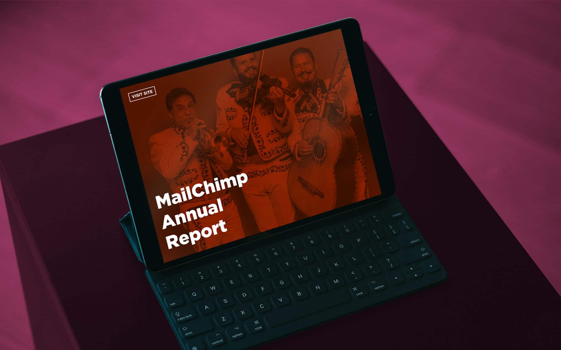
It’s easy to see the kind of business that you’re working with when you’re presented with an annual review that’s this packed with personality. Rather than just giving you a handful of graphs and figures, MailChimp also ensures that investors get the best combination of information by showcasing fun statistics from throughout the year.
4. DoSomething.Org
Another one of our annual review design examples that does something different from the traditional report, DoSomething.Org replaces the annual overview with Quarterly Dashboards. The company believes that the best way to keep investors engaged is to offer them regular updates of what’s going on in and around the business.

The design of the DoSomething.Org report is ideally suited to the personality and nature of the business, with plenty of bright colours, hashtags, and emojis to reach out to their millennial audience. Additionally, in the review, the company doesn’t just highlight financial statistics and earnings, they also tell readers about new hires and work anniversaries too!
5. Shopify
Finally, your annual review design ideas don’t have to be complicated to be effective. Shopify’s “Year in Review” report is an excellent example of this. The company uses an engaging design and a simple timeline format to highlight some of the biggest accomplishments made over the last 12 months.
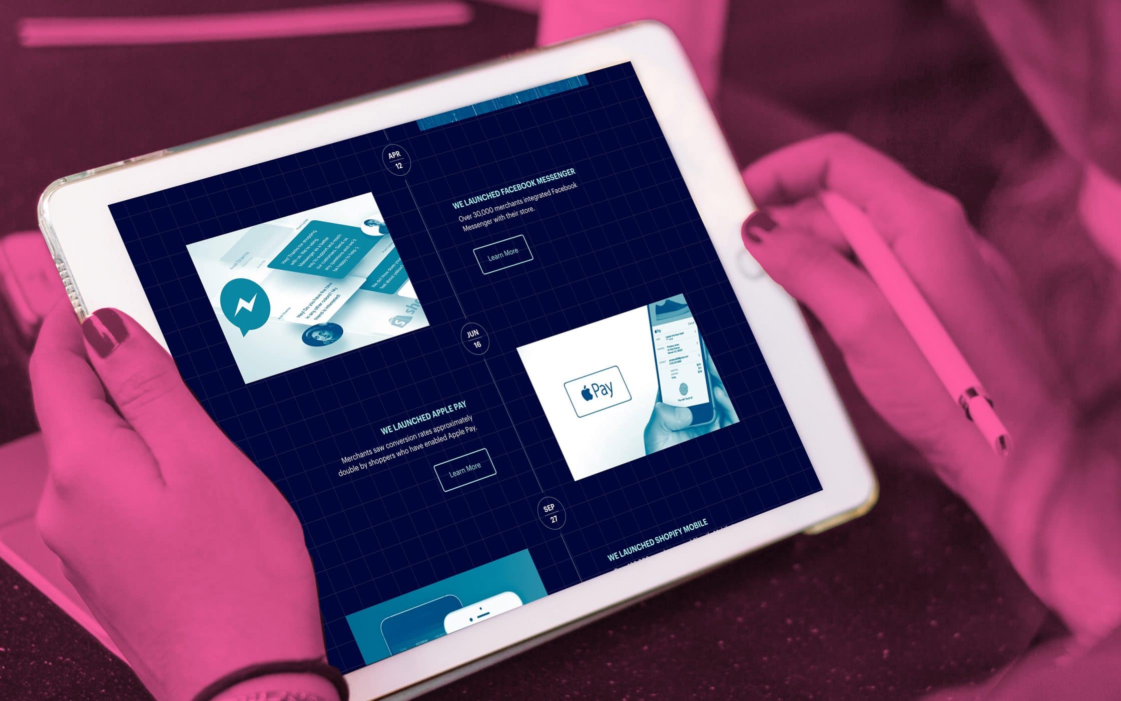
With their highlight-focused design, Shopify ensures that investors can get a quick overview of what the business has accomplished when they don’t have the time to sit down and read through a lengthy report. What’s more, when investors do see something that they want to find out more about, they can click on the “Learn More” button to go directly to a beautifully-designed page all about the event in question.
Annual review design ideas – Tips for terrific reports
Whether you’re a non-profit, a challenger brand, global entity or a startup company, annual review design should be a crucial consideration of your brand-building process. Ultimately, your reports are how you maintain accountability and transparency with everything from balance sheets to cash flow statements.
With the right annual review design ideas, you can tell your brand story to consumers and investors, giving greater depth to your identity, and inspiring people to support your organisation. So, how do you make sure that your annual review design stands out?
1. Focus on accomplishments over activities
When used correctly, an annual review design will clearly communicate the values of your brand, alongside the most exciting metrics and accomplishments you’ve achieved throughout the year. The critical thing to remember is that while it’s important to share an engaging narrative in your review, you don’t necessarily need to cover every detail of the last 12 months.
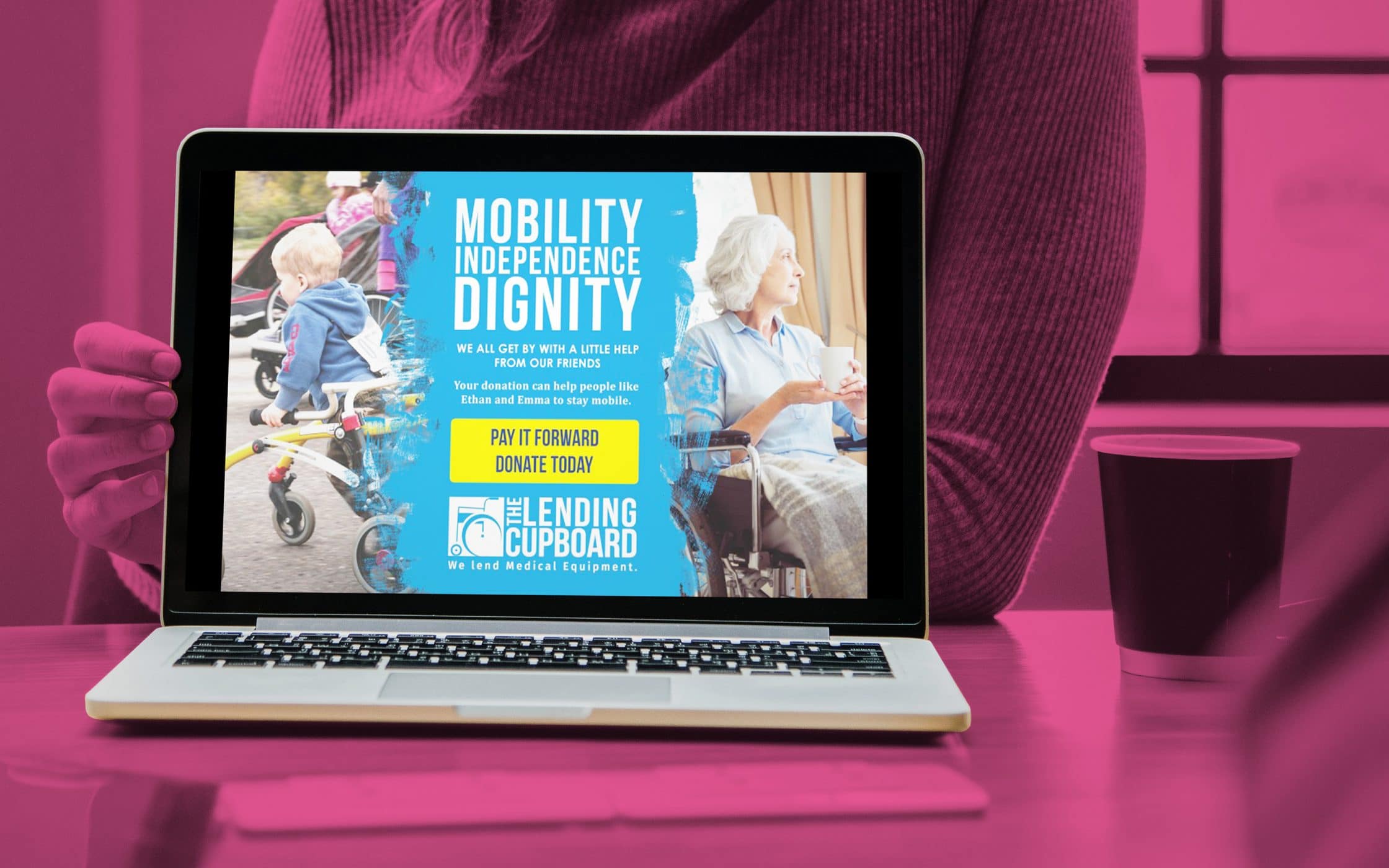
Focus on highlighting the stories that match up with the most significant achievements in your business. For instance, the Lending Cupboard focuses on providing equipment to people who need help maintaining their mobility.
To showcase the importance of their accomplishments over the last year, this company includes stories from clients in their annual review that demonstrate how important it is for these people to have access to the mobility solutions they need.
2. Create an emotional narrative
While numbers are an important part of your annual review design ideas, it’s crucial not to forget about compelling copy too. The emotional narrative within your review explains why your company is doing what it does and helps your investors to see how they’re making an essential difference to the world. Your story for your investors should explain why your organisation exists, what you’ve accomplished up to now, and what you hope to accomplish in the future.
With an emotional narrative, you need only sustain deeper connections with your target audience; you also have an easier time keeping the reader’s attention. With a beginning, middle and end to your story, you can guide your readers through your last 12 months in a more coherent way.
Remember, your investors are looking for transparency in your annual review design, so don’t be tempted to focus exclusively on the “good” things. If something hasn’t gone according to plan, explain why you didn’t achieve your goals this year, and how you’re going to fix this problem going forward – this upfront approach to help your shareholders to trust you.
3. Use your annual review to promote yourself
Finally, once you’ve worked with a team of annual review designers to create the ultimate report, there’s nothing to say that you have to share it exclusively with your investors and shareholders. If you’re willing to place your statements online, then you can splinter your content into various pieces of copy that you can use for promotional purposes.
For instance, you might gather a handful of essential quotes from this year’s annual review design and share them on social media, encouraging people to go to your website and check out more information about your company. Alternatively, you can send snippets of your annual review to press release companies, improving your brand and market reach with stories across a variety of media channels.
Splintering your report into a variety of shareable chunks means that it’s not just a way to engage your investors at the end of each year, it’s also an excellent opportunity to give extra credibility to your marketing campaigns in the months ahead. The quotes and statistics gathered in your annual review can provide depth to everything from your email marketing campaigns, to your content marketing solutions.
Time to book an annual review design agency?
Though finding the ultimate annual review design inspiration might seem complicated at first, the truth is that it’s becoming increasingly easy for companies to think outside of the box with their yearly reports. As brands of all shapes and sizes show us how far you can go with your document’s creativity, there’s no limit to what you might explore in the years ahead.
While annual review design is first and foremost a way to give your investors and shareholders a snapshot view of what your brand has accomplished over the last 12 months, it’s also another way to promote your brand and define your unique personality. When used properly, your annual review is an opportunity to inspire loyalty among followers and shareholders alike.
The easiest way to simplify your annual review design is to take some of the weight off your shoulders. Reaching out to an annual review design agency will allow you to experiment with the latest design trends and strategies, to create something that appeals to your shareholders, and gives you an extra source of credibility for your promotional tactics.
In an increasingly cluttered market full of companies attempting to differentiate themselves, your annual review design ideas can be just another way to stand out from the crowd. If you’re ready to see what your review can do for you, reach out to Fabrik today.
If you enjoyed this article, you might enjoy these too:
— How corporate wellbeing benefits your brand
— Responsive logos: Dynamic designs to impress

Clarity starts with a conversation.
Thanks—we’ll get back to you shortly.
Whether you're navigating a rebrand, merger, or simply need a clearer identity—we’re here to help. No hard sell, just honest advice from people who know the sector.
Let’s start with a simple question…
Prefer to email? Drop us a line.
Fabrik’s been helping organisations rethink and reshape their brands for over 25 years. We’ve guided companies through mergers, rebrands and new launches. Whatever stage you’re at, we’ll meet you there.