


In the age of digital, what does the future hold for annual report design?

One of the simplest, and most effective ways to build a strong outlook and positive reputation for your brand is through high-end annual report design. With an annual report, you can share information about your brand with the public, potential business partners, employees, and existing partners.
While you can say a lot about the benefits and values of your company through your advertising and marketing efforts, annual reports can sometimes be more inspiring, and appealing, because they’re based on real numbers that generate trust. Some publicly traded companies are also required to distribute annual reports, so that’s a great excuse to invest in designing a professional one.
The great thing about annual report design is that it’s your chance to not only reflect the numbers behind your company, but also your goals, accomplishments, and ethos too. The way that you present those crucial statistics in your annual report goes a long way towards defining your company, and your brand personality.
A great annual report is the perfect blend of stunning design, engaging content, and important information. It combines copywriting, imagery, high-end production, and photography into something that makes your business shine, year after year. Whether created as a physical print-out, or a digital representation of your business, it’s important not to overlook the annual report. Any annual report design agency will tell you it’s your flagship document, the one item not to scrimp on.
Unfortunately, as essential as annual report design can be when it comes to conveying valuable information to an audience, the message you’re conveying can easily be lost if it isn’t presented in the right format. Let’s face it – nobody enjoys reading technical manuals and scientific studies. If you want to keep people engaged, and inspired by your company, then you need to get creative.
Here, we’re going to talk you through the annual report design process, offer a little inspiration, and provide professionally-backed tips for how to do your report, the right way.
Let’s get started.
What is annual report design?
For most businesses, the beginning of the “financial” year, is a time to reflect on the past twelve months. Just as you might look back over the year behind you and make decisions about your future, companies consider the numbers behind their failures and successes, and make plans for growth.
Unfortunately, these plans are frequently boring, underfunded, and under-respected. Your annual report is your opportunity to get everyone excited about the development of your company – from shareholders, to employees and customers. That means that you need to pump some personality into the mix with a concept and design implementation that really speaks to the background of your brand.
Just because your annual report contains valuable corporate and financial information for your investors, doesn’t mean it’s nothing more than a book of numbers. An annual report is a vital communication tool for your business, that not only helps you to recap your previous financial year, but also sells your business to potential investors.
So, how can you use annual report design to benefit your brand?
Step 1: Make data accessible
Traditional annual report design involves printing a physical brochure and mailing it to stakeholders. While this is still a popular annual report design process, many companies are designing offline reports, as well as providing access to digital versions online.
The most important factor in deciding the format for your annual report, is figuring out the preferences of your stakeholders. Your delivery method for any material, marketing or otherwise, should be chosen according to what your audience wants. If your stakeholders spend equal time offline and online, offering both printed and online versions could make your report all-the-more accessible.
Step 2: Don’t just report
Okay, so it’s safe to assume that an annual report is meant for “reporting”, but that’s not all it’s about. While number crunching is important, all the numbers can start to look pretty dull after a while, and that’s where annual report design becomes so essential. A visually-appealing report highlights your achievements, while setting your company apart as something special.
Infographics, aesthetic elements, and images can all help to keep your readers engaged with your report content, and it also means that you introduce some personality into the mix. Remember, your report should be a combination of facts, design, and compelling content writing that helps to tell a story about the last year for your business.
Step 3: Show “behind the scenes” in your business
Your annual report is something that you can share with customers, employees, and stakeholders. The main characteristic that each of those audience members share, is that they’re crucial to your business. Stakeholders make investments into your company, so it’s important they know that you’re making positive progress. Employees invest their time and passion, so give them a sign that you appreciate their effort.
A well-designed annual report not only appeals to the leaders and decision-makers in your business, but also provides useful background information into what makes your company tick. This means that you don’t just build a deeper relationship with your shareholders, but you make your company more human and relatable to your customers too.
Step 4: Use design to define your brand
Finally, remember that your annual report design can be key to marketing to investors. In other words, you should consider using everything you create as a method of reinforcing your brand image. Begin by evaluating your brand mission, personality, and values. Once you’re ready, identify all the elements that help to tie these things together, and think about how you can display your personality in a visual way.
Some companies create their annual report design with a central theme in mind – just as they might when developing a new marketing campaign. Whatever you choose to do, it’s important to remember that your annual report, like any other piece of marketing material, helps to represent your brand. It should be a perfect example of what you want your company to stand for.
Defining the annual report design process
Okay, so you know what an annual report is, and why design is so crucial to getting your image just right. Now, all you need to do is figure out what the annual report design process involves.
Usually, if you want to get the most out of your annual report design, you should start thinking about your goals and expectations as early as possible. After all, while these documents are sometimes considered to be a “design drag”, they can be a lot more fun if you’re willing to plan and work alongside annual report designers.
Here are a few things that the annual report design process might include:
1. Choosing a format
Yes, there are more options for an annual report design than the standard 12-page booklet. However, your report can come in any format you choose – from a digital experience, to a print extravaganza. While a table of numbers can be boring, a design that’s rich with imagery and unique elements is far more likely to draw a reader in.

If you’re totally opposed to the idea of the traditional booklet, you can even look at something like “Flywheel’s” annual report, which involved creating a bunch of temporary tattoos that helped to highlight the things the company did over the year.
2. Telling your story
Once you’ve got your format in place, then you need to think about your story. If you want your annual report design to be life-changing, then you can’t simply print some numbers and graphs onto a page, you need to make people empathise with your journey over the last year.
Even if you hit a few financial snags recently, a good story will help your investors to see where you’ve learned and evolved from your mistakes. The story will also help the people who read through your report learn more about your company, and appreciate its human element.
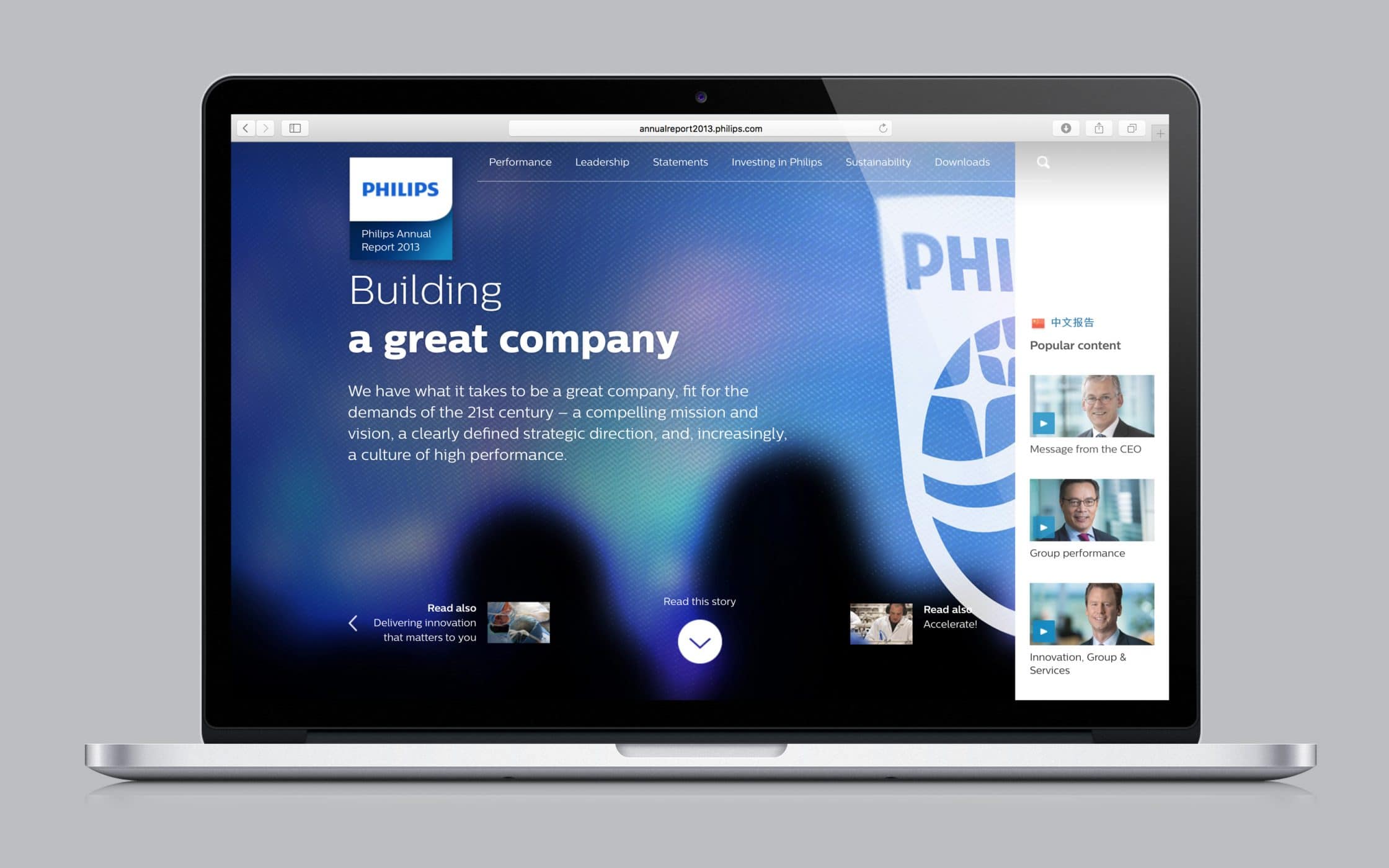
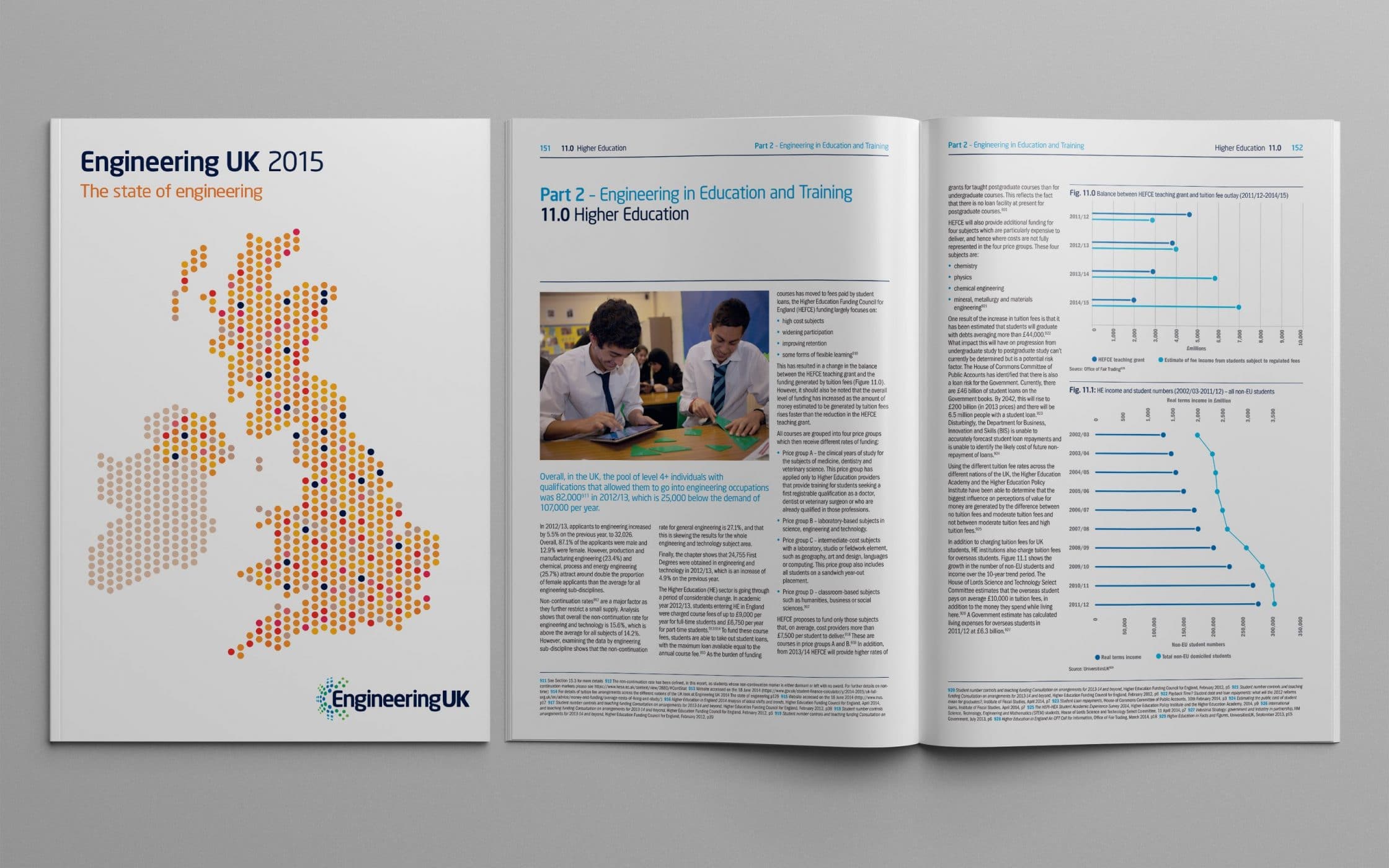
For instance, Phillips created an incredible annual report in 2013, that allowed readers to browse over the numbers for the year, while also delivering engaging information about the brand. The digital version of the report came with messages from CEOs and company heads, that offered insights straight from the leaders of the business.
3. Finding your visual appeal
It probably goes without saying that an annual report design with power needs to have a visual element that helps it to stand out from the crowd. When you’re discussing options with your annual report designer, you should think carefully about your brand personality, and how you can use imagery and visual experiences to convey something that might be difficult to communicate with words and numbers.
Graphs and charts can be a great way to display vital data without boring the socks off your readers, and infographics can be a fun way to add a visual element to content when you need to speak your mind.

Craft Victoria used their 2012 annual report design to show their love of texture and tactile materials. Throughout the booklet, you can find unique paper, translucent section break dividers, and more – all visual elements that add to the personality of the brand.
4. Choosing your typography
Font is font, right?
In the world of annual report design, typography can be one of your biggest assets, particularly when you don’t have a lot of images to work with. With bold typography, you can save a design project and make it instantly more appealing to your audience.
Think about how you might use fonts online for the purpose of website design. Bigger, bolder typefaces can draw the attention of your audience and create a focal point on your screen. The right typography also conveys things like power, confidence, formality, or friendliness.
Look at Amundi’s use of typography in their 2014 annual report design. A combination of bold lettering and contrasting colour helps to immediately capture attention and develop visual interest for the page.
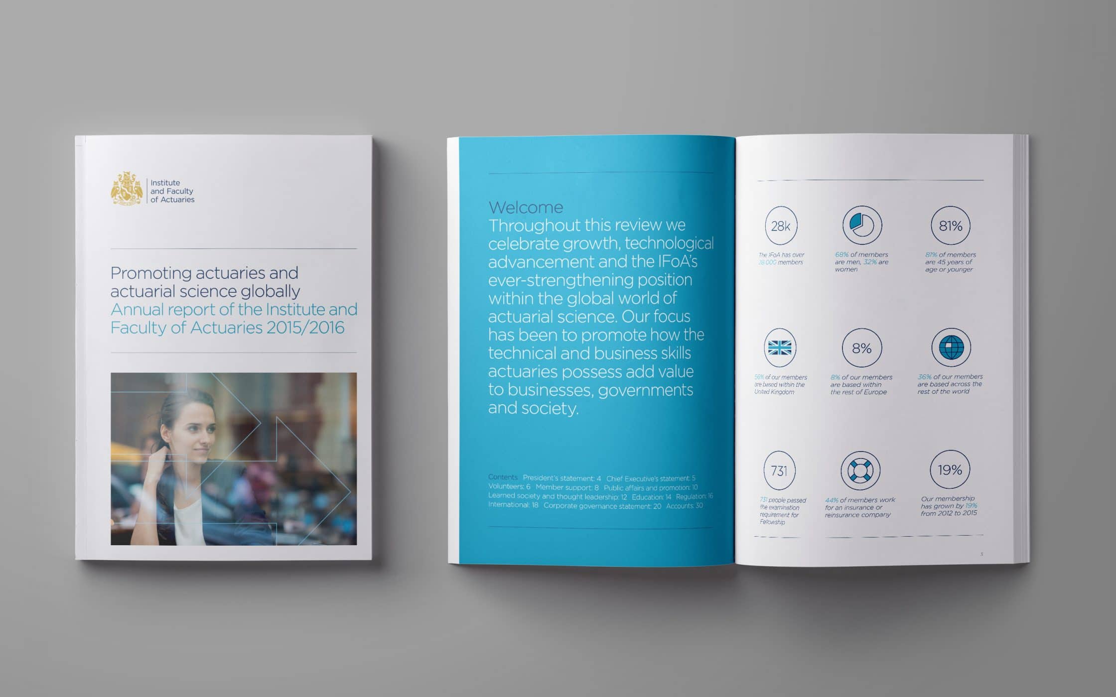
5. Decide how to break up information
One of the most important parts of the annual report design process, is figuring out how to present your information from the last year without overwhelming, or boring your reader. Every piece of information in your annual report should be presented in a way that is easy to read and understand. This complicated document should be broken down into chapters or informational chunks that naturally flow and fit together.
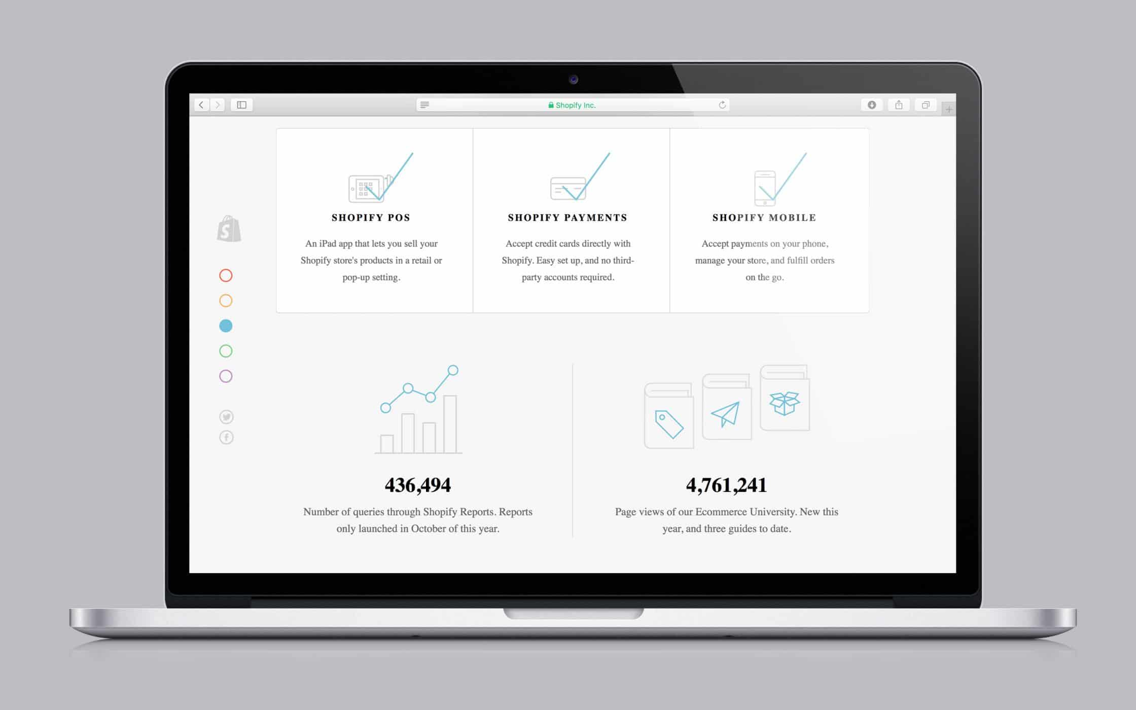
In the Shopify example above, the information outlined in the annual report is simple, clear, and easy-to-understand. The company doesn’t accost its audience with a torrent of information, but instead breaks different factors up into easy-to-digest chunks.
When it comes to annual report design, when you move through the pages in a booklet, or scroll through them online, the experience should be something that’s seamless and simple. You want your employees, shareholders, and customers to follow the information that you’re presenting without getting lost in pool of numbers and graphs.
6. Create your front cover
When you work with an annual report design agency, you might find that some annual report designers encourage you to give them ideas for an overarching theme, whereas other agencies will prefer to take the brief and come back to you with ideas for the conceptual direction. Whatever your preference, and the recommendation of your annual report design agency, the front cover is one of the most important first steps in creating a truly fantastic flagship document. Obviously, beyond whetting the readers appetite through the cover design, the first page will provide a deeper understanding of the information contained within the annual report, helping to create a comprehensive, and connected experience.
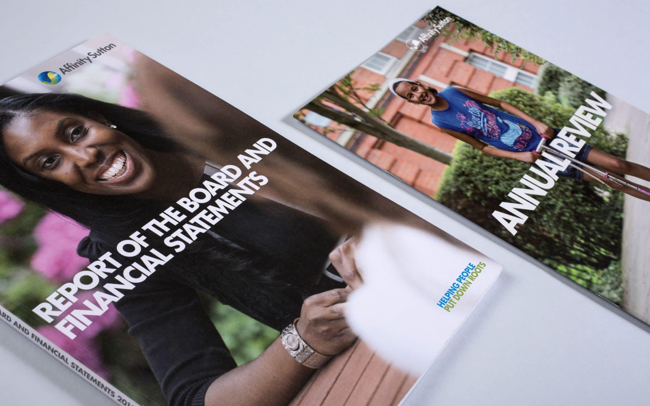
Ultimately, no matter what your preferences might be when it comes to annual report design, your cover, and the other elements of your report should be created to meet the specific needs and preferences of your target audience.
If you know that your audience is looking for a “traditional” report experience, then you should consider a design that focuses on introducing the booklet and the numbers in a clear and concise way. Though you can still allow your personality to shine through in a simplistic annual report design, you might reign in your creative ideas more to appease your boss.
Annual report design inspiration
In the section above, we’ve already begun to give you an insight into what an incredible annual report design might entail. However, one thing that we frequently find to be true at Fabrik, is that examples and inspiration can help to power the creation process.
If you’re still stuck in the mindset that annual reports have to be boring documents full of figures and statistics, the following pieces of annual report design inspiration will have you seeking out a professional annual report design agency in no time.
From cutting-edge techniques that make the most out of modern printing, to artful infographics, there are dozens of ways, both online and offline, that you can introduce your company’s achievements over the last year.
1. MailChimp
Mailchimp’s annual report design for 2016 is fun, fresh, and exciting. They’ve gone for the digital approach, creating a one-page responsive website that delivers all the information you could possibly need through infographics and imagery.
In its branding and marketing efforts, MailChimp have frequently made efforts to show off their fun, imaginative nature. The most recent annual report helps to reflect that personality, featuring easy-to-read facts that make looking at the last year a joyful experience.
2. Clear Media LTD.
Winner of the Red Dot Award, Clear Media Ltd.’s stunningly laser-cut annual report helps to guide readers through a beautiful and vibrant insight into the values and visions of the brand.
More than just an adventure in colour, the annual report design is designed around the company’s brand manifesto, with a theme of “Our Space, Your Stage”. Each panel depicts a different stage of marketing, while the full booklet together shows a single, stunning picture.
3. Banques Alimentaires Quebec
As is often the case with design, sometimes the best solutions come when you think outside of the box. The unique annual report design by Banques Alimentaires delivered the crucial information for the business financial year in the form of a tin can.
The label on the tin can unrolls to deliver a host of useful and printed data in a black and yellow format. The idea is that the unique design will draw attention to the associations of the brand, which is connected to food bank donations.
4. Austria Solar
One of the best things that any brand can do for itself, is differentiate itself from the crowd. At Fabrik, we often try to create marketing and brand communications that speak to the underlying ethos and manifesto of the company at hand. Austria Solar knocked this concept out of the park with their sun-powered annual report design.
The creation was the very first report to be powered by the sun. In other words, the pages remained completely blank until you took it outside, where the sunlight prompts them to flood with colour, type, and crucial statistics.
5. L-Bank
Finally, we mentioned previously that a great annual report design is all about combining imagery, content, and design. However, that doesn’t mean that your report has to be wordy and boring. If you want to make the facts quick and simple to absorb, you could consider using a style similar to L-Bank, who used unique visuals to support their financial claims.
Top tips from annual report designers
Your annual report is a document that provides stakeholders, investors, employers, and customers with instant access to some of the most important information about your company. In other words, it’s a great way to expose the details of your business, flaws included, to the world.
However, it’s also a crucial part of branding for your business, and an opportunity to differentiate yourself from your competitors that shouldn’t be overlooked. When it comes to advice from the experts, our annual report designers recommend the following tips:
Tip 1: Be relevant
At a basic level, an annual report is a form of direct communication from your company, to the world around you, showing insights into all your current financial data. You can easily make your annual report design more attractive to investors and shareholders by using it to provide a meaningful and holistic picture of your company’s strategy, business model, performance position, and prospects. Though it’s important to be creative, you’ll need to stay relevant too!
Tip 2: Write intriguing content
Design is crucial to a great annual report, but the words that you choose are important too. When it comes to annual report content, you should make your copy as simple and straightforward as possible, without being boring. Remember to share your story, and provide insights into your unique personality.
Tip 3: Quality comes before quantity
Investors and shareholders choose where to spend their money based on the information that they get in an annual report. If you struggle to tell your story in a way that shows your value to your potential partners, then you’re going to miss out. Make sure that you focus on delivering the most important information about your business, in a clear, concise way.
Tip 4: Use plenty of compelling imagery
Today’s customers are more visually focused than they’ve ever been. That means that using minimal text, alongside powerful graphics in your annual report design could help your message to be more attention-grabbing and interesting. Make sure that the cover, in particular, makes a strong statement, with a design that compels your reader to keep looking and find out more.
Tip 5: Create an experience
If you want to convince your reader to keep hold of your annual report for longer, then you’re going to need to give them an experience they can enjoy. That doesn’t just mean printing your report on a super-expensive material, or publishing it online in an easy-to-navigate format. Try using clever tactics and bespoke elements that let your customers know that you’re devoted to giving them something special. Unique formats, foldouts, and textures all help to give hints into your brand personality, and expand your company story.
Tip 6: Make it easy to read
Sometimes, no matter how beautiful your annual report design might be, the people who receive it are still going to assume that it’s a document full of boring data. With that in mind, you want to make the experience as painless for your reader as possible, by organising your information carefully. Include a contents page that makes it easier for your audience to track down relevant data, or consider adding in a glossary. Some businesses even use colour-coded sections to make scanning simpler.
Is it time to look for an annual report design agency?
For most companies, an annual report is a financial snapshot of what your brand has accomplished over the last year. However, it’s also so much more than that. When used correctly, your annual report can be an opportunity to bring people in your organisation and industry together in a mutual celebration of your achievements. A annual report can introduce new steps for your business, showcase your personality, and open a window into the soul of your brand.
Whether you decide to create your annual report design offline, online, or both, it’s important to make sure that you understand the message that you’re delivering with every choice you make. Each element, from the typography that you choose, to the colours and infographics that you use, come together to make or break the experience you give your reader.
In a world where it’s becoming increasingly more challenging to differentiate yourself from your competitors, a well-designed annual report can be yet another tool in your arsenal, for showing the unique characteristics and value of your brand.
If you enjoyed this article, you might enjoy these ones too:
– How to write a design brief agencies can actually use
– The art of brand storytelling: What’s your corporate story?
– Why cultivating a healthy corporate culture is good for your brand

Clarity starts with a conversation.
Thanks—we’ll get back to you shortly.
Whether you're navigating a rebrand, merger, or simply need a clearer identity—we’re here to help. No hard sell, just honest advice from people who know the sector.
Let’s start with a simple question…
Prefer to email? Drop us a line.
Fabrik’s been helping organisations rethink and reshape their brands for over 25 years. We’ve guided companies through mergers, rebrands and new launches. Whatever stage you’re at, we’ll meet you there.