The Forever 21 logo history and meaning

If you’re a fashion fan or familiar with the local high-street retailers throughout the US, you probably know the Forever 21 logo. Although the company has had significant ups and downs over the years, it still stands as one of the most well-known fashion companies in the world.
Forever 21 is one of the many examples of companies in the world today using a combination of a word and a number in their logo. The company has built a strong image for itself over the years, despite using a relatively simplistic wordmark.
Like many fashion companies, Forever 21 chose its brand image in an attempt to convey concepts like sophistication and modernity. The organization wanted a design that stood the test of time and appealed to a broad audience of potential customers.
Today, we’re going to be exploring the history of Forever 21, how it chose its iconic name and logo, and how the image has evolved over the years.
Forever 21 history: Introducing the Forever 21 brand
Before we dive into the transformation of the Forever 21 logo over the years and explore the elements of the symbol, let’s take a closer look at the brand.
Forever 21 is a multinational retailer of “fast fashion.” In other words, this means the company focuses on creating products relevant to the current trends in the market rather than producing new or sustainable items from scratch.
Headquartered in Los Angeles, California, Forever 21 was launched in 1984, almost 40 years ago. This might be difficult to believe for many youngsters, who see the company as a relatively new and modern entity in their malls and stores.
Initially, the company was known as “Fashion 21” and was introduced by Do Won Chang and Jin Sook Chang, two married immigrants to the United States from South Korea. The pair opened the first store for their new company in the Highland Park district of LA with only $11,000 in savings.
Today, Forever 21 focuses on selling fast fashion for low prices.
However, in the initial years, Fashion 21 mostly sold popular designs from South Korea to members of the LA community. Unfortunately, this brand hasn’t always had the best reputation, as it has been involved in various controversies related to copyright infringement and labor practices.
Forever 21 symbol meaning: Why is it called Forever 21?
The Forever 21 name is an integral part of the company’s brand identity and the core focus of the Forever 21 symbol. Notably, the name was changed from Fashion 21 to Forever 21 when the organization changed its business model to focus on the “fast fashion” industry.
According to the Changs, the decision to use the number “21” in the name was based on the evocative nature of the digit. Mr. Chang considered 21 to be the most enviable age for most people.
It’s usually the time when we’re just starting adulthood and discovering ourselves while still looking forward to an incredible future.
So, why did Forever 21 use digits for its name rather than spelling the word “twenty-one” out? The simple answer is the spelled-out version of the moniker would be too long for a wordmark or store sign. The use of the digits makes the design more compact.
Forever 21 logo history: The evolution of the Forever 21 symbol
Despite almost 40 years in the fashion and apparel industry, Forever 21 hasn’t made a lot of changes to its design. Like many apparel brands, the company has retained a relatively consistent image designed to build brand loyalty and recognition.
There has only been one major update to the image throughout the Forever 21 evolution, which didn’t affect much of the design.
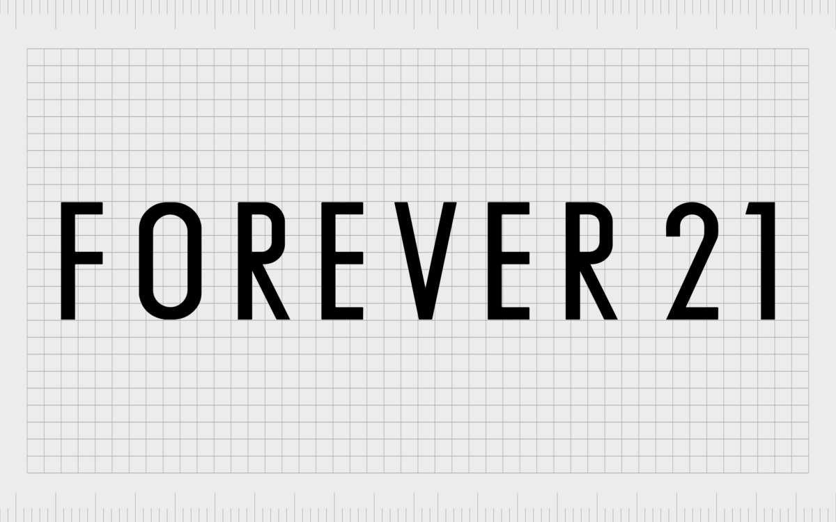
1984
When Forever 21 first changed its name to the title we know today, the company introduced its first logo for the official brand.
The design was very similar to the one we know today, featuring a simple wordmark with a sans-serif font. The old Forever 21 store logo included the lettering for the name in a simple sans-serif typeface.
As you may notice, the Forever 21 logo emblem uses significant spacing between each character. This is intended to improve the legibility of the overall symbol and make the image look bolder and more confident.
The glyphs were quite different from what we’re used to seeing in other luxurious fashion brands, as they were pretty thin and straightforward.
There was a slight edginess to this logo in the sharp cut on the end of the top part of the number 1 character. However, beyond this, there’s not much to make the image stand out.
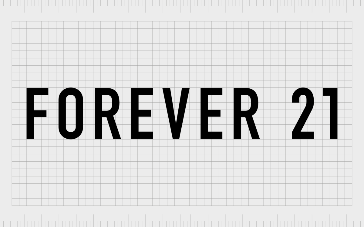
2014
In 2015, the Forever 21 clothing logo was updated slightly. In many ways, the new Forever 21 logo emblem was similar to its predecessor. The sans-serif nature of the font remained the same, and no decorative elements were added.
However, the slanted cut on the “1” was straightened for this version. We can also see the spacing between the characters is a lot narrower.
The decision to update the design was made to ensure the image looked as modern as possible in the new era. The slightly bolder lettering helps convey confidence and professionalism while making the image appear neater overall.
The extra weight of the letters also ensures the text is easily read from any distance.
Interestingly, there is a slight change to the “R” glyphs in this logo, as the diagonal line starts at a slightly different point than the previous logo.
Forever 21 logo meaning, fonts, and colors
Compared to other logo designs in the fashion industry, the Forever 21 logo may appear relatively simple and straightforward. There aren’t a lot of decorative or detailed elements. However, this does help the symbol to maintain a sense of timeless elegance.
The image is bold and eye-catching, ideal for the front of a store. It’s also somewhat simplistic, which might have helped to differentiate the brand from other luxury clothing lines. If you want to learn more about the Forever 21 brand image, you can find some helpful resources here:
What font is the Forever 21 logo?
The Forever 21 logo font is a straightforward sans-serif typography without many eye-catching elements. How did they come to this decision? The solution was chosen as a modern and timeless option for the brand. The image looks similar to the DIN 1451 Pro EngSchrift font here.
Although this typeface might not seem particularly interesting today, it was very different from the more traditional fonts used in the industry at the time.
What are the Forever 21 logo colors?
The Forever 21 logo, like many fashion logos in the world today, avoids the use of many saturated colors. Instead of using bright shades, the company simply relies on black and white. Black is the primary Forever 21 logo color.
However, it is possible to see versions of the Forever 21 symbol where the colors are inverted, with a white font on a black background.
Exploring the Forever 21 logo
The Forever 21 logo is a simple but effective choice for a modern fashion brand. Though the design might not be the most eye-catching in the world today, it’s excellent at connecting with a wide range of different potential customers.
Throughout the Forever 21 history, this image hasn’t changed much, which ensures the company can continue to deliver a consistent visual personality to its target audience.
Fabrik: A branding agency for our times.


