The DC Shoes logo: How it became a symbol of skateboarding culture

The DC Shoes logo is one of the most iconic cultural icons in the world, championed by a huge number of dedicated fans. More than just a memorable emblem, this logo has become a core component of the skateboarding landscape. But where did DC Shoes logo history begin?
The American company, DC Shoes has effectively positioned itself as a competitor in the athletic clothing space by looking beyond the needs of everyday consumers.
With its unique focus on a niche audience, DC Shoes has become a leader in clothing designed for specific members of certain communities.
The DC Shoes logo, complete with its eye-catching seven-point star and compelling monogram, is now a symbol recognized all over the globe. If you’ve ever wondered where the visual identity of the DC Shoes company began, you’re in the right place.
Today, we’re going to take a closer look at the history of the DC Shoes logo and the nature of the brand.
What does DC Shoes stand for? An introduction
Before we begin our exploration of the DC Shoes logo history, let’s start with an introduction to the brand. DC Shoes is an American company in the athletic apparel world, specializing in footwear produced for action sports, such as snowboarding and skateboarding.
Although the company is best known for the unique footwear it produces, the brand has also created a variety of other products throughout the years, including clothing, accessories (Such as hats and belts), and bags. The DC Shoes brand was first developed in 1994 by a team of entrepreneurs.
Ken Block, Damon Way, and Clayton Blehm started their organization in Carlsbad, California, choosing the name “Droors Clothing.” This title was eventually updated to “DC Shoes.”
In 2004, the DC Shoes company was purchased by the Quiksilver brand, and the organization began working in earnest to capture the attention of its niche audience. DC Shoes sponsors a number of professional skateboarders, who also advertise the company’s footwear as spokespeople.
Today, DC Shoes is one of the better-known skateboarding brands in the world, with its own professional skateboarding team.

DC Shoes logo history: The timeless icon
Despite spending several decades in the clothing and footwear landscape, DC Shoes hasn’t made many changes to its logo. In fact, the original Droors Clothing emblem is difficult to find in the world today.
The primary logo of DC Shoes has remained consistent for the majority of its lifespan, ever since the organization was purchased by Quiksilver.
Before this, DC Shoes used a handful of different emblems on its products. However, in 2011, the company went through a rejuvenation process which allowed it to create a compelling, unique logo for the first time. The “flag logo” introduced for the brand has remained the same ever since.
The logo was created as part of a new marketing strategy intended to modernize the brand and form a deeper connection with the skateboarding community. The founder of Quiksilver, Alan Green, even got involved in the development of the logo.
Today, the trademark consists of two parts. The first is the memorable DC monogram, which features the letters of “DC” overlapping into almost a chain-link shape. The components of the characters have been carefully shaped to make them look almost like a reflection of each other.
In the gap between the two arms of the “C” character, we see the famous seven-point star, chosen by the DC Shoes brand to represent excellence and creativity.
The use of a different style of star to many other companies at the time helped to highlight DC Shoes as a brand committed to serving a different audience. The sharp points of the star resonate with the action sports community.
In some cases, the DC monogram is used as the only component in branding certain products from the company, such as its shoes and clothing.
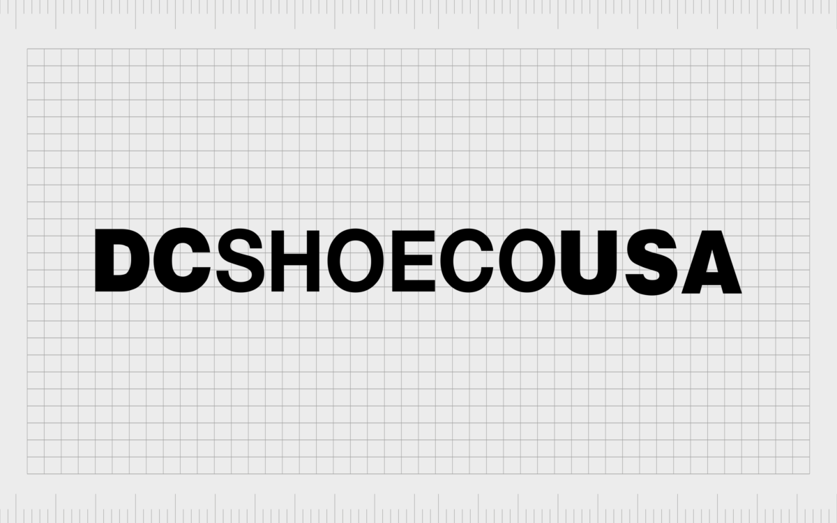
However, the official DC Shoes logo also includes the inscription “DCSHOECOUSA.” This element reveals useful information about the manufacturer, from the name of the company, “DC,” to its focus area, “Shoe,” its environmental focus, “Eco,” and its origin country, “USA.”

The DC Shoes logo: Colors and fonts
Though relatively simplistic, the DC Shoes logo has proven to be a powerful brand asset for the company. The unique positioning of the letters in the emblem symbolizes connectivity, creativity, and the power of community.
They almost look like the links in a chain, which could also be a way for the brand to highlight the strength of its organization.
The seven-pointed star is another interesting choice. The star shape, in general, is usually associated with excellence and innovation. However, in this case, the decision to use something other than the traditional five-pointed star helps to further position DC Shoes as a unique brand.
If you want to take a closer look at the DC Shoes logo, you can find some useful resources here:
What color is the DC Shoes logo?
Simplicity has always been a core component of the DC Shoes logo color palette. Like many fashion and apparel brands, the company has retained a relatively basic color palette to ensure its logo can work well on a range of backgrounds and materials.
The DC Shoes logo colors today are usually white and black. The emblem is generally either positioned in black on a white background or inverted for a white logo on a black background.
However, the DC Shoes emblem can also be converted into a variety of different colors for product branding purposes. This symbol is often seen in different shades on DC footwear, clothing items, and accessories.
What font does the DC Shoes logo use?
The DC Shoes logo font is unique to the brand and a compelling part of the company’s overall identity. The design is similar in some ways to a variety of other typefaces, such as the Nimbus Sans Black font.
The large block letters have been carefully designed to create a unique visual appearance, which causes the “D” and “C” to look very similar, as though they’re reflected against each other.
The typography used in the inscription on the logo is a simple sans-serif font with a lot of similar elements to the primary monogram. It includes two sections of slightly bolder letters to help draw attention to the separate words in the inscription.
A cultural icon: The DC Shoes logo
Although there may not have been many changes to the company’s visual identity during DC Shoes logo history, it’s easy to see how the business has made a resounding impact on its audience.
The DC Shoes logo is a timeless, minimalistic, yet engaging symbol created to connect with consumers on an emotional level. Every aspect of the emblem has its meaning and purpose.
The DC monogram symbolizes community and connectivity, while the seven-point star demonstrates excellence and highlights the company’s unique nature. The black and white color palette symbolizes strength and provides the organization versatility and diversity.
DC Shoes FAQ
What does the DC Shoes logo mean?
Originally, the DC Shoes logo was based on the initial name of the footwear company: Droors Clothing. The DC Shoes company is no longer affiliated with this brand.
The letters “D” and “C” can also be connected to some of the first skaters sponsored by the company, Colin McKay and Danny Way. The seven-point star symbolizes excellence, authority, and creativity.
Did Rob Dyrdek own DC Shoes?
Rob Dyrdek doesn’t own DC Shoes, but he was sponsored by the company as a professional skater. He attached himself to the brand and worked with them on a number of marketing and sales strategies over the years.
When did Droors become DC?
The original company created by DC Shoes, Droors Clothing, was sold in 1993, which was also when the company decided to change its name and update its branding.
Fabrik: A branding agency for our times.
Clarity starts with a conversation.
Thanks—we’ll get back to you shortly.
Whether you're navigating a rebrand, merger, or simply need a clearer identity—we’re here to help. No hard sell, just honest advice from people who know the sector.
Let’s start with a simple question…
Prefer to email? Drop us a line.
Fabrik’s been helping organisations rethink and reshape their brands for over 25 years. We’ve guided companies through mergers, rebrands and new launches. Whatever stage you’re at, we’ll meet you there.


