Chrysler logo history and Chrysler symbol meaning

How much do you know about Chrysler logo history? It’s fair to say the Chrysler car logo is one of the better-known emblems in the world, with its sleek, stylish, and memorable aesthetic.
However, just because you can recognize the chrome wings on the back of a Chrysler vehicle, doesn’t mean you know where the image began.
Chrysler as a car brand has been around for almost 100 years, and it currently stands as one of the largest automobile manufacturers in the world. In our book, this means Chrysler’s brand identity is well worth a closer look.
Here’s your guide to the Chrysler logos over the years and the meanings behind them.
Chrysler history: The Chrysler logo today
Established in 1925 and named after its founder, Walter Chrysler, the Chrysler company is an icon of automobile manufacturing. In the American landscape, Chrysler is one of the “big three” of car vendors responsible for controlling the entire US market.
Today, Chrysler is owned 100% by the Fiat brand from Italy, but this hasn’t always been the case. The brand has also been a part of the Daimler group, and an independent entity in the past.
The Chrysler logo over the years has evolved to reflect the changing trends of the industry, and the evolving identity of Chrysler itself.
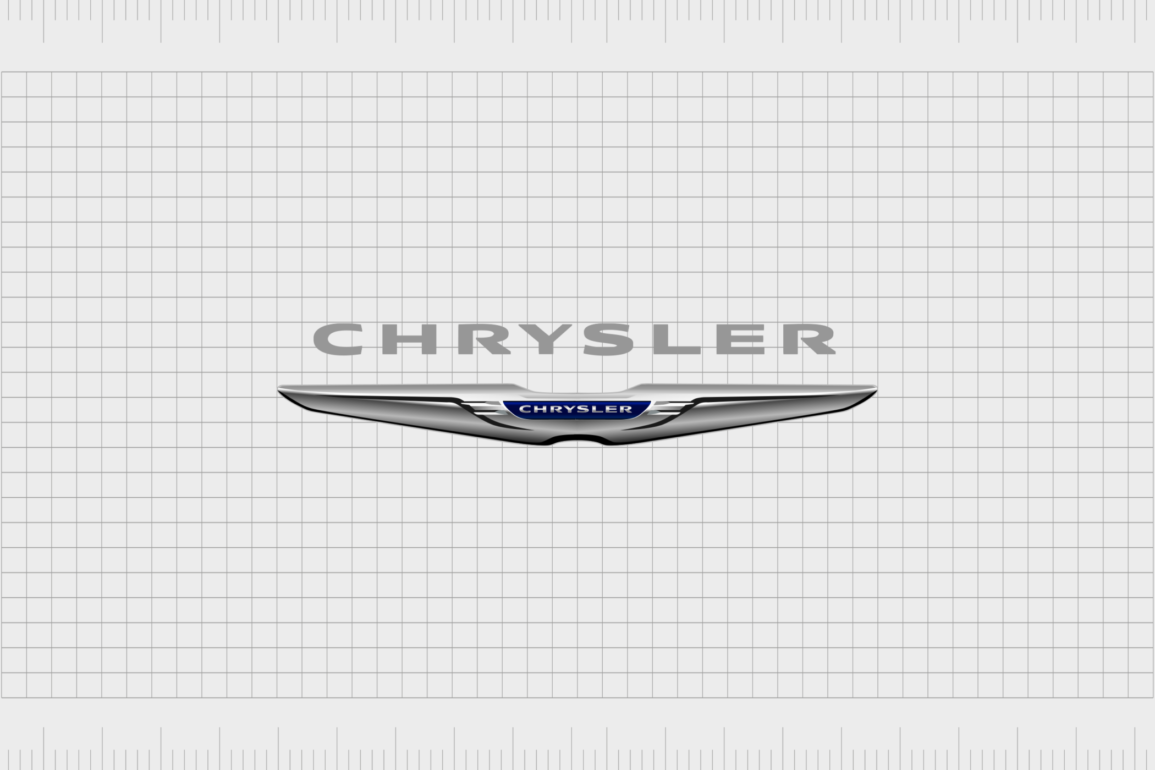
The present Chrysler logo is a sleek, stylish design comprised mostly in shades of grey, black, and blue. The Chrysler emblem looks almost like a registration plate on the back of a high-quality car, with a central space in the middle for the Chrysler name.
In many ways, the symbol is similar to the Aston Martin logo.
Above the Chrysler emblem, the company showcases its name in a bold wordmark, written entirely in grey capital letters – all sans serif.
| Founded: | 1909 |
| Founder: | Ettore Bugatti |
| Headquarters: | Molsheim, Alsace, France |
| Website: | www.chrysler.com |
| Logo downloads: |
Back in 1925, Walter Chrysler brought a team of engineers together, with the dream of establishing a new brand for the American automobile industry. He wanted to create cars capable of competing with the best-in-class offerings from Cadillac and Ford.
To achieve their goal, the Chrysler team introduced innovative new solutions to transform the future of driving. As an upscale, premium automobile manufacturer, the Chrysler car logo has always carried an air of sophistication.
Starting in the 1925 with a wax seal to demonstrate quality and dignity, Chrysler’s brand identity is just as eye-catching and engaging as the cars the company creates. The original logo was designed by Oliver Clark, who would later also help to create the silver-winged radiator image, designed to represent the God Mercury.
The old Chrysler logo
The Chrysler logos over the years
The first Chrysler car logo was created a year before the official introduction of the brand in 1924. This version of the logo was designed by one of the engineers of the car company, Oliver Clark.
Because Clark already knew about design, he seemed like the perfect choice for creating a new logo. Clark’s efforts would go on to make an impact on the full Chrysler brand identity.
1925
The first Chrysler emblem was a golden wax seal, designed to sit in a golden circle, with a stylized blue and gold ribbon just hanging over the edge of the border.
This Chrysler icon had a lot going on, with a rope-style decoration within the wax seal, a bar featuring the Chrysler name in capital letters, and a set of golden lightning bolts to signify speed.
The logo mimicked the appearance of an official wax seal commonly used at government fairs as an award. The design as chosen to represent the reliability, honesty, and quality of the company.
There are also few variations of this Chrysler logo peppered throughout history, including one which featured a set of silver wings – relevant for the identity of the brand in later years.
1955
In 1955, the emblem for Chrysler evolved completely, replacing the wax seal with a set of two arrow shapes pointing to the right. The foreground arrow was a sharp, angular shape in black, while the one in the back was wider, shorter, and designed in red. The Dodge brand also used the same logo.
1962
In the 1960s, one of the most famous Chrysler logos over the years emerged. The Chrysler star logo was designed by marketing firm Lippincott and Margulies. The Chrysler pentastar logo had five points, and changed the colors of the brand to blue, white and black.
Invented by Robert Stanley, the design never appeared on radiator grilles, but it was a common feature on the hoods of some Chrysler cars. According to the creator, the pentastar logo represented simplicity, dynamism, and style.
Some people argue the pentastar’s points represent a series of automobile companies, Dodge, Dodge Trucks, Imperial, Plymouth, and Chrysler. The artists said the star creates the visual illusion of movement.
1993
In the 1990s, a version of the original Chrysler logo returned. The wax seal almost looked exactly the same as before, a testament to the company’s heritage, and long-standing commitment to quality throughout the years. However, the older image only stayed for a couple of years.
In 1995, Chrysler updated its wordmark, with a futuristic sans-serif font. Both this image, and the emblem with the wax seal were used in Chrysler’s marketing materials.
1998
Towards the end of 1998, Chrysler decided to take a new direction with its logo. The company placed the wax seal in the center of a set of silver wings, with three “feathers” on each side. A modernized version of the Chrysler wordmark was placed above the image, this time in solid black.
It was this image that eventually gave way to the new Chrysler logo we know today.
2010
The Chrysler cars logo today is a sleek and modern design, far removed from the image we saw almost 100 years ago. The image is now free of the traditional wax seal. Instead, the name of the company is written within a blue nameplate, making the icon look similar to the back of a car.
The “wings” of the new Chrysler logo can also be described as fenders, with a sleek metallic gradient to remind the viewer of the metallic elements of a vehicle. At the top of the image is the Chrysler wordmark, now written in a sans-serif light grey.
Meaning behind the Chrysler logo: The Chrysler emblem
Throughout the years, the Chrysler symbol meaning has evolved, demonstrating different characteristics of speed, reliability, and sophistication. Interestingly, the first Chrysler logo with the wax seal was designed by the same person who would later create the fender-style wings for the latest icons, Oliver Clark.
According to Clark, the winged element serves dual purposes, it reminds customers of the radiator on a car, and also personifies the Roman God Mercury, known for his speed.
Though the wax seal is missing from the new logo, there’s still a badge in the center of the wings as a kind of seal of approval for the company. The fact this badge is designed in blue, a color which symbolizes trust, is worth mentioning too.
What are the Chrysler logo colors?
Over the years, the Chrysler logo color scheme has changed a number of times. The first design created by Olivier Clark was in red, blue and gold. The most recent Chrysler symbol is a lot simpler, designed in a metallic silver (shaded with white and black), and a deep blue.
The Chrysler logo wordmark is a soft grey, almost white.
The approved colors for the logo are:
#B8B9BD
#000000
#FFFFFF
#3669AD
What font is the Chrysler logo?
The Chrysler logo font is interesting, as it looks as though various letters have been plucked from different typefaces in some cases. According to Chrysler, the typeface is something called “Trade Gothic”, and it comes in a range of cuts.
Chrysler’s name is always written in full capital letters, and in sans-serif type.
Celebrating the Chrysler logo today
The Chrysler logo is easily one of the most recognizable logos in the world today. It’s odd to think the original design of the logo way back in 1925 and the image we know today both come from the same designer. Both were also intended to represent a combination of speed and quality.
Now read these:
—Which car companies own which car brand?
—Famous car brands, their names and logos
—The ultimate list of French car brand logos
—The 50 best-known car logos with wings
—The definitive guide to German car logos
—Famous car logos and emblems with stars
—Top American car brands and their logos
—Your ultimate guide to Italian car brands
—American car companies that went bust
—The conclusive guide to British car logos
—The essential list of Japanese car logos
—A decisive guide to car logos with circles
Fabrik: A branding agency for our times.
Clarity starts with a conversation.
Thanks—we’ll get back to you shortly.
Whether you're navigating a rebrand, merger, or simply need a clearer identity—we’re here to help. No hard sell, just honest advice from people who know the sector.
Let’s start with a simple question…
Prefer to email? Drop us a line.
Fabrik’s been helping organisations rethink and reshape their brands for over 25 years. We’ve guided companies through mergers, rebrands and new launches. Whatever stage you’re at, we’ll meet you there.


