Branding a winner: The Williams Racing logo and its history

Fans of the Formula One racing track might be familiar with the Williams Racing logo. Dating back to the 70s, the Williams racing logo history is quite colorful, featuring numerous changes to the team’s identity, inspired by changes in sponsorship and style.
Like most Formula One teams, Williams has frequently adapted its visual identity to pay homage to the sponsorship companies committed to helping it achieve its goals in the motorsports industry.
However, the overall tone of the Williams visual identity has transformed with time, too, as the organization has driven into a new era with a new generation of fans.
If you’re interested in the Williams Racing team or want to learn more about the evolution of logos in motorsports, we’re here to help.
Today, we will be taking a closer look at the Williams Racing logo and its evolution over the decades.
Introducing Williams Grand Prix Engineering Limited
Williams Racing, otherwise known as Williams Grand Prix Engineering Limited, is a British F1 constructor and motor racing team, first founded in 1977.
The team was formed after Frank Williams gave up on a previous, unsuccessful operation and joined forces with Patrick Head, an automotive engineer.
The group entered the competitive landscape with an initial race in the 1977 Spanish Grand Prix with a March chassis before they began to manufacture their own cars the following year. Williams won its first race in the 1979 British Grand Prix.
Almost 20 years later, in 1997, the team celebrated its 100th victory.
Williams is one of only four teams in the Formula One space to win more than 100 races. It also held the record for the total number of Constructor’s championships until Ferrari took the title in 2000.
Is Williams owned by Mercedes or BMW?
Neither Mercedes nor BMW owns Williams Racing. In 2020, the group was acquired by Dorilton Capital, though it continues to race under the Williams brand.
However, Mercedes-Benz has formed a long-term unit partnership with Williams Racing which is set to last until 2025. This extends the relationship between the two brands, which began in 2014.
Williams F1 logo history: The Williams Racing logo
With almost four decades of racing under its belt, Williams Racing has gone through a few updates to its visual identity over the years. Let’s take a look at the evolution of the Williams Racing logo.
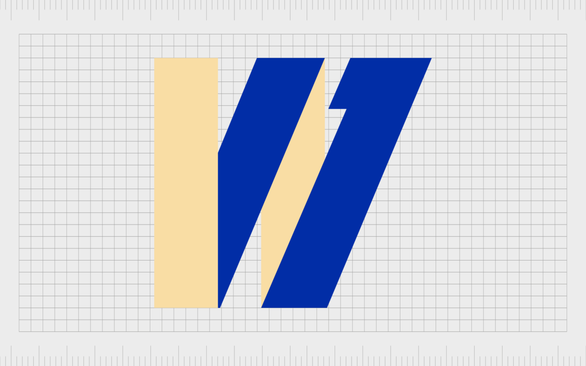
For its first race, Williams debuted a simple logo featuring a stylistic “W,” with a line at the end intended to look like a “1”. The emblem didn’t feature any of the additional components often included in Formula One logos like “F1 team”. It was presented in a cream-white color and light blue.

Two years later, after the brand had begun producing its own cars, a new logo was introduced, which featured the full name of the team and the same “W” shape. In this variation, the colors have been switched to bright yellow and deep forest green.

An interesting variation of the Williams Racing logo appeared in 1981, which featured the full name “Williams” in a sans-serif, lowercase font. The “A” has been squared here to make it look more modern, and the rest of the letters appear to have sharp edges.

This logo was replaced in 1985 when Williams secured a sponsorship with Canon. In the new logo, Williams showcased its connection with Honda, the company currently supplying their racing engines, and the Canon brand.
A new Williams wordmark was introduced in blue, with the “W” stretching across the following three letters. Canon and Honda used their own visual identity.

Later, in 1988, Williams switched engine sponsors from Honda to Judd Power and dropped the Honda wordmark from its logo. It changed its logo to black instead of blue and placed it alongside the Canon logo and the word “Team” on a single line.
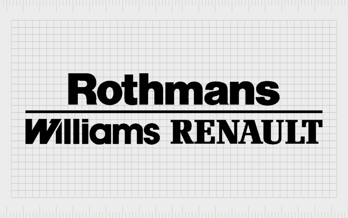
In 1994, Rothmans took over as the main sponsor of Williams Racing, leading to another significant change in branding. The Rothmans logo appeared above the Williams wordmark in a larger, sans-serif font. Next to their own logo, Williams also included a reference to Renault.
The Williams “W” now covers only the following “I.”
Following the dissolution of the Rothmans brand, Williams acquired a new sponsor in the form of the Winfield Tobacco brand. This prompted them to change their logo to feature the company’s core color palette, as well as their distinct wordmark and Kangaroo emblem.
The Williams wordmark still remains the same in style, though it appears a little larger above the Winfield branding.

In 2005, Williams switched sponsors, yet again, to BMW. This prompted the company to build an entirely new emblem with a very different wordmark. The name “BMW” was placed alongside “Williams F1 Team”, separated by a single dot.
A stylized mark above the wordmark was designed to create the “1” shape in white space between two geometric shapes. The color palette also shifted to blue.
In 2006, Williams created a new logo without any reference to sponsorships. The name of the brand, alongside the words “F1 Team,” was positioned on the banner in a combination of light blue and black tones in a serif-style font.
A new geometric design was also introduced, with sweeping, curved shapes similar to roads.

In 2007, Williams started a new partnership with AT&T, which led to a new banner-style logo featuring both a brand-new wordmark for the racing team and the AT&T emblem.
The Williams wordmark in all capital letters was accompanied by a “W” in a circle. The colors light and dark blue are most prominent in this design.

After AT&T ended its sponsorship of Williams Racing, the company changed its logo yet again, drawing greater attention to its new emblem, a W in a circle shape. The Williams F1 Team wordmark was recreated in a similar blocky, sans-serif font.

In 2013, this logo was refined slightly to feature an even larger brand name and the F1 team component on a second level, separated by a line.

After entering a new sponsorship deal with Martini, William’s updated its logo again to feature the “Williams Racing” name in two shades of blue. The font style was still sans-serif, and the letters were depicted in all capital letters.

Following a short period, in 2019, Williams introduced the “ROKiT” sponsorship deal and added their emblem to their new logo, separating all three components onto different levels. The “W” in Williams also became more stylized, with lines separating the middle component.
Finally, in 2020, Williams introduced its most recent logo, with no sponsorship references. This design also includes a wordmark with the same font as the previous design, though the two words have been placed onto the same line.
The colors have also been refined, with black for Williams and a bright shade of blue for Racing.
The Williams F1 logo: Colors and fonts
With numerous different sponsors to pay homage to across the years, the Williams F1 logo has gone through some significant changes.
Interestingly, unlike many Formula One teams, Williams didn’t just add the branding of its sponsor to its existing design in most cases but reformed its brand identity consistently over the years with new fonts and graphical elements.
Today, the version of the Williams Racing logo we see is perhaps one of the simplest held by the brand, with the only unusual element being the lines separating the central part of the “W.”
However, the colors blue and black do highlight a sense of credibility and professionalism. Here are some useful resources if you want to take a closer look:
What color is the Williams Racing logo?
The Williams F1 team logo today is a simple design consisting of two shades. Blue has been one of the most common William Racing logo colors used throughout the decades, and it once again appears in the most recent design. The official Williams Racing logo color for this shade of blue is:
SKY BLUE
PANTONE: PMS 2191 C
HEX: #00A0DE
RGB: (0, 160, 222)
CMYK: (100, 28, 0, 13)
What font does the Williams Racing logo use?
The Williams Racing logo font is unique to the brand, but it’s similar in style to Neutraface 2, with various alterations around the letters. Specifically, the W in this logo is particularly compelling, as it has two white lines in the central part, creating an inverted letter “V.”
Driving to a win with the Williams Racing logo
Over the years, the Williams racing logo has been on the side of countless winning cars and championed by several well-known drivers.
Although the company has altered its visual presence over the years, it has always attempted to convey an essence of elegance, sophistication, and elegance with its fonts and graphics.
Today, the Williams Racing logo is a simple but elegant wordmark. It will be interesting to see if the group decides to make another major change when a new sponsor enters the ring.
Fabrik: A branding agency for our times.
Now read these:
—Which car companies own which car brand?
—The Red Bull racing logo, a symbol of power
—The Mercedes F1 logo, the silver arrows
—Exploring the revered Scuderia Ferrari logo
—A guide to the iconic McLaren logo and symbol
—What you need to know about the Haas F1 logo
—The Alfa Romeo F1 logo, history and meaning
—From Scuderia Toro Rosso to the AlphaTauri logo
—A look back at the iconic Aston Martin F1 logo
—Racing through time, the Apline F1 logo story
Clarity starts with a conversation.
Thanks—we’ll get back to you shortly.
Whether you're navigating a rebrand, merger, or simply need a clearer identity—we’re here to help. No hard sell, just honest advice from people who know the sector.
Let’s start with a simple question…
Prefer to email? Drop us a line.
Fabrik’s been helping organisations rethink and reshape their brands for over 25 years. We’ve guided companies through mergers, rebrands and new launches. Whatever stage you’re at, we’ll meet you there.


