United Airlines logo history, symbol, evolution and meaning

Are you familiar with United Airlines logo history? If you’ve ever travelled by air in the United States, you’ve likely encountered this eye-catching brand mark before. After all, United is one of the biggest American airlines around, and it’s also the third largest airline in the world.
The United logo might seem like a simple combination mark, combining well-known shapes with a bold inscription. However, like many famous airline logos, this image is steeped in meaning. It highlights the commitment the company has to delivering a reliable service in its color palette.
What’s more, the United Airlines icon, consisting of a white globe within a blue square, aligns with the concepts of travel, adventure, and exploration.
Let’s take a closer look at the company history and brand identity of one of the largest air carrier companies in the world today.
The United logo: Introducing the United Airlines Brand
Before we begin discussing the unique components of the United Airlines logo, let’s introduce the brand. United Airlines is a major airline in the United States, responsible for operating a huge domestic and international route network.
Measured by the number of routes served, and the fleet size, United Airlines is now the third-largest airline worldwide, following its merger with Continental Airlines. The company traces its routes back to the “Varney Air Lines” company, introduced by Walter Varney in 1926.
Continental Airlines, now merged with United Airlines, was the successor to the “Speed Lines” company, also founded by Varney in 1932.
In 1927, William Boeing founded the Boeing Air Transport company, and merged with Pratt & Whitney to form the United Aircraft and Transport Corporation. By 1931, the “UATC” formed United Air Lines as a holding company for its various subsidiaries.
Despite some rocky periods over the years, United Airlines achieved phenomenal success. It has eight hubs worldwide, and is a founding member of the Star Alliance, the largest airline alliance in the world.
The United Airlines tagline
United Airlines hasn’t always used a specific tagline in its branding materials. However, in 2022, the company introduced its “Good Leads the Way” tagline for marketing purposes. The tagline draws attention to the company’s focus on doing the right thing for communities and customers.
United Airlines logo history: The United Airlines icon
United Airlines logo has undergone a huge number of changes over the years, as the company has moved through mergers and various stages of growth. The official logo has been changed over a dozen times, since it was first introduced in 1930.
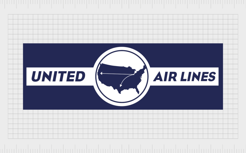
1930: The old United logo
The original United Airlines logo was introduced in 1930, It featured a rectangular banner in dark blue, with a white line across the center, and a circle badge in the middle of the design. The image in the circle featured the United States, and two small arrows, symbolizing transportation.
The thick white lines either side of the badge showcased the words “United” on one side, and “Air Lines” on the other, in a matching shade of blue. The inscription was executed in a italicized sans-serif typeface, with bold lines.

1933
In 1993, United introduced a simplified version of its emblem. The airline’s name became the core focus of the banner, and the accompanying graphics were removed. The font chosen for the inscription was updated, to feature bold, straight letters.
Though the additional graphics in this new logo were removed, the color scheme remained the same, featuring dark blue and white.

In 1935, a new version of this logo was introduced with a slightly lighter blue color in the background, and an updated typeface. In this version, the word “United” was in much bolder, larger characters, while “Air Lines” featured thinner, smaller letters.

1939
The rectangular banner used by United Airlines in the initial years disappeared in 1939. It was replaced with a shield in a tricolor design, featuring the hues of the American flag. The upper part of the crest featured a red background with the word “United” in red.
In the center, was a white section, with the words “Air Lines” in a blue, sans-serif font, as well as the top portion of the silhouette of the United States. The map image of America continued into the blue section of the badge, accompanied by the words “Coast to Coast”.

1940
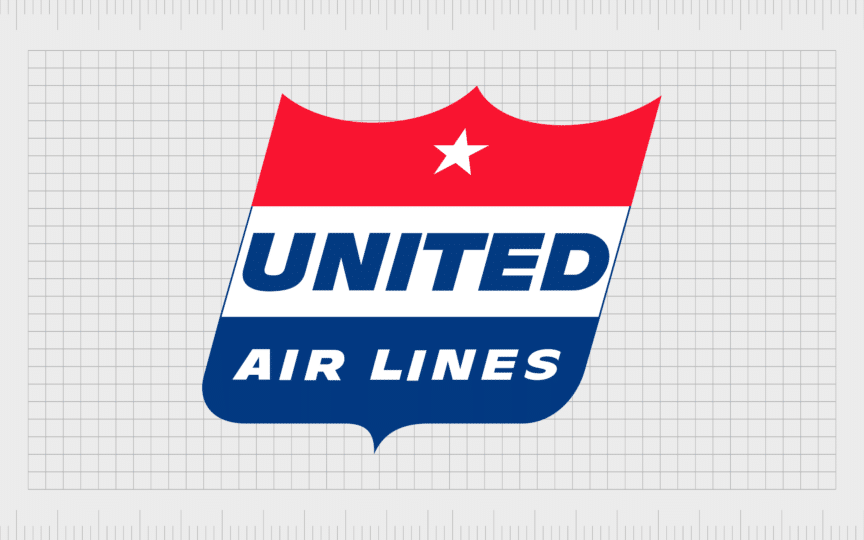
The tricolor crest was updated in 1940, becoming bolder and more refined. The colors were darker and more intense, and the positioning of the words changed, making the word “United” the center point of the image. The font choice was updated too, becoming bolder.
The image of the United States was removed, along with the “Coast to Coast” tagline. However, United did add a five-pointed star in white to the top of its new crest.
1954
In 1954, United got a little more creative with its image. The positioning of the crest was tilted, giving it a broad incline to the right. This was intended to represent speed and movement. The color palette was also updated, with much brighter, more vibrant shades.

In 1960, United created an updated version of this logo, which allowed the word “United” to expand outside of the white banner in the center, giving it a stronger overall appearance. In this version of the logo, United also removed the “Air Lines” part of its name.

1961: The United Airlines tail logo
At the beginning of the 60s, United changed its image again, moving away from the crest to embrace a pointed red and blue triangular shape, representing the tail or wing of an aircraft. The inscription changed drastically too. A new italicized serif font was introduced, in blue.
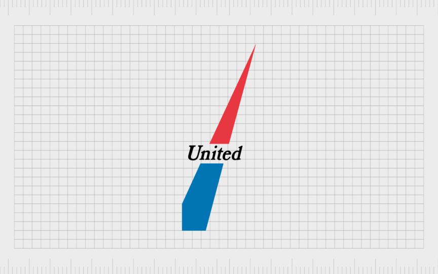
In 1971, however, United decided to update the inscription, choosing a black font with thicker lines, to improve legibility. The image appeared on a white background in most cases.

1974
By 1974, the commercial airline had moved in a new direction with its corporate identity. The official logo was redesigned by Sail Bass, featuring a stylized blue and red letter “U” as the primary icon. This icon was placed above a smooth, sans-serif wordmark.
The font for the wordmark was modern and geometric, and featured all uppercase letters, giving the company a strong, professional appearance.

1988
In 1988, United removed all of the artistic elements from its logo, to focus entirely on the “United” name instead. The highly modern and minimalistic logo increased the size of the word “United” significantly, and depicted the letters in bold font with minimal white spacing.
The “Airlines” component underneath this logo featured significant space between each of the characters, to give the image a balanced appearance.
1993
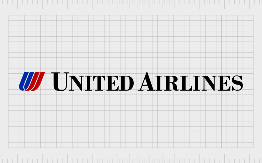
In 1993, United Airline went back a step with their logo, re-introducing the red and blue “U” icon, often referred to as the “Tulip”. The modern typeface was replaced with a more traditional serif black inscription, with sharp lines and edges.

Five years later in 1998, a new “United” logo was introduced, featuring the core components of the previous design. The “U” shape remained, though only featured one blue line instead of two. Additionally, the word “United” was presented in a new, sans-serif font.

2010
After the merger with Continental Airlines gave United a stronger foothold in the airline industry, they introduced the first version of the design most people know today. The new composition featured the words “United Airlines” in a blue, serif font, on two levels.
Next to the airline’s name was the new icon, featuring a blue square, with a white globe in the center. The globe was more than just a white circle. It featured a number of individual segments, making the company appear creative and innovative.

Also in 2010, the United brand created a secondary version of its logo, which removed the “Airlines” inscription. This banner featured the United icon, as well, with the light blue color palette, and the impactful globe image.
The first word of the company’s name was depicted in a bold sans-serif font, with equal spacing between each capitalized letter.
2019
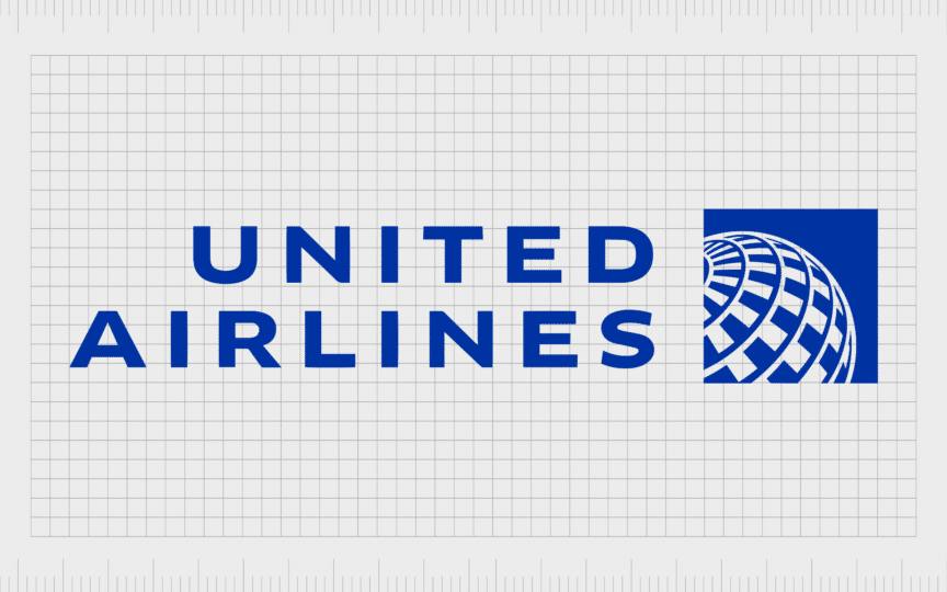
The most recent version of the United Airlines logo is based on the previous design. It refined the lines and contours of the previous image, adopting the sans-serif font and uppercase letters in the secondary design mentioned above.
The globe image became more refined, with fewer segments throughout. Additionally, the color palette was updated to a brighter, more intense shade of blue.

United also introduced a version of this logo which eliminated the “Airlines” element, creating a more streamlined banner.
What does the new United Airlines logo mean?
Star Alliance member United Airlines has made a significant impact on the airline industry over the years, not just with its services, but also with its approach to design.
Though the company experimented with a wide range of different design elements, it always seemed to capture the attention of the right audience. Certain designs, such as the red and blue tulip icon for United Airlines, are still recognized by customers today.
The current logo for the United Airlines company is simple but effective. The globe image demonstrates the company’s commitment to the travel and tourism sector. It also highlights its ability to serve a wide community of customers worldwide.
The color scheme used by United conveys ideas of reliability and trust. Dark blue shades are frequently associated with professionalism and stability. Even the font choice has its own meaning.
The bold, sans-serif font, written in all uppercase letters helps the company to appear stable, strong, and professional.
The United logo: Fonts and colors
Over the years, the United Airlines brand has changed its logo a number of times. While the original logo was somewhat complex, the company has gradually refined and enhanced its image, moving towards a more simplified, but still impactful design.
The current United Airlines logo, with its unique “United blue” shade and simple components helps to identify the brand as a first class airline operator. The image conveys ideas of reliability and strength, positioning United as a leader in its industry.
You can find some examples of the United logo designs linked below:
The United Airlines logo font
In the early years, the United Airlines font was quite similar to the typeface used by the brand today, featuring uppercase letters in a bold, sans-serif inscription. Over the years, the company experimented with a range of different typography options, before settling on the font we know today.
The United Airlines logotype is executed in a bold, clean, and confident sans-serif typeface, featuring traditional shapes and contours. It’s similar in many ways to fonts like Ephemera Kingford Sans and Biodini Sans Bold.
The United Airlines color palette
For a long time, the United Airlines brand distinguished itself in the aviation industry with a patriotic color palette featuring white, red, and blue. However, as the company refined its visual identity, it opted for a simpler color palette, with only two colors.
The official United Airlines colors today are a shade of bright blue, known as “United Blue”, and white. In color psychology, the color blue, common among some of the world’s biggest airlines, conveys ideas of reliability and trust.
Flying high: The United Airlines logo
The rich history of the United Airlines logo offers a useful insight into the journey companies take to find the ideal visual identity. Over the years, United has experimented with a wide range of different graphics, color palettes, and typefaces.
Today, the United Airlines logo is a symbol of the company’s strength in the aircraft industry, and its focus on delivering exceptional service to consumers around the world. The logo is powerful, professional, and instantly recognizable to consumers all over the world.
Fabrik: A branding agency for our times.United Airlines Logo
Clarity starts with a conversation.
Thanks—we’ll get back to you shortly.
Whether you're navigating a rebrand, merger, or simply need a clearer identity—we’re here to help. No hard sell, just honest advice from people who know the sector.
Let’s start with a simple question…
Prefer to email? Drop us a line.
Fabrik’s been helping organisations rethink and reshape their brands for over 25 years. We’ve guided companies through mergers, rebrands and new launches. Whatever stage you’re at, we’ll meet you there.


