A journey through the Haas F1 logo history

Fans of the Formula One landscape may be familiar with some of the Haas F1 logo history. After all, while Haas is a relatively new addition to the motorsports landscape, it has generated some significant attention over the last few years. The group has also earned several sponsorship deals.
Like other well-known Formula One teams and their logos, the Haas emblem has consistently showcased the brand’s name and any accompanying sponsors at the time.
However, unlike many popular companies like Ferrari and Aston Martin, Haas has only been competing in the landscape for a handful of years, first making its debut in 2016.
Recently, the team updated its logo and branding to adhere to a new sponsorship campaign. However, there have been a variety of different Haas logos up until this point.
Here’s everything you need to know about the Haas F1 team and its brand identity.
What does Haas stand for in F1? Introducing Haas
Haas Formula LLC, or Haas F1, is a Formula One racing team developed by the NASCAR Cup co-owner, Gene Haas, hence the memorable name. The organization was developed in 2014 and initially intended to enter the race for the first time in 2015.
However, the brand eventually postponed its entry until the following year.
Haas was the first constructor from America in the F1 landscape to submit a new car after the failed US F1 project of 2010. It’s also the first constructor to compete since the unconnected Haas Lola team competed in the 1985 and 1986 seasons.
The team was created after Haas purchased the Marussia F1 team’s Banbury headquarters in 2014 as a new base of operations.
To produce the vehicles they needed for competitions, the Haas team has approached several automotive brands and thought leaders worldwide, including Dallara for chassis production and Ferrari for motor technology.
Does Haas have a Ferrari engine?
When Haas first approached Ferrari for a long-standing relationship, the decision was met with some controversy. While the constructor was applauded for pioneering a new low-cost model for Formula One, allowing new teams to enter the sport, other smaller teams expressed concerns.
In 2018, Haas also came under scrutiny from competitors due to the use of a car that strongly resembled a car used by Ferrari in 2017.
Despite some concerns, Haas has maintained its relationship with Ferrari and continues to rely on the engines provided by the automotive company going into the 2023 series.
Haas F1 logo history: Through the years
As mentioned above, Haas is a relatively new addition to the Formula One landscape, so it hasn’t had much of a chance to produce many different logos over the years.
In between sponsorship deals, the group has frequently resorted to using a standard “placeholder” logo featuring the company’s name and accompanying emblem.

When Haas introduced its first F1 logo, it was without an official sponsorship deal. Like many Formula One teams, the company chose a combination emblem, which combined the badge from the company’s cars with the words “Haas F1 team”.
The design was depicted in red and black, with a classic sans-serif font to improve legibility.
One of the most compelling parts of the Haas F1 team logo was the “H” in the circle badge. The “H” had an elongated line in the center, which stretched beyond the circle, made to look like a road.

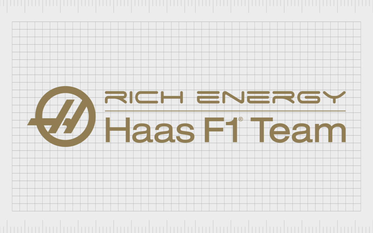
The first significant redesign for the Haas F1 team took place in 2019 after the company acquired Rich Energy as a title sponsor. The logo’s color palette changed drastically, replacing bold red with luxurious gold.
The iconic emblem remained within the logo, though it appeared slightly smaller alongside the two-level inscription.
The wording next to the design conveys the logo of the Rich Energy brand on the top, and the Haas F1 team wordmark on the bottom, with a golden line separating them. The font style for the Haas part of the logo remains consistent with the previous design.

In 2019, after the contract with Rich Energy was terminated, Haas also introduced a version of this logo that eliminated the Rich Energy branding.
The decision to terminate the contract was made just before a Grand Prix in Italy, which left the company limited time to make any major design changes. This may be why we still see the golden color palette.
Following the Grand Prix, Haas returned to its original logo.

2021
In 2021, Haas embraced a new sponsor in the form of the Uralkali brand. The sponsorship was acquired from the company’s newest Russian driver, Nikita Mazepin.
A new logo was created to highlight the sponsorship deal, which was very similar to the Rich Energy logo, but with a significant color palette change. The Haas F1 team wordmark appeared in dark blue, while the emblem appeared in the company’s classic shade of red.
The name of the Uralkali company appeared with its own unique branding above a line featuring the colors red, white, and blue.

When the 2022 Russian invasion of Ukraine took place 2022, Haas quickly dropped their Russian driver and removed all references to the previous sponsorship brand. The team refused to corporate with the Russian company any further and returned to their original logo from 2016.

The new Haas F1 team logo
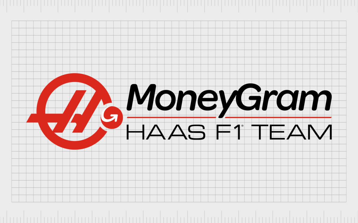
For the 2023 Formula One season, Haas has introduced a new logo, focused specifically on highlighting their connection with a new title sponsor. The logo is similar in a lot of ways to the 2016 logo, though the coloring is slightly different, with a deeper shade of red.
The emblem has met with some controversy from F1 fans, who believe the overall design looks a little messy compared to previous designs. In this variation of the Haas F1 team logo, we see the Has circular emblem, with the brandmark from MoneyGram (a red circle with a white arrow) on top of it.
The MoneyGram wordmark is also present in a much larger and bolder font than the Haas wordmark, which may be why the company decided to switch to an uppercase font.
The Haas F1 team logo: Colors and fonts
For the most part, the Haas F1 team logo has had a number of core consistencies over the years.
In every version of the design, we see the core Haas brandmark in the form of an H inside of a circle. The name “Haas” and the words “F1 Team” or “Formula One Team” have also been included in most designs. However, the color and positioning of the branding elements have changed.
Like most Formula One team, the Haas company has mostly focused on changing its logo to match the branding of the title sponsors behind it. This is certainly true for the most recent logo, which appears to draw more attention to MoneyGram than the Haas team itself.
If you want to take a closer look at the Haas F1 logo, you can find some useful resources here:
What color is the Haas logo?
The Haas logo colors used by the F1 team have gone through a few changes over the years, at one point switching to an entirely golden format.
However, the most common colors used by the brand have always been black and red. The F1 Haas logo color palette today combines these two colors nicely, with a deep red emblem and a sharp line separating the two names.
The hex color for the red shade is #E6002B, while the RGB code is (230, 0, 43).
What font does the Haas logo use?
Like most Formula One team, Haas has a few different typefaces in its logo, thanks to the addition of a new sponsor.
The Haas “H” is in a custom typeface designed specifically for the brand, while the “Haas F1 Team” wordmark is written in a simple sans-serif font with square characters. It is currently presented in an all-uppercase, slimline style.
The MoneyGram font is also specific to the financial brand. It’s similar in style to Puck Medium Italic and Centrale Sans Rounded Bold Italic.
Understanding the Haas logo for F1
As the branding for a relatively new team in the Formula One landscape, the Haas F1 logo history doesn’t go far. However, seeing how the organization has changed its branding and visual identity over the years to match its sponsors is interesting.
Today, the Haas F1 logo might not be everyone’s favorite brand emblem, but it’s an excellent insight into how companies can effectively promote their sponsors through F1 branding. The red and black combination mark is sleek and powerful, with plenty of compelling elements.
Fabrik: A branding agency for our times.
Now read these:
—Which car companies own which car brand?
—The Red Bull racing logo, a symbol of power
—The Mercedes F1 logo, the silver arrows
—Exploring the revered Scuderia Ferrari logo
—Branding a winner, the Williams F1 logo history
—A guide to the iconic McLaren logo and symbol
—The Alfa Romeo F1 logo, history and meaning
—From Scuderia Toro Rosso to the AlphaTauri logo
—A look back at the iconic Aston Martin F1 logo
—Racing through time, the Apline F1 logo story
Clarity starts with a conversation.
Thanks—we’ll get back to you shortly.
Whether you're navigating a rebrand, merger, or simply need a clearer identity—we’re here to help. No hard sell, just honest advice from people who know the sector.
Let’s start with a simple question…
Prefer to email? Drop us a line.
Fabrik’s been helping organisations rethink and reshape their brands for over 25 years. We’ve guided companies through mergers, rebrands and new launches. Whatever stage you’re at, we’ll meet you there.


