The best trucking company logos to inspire your design ideas

The best trucking company logos are essential to any freight or logistics company striving to stand out in a competitive industry. Trucking logos don’t just help to differentiate the professional vehicles responsible for essential worldwide deliveries, they have a lasting impact on consumers.
Just like any effective brand mark, the right trucking logos ensure carriers can connect emotionally with their target audience. These designs earn businesses the trust of not just other companies in search of freight support, but countless other consumers too.
Using a careful combination of color, typography, and imagery, trucking business owners can unlock all the benefits of exceptional brand equity, and pave the way for global growth.
Today, we’re looking at some of the most impressive logos for trucking companies ever produced, to provide you with some much-needed inspiration for your own logo design.
Common features of trucking company logos
Trucking company logos come in a variety of shapes, sizes, and forms. Some organizations rely exclusively on simplistic logos which showcase their name in a specific color and font. Others take advantage of evocative iconography, lines, and shapes.
Since trucking companies display their logos in regions all over the world, they need images that are highly versatile. These brand marks need to work in a variety of sizes, on multiple platforms and mediums, and in a host of different geographies.
As such, many of the most effective trucking logos are straightforward, modern designs that take advantage of universal trends.
Some of the key components of the best trucking company logos include:
Simplicity
While trucking companies display their logos in a range of different environments, both offline and online, these designs often appear most on the side of fast-moving vehicles. This means brands need to ensure the images they choose can make an impact quickly.
A simple and straightforward logo is easier to recognize and remember at a glance. It also helps customers to rapidly identify the company in question. Logo designers working with trucking companies often use fewer colors and clean fonts to boost accessibility.
Relevance
Great logos should always be relevant to the industry of the company they represent, and the target market the business wants to reach. They convey not only an organization’s personality and identity, but also their unique selling proposition and purpose.
It’s common for trucking companies to use shapes and imagery that highlight the scope of their service. For instance, globe shapes are common among international businesses. Some companies may even use a truck icon in their logo templates.
Versatility
As mentioned above, trucking company logos need to be highly versatile. They should be able to work in a variety of shapes, sizes, and situations. Whether printed on a letterhead in black and white, or placed on the side of a truck, the brand mark needs to send the same message.
Crucially, since many trucking companies also work across various landscapes and geographies, these logos need to be easy to understand regardless of a customer’s language or culture.
The best trucking company logos worldwide
The trucking industry, connected with the freight and logistics space, is a broad landscape. In the United States alone, there are more than 570 thousand long-distance trucking companies in operation as of 2023. What’s more, consumer trends are contributing to increased competition.
The rise of the ecommerce space has had a significant impact on the trucking industry, as companies search for vendors to deliver their items to customers and retailers.
If you’re looking for a way to stand out in this landscape with an eye-catching logo, the following examples should give you some great sources of inspiration.

1. Schneider
Schneider is an international shipping and logistics company, serving shippers, carriers, and companies in search of logistics support alike. Since its launch, the company has earned significant brand awareness, through the use of a simple, straightforward logo.
Schneider’s logo features a simple wordmark, depicted all in uppercase with bold, straight lines. Underneath the wordmark, we see another line, adding the strength of the image. The wordmark, depicted in orange, is slightly slanted, to convey ideas of speed and efficiency.
2. Knight-Swift
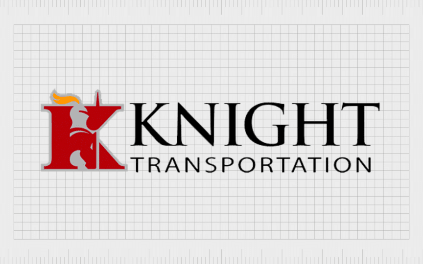
Knight-Swift, otherwise known as Knight-Swift Transportation holdings, is an American logistics company, with a huge presence. It’s the fifth largest trucking company in the US, and was first founded in 1990, by four cousins.
Unlike most logos in the transportation industry, Knight’s emblem is relatively complex. It features a monogram “K” shaped to look a little like a knight, alongside a wordmark across two levels. The company also includes a tagline in its emblem, “Delivering More”.
3. KLLM
One of the largest temperature-controlled truckload companies in the United States, KLLM operates throughout 48 states, as well as offering services in Mexico. The company was first launched in 1963, and has earned an incredible reputation over the years.
KLLM’s logo is sleek and sophisticated, featuring a serif-style inscription, with a sans-serif section placed underneath. The most eye-catching part of the transport logo for the trucking brand is the golden horse, which symbolizes speed, elegance, and strength.
4. Trans American Trucking
Since 1976, the Trans American Trucking Service has been responsible for moving endless amounts of heavy cargo and machinery throughout the US and Canada. The company offers a range of specialist services as well as fully licensed and insured logistics.
Compared to other trucking company logos, the Trans American emblem is quite unique. It features a retro-style wordmark, depicted in a range of different fonts, on a transparent background. The red coloring symbolizes the passion and vitality of the business.
5. XPO
Launched in 2011 as “Express-1 Expedited Solutions”, XPO is an American transportation company that specializes in “less-than-truckload” shipping. It operates across 564 locations globally today, making it one of the larger organizations on this list.
The XPO custom logo is relatively simplistic. It features only a short piece of text, showcasing the letters of the company’s name, in bold, capital letters. The red coloring, common in the trucking landscape, helps to make the design stand out in any environment.

6. UPS
Probably the best-known trucking company on this list, the United Parcel Service, or UPS is a freight and supply chain management brand, which was first launched in 1907. The company is the largest courier in the world by revenue, and is also a Fortune 500 brand.
The UPS shield is instantly recognizable for its unique logo colors and impactful shape. The shield conveys ideas of security and safety, helping to earn UPS trust in the transportation industry. The golden and brown coloring also adds to a luxurious aesthetic.
Find out more about the UPS logo here.
7. Deluxe Delivery Systems
One of the most complicated logos on this list comes from Deluxe Delivery Systems, a logistics and freight company first introduced in 1985. The company offers services covering fulfillment, logistics and distribution, and supply chain management.
The core component of this logo is the image of a globe, which highlights the core areas the company serves. Additionally, the red, white, and blue coloring makes the company seem patriotic, particularly for an audience in the United States.

8. FedEx
Similar to UPS, FedEx is one of the most recognizable logistics and transportation companies in the world. The name comes from the brand’s earlier title “Federal Express”. FedEx is one of the biggest companies in the world, and the fifth largest American employer.
Although the FedEx logo may seem simple, it features a lot of unique elements, from an eye-catching color scheme to a stylish sans-serif font choice. The hidden arrow in the white space between the “E” and the “X” demonstrates the company’s commitment to speed and progression.
9. DHL
A German multinational package delivery and supply chain company, DHL was first created in 1969, and has grown to become one of the world’s largest couriers. The brand serves consumers and companies across the globe, and is even listed on the Frankfurt Stock Exchange.
DHL’s logo is immediately eye catching, thanks to the bold use of the contrasting colors yellow and red. The font choice used for “DHL” is modern and evocative, with a slight slant and two horizontal lines on either side to convey ideas of speed.

10. Ward Transport and Logistics
Originally founded in 1931, Ward Transport and Logistics is a popular trucking company, with a mission of becoming the world’s most responsible and reliable shipping partner. The company offers a range of logistics, brokerage, and transportation services.
An interesting example of vintage trucking company logos, the Ward emblem is a little old-fashioned, featuring a circular badge, with the name of the company in the center. The image also includes a tagline, as well as the words “Since 1931” to highlight its history.

11. C.H. Robinson
American transportation company, C.H. Robinson offers truckload, less-than-truckload, air freight, intermodal, and ocean transportation options. It first launched in 1905, and serves customers throughout the United States, Europe, Asia, and South America.
Sleek and stylish, the C.H. Robinson logo includes a simple inscription in sans-serif font, accompanied by a unique geometric icon. The hexagon shape, depicted in blue, demonstrates stability, reliability, and trustworthiness.
12. J.B. Hunt
Another example of vintage trucking company logos comes from J.B. Hunt Transport Services. This American transportation company was launched in 1961, and is currently considered one of the biggest trucking organizations in the US.
The compelling J.B. Hunt logo features the name of the company written in sans-serif font, on a script-style background. The image is presented in black and yellow, intended to capture the attention of viewers anywhere in the world.

13. Maersk
Danish shipping and logistic company, Maersk, was launched in 1904, making it one of the oldest companies on this list. The company offers a range of services connected to shipping, supply chain management, and port operations, with offices across 130 countries.
Despite its long history, Maersk has quite a modern logo. It features the name of the company in bold, geometric font, alongside a star icon. The 7-pointed star, symbolizing excellence, is positioned in a blue square with curved edges.

14. ABF Freight
A subsidiary of the ArcBest corporation, ABF Freight is an American less-than-truckload company, based in Arkansas. It initially launched in 1923 under the name “OK Transfer”, until it acquired the AMF company and updated its branding.
The ABF Freight trucking company logo is sleek and straightforward. It features an italicized inscription, where the letters of the brand’s name appear to overlap. Underneath the image is a horizontal line in yellow, followed by the word “Freight”.
15. DSV
Another example of an excellent trucking logo design comes from DSV, a Danish transportation and logistics company founded in 1979. The company has gone through rapid expansion over the years, branching out into different divisions for road, air, and sea transport.
The brand image of the DSV company is simple but compelling. It features the business name in bold capital letters, which seem to blend together to convey ideas of innovation and creativity. The blue coloring in the logo also connects with concepts of reliability and strength.
16. Werner Enterprises
One of the better-known logistics companies in the United States, Werner Enterprises is an American logistics and transportation company. It operates across the US, Mexico, and Canada, and initially launched in 1956.
The Werner trucking business logo features a number of interesting design elements. The inscription for the brand name is set across two levels, and each word is slightly curved to make the two terms appear as though they fit perfectly together.

17. Landstar
Launched in 1968, Landstar System Inc is a transportation company specializing in third-party logistics. The company primarily operates in the United States, but also has a presence in various other countries throughout the world.
The first thing most people notice about the Landstar professional logo is the large five-pointed star, encircled by two lines. The image draws attention to the company’s focus on excellent service. The color choice, and bold clean font also give the brand a reliable and trustworthy image.
18. TFI International
Canadian transportation and logistics company, TFI international, offers a range of truckload, less-than-truckload, courier, and logistics services. It’s the largest LTL business in Canada, and it’s also the company with the biggest trucking fleet in the region.
Like many truck logo designs, the TFI international emblem is clean and straightforward. It features the company’s name, presented in bold, grey font, slightly italicized to convey speed. There’s also a red line above the inscription, which shows power and passion.

19. Swift Transportation
One of the biggest trucking companies still in operation within the United States, Swift was first founded in 1966. The company has more than 23,000 trucks operating at present, making it the largest common carrier in the US.
The brand image of the Swift company combines a blue and gold shield, with a white zigzag in the center, with a bold wordmark. The image is confident and strong, and the slight slanting of the inscription also helps to convey ideas of speed and efficiency.

20. Saia
One of the most interesting trucking company logos on this list comes from SAIA, an American less-than-truckload company that first launched in 1924. Saia currently ranks within the top ten LTL carriers in the United States, earning annual revenues of over $1.8 billion.
The Saia logo is quite a decorative image, featuring stylized lettering in a unique serif style font. The letters at the beginning and end of the inscription extend down into an underline, with a pointed section in the middle.

21. YRC Freight
First launched in 1924, YRC Freight advertises itself as one of the original “LTL” carriers for the US landscape. The company is a leading transporter of industrial, retail, and commercial goods, and specializes in short-haul shipping solutions.
YRC attracts potential customers to its company with a great logo, designed to be both simple and instantly recognizable. It uses two lines, to represent a road, depicted in yellow, underneath the letters “YRC” in block, sans-serif letters.

22. Ryder
A little different to some of the other trucking companies we’ve looked at so far, Ryder focuses on truck sales, truck rental, logistics, and truck leasing. It’s a leading provider of fleet management solutions, and also offers services for supply chain management.
The Ryder logo is a bold and memorable logistic logo, featuring a circular shape on the side, which looks a little like a planet. The logo text in this design is sleek and easily legible in a range of sizes, and uses the color red to convey ideas of passion and energy.
23.BDP
BDP International, a member of the PSA Group is one of the top privately held freight and logistics companies in the United States. The organization operates freight centers in more than 20 cities throughout North America, and has partnerships in over 120 countries.
Compared to the other trucking company logos on this list, the BDP emblem is quite sophisticated. Designed to look fantastic on a range of print materials and mediums, the image includes a unique geometric icon, followed by the company name in serif font.
24. KAG
KAG, or the Kenan Advantage Group, is one of the largest tank truck transporters and logistics providers in North America. It delivers fuels, chemicals, and other essential products to regions across the North American landscape, with cutting-edge trucks.
Like many trucking brands using their company names as the heart of their emblem, KAG focuses its design primarily on a compelling inscription. The more dynamic layout of the lettering, with its gradients and slight slant, highlight the company’s focus on speed and precision.

25. Worldwide Express
Responsible for delivering parcels for companies to customers worldwide, Worldwide Express is an industry leader in the logistics landscape. It’s connected to the UPS brand, and focuses primarily on helping small and mid-sized companies with their shipping needs.
One of the most modern images in this logo collection, the emblem of the Worldwide Express company features a circular badge, designed to look like the earth. Over this circle, we see the letters “W” and “E” depicted in a double-line white font.
Learning from famous trucking logos
As you can see from the trucking company logos above, there’s no one-size-fits-all strategy to designing the ideal emblem. The perfect trucking company logo will differ depending on your target market, your brand personality, and the services you offer.
When it comes to transportation logo design, however, it’s worth keeping a few things in mind. Simple designs are often easier to remember than complex alternatives. Additionally, the perfect trucking logo will need to work well across a variety of landscapes and mediums.
If you’re struggling to find the perfect emblem for your delivery trucks or logistics company, working with professional designers is the best way to ensure the right results.
Reach out to Fabrik Brands today for step-by-step guidance and support building the ultimate brand identity for your evolving company.
Fabrik: A branding agency for our times.
Clarity starts with a conversation.
Thanks—we’ll get back to you shortly.
Whether you're navigating a rebrand, merger, or simply need a clearer identity—we’re here to help. No hard sell, just honest advice from people who know the sector.
Let’s start with a simple question…
Prefer to email? Drop us a line.
Fabrik’s been helping organisations rethink and reshape their brands for over 25 years. We’ve guided companies through mergers, rebrands and new launches. Whatever stage you’re at, we’ll meet you there.


