Allbirds logo history: From a simple sketch to a global brand

Are you familiar with Allbirds logo history? For many fashion and footwear lovers, the Allbirds logo is an instantly recognizable emblem. It’s an iconic symbol, associated with sustainability, eco-friendly products, and innovation.
Though relatively simplistic, the Allbirds logo is immediately eye-catching. It draws attention to the unique nature of the brand, and its compelling personality. Compared to other footwear and sneaker logos, the Allbirds emblem is sleek and sophisticated.
It gives the company a traditional appearance, similar to that of other world-renowned fashion brands from across the globe. If you’ve ever been interested in the origins of the Allbirds logo, or you’ve wondered about its meaning, you’re in the right place.
Today, we’re going to take a closer look at the Allbirds symbol, and how it has evolved over the years. Let’s dive in.
About Allbirds: Introducing the Allbirds brand
Before we begin exploring Allbirds logo history, let’s take a closer look at the brand itself. The Allbirds company is a footwear and apparel brand with a focus on eco-friendly products. A certified B corporation, the Allbirds brand stands out for its commitment to sustainability.
The founder of Allbirds, Tim Brown, apparently got the idea for the company while he was working as vice-captain of the New Zealand football team. He had attended business school previously, and used to make leather shoes for friends, but realized they were often uncomfortable.
In 2014, Brown was given a grant from New Zealand’s wool industry to design a new form of sneaker. He went on to launch his concept on Kickstarter, and raised almost $120,000 in five days.
During its first year of business, the company raised more than $7 million from investors, and captured the attention of various big corporations. Today, the company has emerged as one of the most innovative eco-friendly sneaker companies in the world.
Allbirds logo history: The evolution of the Allbirds emblem
Rebrands, brand refreshes, and changes to logo design are common in the footwear and apparel space.
However, Allbirds has avoided making any significant changes to its logo since it launched officially in 2016. The company has retained the same consistent image for over 7 years.
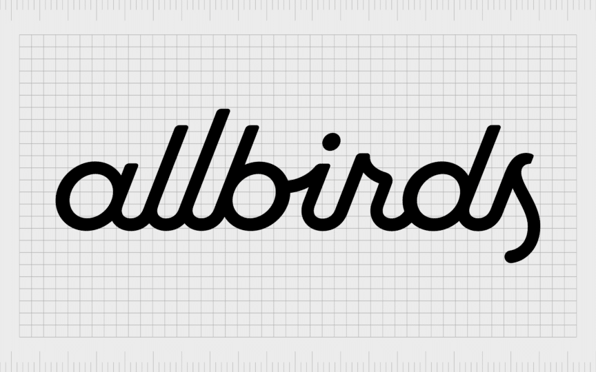
In terms of visual identity, Allbirds has taken a far more traditional approach to its logo than it has with its innovative materials and product design choices. The monochrome logo of the Allbirds symbol features a cursive logotype as its only element.

All of the letters, written in lowercase font, are connected with sleek lines and contours, giving the company a creative, yet sophisticated image. The letters themselves are stylized to look almost like human handwriting, which makes the company seem more approachable.
Modern and sharp, the Allbirds badge has remained completely untouched over the years. The simple typeface includes multiple different heights of line, giving the company a bubbly appearance. Additionally, the rounded letters seem welcoming and friendly.
Perhaps the most interesting part of the Allbirds inscription is the letter “S”, which is slightly more condensed than the rest of the characters. It’s also larger in terms of height than the other letters, with the lower portion extending below the rest of the characters.
The two “L” letters are also quite interesting in this logo, as they each feature different lengths. The first “L” is much shorter than the second, which might symbolize the company’s commitment to growth, forward progression, and ambition.
What is the Allbirds symbol? Allbirds logo meaning
The Allbirds logo might seem just like a simple inscription, baring the name of the famous brand, but it has a lot of underlying meaning. The unique font choice is iconic, intended to represent the playful contours of traditional handwriting.
Instead of using a uniform typeface, Allbirds allows its creativity to shine through, with lines in varying lengths, and characters that form unique shapes. Additionally, it’s worth noting that all of these characters are connected, showcasing a sense of unity.
The black and white color palette is a versatile choice in the fashion industry. It’s commonly used to ensure a logo can work well on all mediums and platforms. However, it’s also symbolic of strength, sophistication, and style.
The decision to present the Allbirds logo in all lowercase letters is important here too. It makes the company seem more approachable and friendly. The company has avoided following the trend of bold, blocky letters in the sporting world, for something sleeker and more refined.
The Allbirds logo: Fonts and colors
The Allbirds logo is symbolic of the company’s values and personality. The simple inscription tells us everything we need to know about the brand’s commitment to delivering excellence in its innovative shoes. It also highlights the youthful and modern nature of the business.
Depicted in black and white, the Allbirds logo also works well in a range of different environments, giving the company the versatility, it needs to stand out in the fashion world.
You can see the Allbirds logo in closer detail with the resources below:
What color is the Allbirds logo?
The Allbirds logo colors haven’t changed since the beginning of the company. The official Allbirds logo color is simply black, presented on a white background. In some cases, the company has inverted this color palette for various branding and marketing purposes.
As mentioned above, this convenient and versatile color palette ensures the badge can work well in a host of backgrounds without losing its appeal or legibility. It also draws attention to the commitment Allbirds has to the style landscape and fashion industry.
What font does the Allbirds logo use?
Like the color palette, the Allbirds logo font hasn’t changed since the company created its original badge in 2016. The script lettering for the logo is specific to the brand, and was created in collaboration with the Red Antler company.
This custom typeface features a number of bubbly and unique elements, drawing attention to the creativity of the business. It has a slight resemblance to some other commercial fonts, such as the Enfantine Nathan typeface.
Soaring to new heights: The Allbirds emblem
Although there haven’t been any changes to the company’s design throughout Allbirds logo history, examining the brand’s visual identity can provide some unique insights to consumers and designers.
The Allbirds logo has remained consistent throughout the years, in part because it’s versatile enough to grow and evolve with the brand. Though simplistic, this logo perfectly represents the unique personality of the Allbirds company, and its core brand values.
With a playful and creative inscription, Allbirds tells its customers its committed to creating stylish products, which appeal to everyone. The cursive badge is eye-catching and compelling, reminding us of concepts like progression, unity, and beauty.
Fabrik: A branding agency for our times.
Clarity starts with a conversation.
Thanks—we’ll get back to you shortly.
Whether you're navigating a rebrand, merger, or simply need a clearer identity—we’re here to help. No hard sell, just honest advice from people who know the sector.
Let’s start with a simple question…
Prefer to email? Drop us a line.
Fabrik’s been helping organisations rethink and reshape their brands for over 25 years. We’ve guided companies through mergers, rebrands and new launches. Whatever stage you’re at, we’ll meet you there.


