


Volvo logo history and the Volvo symbol meaning
If you’re not a die-hard fan of the brand, you may not know much about Volvo logo history – but that doesn’t make the symbol any less compelling. This iconic image has captured the attention of countless consumers over the world, not least because of its connection to the male gender symbol.
For the past 85 years, even as the details of the Volvo car logo have evolved, the defining shape of the emblem has remained the same. For many, Volvo’s logo is one of the more unusual images chosen by a car manufacturer, but also among the most memorable.
If you’ve ever asked yourself, “why is the Volve symbol a male gender mark?” Or you’ve questioned what the original Volvo logo might have looked like, you’re in the right place.
Here’s your guide to Volvo emblems over the years…
Volvo history: The Volvo male symbol
The Volvo logo is distinctive for a number of reasons, not least because it’s also the symbol used to represent the male gender in many parts of the world. The current version of this symbol is simple, modern, and perfect for a growing global company.
Introduced in 2021, the new Volvo logo includes the name of the company written in a bold serif font in the middle of a wide circle border. In one section of the circle, towards the upper right, we see a clean black arrow, pointing upwards, almost indicating forward motion.
This modernized version of the Volvo logo isn’t quite as similar to the male gender symbol as some of the previous iterations, but the connection is definitely still there. The image is an updated version of many similar symbols connected with the brand since 1930.

Volvo: Brand overview
| Founded: | 1927 |
| Founder: | Assar Gabrielsson and Gustaf Larson |
| Headquarters: | Gothenburg, Sweden |
| Website: | www.volvocars.com/ |
| Logo downloads: |
Volvo is a Swedish auto manufacturing company first established in 1927 by founders Gustaf Larson and Assar Gabrielsson. The pair chose the name “Volvo” from the Latin word Volvere, which means “to roll”, or “I roll”.
Today, the company is best-known for producing a huge range of sedans, station wagons, and SUVs.
Popular for its commitment to safety and stability, Volvo quickly became a well-known car brand across the globe. In 1999, Volvo sold its car-making division to the Ford Motor Company, and in 2010, the brand was sold again to Geely.
Today, Volvo remains a part of the wider Geely brand.
The Volvo logo was created at the beginning of the company’s history and has often been connected with the male gender symbol – which also happens to be the astrological symbol for Mars.
Though this image became synonymous with the male gender during the Renaissance, Volvo chose the image for its other, alchemic meaning.
The symbol was also used as a chemical symbol for iron.
Volvo logo evolution: The Volvo logo over the years
There have been a handful of Volvo logos over the years, though most have maintained a number of the same elements, including the image often confused with the male symbol.
Each year, upgrades to the Volvo car logo focused on making the brand image more synonymous with quality and reliability.
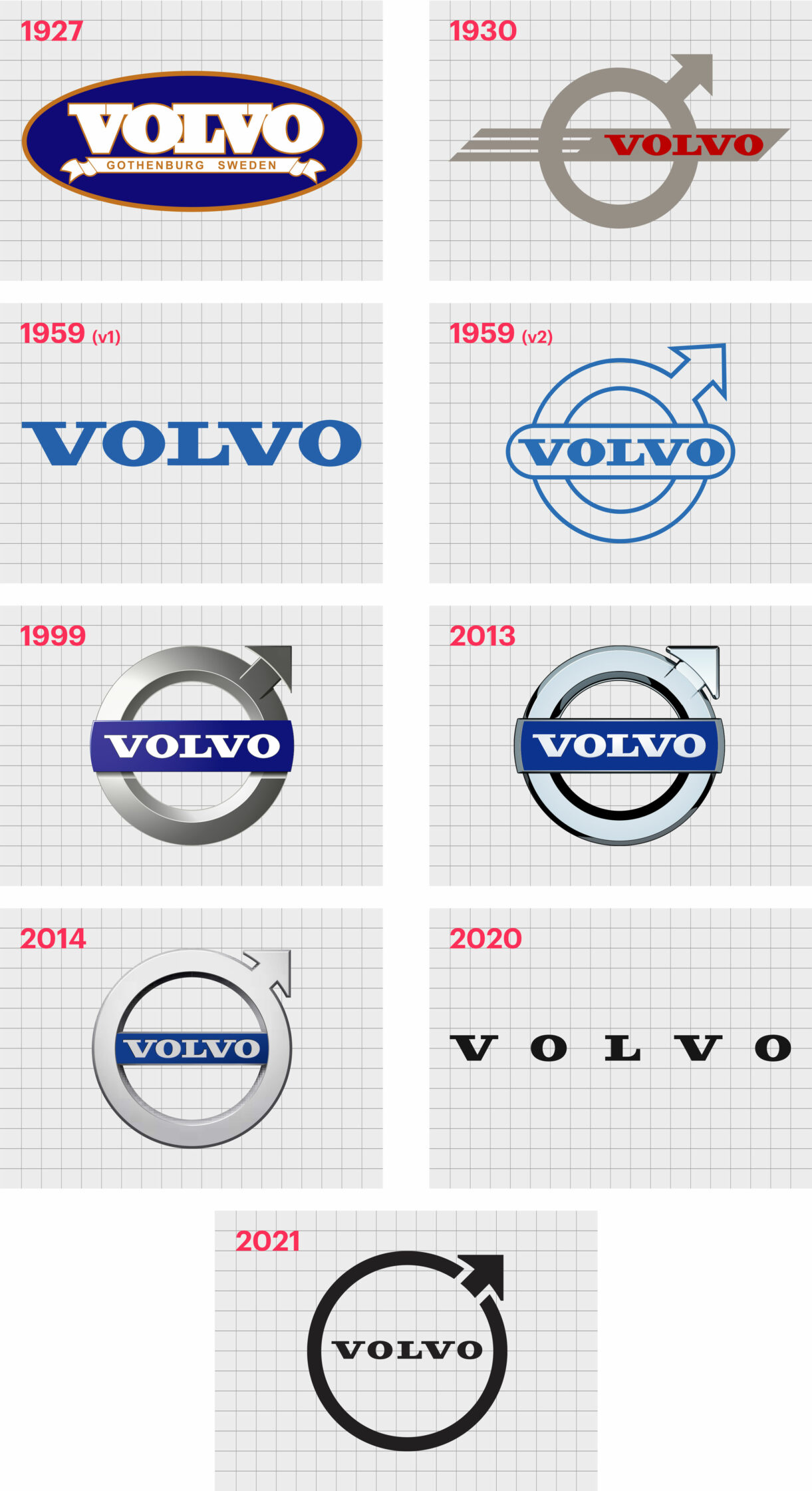
1927
The original Volvo logo was one of the only emblems created by the brand which didn’t include the circle with an arrow in it. This old Volvo symbol simply used the name “Volvo” in a blue oval with a golden brown outline.
Underneath the name (written in white, capital serif letters), was a banner-style ribbon featuring the words “Gothenburg, Sweden”. This was a very traditional image for the company, and one which made a lot of sense for the brands of the day.
1930
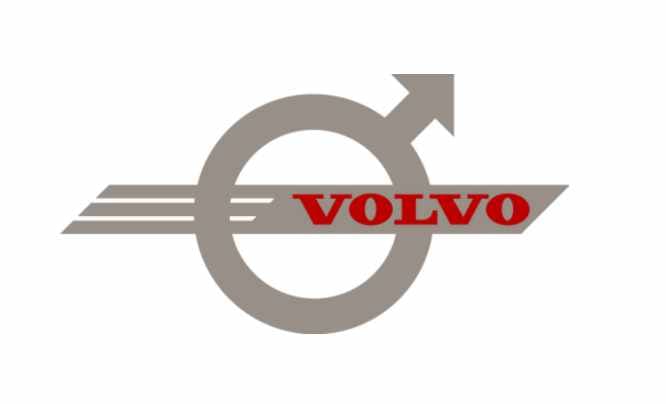
1930 is the first time we saw the Volvo car symbol with the shape we know best today. This image used the alchemic symbol for iron, depicted in grey, with a grey line going through the middle of the circular part of the shape. The line featured the name “Volvo” in red, serif, all-capital letters.
The line in the center of the Volvo image here included two white stripes. The design created a sense of motion, pushing the icon towards the right. The overall effect was a symbol of progress and forward movement.
1959
In 1959, Volvo considered going without its iconic shape for a while, using just the wordmark instead. The font for this wordmark was similar to those used in previous versions of the old Volvo logo. The letters were bold, serif in style, and written fully in capitals.
The biggest difference in this Volvo logo change, aside from the absence of the male gender symbol, was the color choice. Volvo switched from grey and red, to a soft, reliable shade of blue.
1959
In 1959, there was yet another change to the Volvo car symbol. The wordmark became a little broader, and more stretched out, written on a banner in the center of the famous Volvo symbol.
Though versions of this logo were depicted in blue and white, the design most commonly appeared in black and silver.
1999
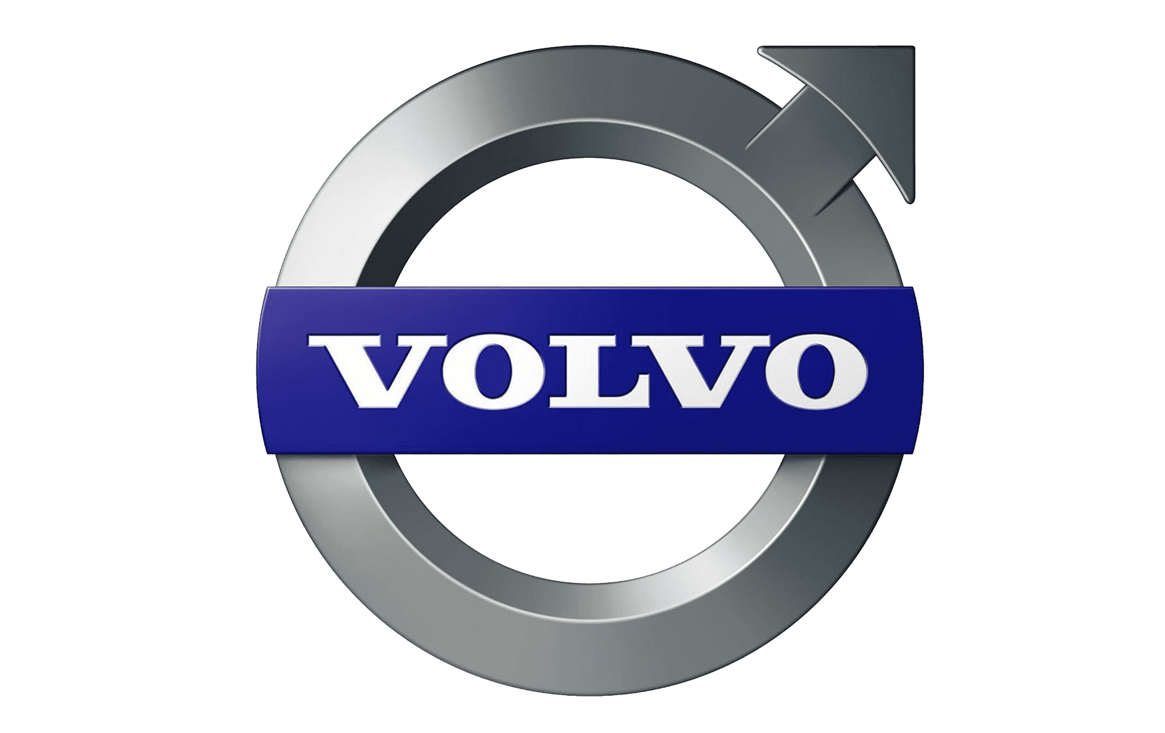
In 1999, a new Volvo logo was introduced. Similar to the previous iteration, this emblem featured the wordmark for the brand inside of the iconic circle and arrow shape.
The color choices were altered again, with the circular shape now depicted in metallic grey, and the wordmark written in white on a deep blue background.
The image updated slightly in 2013, adjusting the deeper gunmetal grey of the circular shape, to a rich, chrome silver. The banner depicting the Volvo name was also altered slightly, becoming more refined and sophisticated.
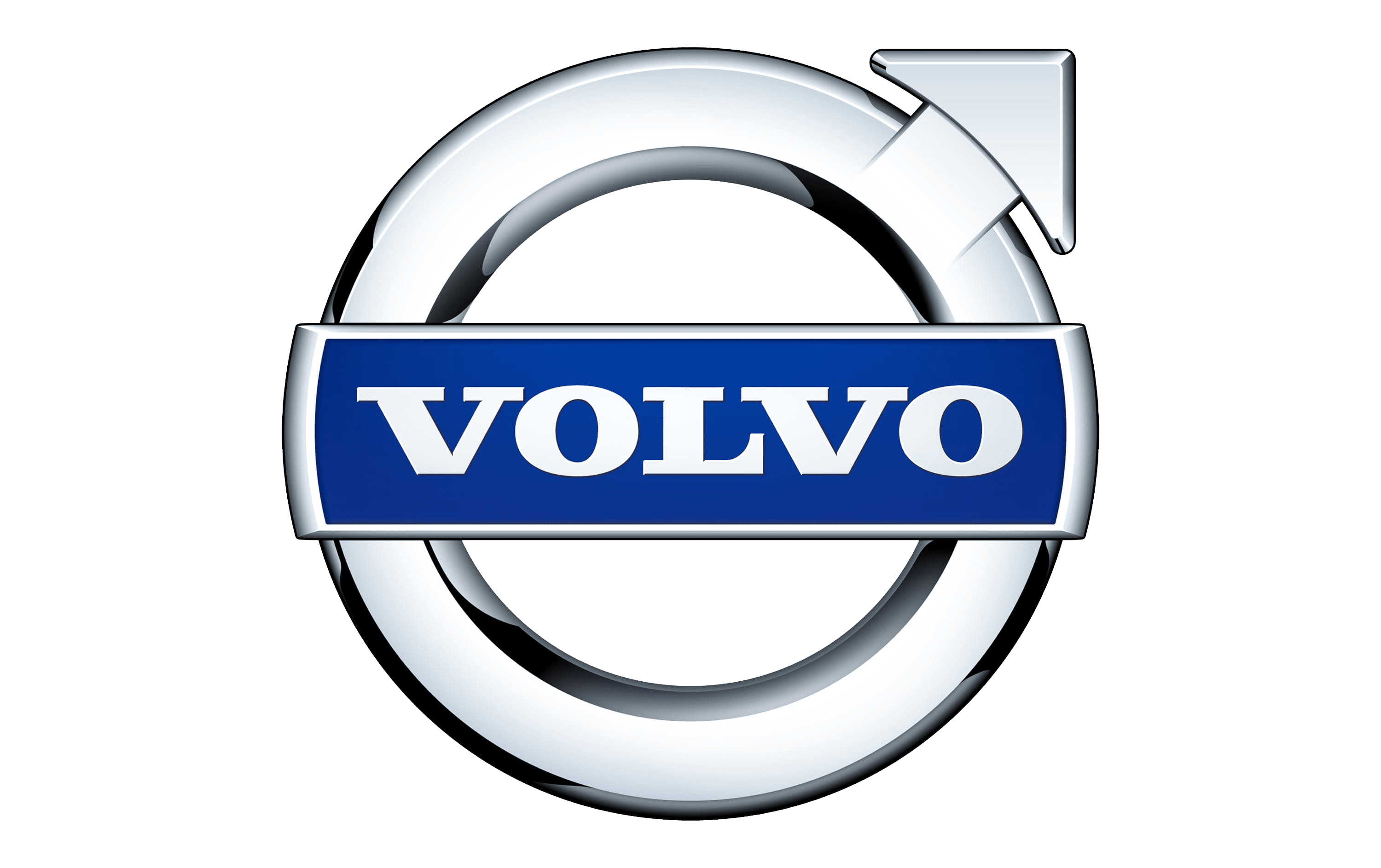
2014
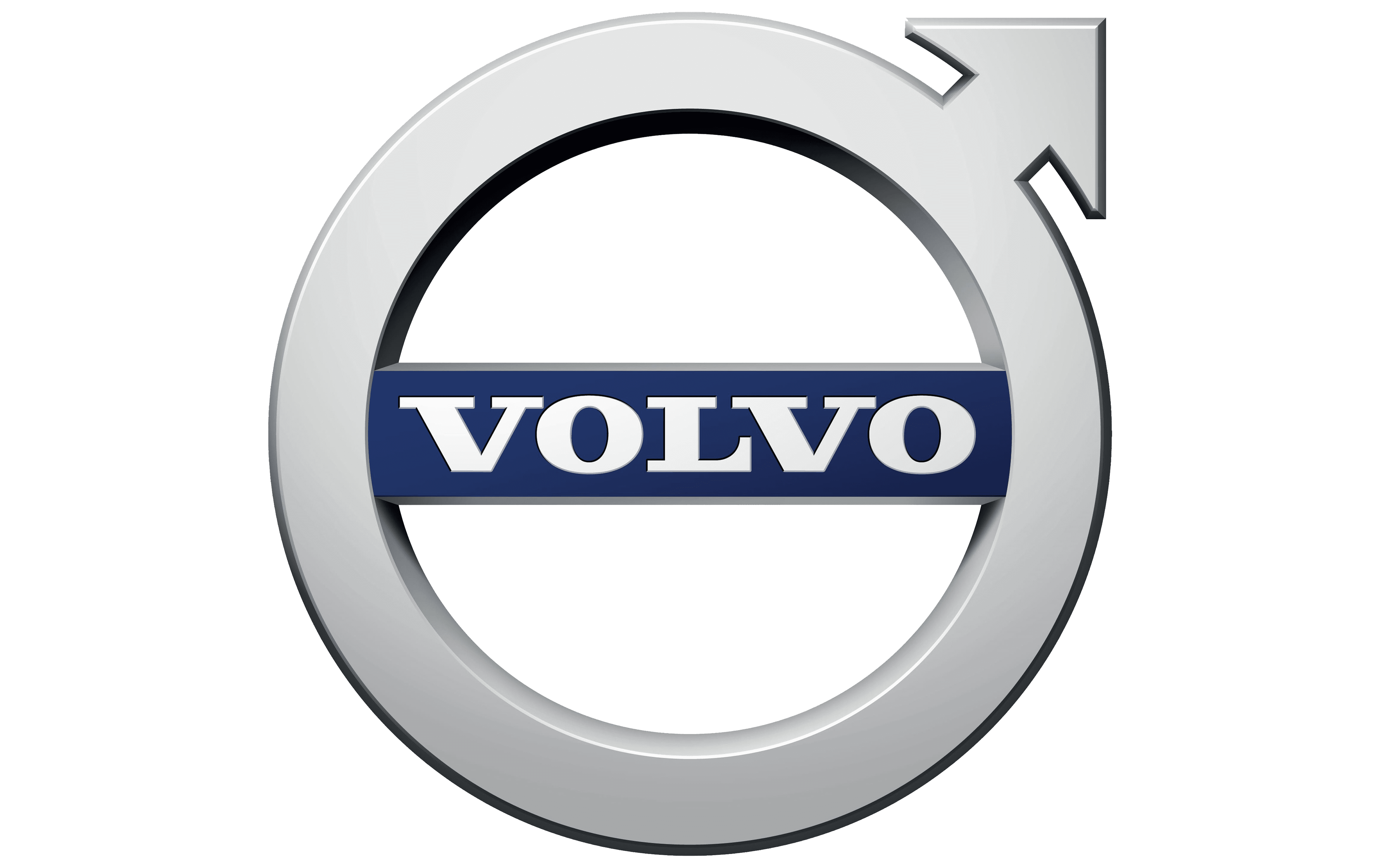
In 2014, the Volvo emblem evolved to the symbol most people are familiar with today. The banner for the Volvo wordmark was placed within the symbol of the circle with the arrow, rather than sitting on top of it.
The color scheme was also refined, though the central choices of silver, white and blue remain.
2020
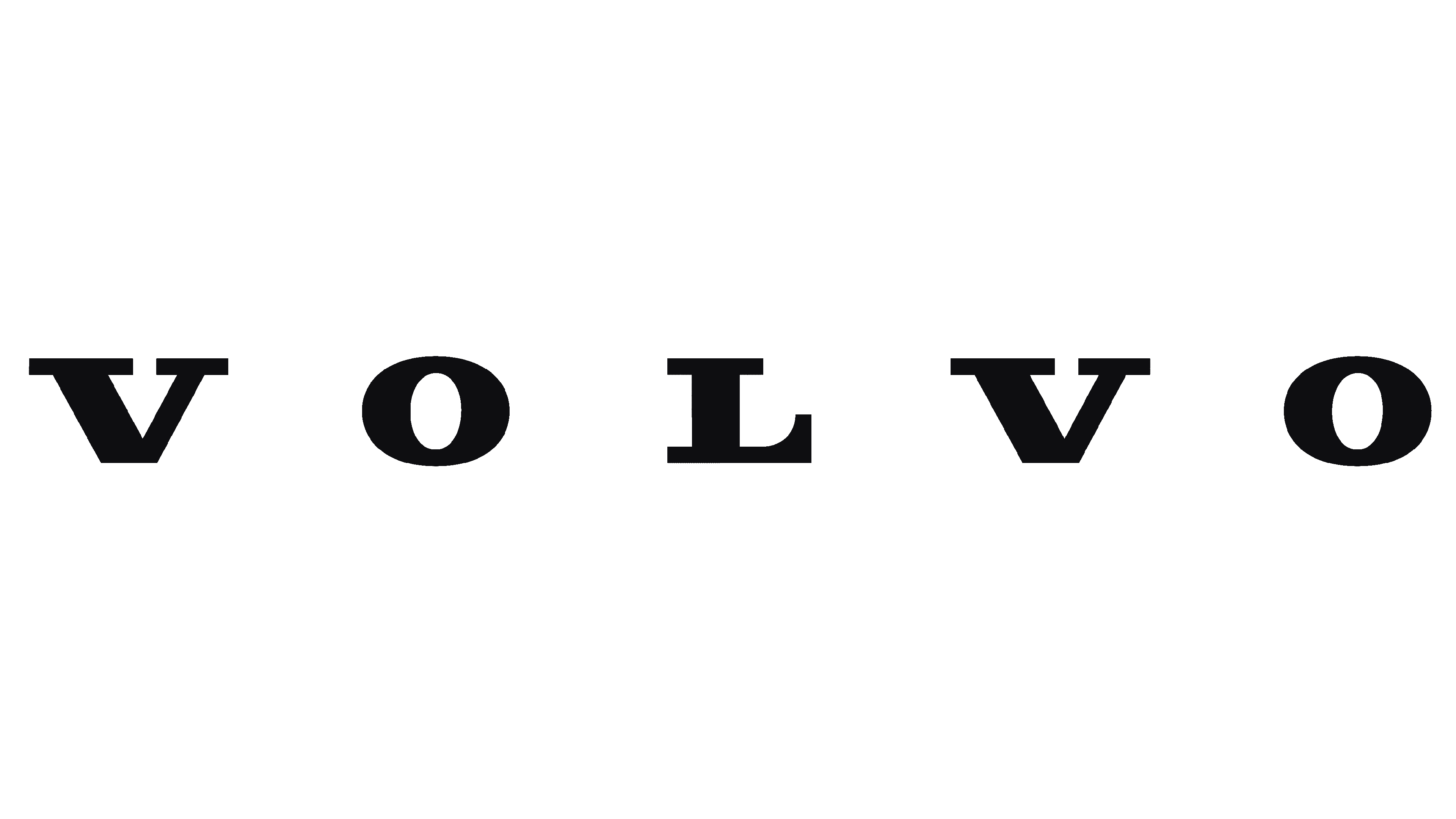
In 2020, Volvo once again returned to a more minimalist design, this time just using the word “Volvo” in highly spaced-out serif letters. The distinctive typeface written on a white background creates a sense of sophistication and power.
2021
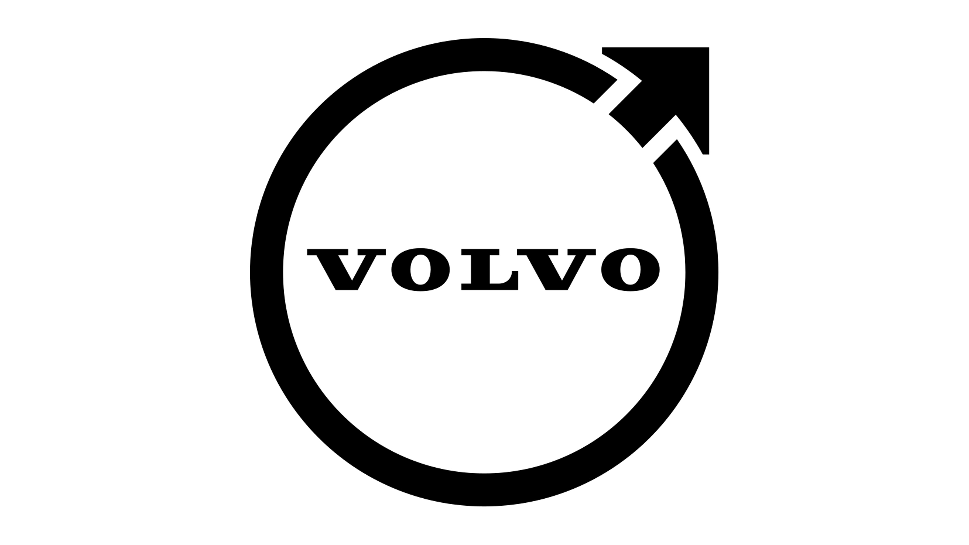
The latest version of the Volvo car symbol appeared in 2021, bringing the company back to its roots with the unforgettable circle symbol with its top-right arrow.
The flat black and white design brings a minimalist appeal to the image, which helps to highlight the sophistication and modernity of the brand.
The Volvo wordmark shares a similar font to the one most commonly remembered in 2014.
Volvo symbol meaning: The Volvo emblem
Discussions about the Volvo logo meaning have been popular in automobile circles for some time now. The male gender icon originated in Rome and was also used as an astrological symbol for Mars, said to represent the God’s sword and shield.
Although many people assume Volvo chose the male gender symbol to create an image of strength and masculinity, this isn’t the case.
Volvo’s logo actually comes from the chemical symbol for iron. Alchemists used the same design used to depict the male gender to symbolize iron.
According to historical insights into the Volvo Company, Founders Larson and Gabrielsson were inspired by their time working for a Swedish steel company, and they decided to use the “iron mark” as a result.
The mark, according to Volvo, is intended to reflect the heritage and strength of the Swedish company, and the automaker’s commitment to durability, strength, and safety.
Volvo logo colors
Today, Volvo, like many modern automobile brands, has chosen to update its logo to a simple black and white version of previous designs. The current Volvo logo colors represent power, sophistication, class, and modernity.
In the past, the Volvo logo color wasn’t simply black, of course. Previous versions of the design featured blue, which is usually intended to depict wisdom and reliability. Silver, another color in the badge, is frequently connected with innovation and creativity.
What font is the Volvo logo?
The Volvo logo font is a simple serif design based on Clarendon Text. The bold, sophisticated choice of font helps to highlight the extensive history and heritage of the brand, as well as its reliable nature.
Volvo’s logo font is instantly recognizable among vehicle enthusiasts.
Celebrating the Volvo logo today
The Volvo logo today is an excellent insight into how some symbols can stand the test of time, even when some of your customers may not understand what they mean.
While not everyone understands the source of the Volvo logo, most people can instantly identify a Volvo car on any street.
Why not check out more Logofiles on Brand Fabrik?
Now read these:
—Which car companies own which car brand?
—Famous car brands, their names and logos
—The ultimate list of French car brand logos
—The 50 best-known car logos with wings
—The definitive guide to German car logos
—Famous car logos and emblems with stars
—Top American car brands and their logos
—Your ultimate guide to Italian car brands
—American car companies that went bust
—The conclusive guide to British car logos
—The essential list of Japanese car logos
—A decisive guide to car logos with circles
Fabrik: A branding agency for our times.

Clarity starts with a conversation.
Thanks—we’ll get back to you shortly.
Whether you're navigating a rebrand, merger, or simply need a clearer identity—we’re here to help. No hard sell, just honest advice from people who know the sector.
Let’s start with a simple question…
Prefer to email? Drop us a line.
Fabrik’s been helping organisations rethink and reshape their brands for over 25 years. We’ve guided companies through mergers, rebrands and new launches. Whatever stage you’re at, we’ll meet you there.