


Peugeot logo history: Taking the Peugeot symbol for a spin
The Peugeot logo is one most people can instantly recognize at a glance on the street. With a proud lion to depict strength and prestige, the Peugeot symbol is regarded by many as one of the industry’s most influential icons.
First launching in 1810, Peugeot is one of the oldest car companies in the world, and it’s had several variations to its logo over the years. However, despite decades of change and evolution, many Peugeot car logo variations we’ll cover below have shared a similar aesthetic.
Whether you’re a massive fan of the Peugeot car company or want to learn a little more about the emblems you can see on the road today, read on for your complete guide to the Peugeot logo.

Peugeot: Brand overview
| Founded: | 1810 |
| Founder: | Armand Peugeot |
| Headquarters: | Paris, France |
| Website: | www.peugeot.com |
| Logo downloads: |
Peugeot is an iconic French car company and one of the oldest automobile manufacturers in the world. Owned by Stellantis today, the brand was first created in 1810, when the Peugeot family initially focused on creating saws, hand tools, coffee grinders, and bicycles.
The company’s logo, coined by Emile Peugeot, started with a lion walking on an arrow to symbolize the speed and strength of Peugeot saw blades. When the company eventually began to produce cars and motorcycles in the 1900s, the lion emblem remained an essential part of the brand.
Armand Peugeot was interested in automobiles from the early days and met with leading innovators like Gottlieb Daimler to learn more about their potential. The first Peugeot vehicle was a steam-powered car.
Peugeot logo History: The Peugeot logo evolution
There have been several Peugeot logos throughout the years, adapted to suit the modern styles of the time and the expectations of the company’s evolving audience. Currently, the Peugeot symbol is regarded as one of the most important in car branding history.
Officially, the origins of the Peugeot car symbol date back to 1810, and the original design elements are still evident in the logo today. This makes Peugeot’s logo the oldest car emblem in the world.
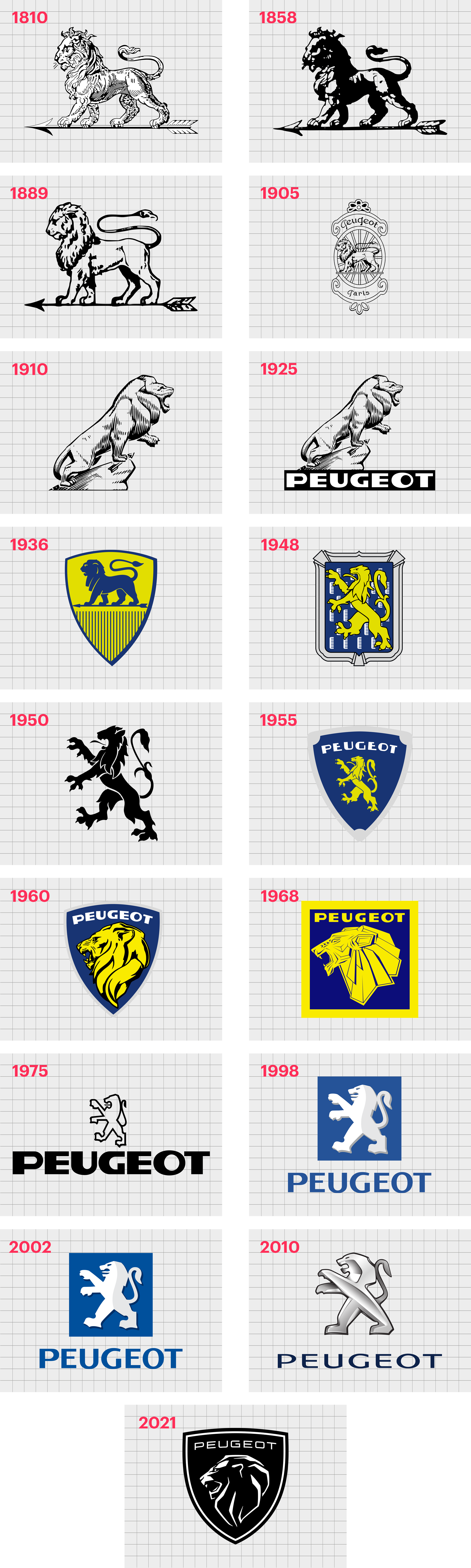
1810
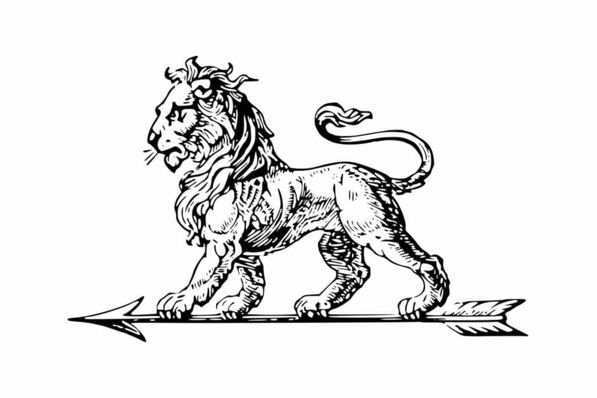
Long before it was known for manufacturing cars, the Peugeot company was already using the iconic lion in its emblem. The image of the animal walking along an arrow was intended to demonstrate the strength, grace, and durability of the company’s products.
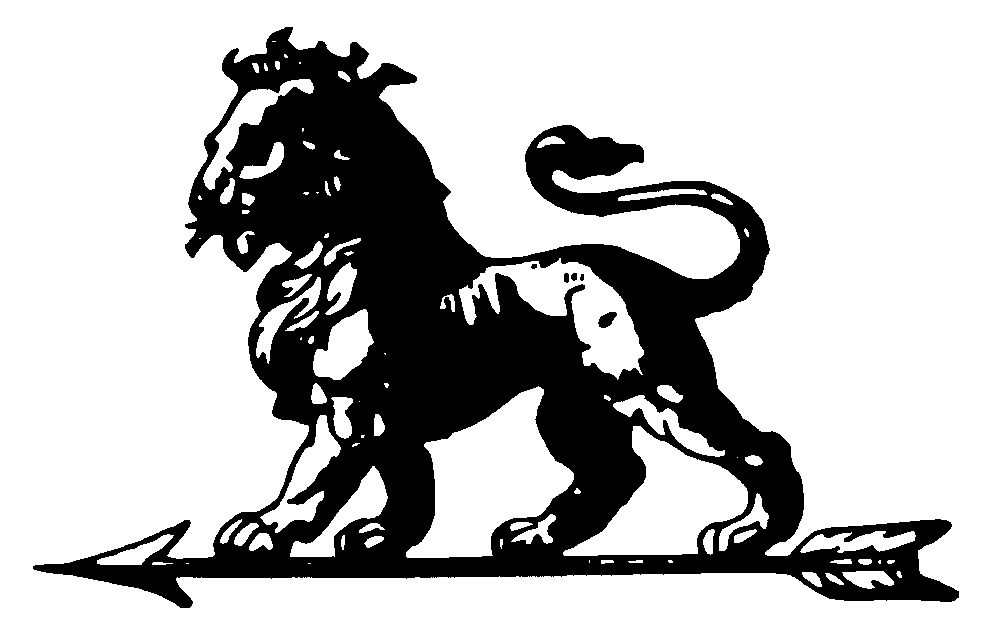
In the 1850s, a darker version of the logo was produced, with more black details and deeper contours. However, the essential elements of the logo in this design remained the same.
1889
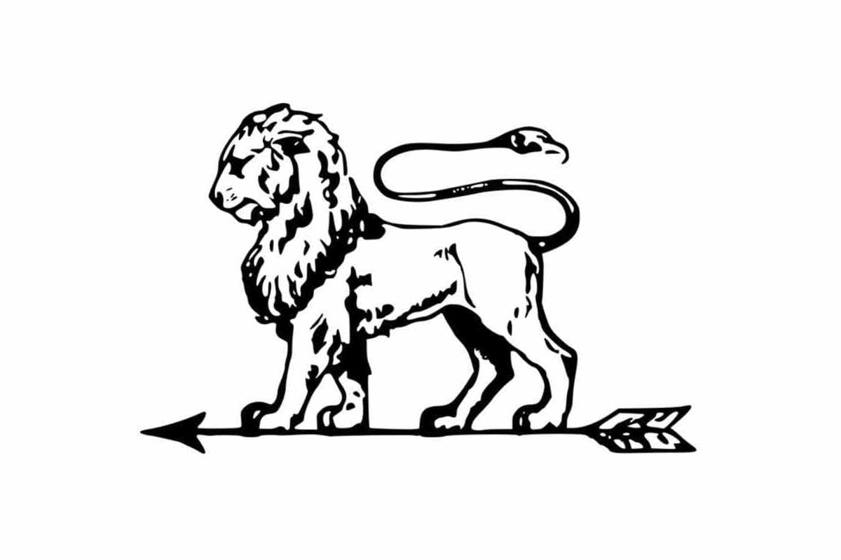
The Peugeot emblem in 1889 was a slightly refined version of the previous design, with a unique tail on the lion, and a somewhat different vibe from the image overall. A jeweler designed this variation of the old Peugeot logo and eventually placed it onto a coat of arms.
In 1905, the Peugeot team placed the new lion design on a badge representing a coat of arms. The oval emblem with its ornate framing had the words “Peugeot” and “Paris” written in cursive font. Interestingly, the “Ps” appeared to be pointing backward.
1910
In 1910, the Peugeot emblems evolved again, abandoning the old-fashioned badge design to highlight the lion on its own. This variation of the Peugeot logo was a lot more three-dimension and showed the lion in mid-roar.
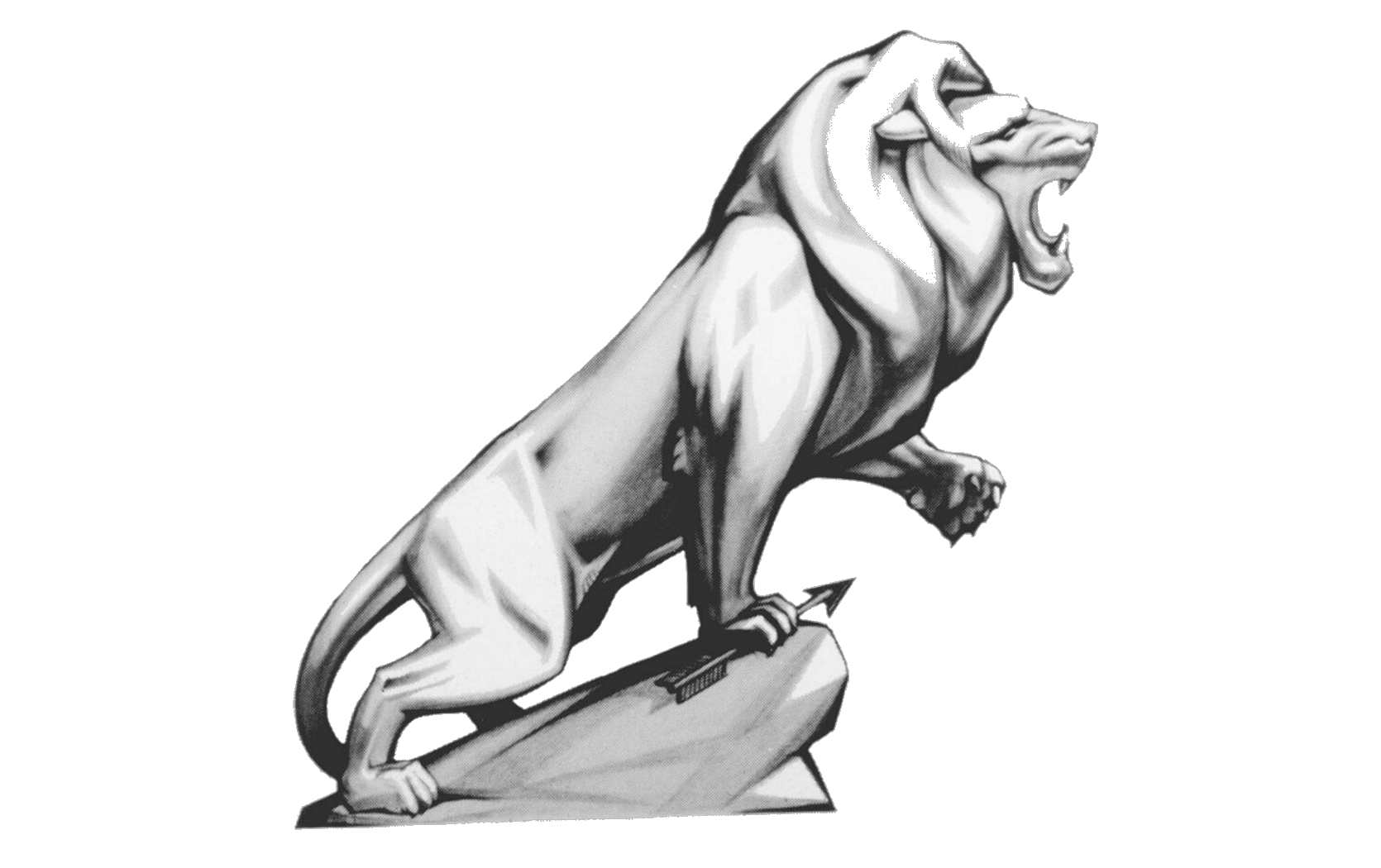
In 1927, Peugeot refined this new version of its logo and added a wordmark to the bottom in bold sans-serif letters. The lettering, like the design of the logo, was eye-catching and confident, intended to convey the strength and professionalism of the brand.
1936
1936 marked a return to the company’s roots for Peugeot, with the return of the lion standing on the arrow. This time, the design was placed on a yellow shield and depicted in blue. The classic crest design helped highlight the brand’s prestige and heritage.
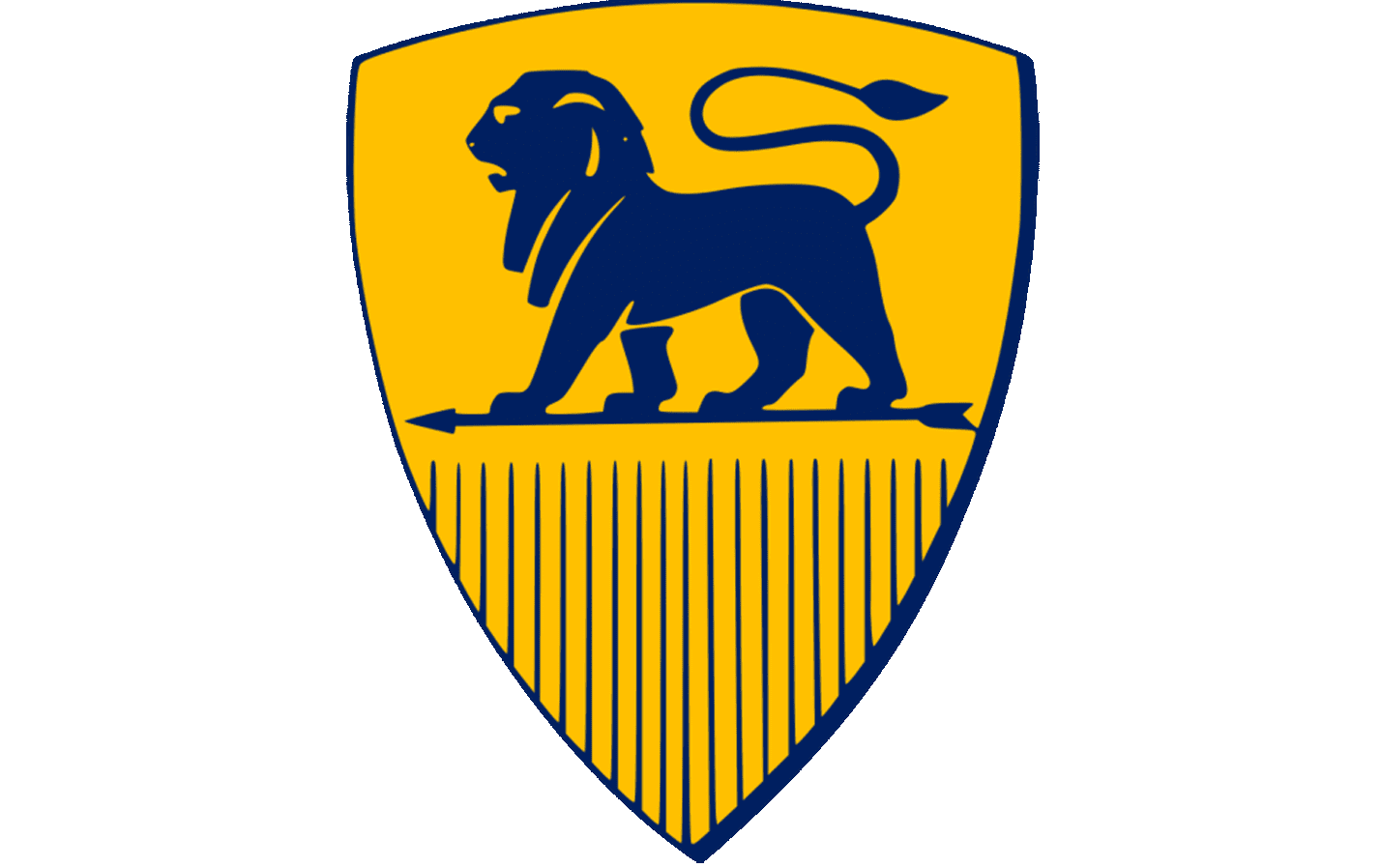
1948
In 1948,Peugeot started placing its emblem on car bonnets and also experimenting with their lion’s style. The emblematic lion for the new range of designs was inspired by the Franche-Comté coat of arms and placed on top of a rectangle with an ornate frame.
During the 1950s, Peugeot removed the frame and used a simple version of the lion rampant on its own. This version of the lion was in solid black, making it a good choice for fitting on virtually any background.
1955
By 1955, Peugeot was exploring the shield-style emblem once again. This time, the Peugeot emblems started with the company’s name and the lion rampant in dark blue. The bold Peugeot wordmark was placed above the lion’s head.
In the 1960s, the company changed the lion to an image of just the lion’s head with a thick and flowing mane. The shape of the emblem still resembled a classic coat of arms.
1968
The Peugeot logo for the late 1960s featured a geometric twist with more flat elements and bold lines. The image was more minimalist than previous images, but it still had a modern and strong appeal for the Peugeot brand.
1975
During the 1970s, Peugeot began experimenting with its famous lion outline logo, which placed the lion rampant symbol on top of a bold, sans-serif wordmark for the brand. The unique design added a sense of volume and power to the Peugeot symbol.
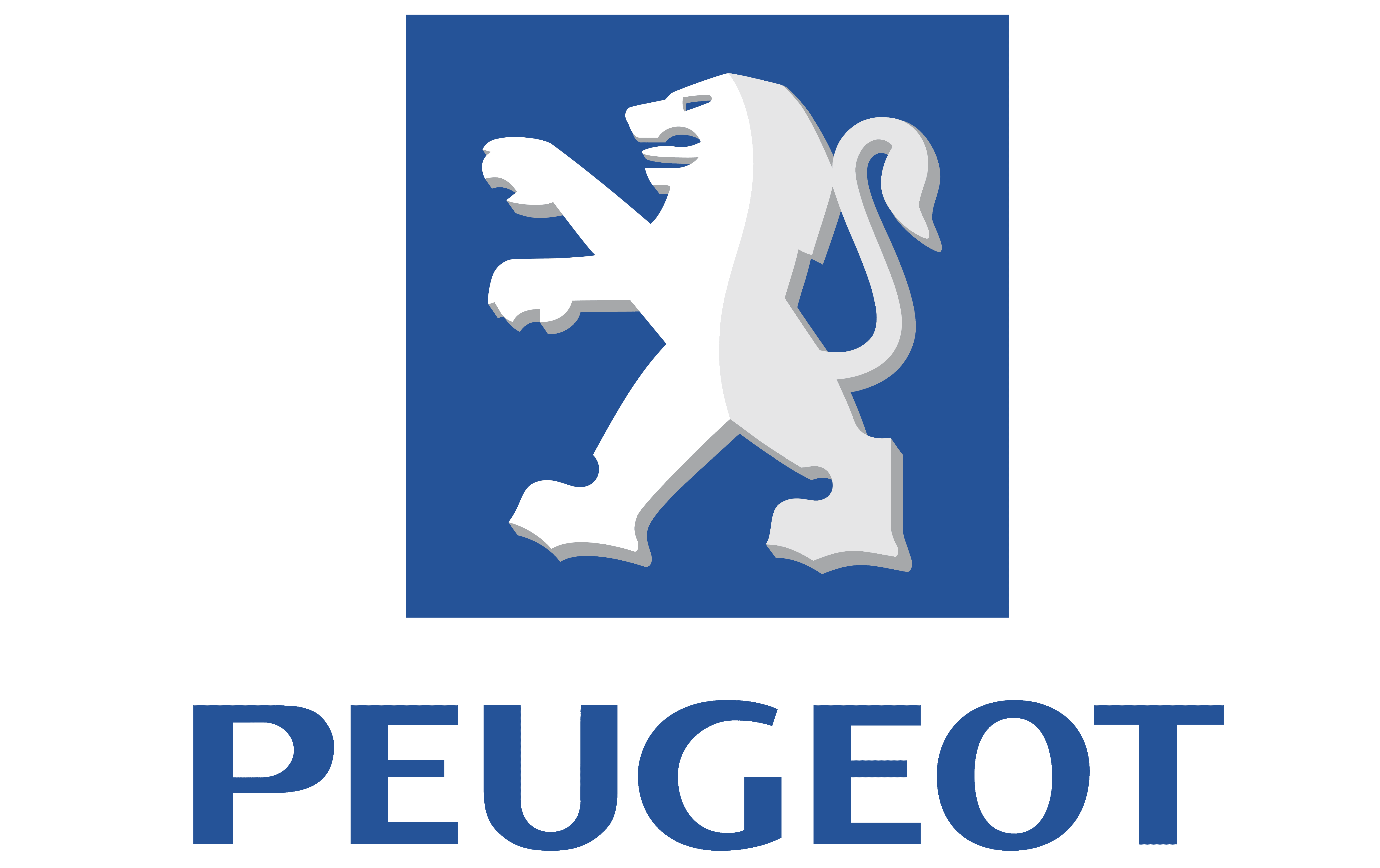
By 1998, the company had changed the color palette and design of the logo slightly. This time, the lion was designed in white and silver on a deep blue background, matching the wordmark underneath. The lettering was similar to the previous design but somewhat slimmer.
In 2002 the logo was defined a little further, with a slightly different shade of blue and a few bolder contours in the lion itself.
2010
From 2010 and 2021, Peugeot continued using the lion rampant as the primary image for its brand. However, this time, the design was displayed in a chrome, metallic effect, with various points of shadow and lighting.
The Peugeot wordmark also became slimmer and more modern, with a more contemporary approach to spacing.
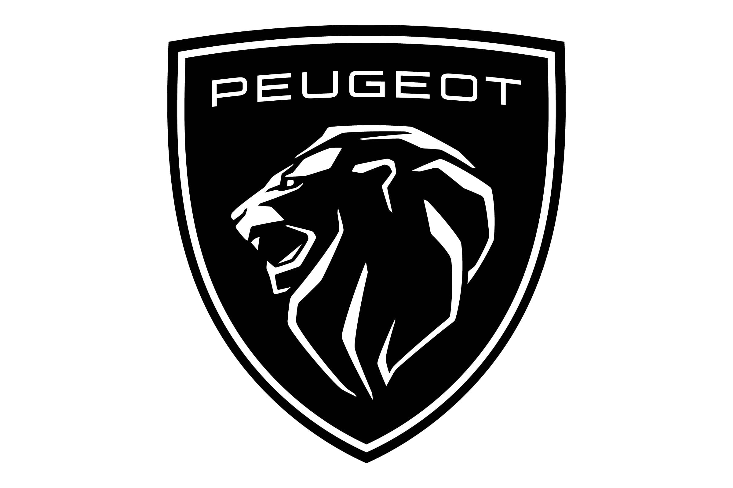
2021
The new Peugeot logo introduced in 2021 is a variation of the company’s logo from previous years, which featured a lion’s head on a shield background. This new design features a black crest with a white outline and the company’s name in sans-serif font.
The image of the lion is still present, though we only see the head of the creature, mouth open in mid-roar to depict power and strength.
Peugeot symbol meaning and features
The Peugeot car symbol might have changed several times over the years, but all Peugeot emblems have retained the same crucial lion image.
The lion is the most critical part of the Peugeot brand identity, intended to symbolize the strength and durability of the company’s products when they were still producing steel products.
The lion was also a heraldic symbol of the commune which the Peugeot family came from, making it an important part of their personal history.
Today, the lion symbol continues to represent the power and sophistication of the brand. The shield background for the lion head is another insight into the company’s stability and a throwback to its long-standing heritage.
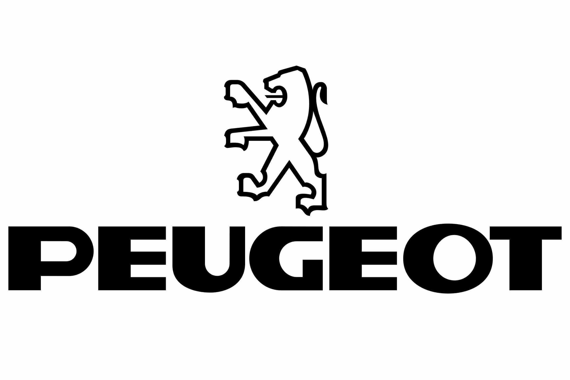
What font is the Peugeot logo?
The Peugeot logo font is a unique typeface explicitly designed for the company. The exclusive corporate typography is called “lion” and is used for all Peugeot branding.
The variation of the Peugeot symbol font most people know today comes from previous interpretations of the company’s typography over the years. The design is bold, contemporary, and easy to read, ideal for a car brand.
Peugeot logo colors
The official Peugeot logo color has changed several times over the years, like the company’s lion design and font choice. Today, the colors of the brand are simply black and white. These shades are often combined to convey an image of sophistication and timeless elegance.
Celebrating the Peugeot logo today
As one of the oldest automotive logos in history, the Peugeot logo has played an essential role in the branding landscape for cars throughout the years. This emblem has helped inspire many companies to choose symbols for their car brands over the years.
Peugeot’s logo is an excellent example of how companies can leverage the traditional elements of their original logos and adapt them to suit a modern audience.
Fabrik: A branding agency for our times.

Clarity starts with a conversation.
Thanks—we’ll get back to you shortly.
Whether you're navigating a rebrand, merger, or simply need a clearer identity—we’re here to help. No hard sell, just honest advice from people who know the sector.
Let’s start with a simple question…
Prefer to email? Drop us a line.
Fabrik’s been helping organisations rethink and reshape their brands for over 25 years. We’ve guided companies through mergers, rebrands and new launches. Whatever stage you’re at, we’ll meet you there.