


Kia logo history and the Kia symbol meaning
There’s a good chance you can comfortably recognize the Kia logo at a glance, but do you know where this emblem came from? Most people don’t. Here’s everything you need to know about the Kia symbol…
The Kia car symbol has quickly earned its place among the better-known car logos in the world. Not only is it easy to remember, but this simple and clean logo helps to highlight the personality and values of the brand for potential customers.
Through a careful use of color and style, the Kia emblem immediately depicts a forward-thinking, modern brand, with a focus on energy and passion.
Today, we’re going to be looking at the details of various Kia emblems over the years and discussing how the Kia car symbol has evolved.
Kia history: The Kia car logo today
The Kia symbol as we know it today is a sleek, easy-to-recognize and simple symbol, consisting of a stylized word mark. The design is available in both red (the original color of the brand), and black, and is usually depicted on a white background.
At a glance, Kia’s current logo looks like a modern, geometric shape, created with the use of lines and white space. However, looking a little closer, we can see the individual letters of the “Kia” name.
Like many leading car symbols, the Kia logo is intended to depict a sense of speed, creativity, and excellence. The use of wide, sleek lines creates a sense of structure in this logo, while the almost abstract nature of the shape gives it a creative and modern flair.
In the past, Kia also used an oval surrounding its wordmark to depict the earth. Today however, the simplistic typography is enough to capture the hearts and minds of customers alone.

KIA: Brand overview
| Founded: | 1944 |
| Founder: | Kim Chul Ho |
| Headquarters: | Seoul, South Korea |
| Website: | worldwide.kia.com |
| Logo downloads: |
The Kia Corporation was first launched in 1944, around 77 years ago at the time of writing. Formerly, the company was known as the Kyungsung Precision Industry, then the Kia Motors Corporation, with the name stylized as KIΛ, which led to the development of the Kia car logo.
Currently, Kia is a South Korean automobile company with customers all over the globe. The brand is the second largest manufacturer in South Korea of cars, following its parent company, Hyundai.
Though Kia started life in 1944 creating bicycle parts and steel tubing, it quickly evolved to experiment with cars and trucks. Today, Kia is one of the better-known vehicle brands worldwide.
Kia logo evolution: The Kia logo over the years
Similar to many modern companies, the Kia brand continues to invest in new Kia logos to this day. The fundamental brand symbol is based on the name of the company, Kia, which translates from Korean to mean “the Rise of Asia”.
When the brand first began, it wanted to become the top representative of its country for the international market.
Over the years, the Kia logo has evolved a number of times, somewhat drastically, to become the symbol we know today.
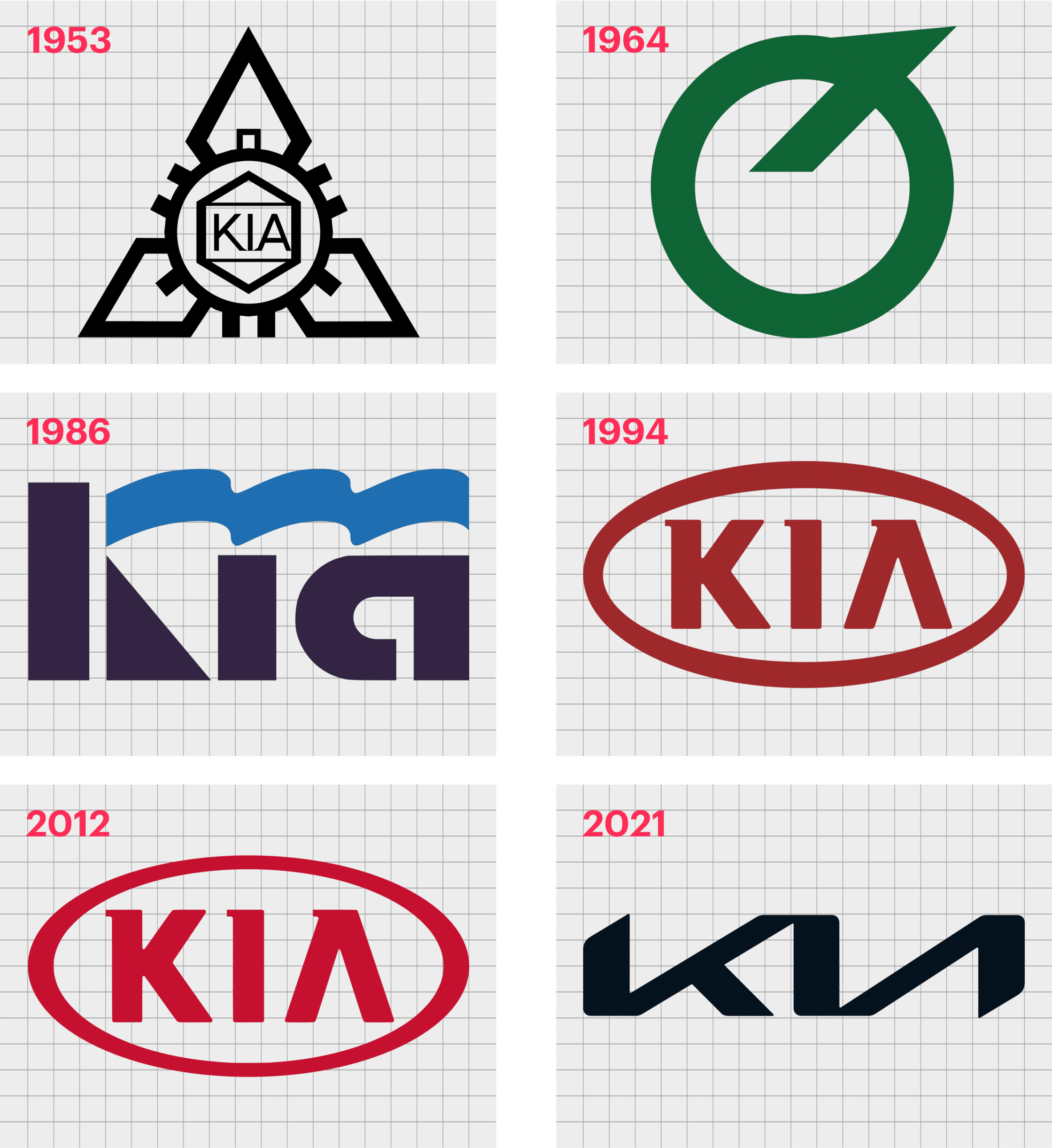
1944
The original Kia logo was a much more complex design than we know today. This design was created when the company was still focused on the manufacturer of bicycles and parts. The image featured three diamonds around a gear shape, with the name of the business framed on another diamond.
Although quite complex compared to the car logos popular in the world today, the old Kia logo was a strong piece for its time. The use of a monochrome color palette was a deliberate way to add a sense of authority and professionalism to the brand image.
1964
During 1964, Kia began experimenting with the manufacturing of cars. At the same time, the brand explored new avenues for its logo. For a time, the company used a symbol of a green circle with a diagonal line extending from it, similar to an upside-down “Q”.
1986
In 1986, Kia reintroduced the wordmark as the primary component of its logo design. The image used was a stylized version of the name, executed in a custom typeface, with thick, bold lettering. A curving line, looking somewhat like a waving flag, replaced the upper bar for the letter “K”.
1994
The 90s saw the arrival of perhaps the most significant Kia logo change for the company. The base of the most recent Kia logo before the 2020 update was introduced at this time. Here, we saw the new Kia logo font, placed within a simple red oval.
The design of the wordmark was intended to be as simple and clear as possible, unlike previous designs. Additionally, Kia embraced red as its primary color palette, to highlight the energy and passion of the company.
The surrounding white was intended to convey loyalty.
The design was refined somewhat over the years, but stayed mostly the same until 2020-2021, when a new version of the logo was introduced.
2021
The latest version of the Kia symbol, sometimes depicted in red, and other times in black, brings a futuristic, fun, and even youthful element to the Kia identity. The company still uses a wordmark for its primary visual identity, but the inscription is a lot more modern.
The letters of “KIA” seem to almost merge together in this design, to create a unique new shape.
Kia logo meaning: Kia symbol meaning
The Kia logo symbol today is intended to convey a sense of passion, energy, and modernity, as the company continues to evolve to suit an ever-growing number of customers. The Kia logos over the years have consistently maintained a strong image focused on the name of the company.
Today’s Kia logo is beautifully well-done, whether in black or red. At a glance, it conveys ideas of creativity, power, and exploration.
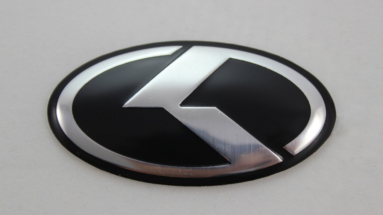
Interestingly, the Kia logo in the States and other parts of the world isn’t always the same as the image you’ll see in the Korean markets. The symbol used in the brand’s homeland sometimes features a blue or black circle, with a thick outline, and a design in silver meant to represent the letter K.
Notably, all of the versions of Kia’s logos are usually depicted in silver metal when placed on cars. The exact badge you see on your Kia vehicle will depend on where you’re buying the car, and when the vehicle was produced.
Kia logo colors: Colors used in the Kia logo
The official Kia logo colors are red, black, and white. In some cases, you may not see the red of the previous Kia logo on the new branding assets. Many versions of the new logo are depicted in black and white, to help add to the strength of the brand.
The color black is usually associated with sophistication and professionalism.
Kia colors include:
Kia live red
Hex: #BB162C
RGB: 187, 22, 44
CMYK: 0, 0.882, 0.764, 0.266
Kia gray
Hex: #7E8083
RGB: 126, 128, 131
CMYK: 0.038, 0.022, 0, 0.486
Black
HEX COLOR: #000000
RGB: 0, 0, 0
PANTONE: PMS BLACK 6 C
What font is the Kia logo?
The typography or Kia logo font is one of the most iconic elements of the Kia brand. Since the company has relied heavily on the use of word marks over the years, the right typography has made a huge difference to the overall image of the brand.
As you might expect, the Kia logo font isn’t a pre-existing type, but a font specially designed for the company itself. The font of the Kia logo is a sleek, stylized sans-serif design, intended to look bold and modern in blocky, capital letters.
Celebrating the Kia logo today
The Kia logo is one of the better-known symbols in the vehicle industry for a number of reasons. Over the years, the design has gained the attention of car enthusiasts around the world.
Though simplistic compared to other car logos, the Kia car symbol continues to make a meaningful impact on customers across the globe today.
Remember, you can find out more about similar designs to the Kia logos by checking out other Logofiles on Brand Fabrik.
Now read these:
—Which car companies own which car brand?
—Famous car brands, their names and logos
—The ultimate list of French car brand logos
—The 50 best-known car logos with wings
—The definitive guide to German car logos
—Famous car logos and emblems with stars
—Top American car brands and their logos
—Your ultimate guide to Italian car brands
—American car companies that went bust
—The conclusive guide to British car logos
—The essential list of Japanese car logos
—A decisive guide to car logos with circles
Fabrik: A branding agency for our times.

Clarity starts with a conversation.
Thanks—we’ll get back to you shortly.
Whether you're navigating a rebrand, merger, or simply need a clearer identity—we’re here to help. No hard sell, just honest advice from people who know the sector.
Let’s start with a simple question…
Prefer to email? Drop us a line.
Fabrik’s been helping organisations rethink and reshape their brands for over 25 years. We’ve guided companies through mergers, rebrands and new launches. Whatever stage you’re at, we’ll meet you there.