The Grammarly logo: Edits throughout history
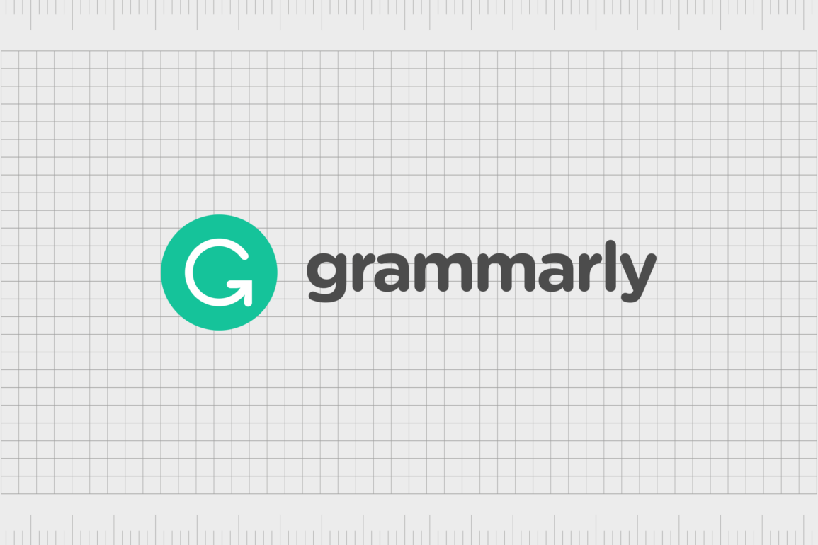
The Grammarly logo has quickly emerged as one of the most recognizable emblems in the technology industry. But how much do you know about Grammarly logo history, and why the tech giant decided to upgrade and evolve it’s emblem?
Though it might seem like a relatively simple design at first, this versatile and highly scalable logo has helped the company to strengthen its connection with a huge online audience. Sleek and sophisticated, the Grammarly logo blends well with the innovative technology landscape.
Like many technology companies, Grammarly has simplified its logo over the years, eliminating additional elements to create a clean, fresh, and balanced image.
Today, we’re going to be taking a closer look at Grammarly logo history, and the evolution of the company’s brand since it first launched in 2009.
Introducing Grammarly: The editing app
Before we start discussing Grammarly logo history, it’s worth taking a moment to learn more about Grammarly itself. Grammarly is a cloud-based typing assistant and editor app. The solution uses artificial intelligence and other innovative technology to assist users in improving their content.
Originally, the company was established in 2009, by the creators of My Dropbox, Alex Schevchenko, Max Lytvyn, and Dymtro Lider. It was intended to be an educational app at first, built to help university students improve their English skills.
Today, the Grammarly app serves a wide range of customers from all walks of life, including editors, professionals, and writing teams.
The Grammarly app, available for the web, as a browser extension, and as a download for Microsoft Office apps like Word, comes with a range of features. It can review spelling, punctuation, grammar, clarity, engagement, and delivery mistakes in texts. It’s also capable of detecting plagiarism.
Recently, Grammarly even updated its app to feature a new generative AI solution, named “Grammarly Go”, based on the GTP-3 algorithms behind ChatGPT. This tool can generate and re-write content on the behalf of users with prompts.
Grammarly logo history: The evolving Grammarly symbol
Though Grammarly has only been available for a relatively short time compared to some other apps and software solutions, it has made some updates to its brand image. Like many tech companies, Grammarly has updated and refined its logo to create a more modern image.
Here’s a quick insight into the history of the Grammarly logo, and the Grammarly icon.

2009
When Grammarly was first launched in 2009, its initial logo was a little more complex than the one we know today. The official logo was a combination mark, featuring the word “Grammarly” in sentence case, sans-serif letters.
Though the characters were depicted in grey, they featured a slight gradient, which made each letter appear slightly lighter towards the top section. The “G” in the wordmark was the most interesting element. The top curve of the letter was shortened, to make space for a pencil icon.
The pencil, created in shades of light grey, blue and white, balanced on its tip on the horizontal line of the capital “G”. The “G” itself was also balanced on a small grey circle, placed on top of a blue semi-circle, to look a little like a traditional globe.

2015
In 2015, Grammarly decided to update its logo with a focus on a simpler, more streamlined design. The pencil graphic disappeared, as did the gradient in the letters of the wordmark. However, the letters of the inscription were still depicted in a soft shade of grey.
Interestingly, Grammarly chose to remove the capital “G” from the beginning of its name entirely, creating a fully lowercase inscription. This decision creates a slightly more streamlined, and friendly looking image for the company.
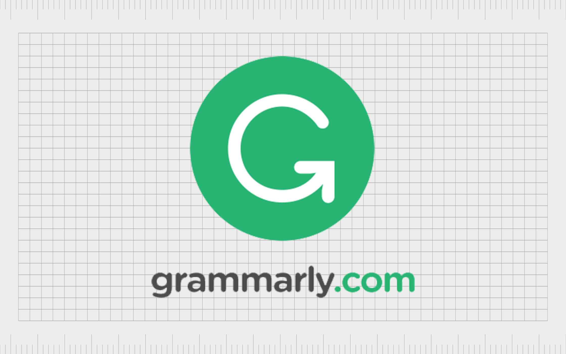
To replace the stylized “G” from the previous design, Grammarly created a new accompanying icon for its logo, featuring a green circle, with a white “G” shape in the middle. The horizontal line on the “G” has been replaced with an arrow, to symbolize progression and growth.
A version of the logo was also introduced with a much larger icon, placed on top of an inscription for “Grammarly.com”. The standalone circle icon was additionally used by the company as a favicon for its mobile apps and website.
2017
In 2017, Grammarly made a very subtle change to its existing logo, refining the letters on the wordmark slightly, and updating its color palette. Though green and grey still remain the primary colors of the icon, the shade of green is a little cooler, and more vibrant.
This slight update also affected the Grammarly icon, which now uses the slightly brighter shade of green. However, the change is subtle enough that most people may have missed the update.
Why did Grammarly change its logo?
Grammarly has only made a handful of changes to its logo over the years, but each alteration has had a specific purpose. The first change made in 2015 was intended to simplify and refine the company’s visual image, bringing it in line with the stylistic choices of other leading tech companies.
In 2017, Grammarly updated its color palette to make its icon and favicon a little more eye-catching in the digital world. The cooler green coloring is more calming, and engaging.
Interestingly, Grammarly has also made temporary changes to its logo in the past. The most notable update took place during the war between Russia and the Ukraine. Following in the footsteps of other leading brands, Grammarly changed its entire color palette and logo to reflect the Ukraine flag.

The blue and yellow version of the logo appeared across all of the versions of the Grammarly app, as well as on its website and within its social media channels.
The logo change wasn’t the only step Grammarly took to show its solidarity with the victims of the Ukraine war. The brand also wrote an open letter to tech giants on behalf of Ukrainian citizens, and promised to donate $5 million to organizations helping to defend the people of Ukraine.
The Grammarly logo: Fonts and colors
Though it may seem quite simple at a glance, the Grammarly logo is a powerful and evocative symbol. The minimalistic and sophisticated style aligns Grammarly with its competitors in the technology space, and shows its forward-thinking approach to business.
The green color palette demonstrates a commitment to growth and nurturing. This reflects Grammarly’s values and purpose, to help people improve their writing. The stylized “G” in the Grammarly icon, with its upward pointing arrow also demonstrates a focus on progression.
With its straightforward logo, Grammarly aims to inspire its audience, and demonstrate its purpose as a leading technology company. You can see some examples of the Grammarly logo below:
What color is the Grammarly logo?
Originally, the Grammarly logo colors were blue, grey, and white, shades synonymous with trust, reliability, and sophistication. In 2015, the company upgraded the Grammarly logo color palette, with a focus only on grey and green.
The new green coloring connected the company with concepts of nature, creativity, and vitality. The shade was updated slightly in 2017, to appear a little brighter, calmer, and cooler.
Although Grammarly did temporarily change its logo colors to the shades of the Ukraine flag, the official brand colors of the company remain green, white, and grey.
Green
Hex: #15c39a
RGB (21, 195, 154)
Grey
Hex: #4c4c4c
RGB (76, 76, 76)
What font does the Grammarly logo use?
The Grammarly logo font hasn’t changed much over the years. Since inception, the company used a sans-serif typeface to demonstrate modernity and accessibility. However, they did choose to switch from a sentence-case inscription to a lowercase wordmark in 2015.
The Grammarly logo font is similar in style to Lato, Proxima Nova, as well as a variety of other open-sans fonts.
Editing brand identity: The changing Grammarly icon
Looking back at Grammarly logo history, we can see the company has effectively updated and enhanced its logo for a modern audience over the years. The Grammarly logo today is a streamlined and refined emblem, which highlights the core purpose and values of the brand.
The eye-catching design, with its bright green circle, stylized “G” symbol, and friendly wordmark remind us of growth and progression. The sans-serif font choice and lowercase letters also depict Grammarly as a friendly, compassionate company.
This personality is further highlighted by Grammarly’s decision to update its logo, albeit temporarily in honor of the victims of the Ukraine war.
Fabrik: A branding agency for our times.
Clarity starts with a conversation.
Thanks—we’ll get back to you shortly.
Whether you're navigating a rebrand, merger, or simply need a clearer identity—we’re here to help. No hard sell, just honest advice from people who know the sector.
Let’s start with a simple question…
Prefer to email? Drop us a line.
Fabrik’s been helping organisations rethink and reshape their brands for over 25 years. We’ve guided companies through mergers, rebrands and new launches. Whatever stage you’re at, we’ll meet you there.


