


Famous owl logos: Your essential guide to companies with owl logos

Companies with owl logos often attempt to convey wisdom, mystery, and wonder in their brand marks. Animals are often a fantastic way to add meaning to logos, as they often have their own unique connotations developed over time throughout the globe.
Famous owl logos may not be as common as logos which feature birds in general, or a range of other animals like horses, tigers, and so on. However, owls generally stand as one of the most meaningful creatures for a range of consumers.
Today, we’re going to be looking at the meaning behind some of the most well-known brands with owl logos. We’ll also be discussing when it might be appropriate to use owls and similar animals in your own logo designs.
Why do companies use logos with owls?
Companies with owl logos are much like any business attempting to bring more meaning to their brand image through the use of symbolism. Owls are beautiful creatures, but they’re also something we associate with a range of different ideas and emotions.
Just like the bull in the Lamborghini logo can symbolize strength, the owl is often associated with concepts like wisdom, practicality, and mystery. Notably, the unique nature of the owl, and its unusual characteristics also means it can have other, completely contrasting nuances too.
For instance, when logo designers exaggerate the wide eyes of an owl, it can be associated with youthfulness and discovery. It might also be something we’d associate with silliness or humor, depending on how the animal is depicted.
The exact significance we give to famous owl logos often varies depending on:
Color choices
The colors connected with an owl logo can often give context into what the logo should mean. Darker colors convey mystery, while brighter colors are more playful and exciting. Shades like blue can even be connected with trustworthiness.
Positioning
The positioning of an owl, and how it poses in a logo will make a difference to its meaning too. Owls are predators, so seeing the creature’s wings out-stretched, its talons grasping at the air and its beak ready for prey can make the image more aggressive.
Emphasis and proportion
The way certain parts of an owl are emphasized also conveys meaning. Wider eyes and a larger head are often something we associate with youthfulness and discovery. However, emphasis on the bird’s wings would connect more to ideas of freedom and power.
Let’s take a look at some examples of owl logos around the world…
Famous owl logos
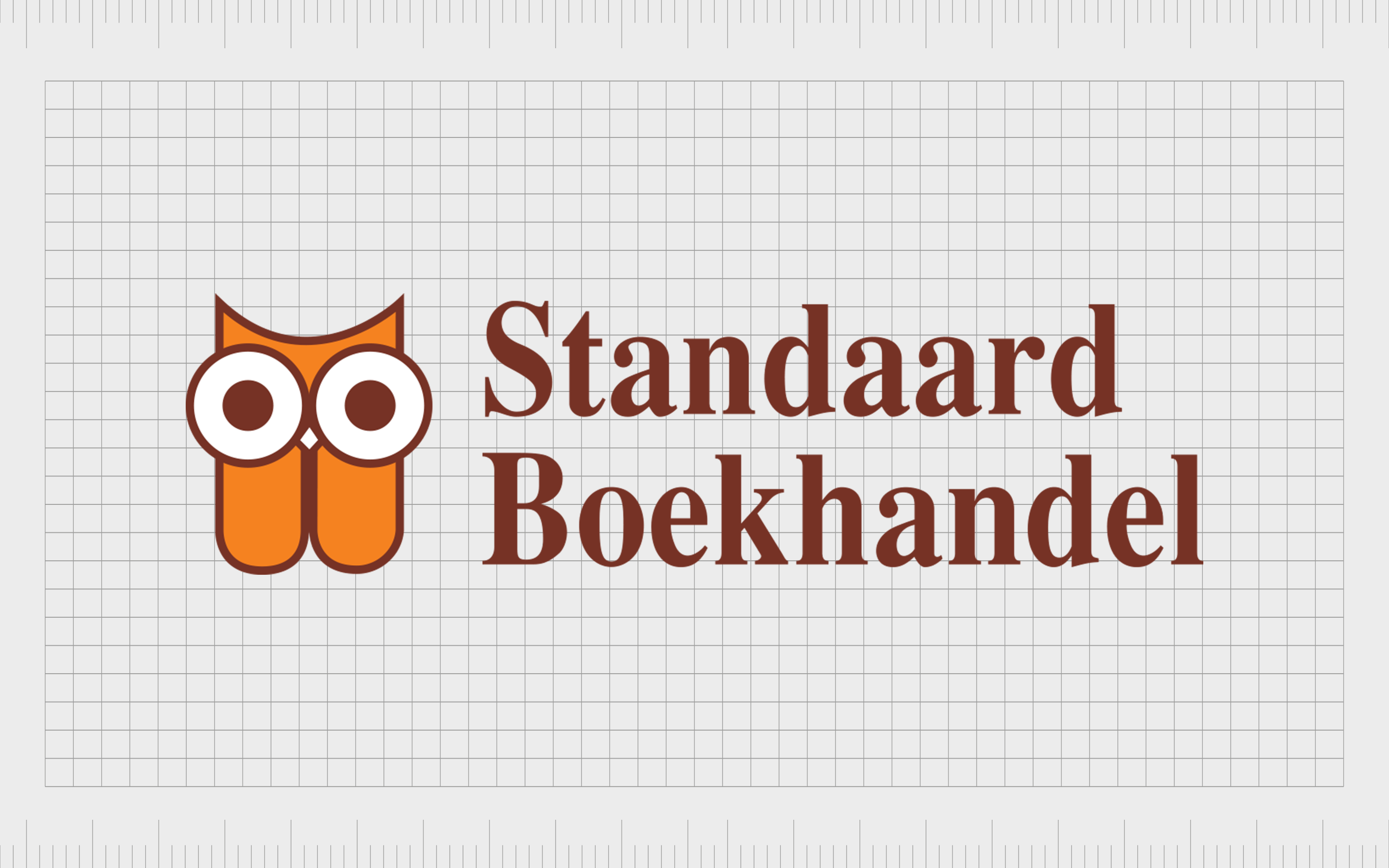
Standaard Boekhandel
An excellent insight into the versatility of owls as a focal point of a logo, Standaard Boekhandel’s owl logo uses the design principles of proportion to draw attention to the eyes of the creature, perhaps to pull attention to reading.
After all, this retail chain in Belgium focuses primarily on selling books, though it also offers a wide range of other products like board games.
Notably, the lower part of the owl is dissected, partially to represent two separate wings, and partially to make us think of the shape of a book.
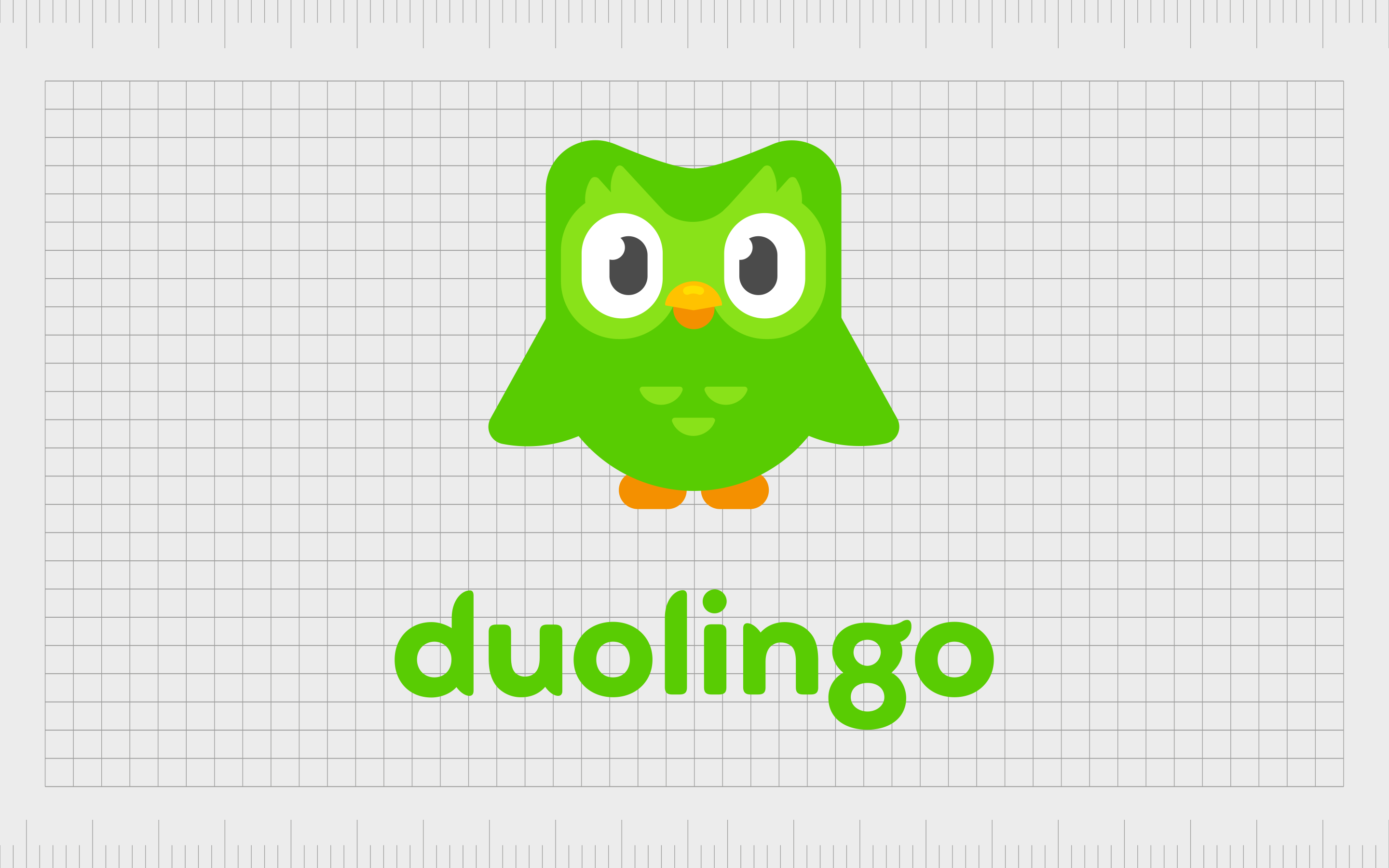
Duolingo
While Duolingo’s owl mascot is sometimes omitted from certain branding and marketing campaigns, it’s still a creature commonly associated with the brand. Most people are familiar with Duolingo as the online company dedicated to helping people learn a second, third, or additional language.
Duolingo takes advantage of the owl’s natural connections to knowledge and wisdom with this logo. The decision to use colors like orange and green, often associated with creativity and exploration, pulls focus to the values of the company.
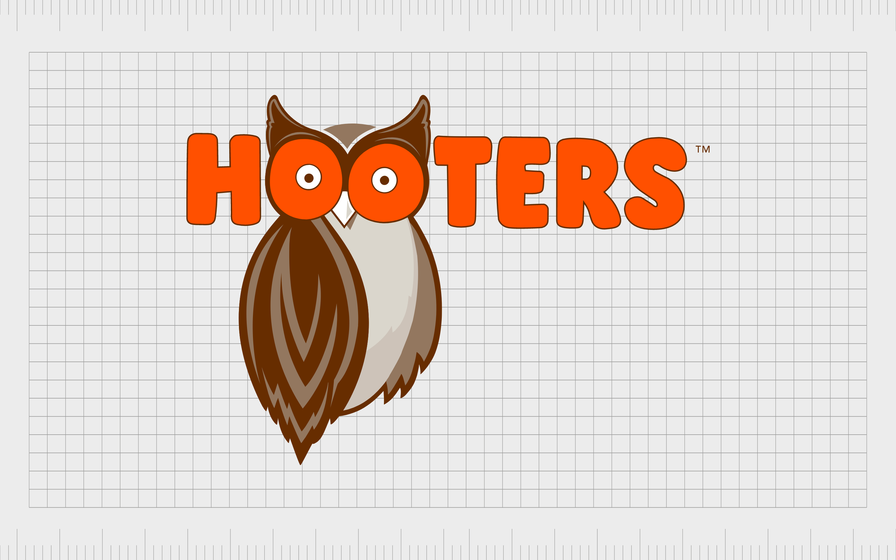
Hooters
For many, Hooters has the most famous owl logo of all. This appears to be a natural choice for a logo for a company with a name connected specifically to the sound an owl makes. The name, of course, also has another meaning, which is further emphasized by the unique positioning of the owl mascot.
The bright wide eyes of the owl gives a playful nod to the wonder and amazement patrons might feel when presented with the beautiful girls acting as servers in Hooters bars. This fun logo is further emphasized by the use of the color orange for creativity.
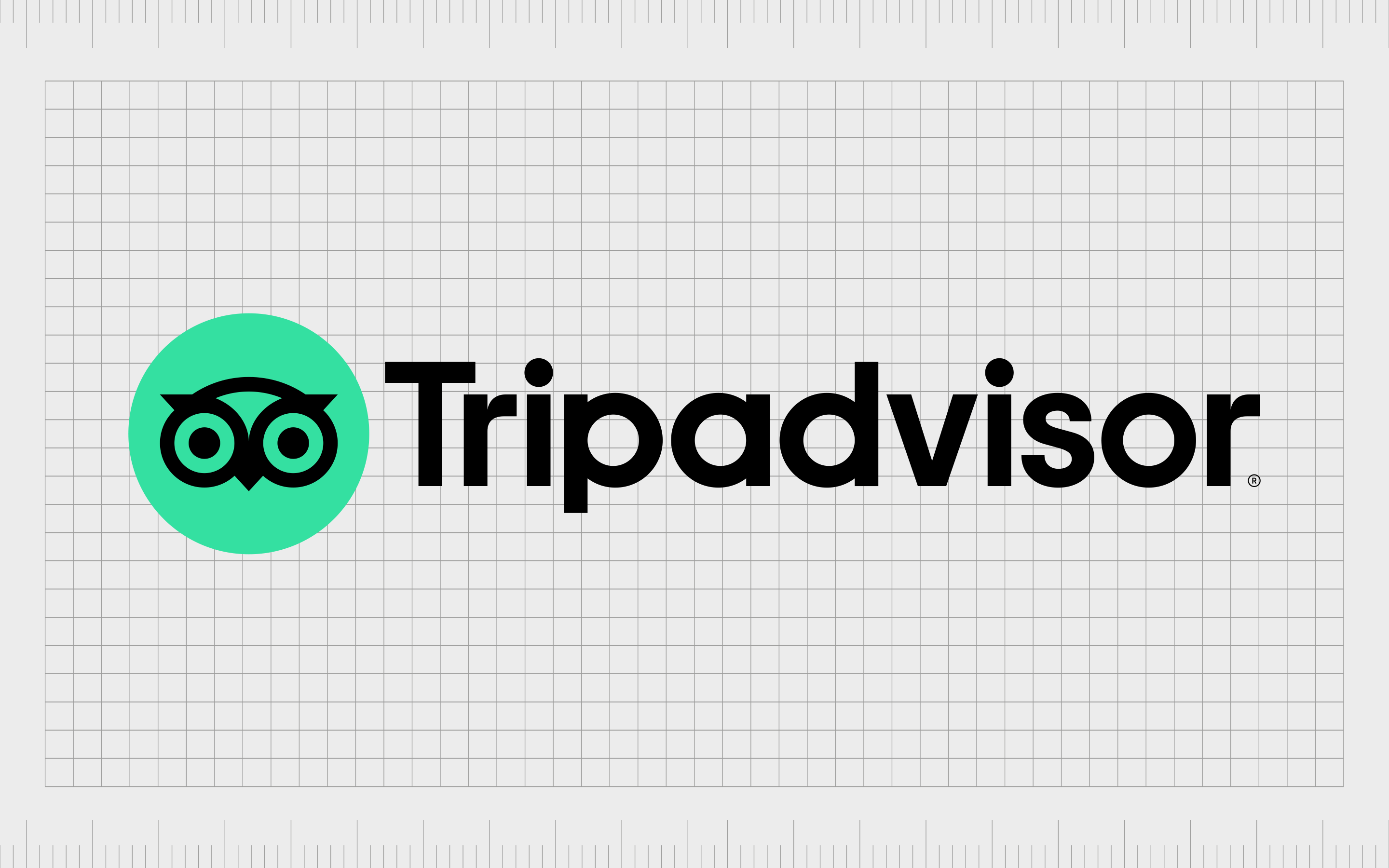
Tripadvisor
Like Hooters, Tripadvisor is one of the more well-known and famous owl logos in the world today. The American online company has been active for more than 20 years, helping people to find the best locations to visit across the globe.
The great thing about the Tripadvisor logo, is the way the company uses the shape of the owl. The wide-eyed bird reminds us of discovery and exploration. However, it’s also designed to look very similar to a pair of binoculars, which we can also connect to ideas of adventure.
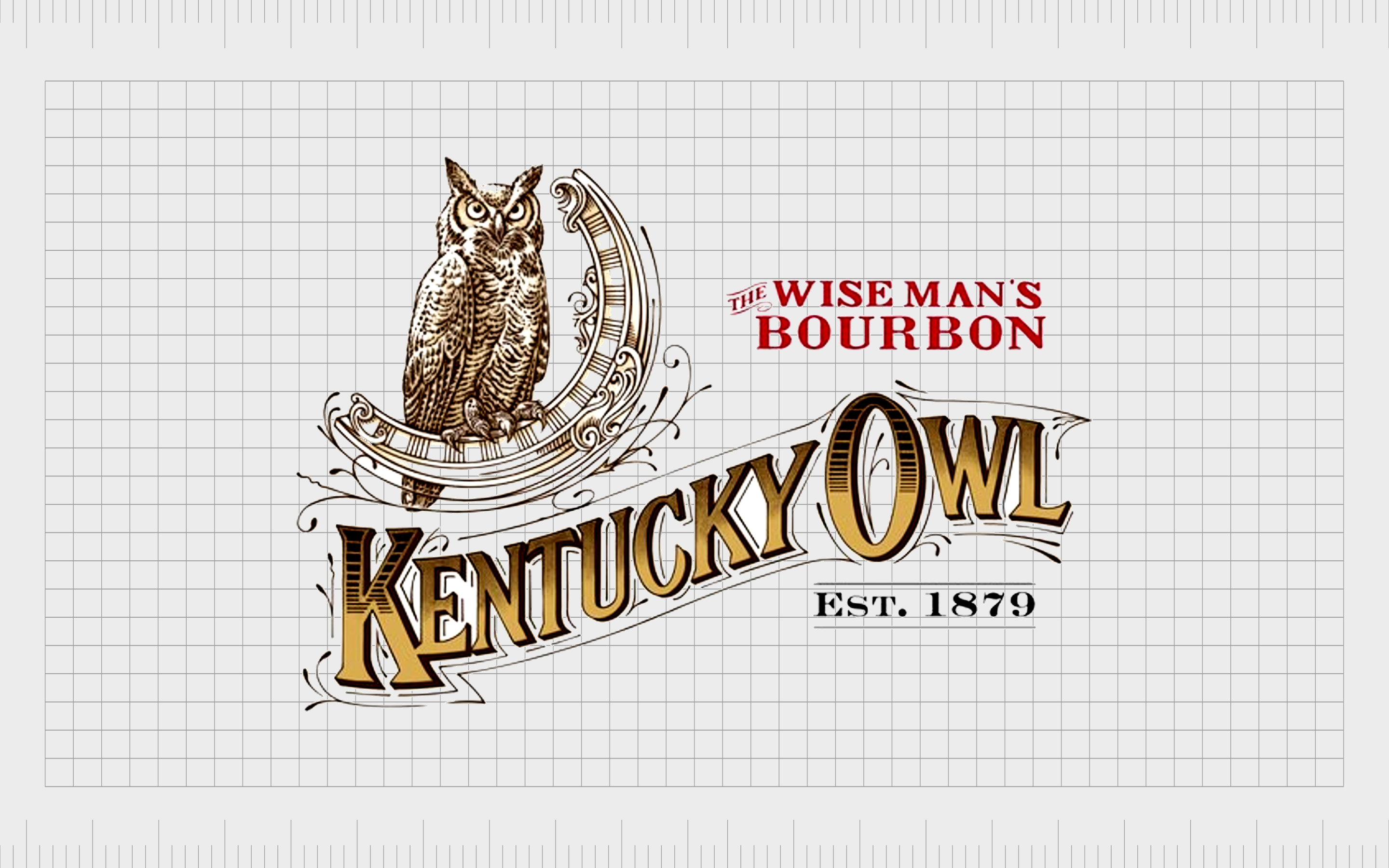
Kentucky Owl Bourbon
If you’re familiar with slightly older brands of liquor, then you’ve probably spotted this logo in a store or two. This is one of the more old-fashioned and traditional versions of an owl logo on this list. The image is extremely detailed, which sets it apart from more minimalist logos today.
With the tagline “The wise man’s bourbon”, we immediately see the connection between the owl and the concept of wisdom. The spectacular image of the owl makes us think of something regal, beautiful, and prestigious.
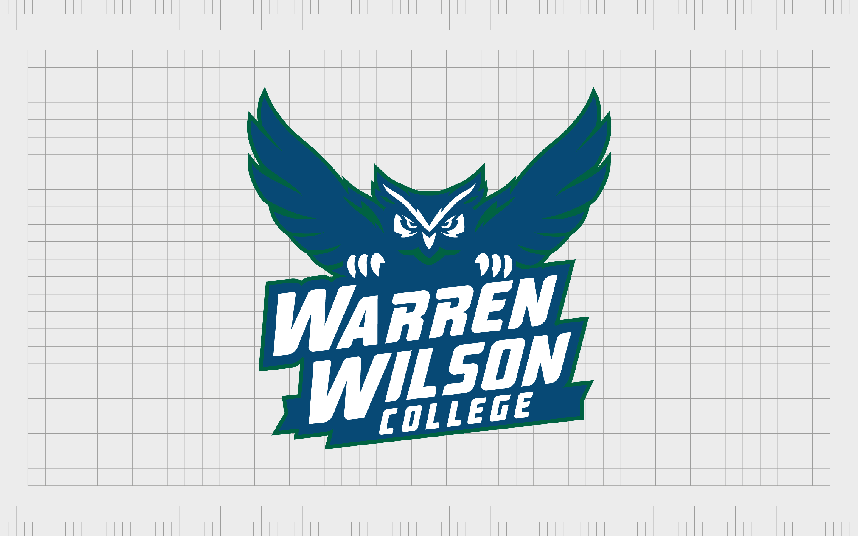
Warren Wilson College
An owl is the mascot of the Warren Wilson College athletics team. The college itself is a private liberal arts school in North Carolina, known for a curriculum combining work, academics, and service.
The design of the owl logo here is an interesting one, as it strays away from a focus on wisdom, and looks more at the aggressive elements of the bird.
The presence of the bright white talons on the owl, and its wide outspread wings demonstrate the physical prowess of the bird as a predator. This makes it a more engaging image for a sports team, where the focus is competition.

Hoot Design Studio
Hoot Design Studio is an award-winning illustration studio, as well as a craft beer industry expert. The company produces labels specifically for the craft beer landscape. Hoot’s logo is an excellent example of how owls can be used as a way of showcasing the quirkiness of a company.
The positioning of the owl’s eyes in this logo allow them to take the place of the two “O’s” in “Hoot”, they’re also placed at a slightly odd angle, with different proportions, to highlight the creative and unusual nature of the business itself.

Red Owl
The Red Owl Company is actually a retail chain and grocery store in the United States. This business was initially founded in 1922 and operated by a private investment firm. The company often placed its iconic red owl image on a multitude of its products, including herbs and spices.
The use of a bright red owl here is excellent for grabbing the attention of potential shoppers as they pass by on the street. In this case, the owl does look slightly aggressive, which might be an attempt to highlight the competitiveness of the brand.

Collingwood Fighting Owls
As mentioned above, the owl is a predatory bird, which makes it an interesting choice for an athletics team. It’s common to see the owl used as part of college football and other athletics groups associated with education. The Collingwood fighting owls is one such example.
As in the Warren Wilson Athletics logo, the designers of this image have chosen to highlight the more aggressive and powerful nature of the owl, with its out-stretched talons almost looking as though they’re coming towards the audience.
There’s an excellent use of motion in this logo to depict the owl in mid-flight, highlighting action.
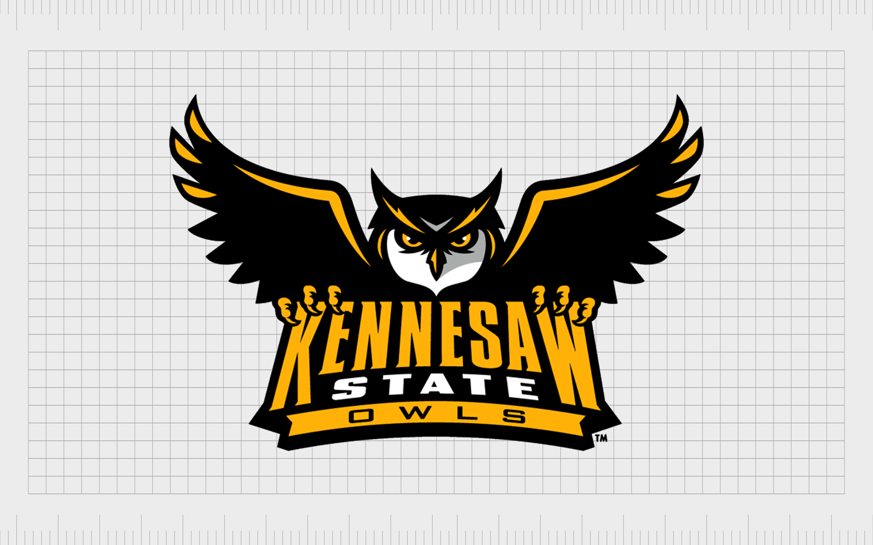
Kennesaw State Owls
The Kennesaw State Owls are another excellent example of a football team for a college using owls as their primary mascot. The Kennesaw State Owls represent Kennesaw State University and began playing in 2015 as a member of the Big South Conference.
The use of gold and black coloring draws attention to the regal nature of the owl as a creature, while highlighting the official colors of the college itself. This owl still bares its talons, like many of the owls in other athletics logos, but it does look slightly more subdued and studious.
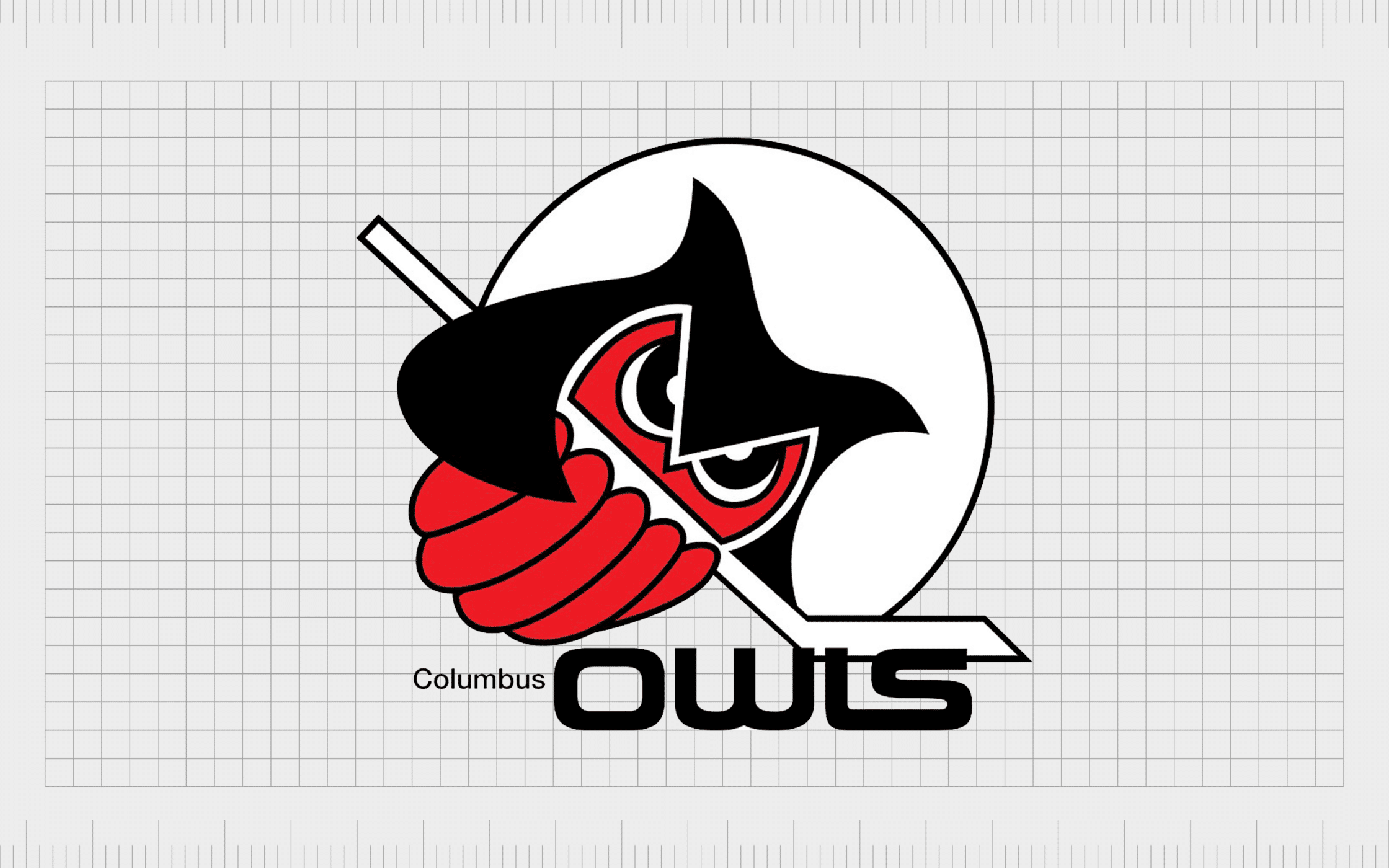
Columbus Owls
The Columbus owls were a minor league professional hockey team for a number of years. This logo is a very unusual insight into how owls can appear in brand emblems. Unlike other athletic logos, the owl itself doesn’t look particularly aggressive or combative.
However, the feathers on the lower half of the owl have been designed in a way to make them look like the fingers of a hand gripping the hockey stick. The overall image is quite abstract, but it’s a good way to ensure the image of the group remains in the minds of fans.

White Owl Cigars
White Owl Cigars is an American-made brand of cigars, owned by Swedish Match. The company first started producing its cigars in 1887 and have been using an owl as their primary mascot ever since.
Though this image isn’t present all around the world today, it’s a memorable design among fans throughout multiple nations.
White Owl Cigars features a white owl sitting on top of a cigar, as though it were a tree branch. This is quite a traditional looking logo, with a significant amount of detail, compared to some of the images we’ve seen so far.
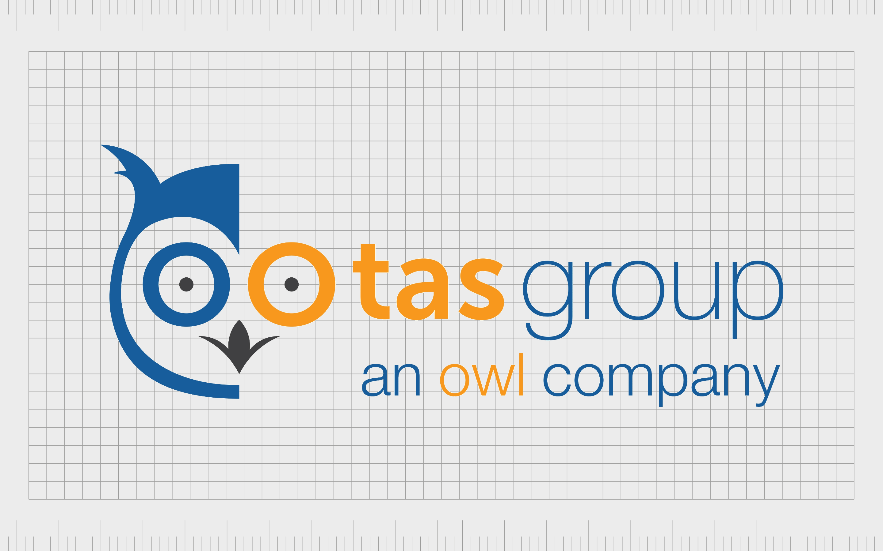
TAS Group
The TAS Group is a Fintech company, offering platforms for digital payments, payment networks, and intraday liquidity. The company have clearly chosen an owl to convey their trustworthiness, wisdom, and knowledge in the financial and technology space.
The image of an owl in this context looks very appealing, particularly when combined with a sans-serif wordmark, written in the colors of orange and blue. These shades are often associated with reliability, and creativity.
The owl itself is a fun, playful, and slightly abstract image.
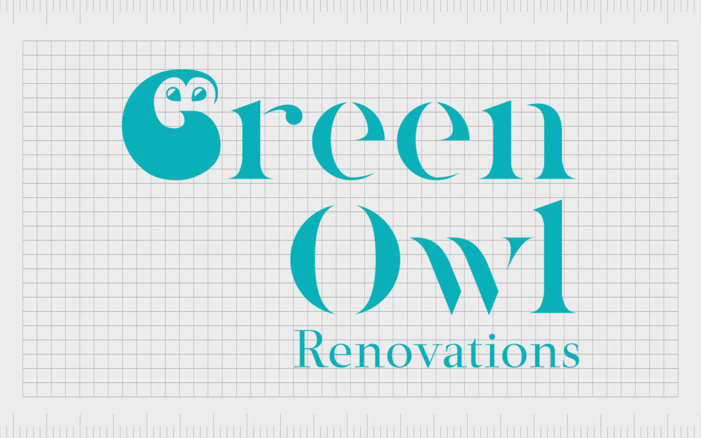
Green Owl Renovations
Green Owl Renovations is a trusted property renovation company in London. This might not be the most famous owl logo in the world, but it’s a good insight into how versatile these animals can be for all kinds of companies from different industries.
The design is somewhat abstract, making it an ideal choice for a modern company looking to allow their audience to make their own assumptions about what the business stands for. The image also looks quite cute and approachable, which is ideal for a business trying to create trust.
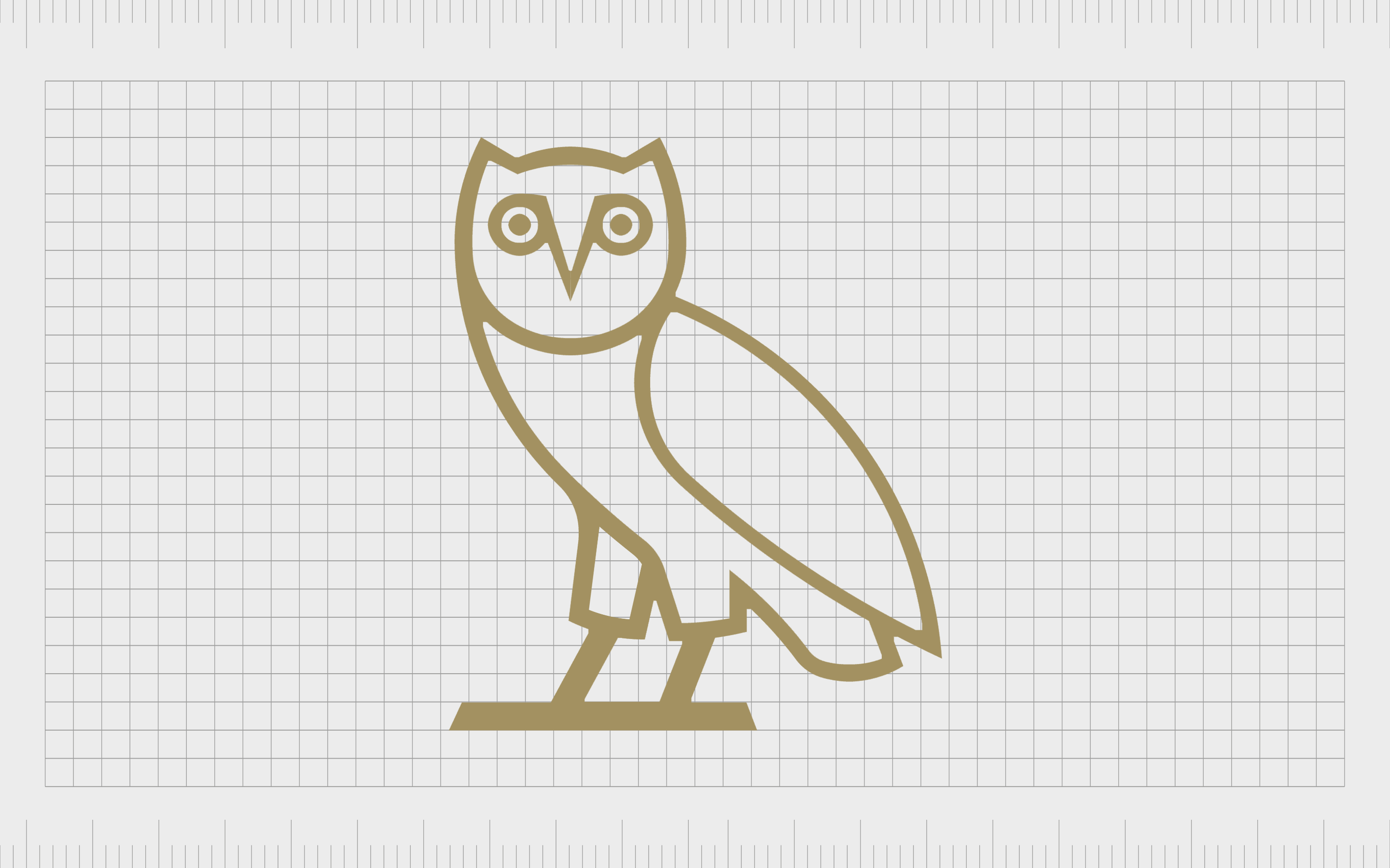
OVO
Otherwise known as October’s Very Own, the OVO brand is the clothing company of Hip Hop artist Aubrey Drake Graham (otherwise known as Drake). The two “O’s” in OVO are intended to look like the eyes of the owl, while the V is the beak.
The emblem here is very simple and minimalistic, making it a good choice for a company specializing in fashion and design. In some cases, the logo also features a wordmark which is stylized to look like the enlarged face of an owl, with just the two eyes and the beak.
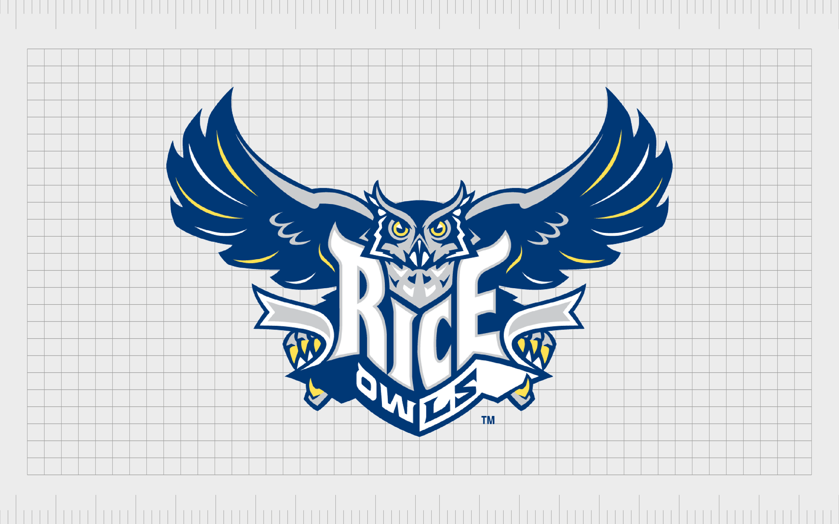
Rice Owls
Rice Owls is an American Sports collegiate program, established in Rice University in Texas. This program consists of 14 teams for both women and men, competing in the sports disciplines of Basketball, Baseball, Soccer, and more.
Although the Rice Owls program removed the actual owl from their logo in 2010, it’s still a very famous image associated with the group. This previous design featured the bird with its wings outstretched to highlight motion and forward progression.
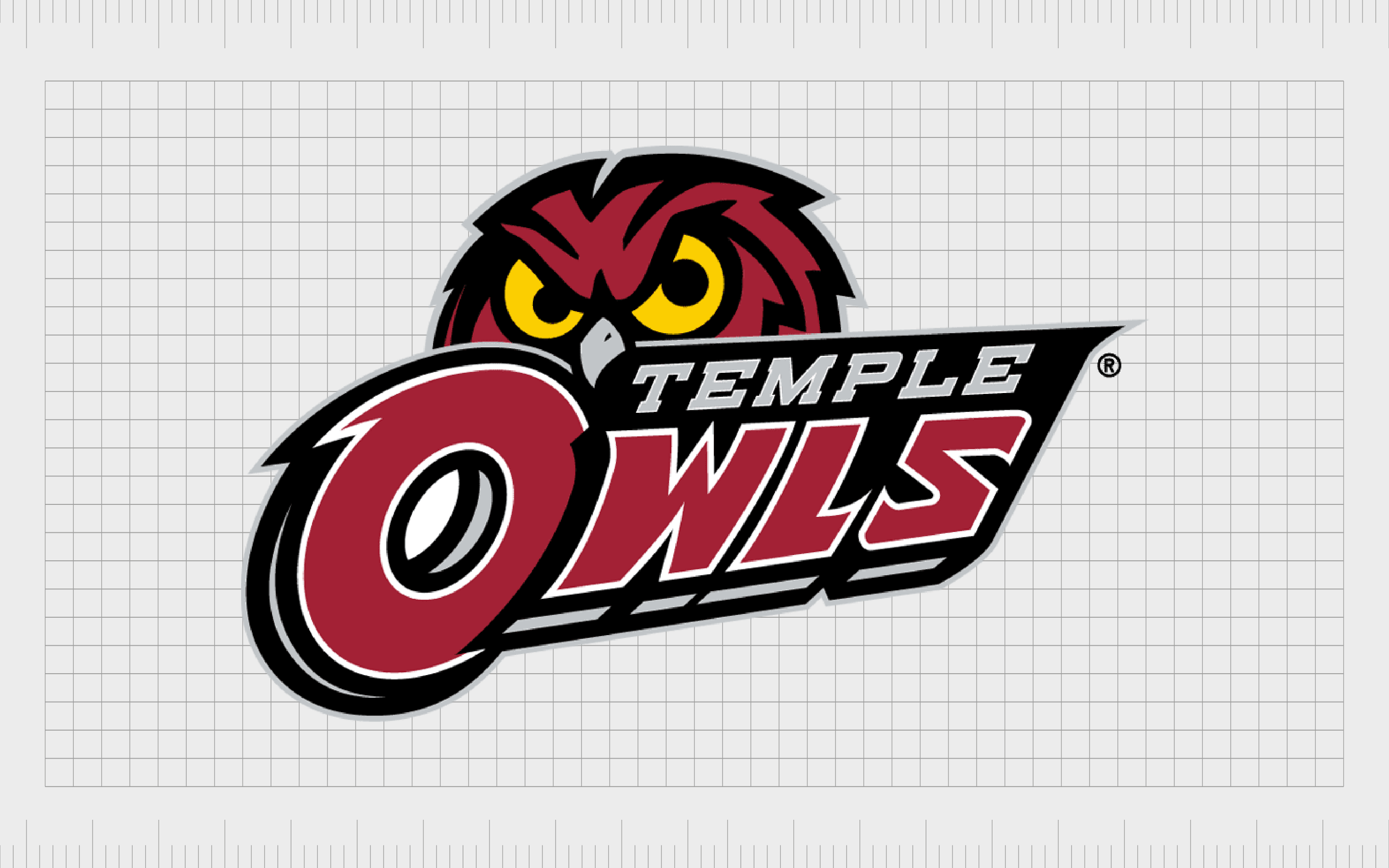
Temple Owls
The Temple University of Philadelphia is another great example of a University embracing the mascot of the owl. The group changed its logo in 2020 to remove the image of the owl completely, focusing instead on an entirely typographic image.
However, this is still a well-known image.
The previous version of the Temple Owls logo showed a rather aggressive looking bird, with narrowed eyes in bright yellow to demonstrate the predatory nature of the creature. Even the typography of the word “Owls” includes texture similar to feathers.
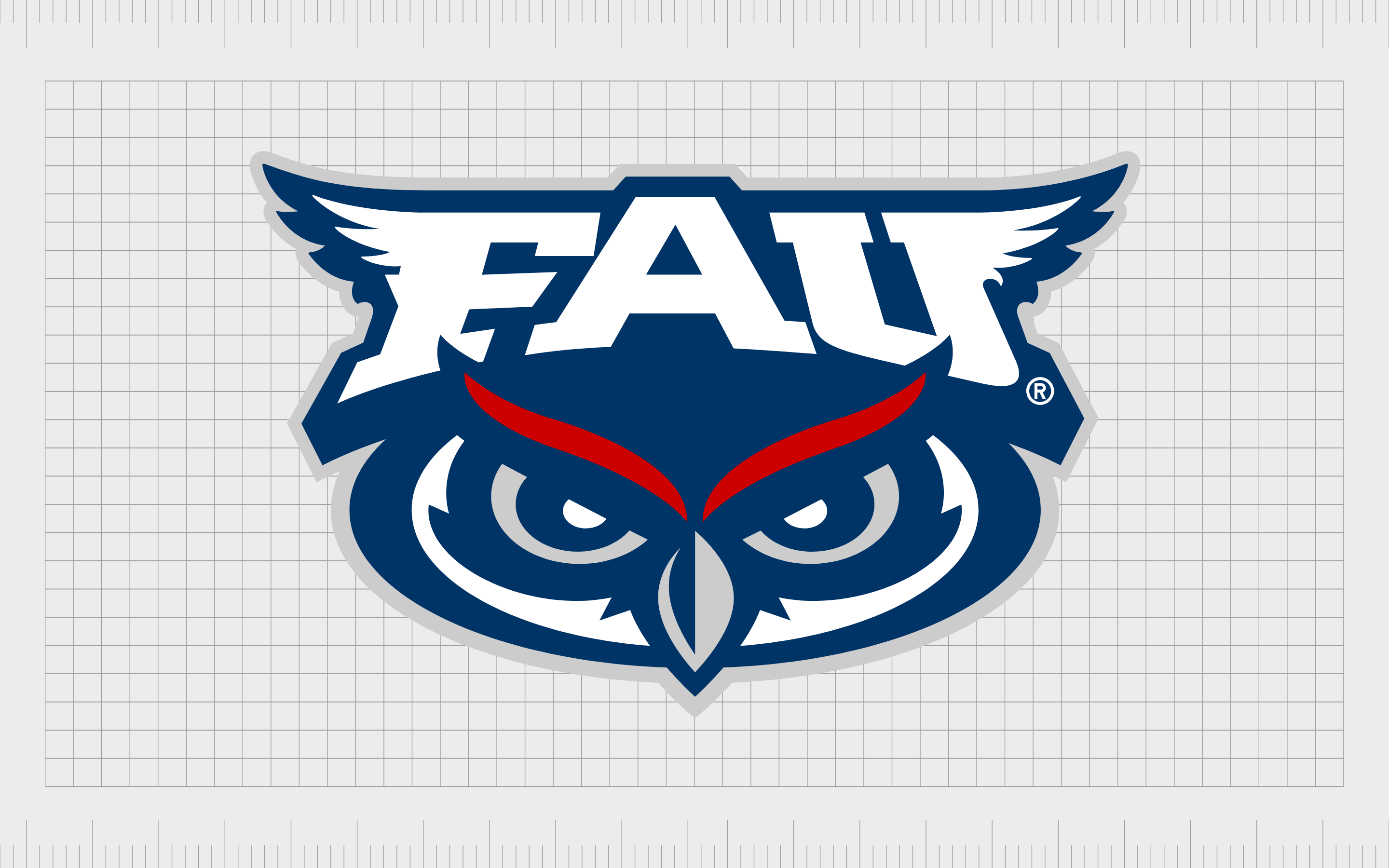
Florida Atlantic Owls
The Florida Atlantic Owls are a sports team representing the Florida Atlantic University. Like many educational institutions, the group chose the owl as their mascot to form a connection with ideas like wisdom and knowledge.
The team is well known throughout the baseball landscape.
Perhaps one of the most interesting features of this logo is the wordmark, which features the wings of an owl on the serifs for both the F and the U. The owl itself only shows its face in this image, complete with a pair of aggressively narrowed eyes.
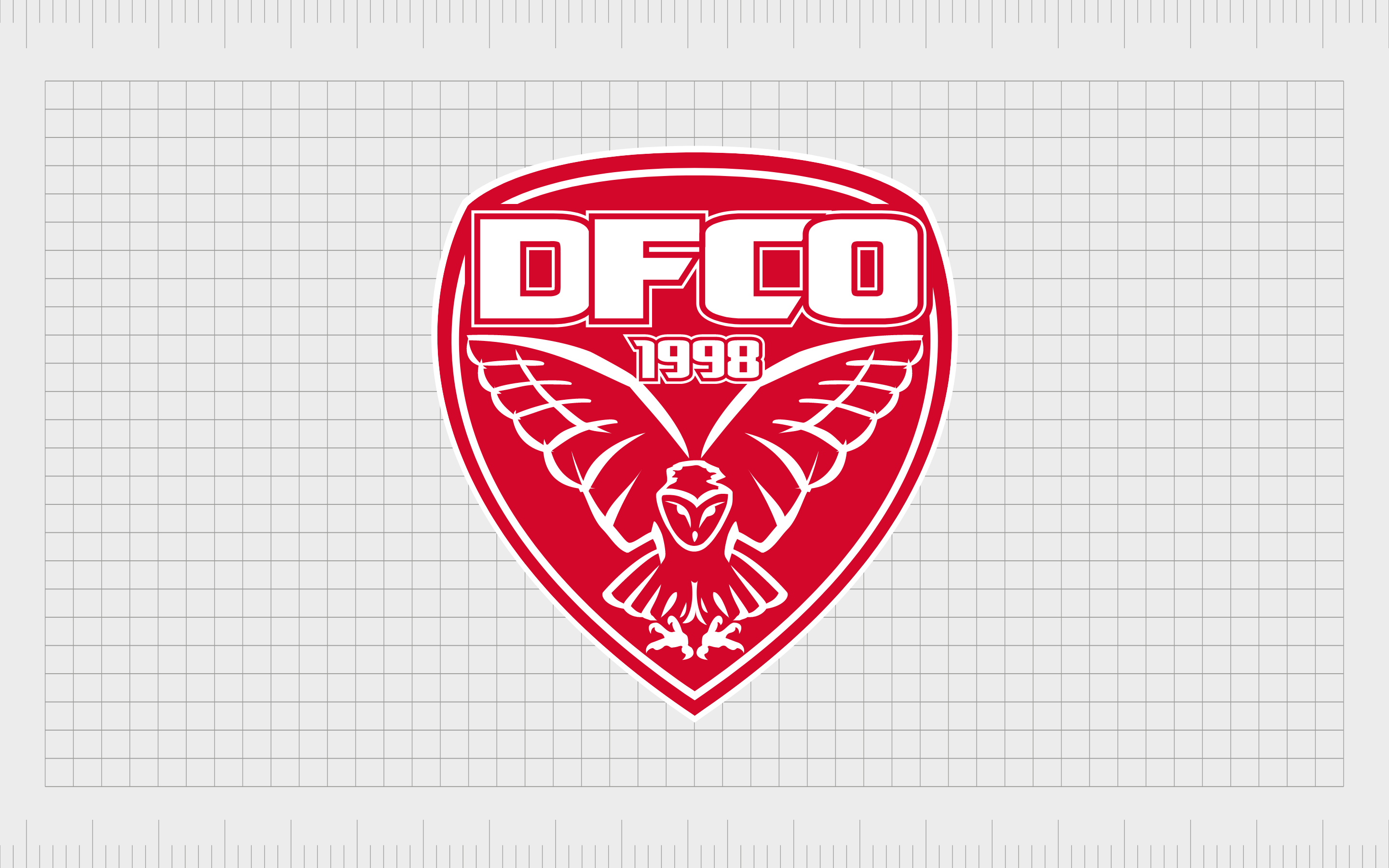
Dijon
Dijon, or Dijon Football Cote d’Or is a relatively new French football club launched in 1998. The club was actually designed following the merger of two regional teams. Though you may only be familiar with this logo if you live in France, it does have a wonderfully strong image.
According to the history of the team, the mascot of the owl was adopted right at the beginning of the club’s birth. The owl is actually a celebration of the homeland for the team, as the owl is the symbol of Dijon, and a famous detail in the local Notre-Dame.
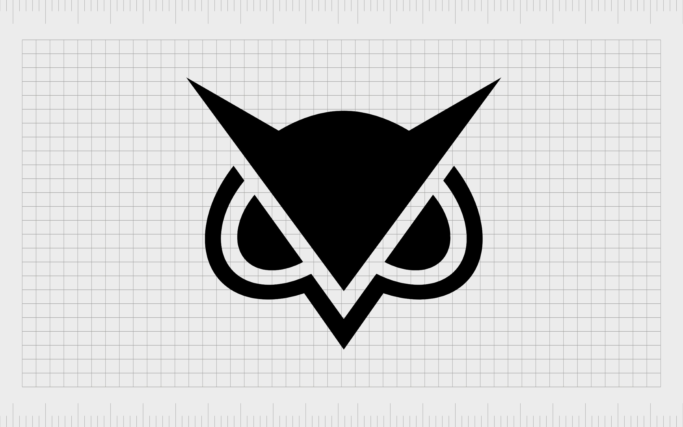
Vanoss Gaming
Vanoss Gaming is the pseudonym of a Canadian video game commenter named Evan Fong, who launched a YouTube channel in 2011.
Although the first image chosen by the professional for his official logo just used the letters “V” and “G”, the subsequent version embraced the image of an owl.
The owl design is apparently chosen based on the mask the player uses in the game GTA Online, which depicts the head of an owl. The logo is a wonderfully simplified and modern design, showing just the ears, eyes, and beak of the bird.
Understanding brands with owls in their logos
As mentioned above, owls are a wonderfully meaningful creature in the world of logo design. While they might not be the ideal choice for every company, they can depict a lot of different ideas when positioned correctly and given the right context.
Animals are a common part of logo design for a good reason. When designing a logo, companies need to be able to convey significant meaning to their audience, often with just a simple image.
To do this correctly, it’s common for many companies to embrace symbols their audience are already familiar with. Animals are just one example of such a symbol.
We can see examples of the power an animal logo can have all over the commercial world. The Jaguar logo immediately conveys ideas of speed and strength with its muscular cat emblem, while the Porsche logo is commonly associated with beauty and elegance.
Owl logos are most frequently associated with wisdom, but they can also be versatile enough to showcase a range of other meanings, like power, or mystery.
The most common place to see an owl logo is in the academic landscape. Educational groups and universities will usually embrace this mascot to showcase studiousness and discovery. However, as you can see from the examples above, owls can extend to virtually industry.
Just some of the things you can use owls to convey include:
- Wisdom: Owls are something we consistently associate with intelligence and wisdom. They appear in stories all around the globe as a beacon of knowledge.
- Power: Though beautiful and studious in their appearance, owls are still carnivores, and predators. They can be extremely dangerous animals in some cases.
- Mystery: Owls with their wide eyes and unusual characteristics can be a source of great mystery and wonder.
- Discovery: The wide-eyed nature of owls also reminds us of concepts like exploration and discovery. This is enhanced by the fact that they can fly great distances.
- Quirkiness: Owls are generally odd creatures. They can swivel their head all the way around and have unusually long legs. They’re great for making a brand look unique.
Celebrating famous owl logos
Companies with owl logos are fantastic at infusing a company with greater depth and meaning. Famous owl logos can be playful and humorous, like the Hooters logo, or they can be an insight into the strength and power of a group, like with countless college athletics teams.
When choosing a logo for your business, it’s important to think carefully about the kind of values and messages you’re attempting to convey with your choice of symbolism.
If you’re not sure whether an owl logo is right for you, it might be worth exploring a range of different options with the help of a professional logo designer.
Fabrik: A branding agency for our times.

Clarity starts with a conversation.
Thanks—we’ll get back to you shortly.
Whether you're navigating a rebrand, merger, or simply need a clearer identity—we’re here to help. No hard sell, just honest advice from people who know the sector.
Let’s start with a simple question…
Prefer to email? Drop us a line.
Fabrik’s been helping organisations rethink and reshape their brands for over 25 years. We’ve guided companies through mergers, rebrands and new launches. Whatever stage you’re at, we’ll meet you there.