


Datsun logo history: A guide to the Datsun symbol
How familiar are you with Datsun logo history? A well-known automobile brand throughout the years, the Datsun company has actually been launched and discontinued twice. The latest iteration of the company belonged to Nissan, another market-leading Japanese brand.
Though the Datsun logo officially disappeared recently, when the company was once again shut down in 2022, most people are still familiar with the image. The Datsun symbol became a beacon of cost-effective performance over around 100 years in its industry.
Today, we’re going to take a closer look at Datsun logo history, and the various symbols used to identify the brand over the years.

Datsun: Brand overview
| Founded: | 1931 then again in 2013 |
| Founder: | Yoshisuke Ayukawa |
| Headquarters: | Tokyo, Japan |
| Website: | www.datsun.com |
| Logo downloads: |
The latest iteration of the Datsun company was an automobile brand owned by Nissan. However, the first production run of the official Datsun company started in 1931.
The origins of the original Datsun brand dates back even further, to a company named “DAT motors”, best known selling full-sized cars to Japanese consumers.
What does Datsun mean?
When the company began developing smaller vehicles, they decided to name their collection “Datson”, which meant “Son of DAT”. The name was then updated to Datsun two years later, in 1933.
The first prototype “Datson” car sold in 1931. The “Datson Type 10” as it was called only sold around 10 models in total, before the car’s name was updated to the “Datsun Type 11”.
By 1935, the company established a production line, following the example set by Ford.
After years of success in the European, US, British, and Japanese markets, the Datsun company was first discontinued in 1986. However, Nissan revealed it was relaunching the Datsun marque in 2012, though only for a handful of global locations.
The second version of the Datsun company built new and popular cars for the Indian and Russian markets, until Nissan gradually began shutting the company down again.
By 2022, Datsun was once again officially discontinued.
Datsun logo history: The Datsun symbol
Over nearly 100 years of operation, the Datsun logo has gone through a number of changes. Mostly, the Datsun symbol has evolved to suit the trends of the time, allowing it to align more effectively with the image of Nissan, and the wider automotive industry.
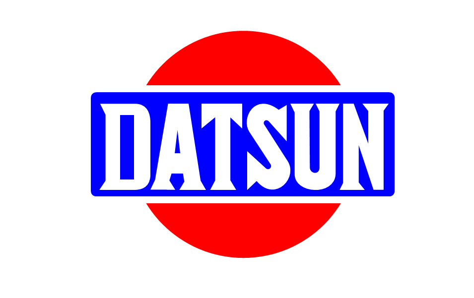
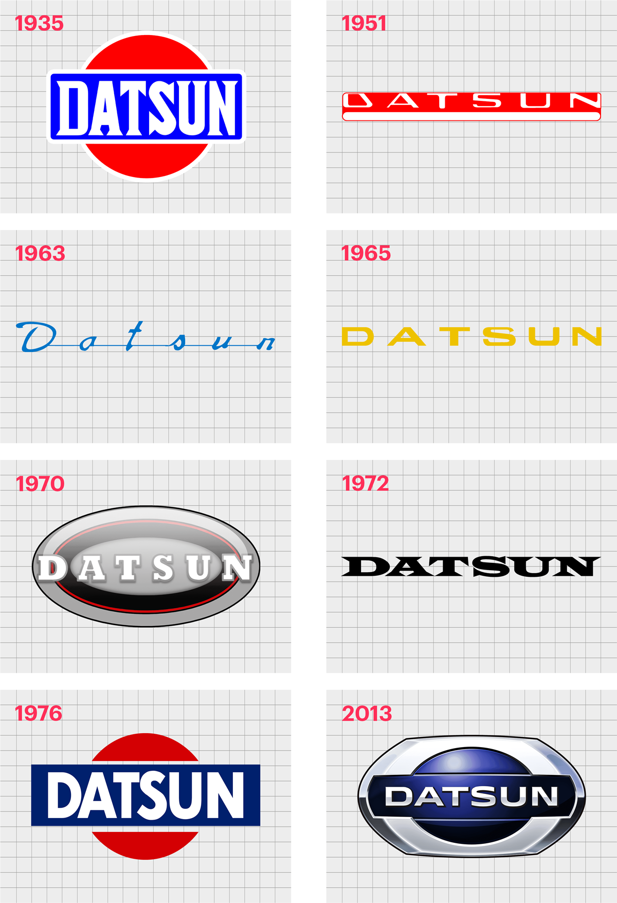
1935
The first Datsun logo was a brightly colored emblem, featuring a blue rectangle with a white border, placed over a solid red circle. The red circle was widely seen as the main symbol of Japan at the time, highlighting the company’s origin.
The white wordmark “Datsun” was presented in all capital letters, in a bold serif typeface, demonstrating the strength and confidence of the brand.
1951
In 1951, Datsun completely redesigned its symbol, replacing the blue rectangle over a red circle with an elongated red rectangle, featuring the name of the company. The typeface used for this symbol was much thinner, and lacked the serifs of the original design.
The overall design was intended to look almost three dimensional, with a large white stripe underneath the wordmark to give depth to the image.
1963
In 19653, the Datsun logo changed dramatically again. This time, the rectangle was removed entirely, and the entire emblem became a wordmark. The “Datsun” name was still written in an elongated style, but the typeface was a cursive, title-case design.
The red coloring was replaced with blue, a color often associated with reliability and trustworthiness. Each letter was also connected by a line through the middle of the word.
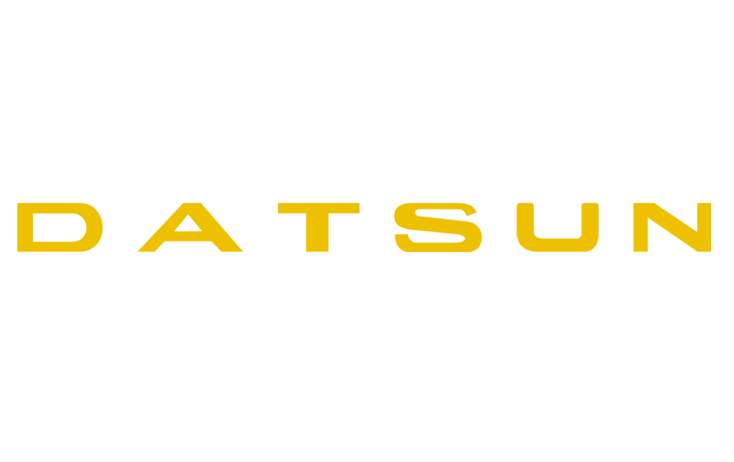
1965
In 1965, Datsun explored a new color pallet, and another new font. The blue lettering was replaced by a bold yellow wordmark, once again in all capital letters.
The letters in this Datsun symbol were a lot closer together in previous iterations, creating an essence of stability and strength.
1970
In 1970, Datsun changed its colors again, and placed a white wordmark on an oval-shaped badge emblem. The oval badge was depicted in gradients of grey, with red, and black outlines in various widths.
The “Datsun” white wordmark also had a pale gray outline.
In this variation of the Datsun symbol, the typeface was a bold, serif font, with significant spacing between each of the letters, to improve legibility.
1972
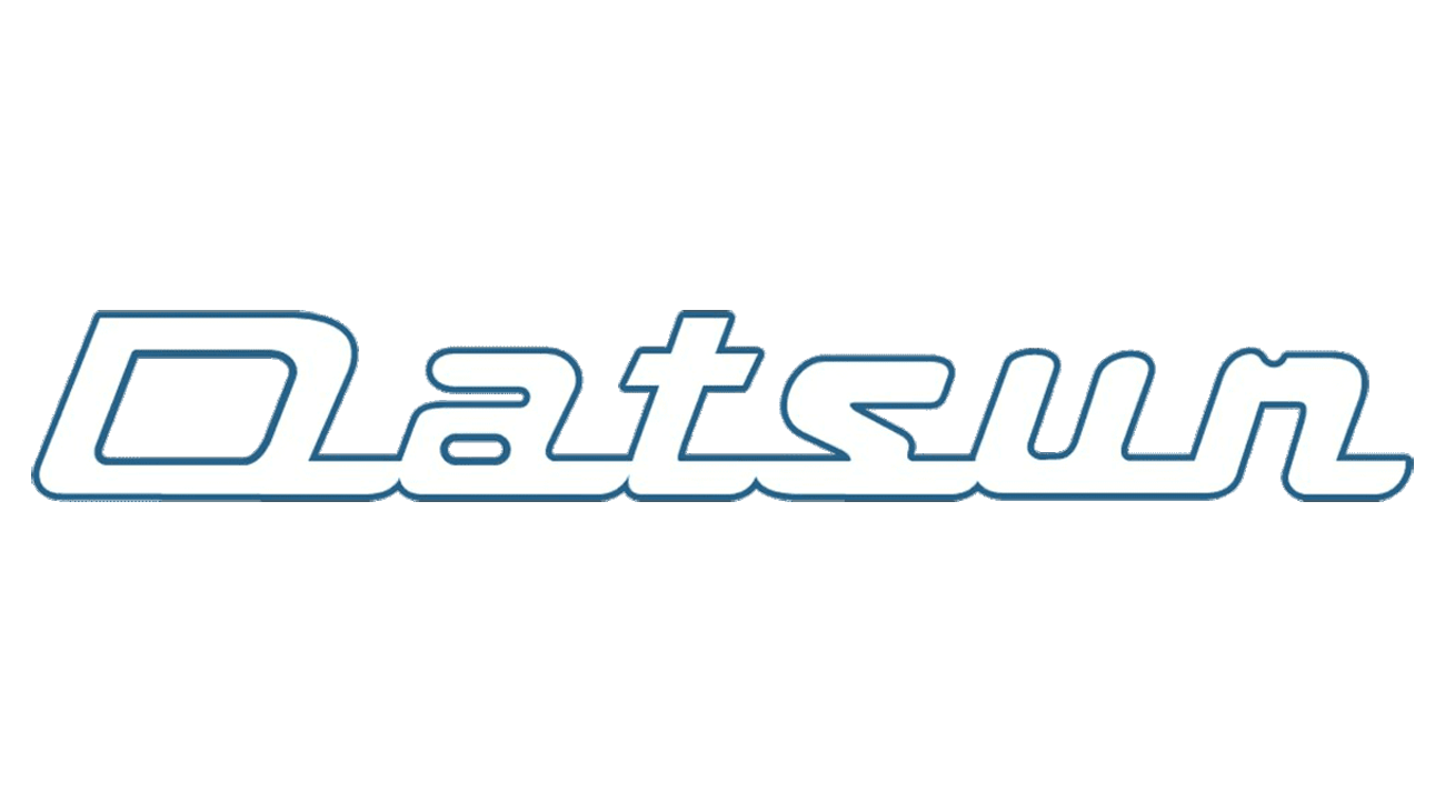
Very quickly after introducing their badge emblem in 1972, Datsun updated its image again to focus exclusively on the wordmark. The letters were pushed closer together, and the serifs on the characters made sharper.
This minimalist logo helped to highlight the modern nature of the brand, and allowed for a highly professional, polished image.
1976
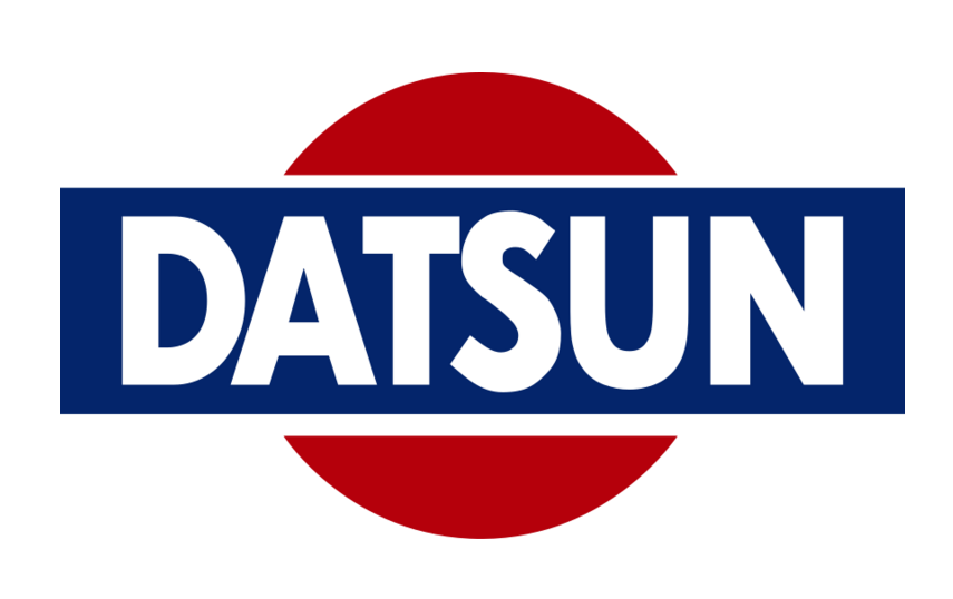
Datsun returned to a version of its original logo for a time in 1976. The contours and colors of this variation were modernized and refined for a new audience. The shades of blue and red here are a lot deeper and darker, while the font choice is balanced and clean.
2013
The last version of the Datsun logo before the company was once again discontinued was a modern design, using a gradient effect in a silver oval and the wordmark for the company to create a “metallic” image.
This variation of the logo takes elements from previous iterations, including the image of the rectangle over a circular shape. However, the colors focus mostly on blue and silver.
The typeface for this logo has also been refined even further, creating a clean sans-serif image.
The defining elements of the Datsun logo
The Datsun logo from 2013 blended perfectly with the automotive industry of the time. Most companies were using metallic badges as a way of showcasing their modern, and scientific approach to motor design.
This was also true for the Nissan brand who owned the Datsun company, and had a logo with a very similar visual effect.
What font did the Datsun logo use?
The Datsun logo font is a custom typeface designed specifically for the company. Over the years, it was common for the Datsun symbol to use a significant amount of spacing between each of the letters in its logo, perhaps to improve legibility.
As the company evolved and modern trends meant it was less common to see such a significant amount of spacing, the letters in the Datsun logo grew closer together.
The company also gradually moved away from its serif typeface choices, to a more clean, modern, and friendly sans-serif alternative.
The latest version of the Datsun logo is a bold, sans-serif inscription, written in all capital letters. The design, enhanced by the metallic gradient of its coloring, made the company look professional and forward-thinking.
What were the Datsun logo colors?
Datsun experimented with a number of colors over the years, though their most common choices often involved red and blue.
The most recent version of the Datsun logo before the company shut down included a silver gradient pallet, using various shades of grey, silver, and black to create a reflective metal effect.
Outside of the chrome effect, the main Datsun logo color before the company’s discontinuation was a deep blue. The dark blue color highlighted the brand as a sophisticated, trustworthy, and credible company in the automotive space.
Celebrating the Datsun logo today
Sharing a lot of similarities with Nissan logo history, Datsun logo history offers an interesting insight into the growth and development of the company over the years. Datsun went through a number of changes to find the logo best suited to its brand identity and image.
Compared to some other automotive companies, Datsun’s logo was actually one of the more experimental designs, often jumping between different typefaces, color choices, and shapes.
The last version of the Datsun logo was an excellent insight into the company’s modern brand identity, and enduring impact on the automotive market.
Fabrik: A branding agency for our times.

Clarity starts with a conversation.
Thanks—we’ll get back to you shortly.
Whether you're navigating a rebrand, merger, or simply need a clearer identity—we’re here to help. No hard sell, just honest advice from people who know the sector.
Let’s start with a simple question…
Prefer to email? Drop us a line.
Fabrik’s been helping organisations rethink and reshape their brands for over 25 years. We’ve guided companies through mergers, rebrands and new launches. Whatever stage you’re at, we’ll meet you there.