


British supermarket logos: The top UK supermarket brands

British supermarket logos are brightly colored, bold, and engaging emblems. Designed to grab the attention of shoppers, convey a sense of trust and credibility, and generate loyalty, these logos have become a mainstay of the British high street.
Like businesses from any industry, British supermarket brands and UK grocery stores rely on their logo to connect with their audience. Whether it’s the green of “Asda”, intended to convey a sense of freshness, or the iconic red and blue image of Tesco, each design has its own personality.
Indeed, British supermarkets are excellent at leveraging color and style not only to speak to their customers, but also to differentiate themselves from other market-leading brands.
Today, we’re going to be taking a closer look at the brand identities and logos of some of the most iconic British supermarkets in the region. Though many of these companies have changed their logo a few times over the years, we’ll be focusing only on the most recent emblems for this list.
The top British supermarket logos
There are a wide number of British supermarket logos to explore in the country today. Some are better-known to people from every city and town, like Aldi, Asda, and Tesco. While others are more likely to be found in smaller suburbs and specific regions.
Currently, Aldi is the most famous low-cost UK grocery store, according to polling data from the YouGov website, but Marks and Spencer has the highest ranking in terms of positive brand association.
M&S Food, the supermarket-style version of the Marks and Spencer brand, received a popularity rating of 78% among all adults. This places it just above Tesco (76%), and Aldi (72%) in terms of market appeal.
In the UK, supermarkets achieve excellent connections with customers through not just their logos, but their personality, and unique business models.
For instance, while M&S Food may not be as affordable as top-rated brands like Aldi and Lidl, the company has a strong commitment to serving natural, organic foods, sourced sustainably throughout the United Kingdom.
Let’s take a closer look at some of the top brands…
The top 10 UK supermarket brands
Let’s start by exploring some of the most popular and well-known British grocery stores on the market, according to YouGov polls. These companies have the highest level of “fame” among consumers, as well as some of the best overall perceptions.
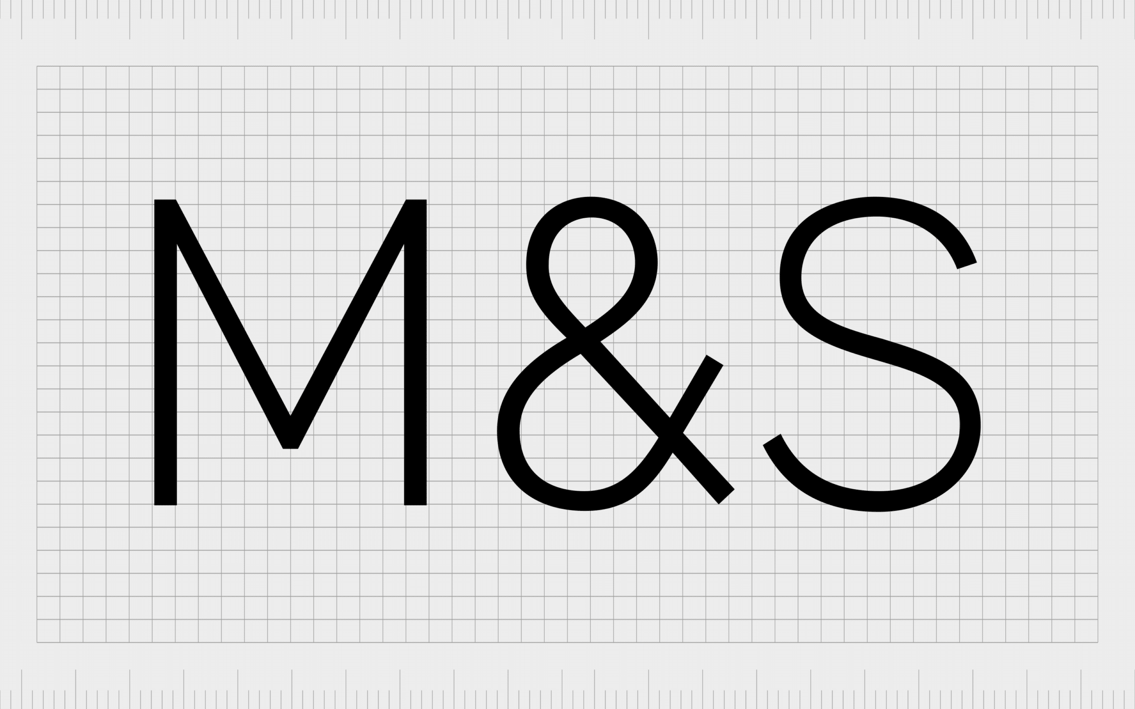
1. M&S Food
Marks and Spencer, known commonly as M&S, is one of the most popular UK grocery stores available. The company was first founded in 1884, and has 959 stores across the United Kingdom, including 615 which sell food products exclusively.
The organisation became the first British retailer in 1998 to make a pre-tax profit of more than $1 billion.
M&S Food has its own unique logo, based on the standard Marks and Spencer emblem. The design features the letters M&S, with the ampersand in green to convey freshness and a connection to the world of food and produce.
The words “Simply Food” highlight the focus of the grocery store chain, and the commitment to serving organic products with minimal additives and preservatives.
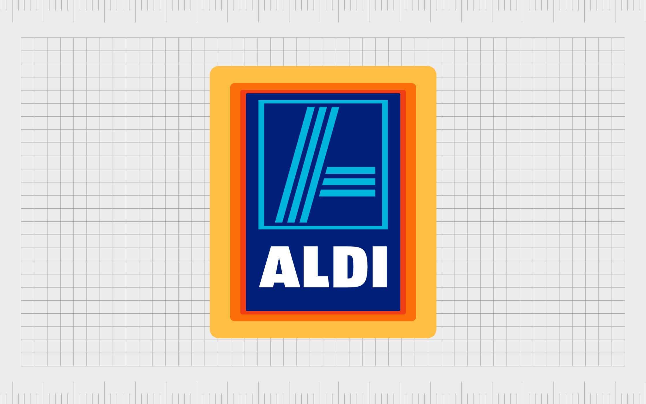
2. Aldi
Aldi isn’t technically a UK company, but it has a significant presence within the British region, as well as in various locations around the world. Aldi is a family-owned discount supermarket chain which started life in Germany.
The organization was launched in 1946, when a pair of brothers took over their mother’s grocery store.
The Aldi supermarket logo is a world apart from most of the UK grocery store images we’re used to seeing. The colors are bright and bold, combining red, orange, and yellow, with white, and various shades of blue.
The image is extremely eye-catching, and excellent for differentiating the business from other supermarkets in the UK.
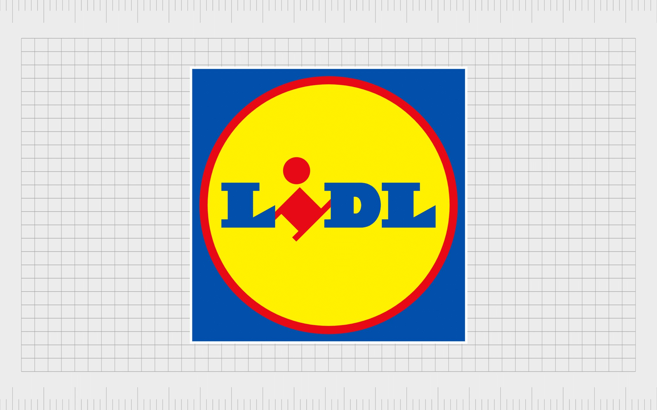
3. Lidl
Another German supermarket brand with a strong presence in the United Kingdom, Lidl first launched in 1932, and operates as a direct competitor to Aldi. The company has more than 11,000 stores across the United States and Europe, and belongs to the Schwarz Group.
Lidl, like Aldi, chose its logo with a focus on disconnecting itself from the other common designs used by businesses throughout the United Kingdom. The image is brightly colored, with a bold yellow circle, featuring the company’s name.
The angled “I” looks almost like a person, and highlights the brand’s effort to turn the “traditional” grocery store image on its side.
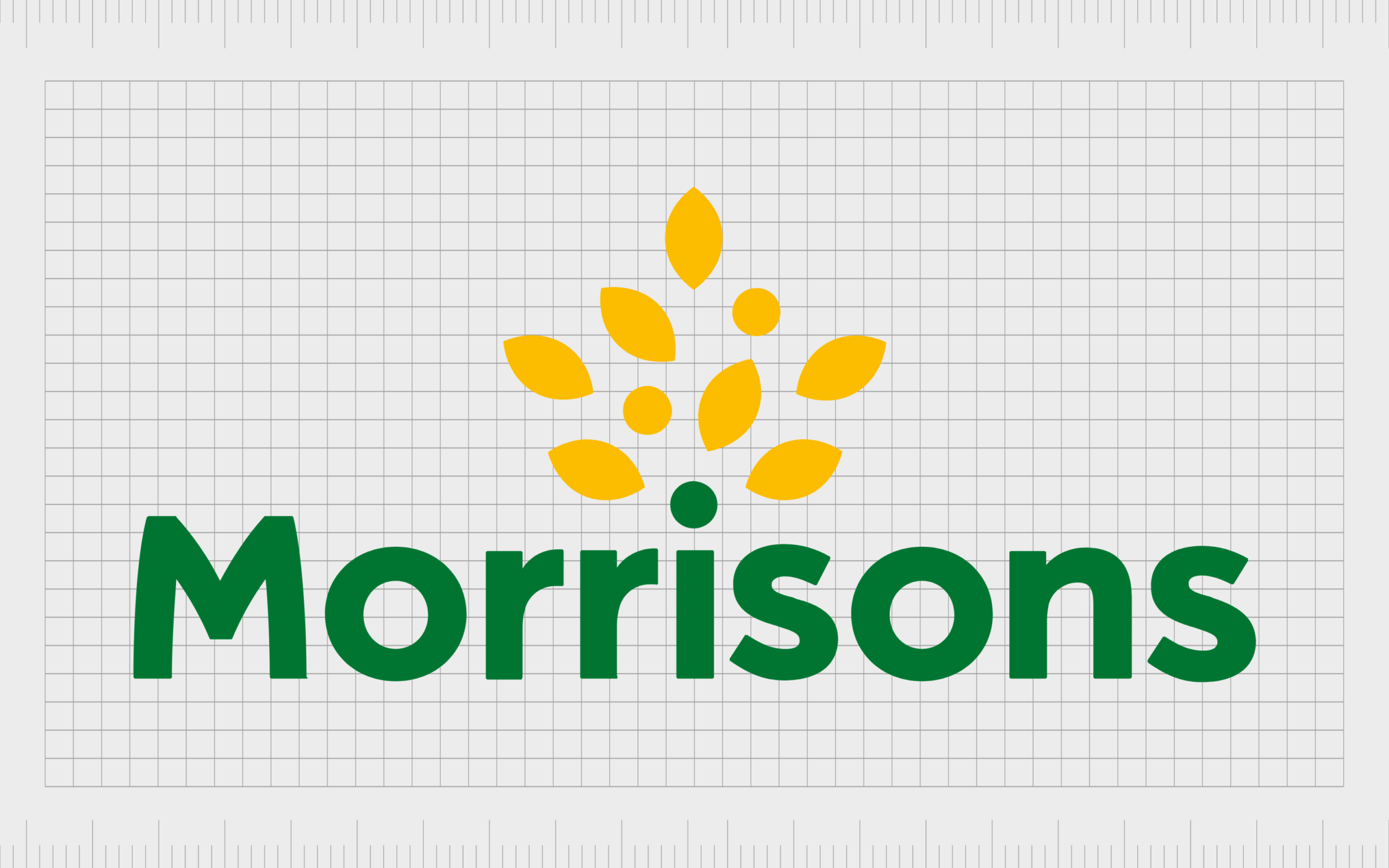
4. Morrisons
Morrisons, otherwise known as WM Morrison Supermarkets, is currently the fourth largest supermarket chain in the UK. It has one of the most memorable British supermarket logos around, and 497 stores located throughout England, Scotland, and Wales.
The image created by Morrisons is a geometric logo, with a bold wordmark in a deep green shade. The coloring references the natural focus of the brand, and its commitment to growth, which is also highlighted by the tree shape.
The simple, sans-serif font chosen by this brand for its most recent emblem is also fantastic for making the company seem more accessible.
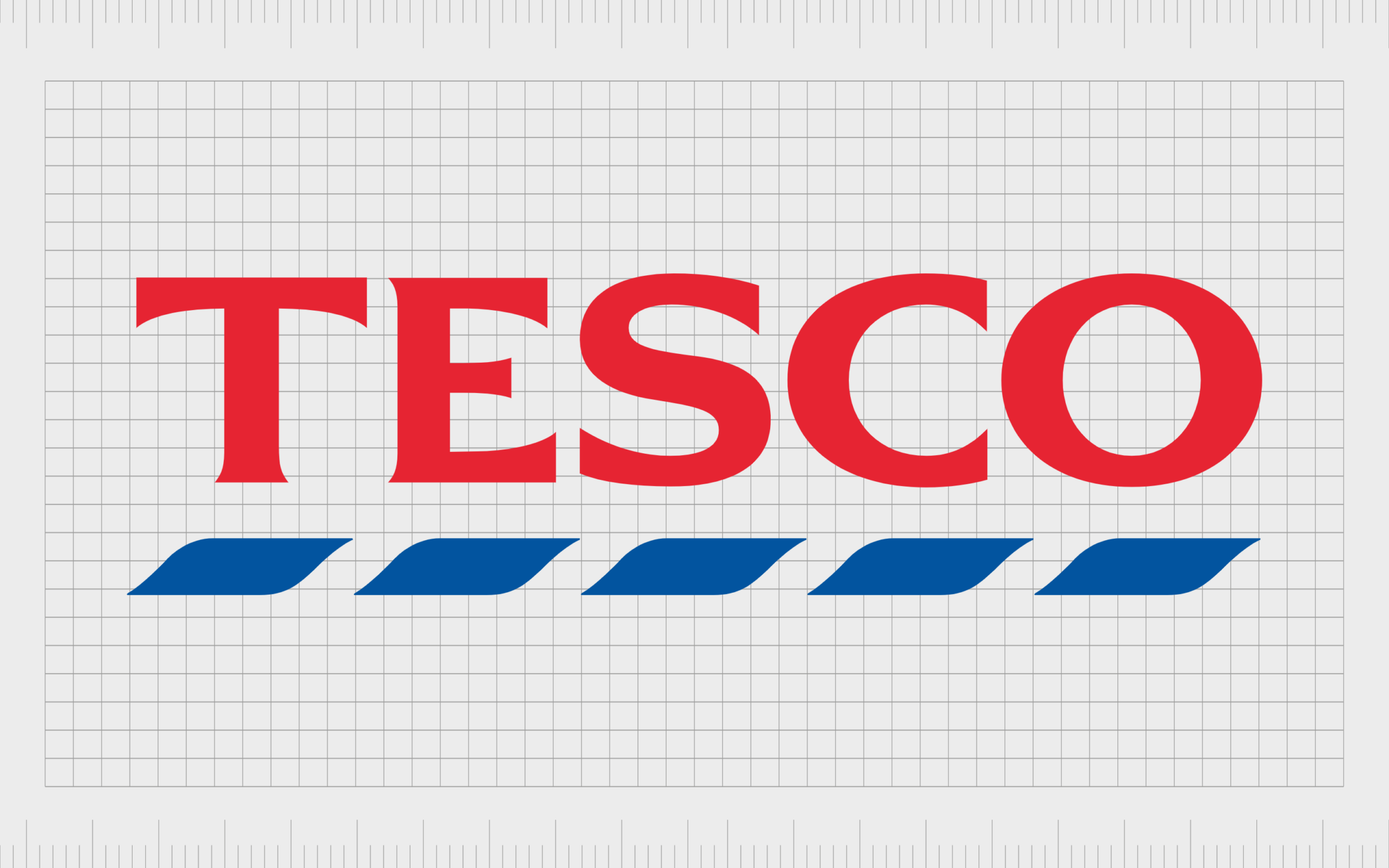
5. Tesco
A multinational grocery and general merchandise retailer, Tesco is one of the biggest supermarkets in the UK. In 2011, it was also the third largest retailer worldwide according to gross revenues.
The company was first launched in 1919, and started life as a group of Hackney Market stalls. Today, Tesco is also responsible for various sub-brands like Makro, and One Stop.
Tesco’s logo is one of the few UK supermarket logos to use the color red. The image borrows the colors from the British flag (red, white, and blue). While blue depicts excellence and trustworthiness, red is intended to showcase “vitality” and prosperity.
The serif-style font also draws attention to the heritage and sophistication of the brand.
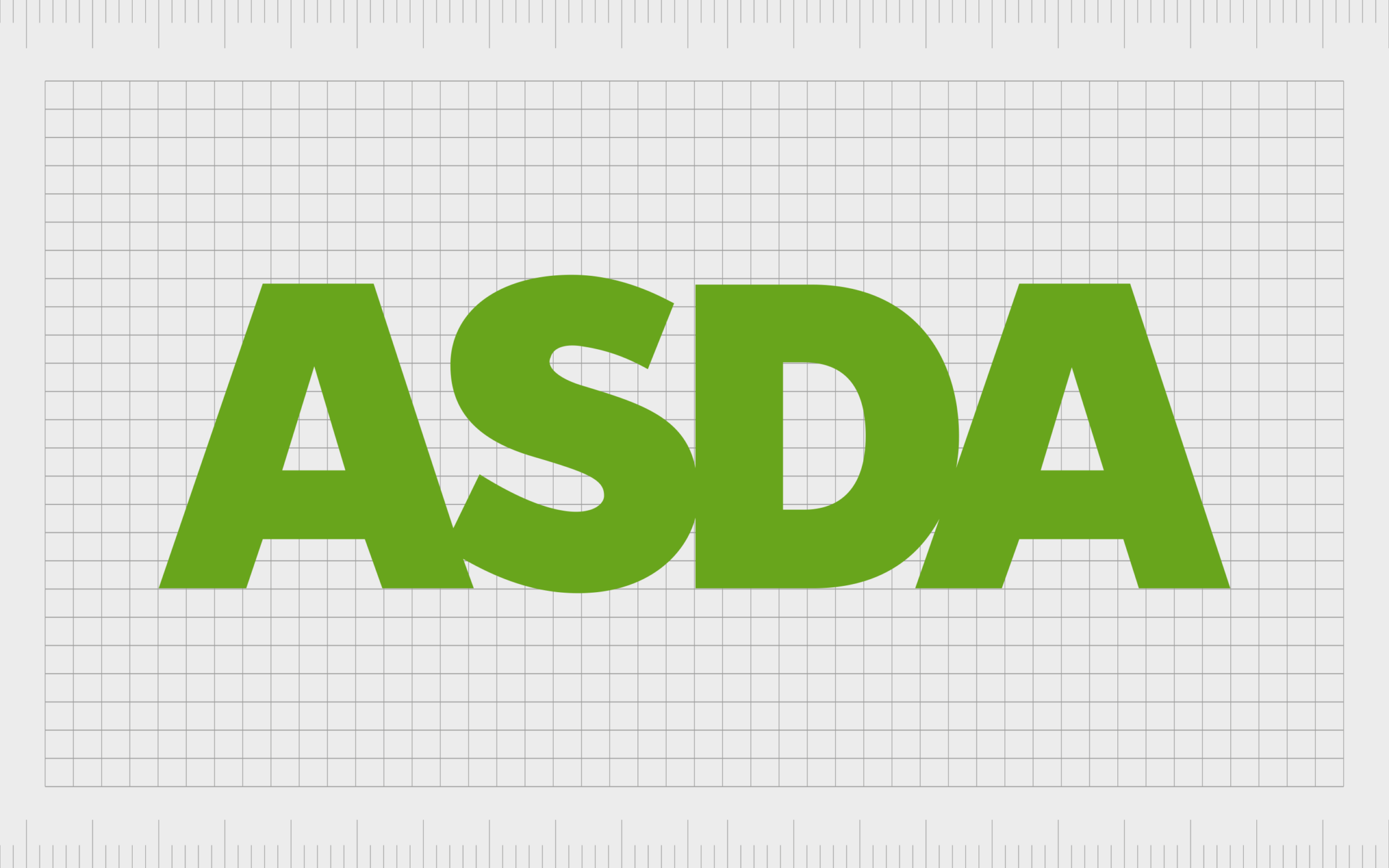
6. Asda
Perhaps one of the most famous UK grocery stores around, Asda was first launched in 1949, and has offered a wide range of foods and general products ever since. The company also offers insurance and payment services, as well as being a mobile phone communications provider.
Asda is currently the third largest supermarket chain in the United Kingdom.
The Asda logo is as simple as they come, featuring only a bold and blocky wordmark. The image is intended to be simple, clean, and refreshing. The bright color of green replaced Asda’s previous colors to highlight the company’s focus on growth and fresh produce.
The sans-serif lettering and bold font helps the organization to appear more family friendly.
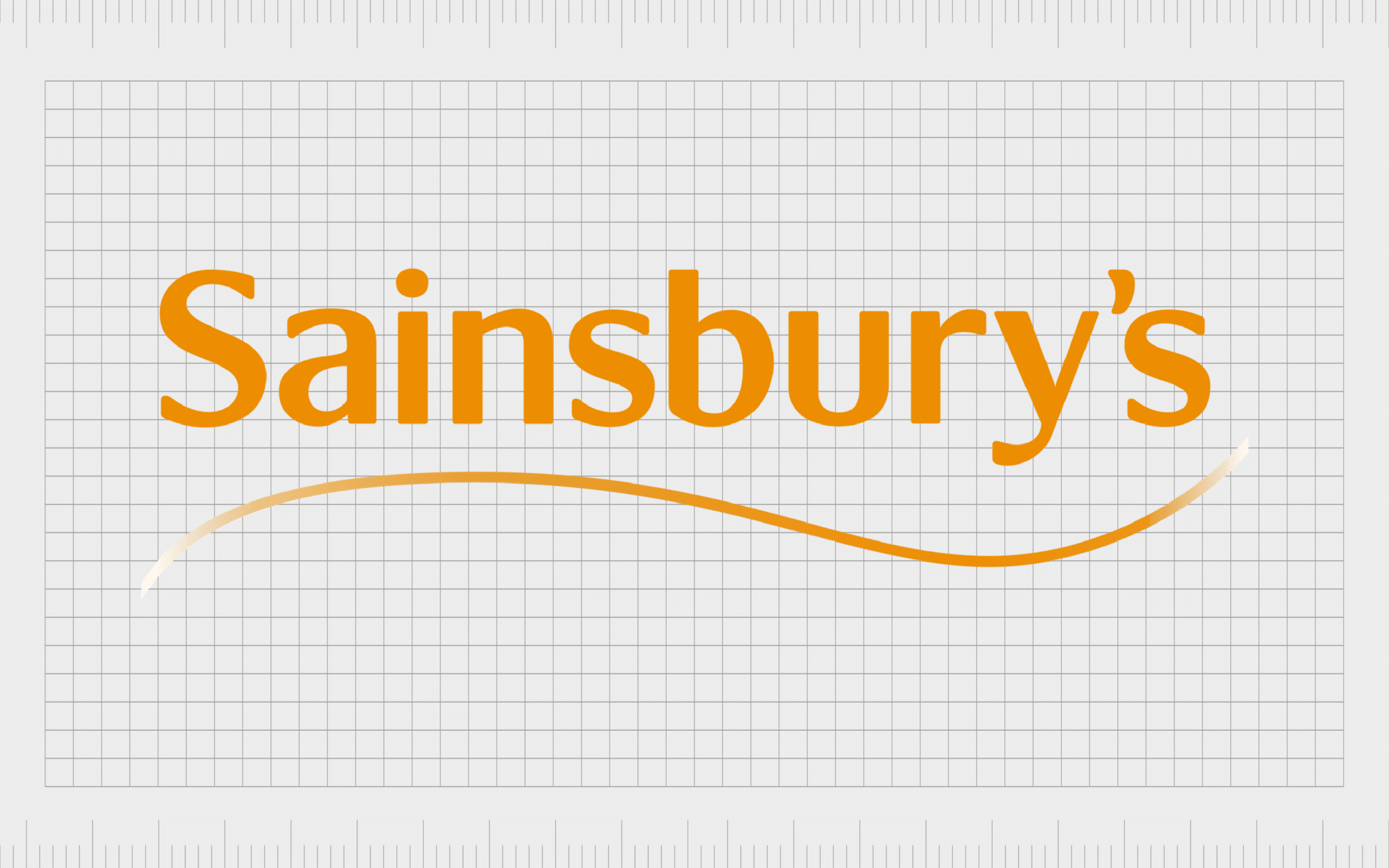
7. Sainsbury’s
Currently the second largest supermarket chain in the United Kingdom, Sainsbury’s has around 14.9% of the market share in Britain. The company was founded in 1869 by John James Sainsbury, in London.
Quickly taking the country by storm, Sainsbury’s offers a wide range of food products, as well as general merchandise, and banking facilities.
Compared to other UK supermarket logos, Sainsbury’s has quite a unique image, embracing the color orange, which isn’t often seen among other organizations. The orange shade helps to convey a sense of joy, creativity, and discovery for the brand.
The company’s simplistic wordmark has a friendly and modern feel, helping it to compete with other market-leading businesses.
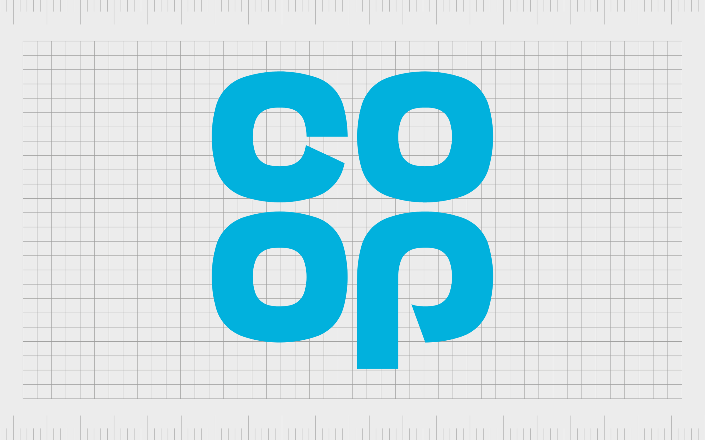
8. The Co-operative
The Co-operative Group is an interesting addition to our list of British supermarkets. This company is responsible for a range of different retail businesses including wholesale, pharmacy stores, insurance, legal services, and food.
Known commonly as the “Co-Op, the brand was first launched in 1863 in Manchester, and is one of the biggest groups in the UK today.
The Co-Op logo is beautifully modern and engaging. It combines the letters commonly used to refer to the store into a square image, making it look almost like a flower or four-leaf clover.
The quirky design is enhanced by a stylized typography choice. The color blue is another great choice for the organization, as it helps to invoke a sense of credibility and trustworthiness.
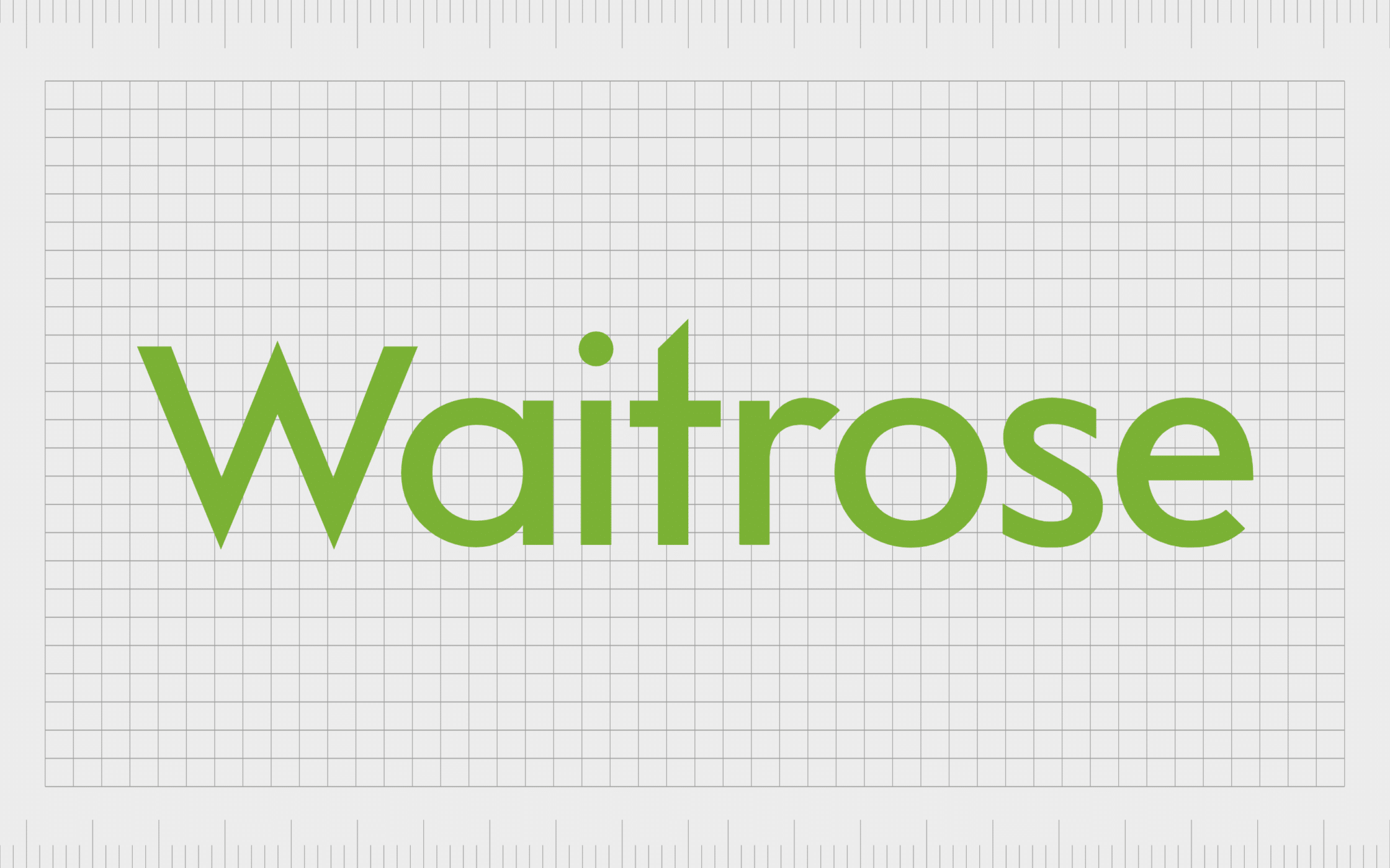
9. Waitrose
Another well-known choice among British supermarket logos comes from Waitrose. Otherwise known as Waitrose & Partners, Waitrose was first launched in 1904, and was acquired by the John Lewis Partnership in 1937.
The company has 332 stores across the United Kingdom, including a selection of smaller convenience shops.
The Waitrose chain has an up-market and classy reputation among most buyers, which is something we can see in its elegant and sophisticated logo. The emblem features the name of the business in slim sans-serif letters, on a green block.
The various shades of green remind us of natural foods, organic produce, and the range of products on offer by the brand.
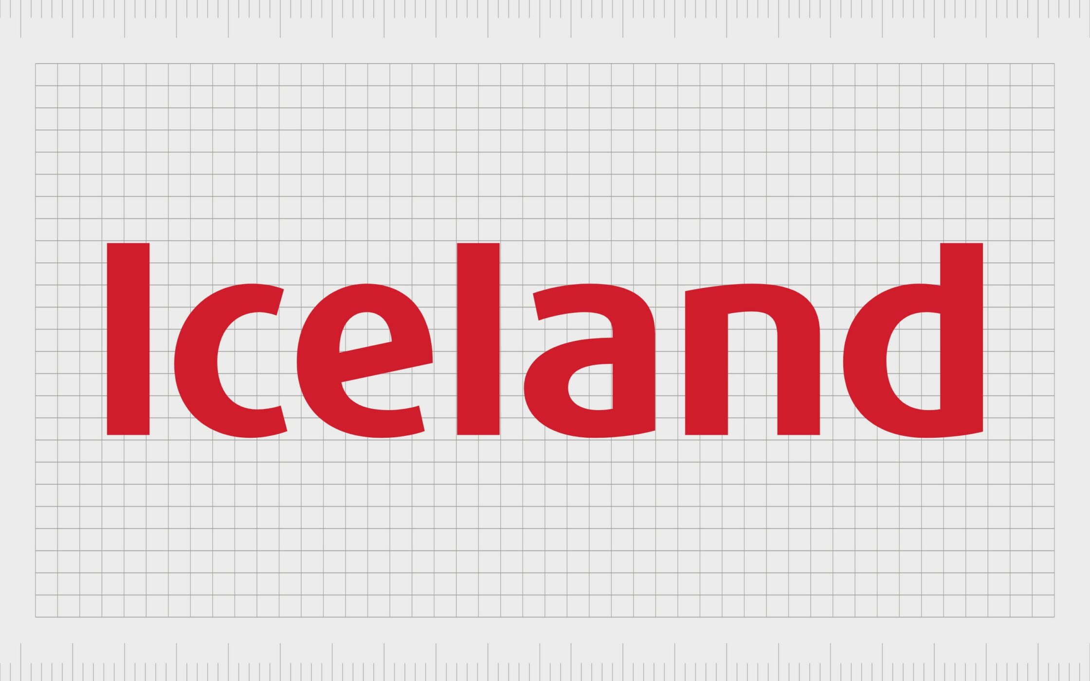
10. Iceland
Launched in 1970, Iceland is one of the newer UK grocery stores to emerge in the market. The company specializes in selling frozen food, prepared meals, and frozen vegetables. However, the company also sells non-frozen items too.
Iceland is also responsible for a chain of sub-brand stores known as “The Food Warehouse”.
The red coloring of the Iceland logo is intended to grab customer attention, and make us think of low prices, sales, and prosperity. The simple sans-serif font also helps the company to appear more modern and family-friendly, compared to other high-class stores.
Other famous UK grocery stores and supermarkets
As mentioned above, while there are a number of very well-known British supermarket logos which appear throughout the country, there are also some slightly smaller, but popular alternatives.
Many of the smaller brands emerging throughout Britain today have taken a similar approach to their larger competitors in their branding, with highly original images, and sophisticated word marks.
Let’s take a closer look at some of the more well-known UK food stores…
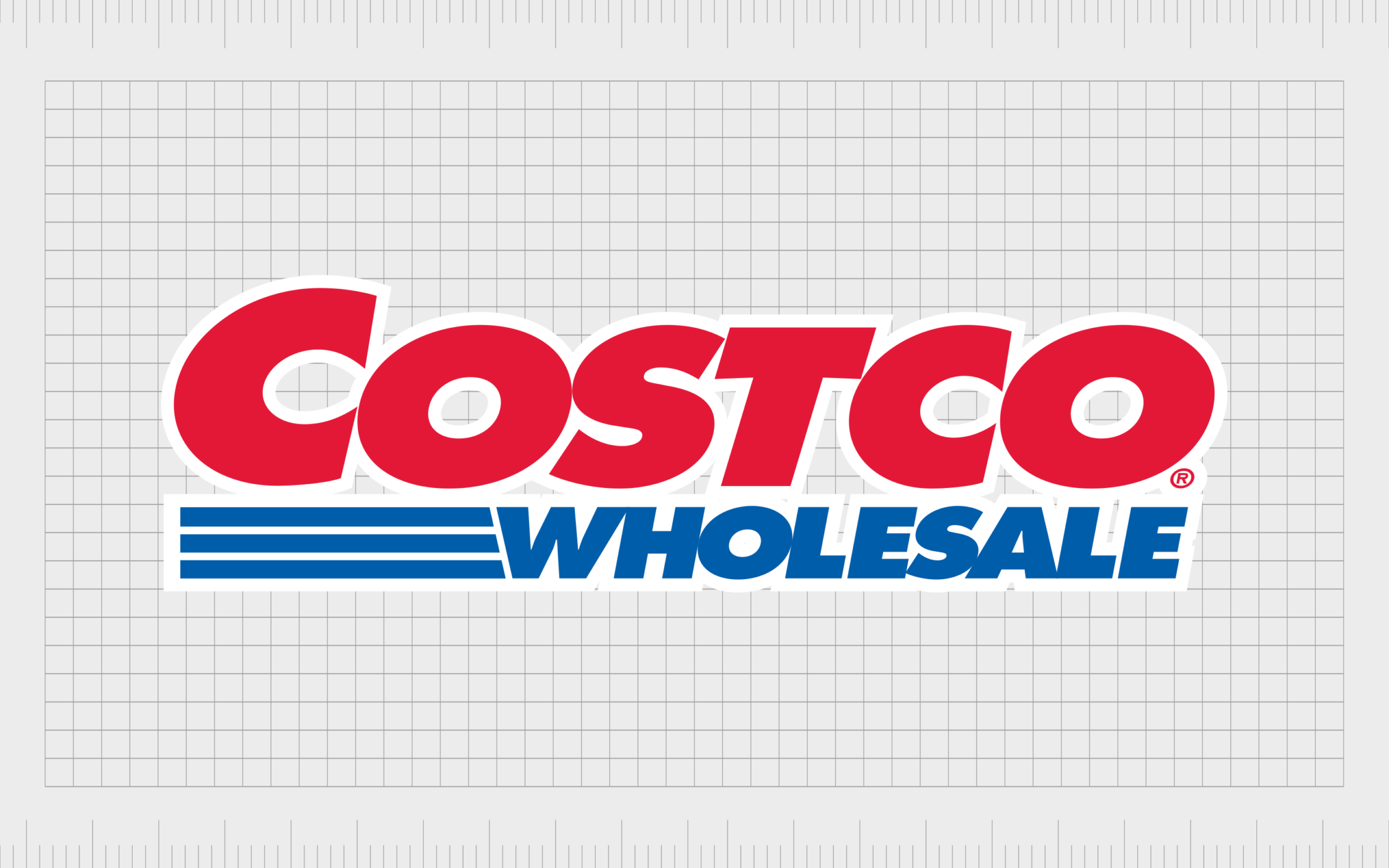
Costco
Costco is actually an American multinational corporation, with a growing presence in the United Kingdom. It’s one of the largest retailers in the world, offering a huge selection of organic foods, produce, and wines.
The company was also ranked number 10 on the Fortune 500 list of America’s largest corporations by revenue in 2021.
In the Costco logo, we see a reference to some of the brand’s largest selling points. The Costco image features a bright red wordmark, followed underneath by the tagline “wholesale” in deep blue.
The slight angling of the image helps to draw attention to the speed and simplicity of shopping with the retailer. This is enhanced by the 3 lines next to “wholesale”.

Farmfoods
A British supermarket chain best-known for selling frozen products, Farmfoods has over 300 shops throughout the United Kingdom. More than 100 stores are located within Scotland.
The company started life as a meat processing business in 1955, but quickly evolved into the grocery store landscape.
Bright and attention-grabbing, the Farmfoods logo uses a bold sans-serif wordmark in red with a yellow outline, to draw attention to prosperity and joy.
The image is usually placed on a banner which showcases the British countryside, highlighting the organization’s background with farmers and the meat processing landscape.
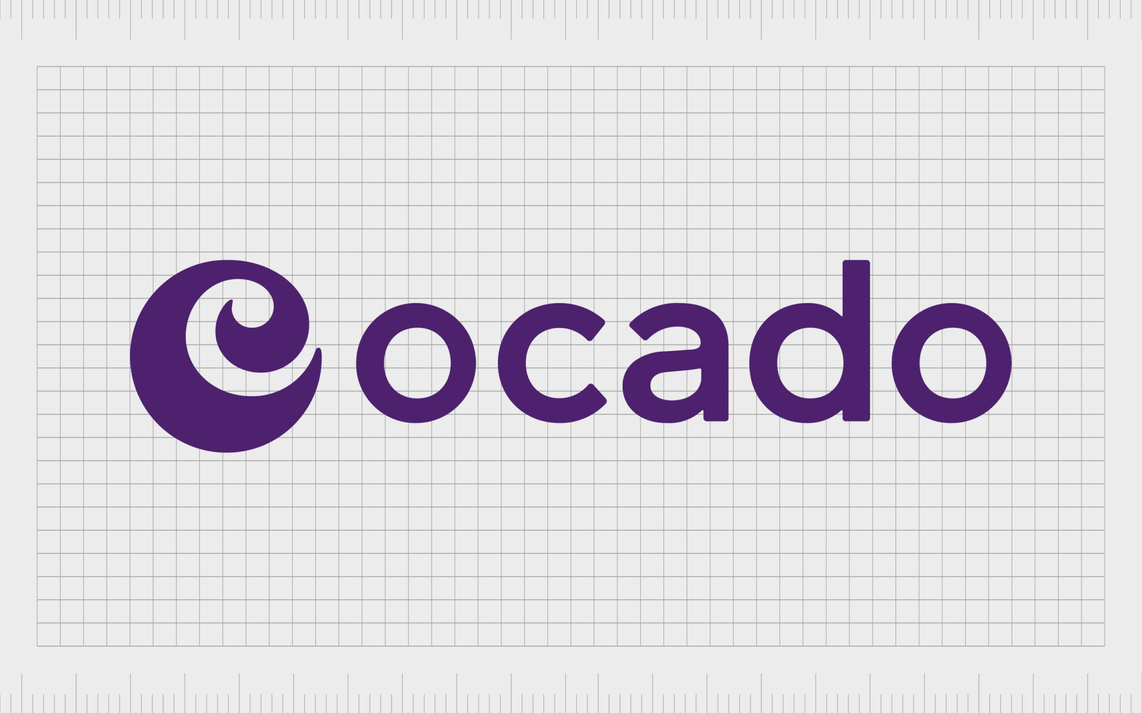
Ocado
Ocado is a British business which first launched in April 2000, and the company is now 50% owned by Marks and Spencer.
Though ‘relatively’ new to the supermarket space, Ocado is one of the largest online grocery stores available in the UK. The business primarily sells through its mobile app.
The Ocado group logo is simple and sophisticated, featuring a sans-serif wordmark in a light shade of purple, to highlight luxury. The swirling image next to the company’s wordmark is a reference to both the internet browser, and the creativity of the organization.
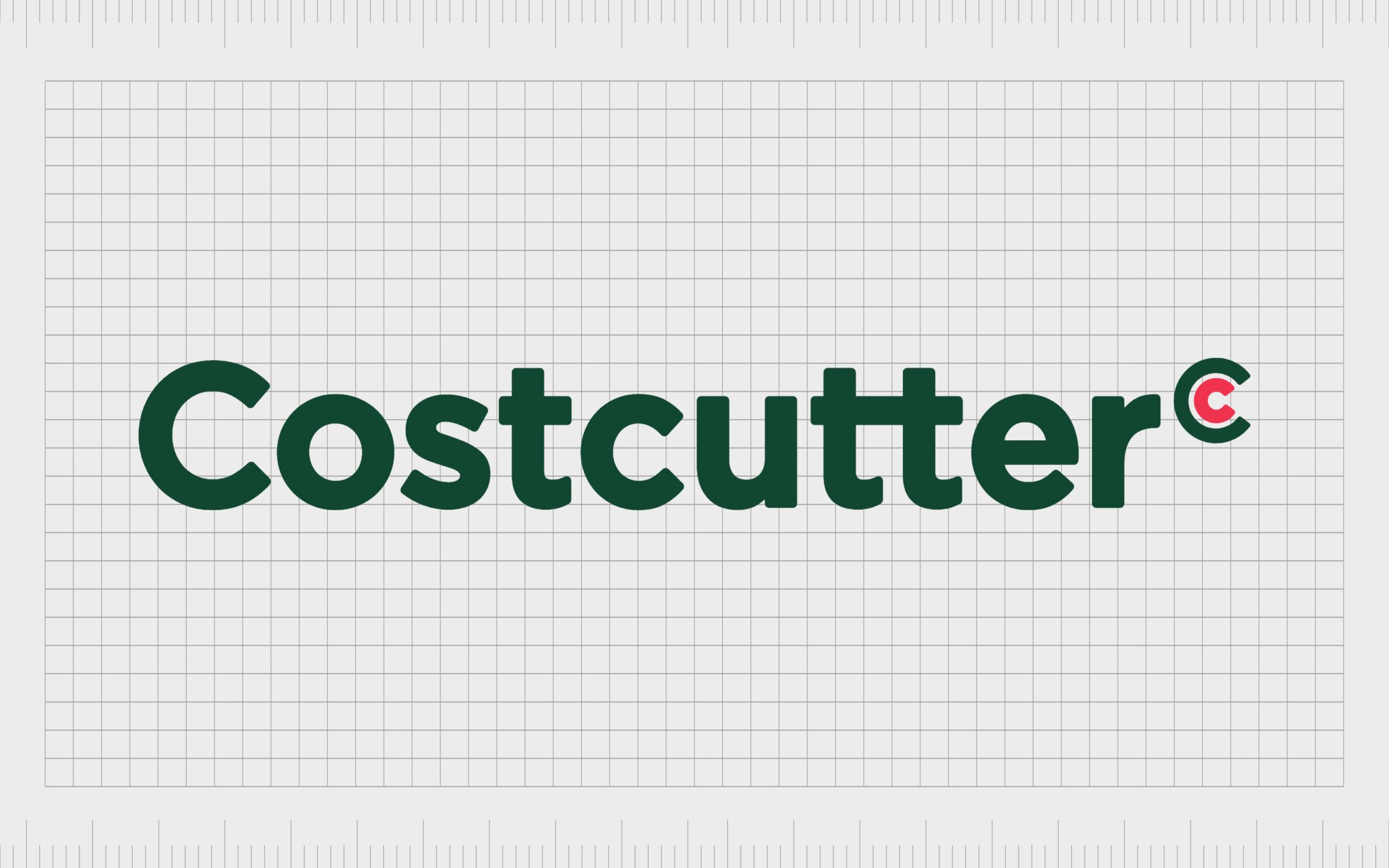
Costcutter
First introduced in 1986, Costcutter is a British supermarket business with a presence in Ireland too. The company primarily supplies products to a range of supermarkets and convenience shops. The company has around 1,400 stores under the Costcutter banner.
The logo embraced by Costcutter hasn’t changed much over the years. The dark green coloring in the wordmark has been a consistent part of the organization’s brand identity. The current logo is a simple wordmark with a copyright mark at the end in green and red.
The deep green coloring is a reference to the company’s commitment to growth and freshness.
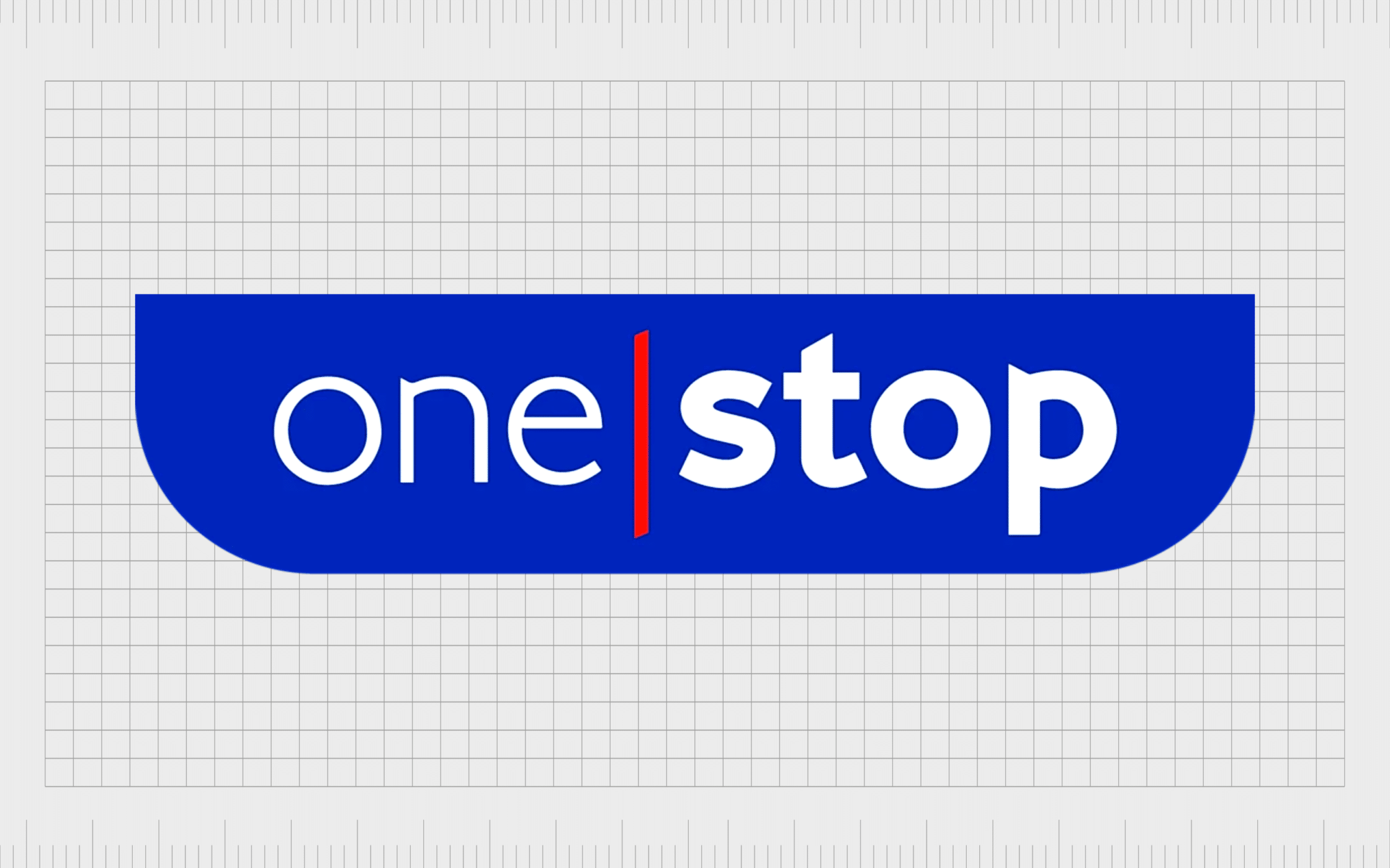
One Stop
A convenience store owned by the Tesco group; One Stop was first introduced to accompany the “Tesco Express” stores throughout the United Kingdom. Many of these stores sell Tesco branded products, and have their own Tesco cash machines.
As a sub-brand for Tesco, One Stop uses a lot of the same elements in its own logo, including the same selection of colors (red, white, and blue). The serif-style writing is stylized to look modern, fun, and quirky, appealing to a range of people in search of a quick shopping destination.
The name is intended to reference the position of the store as a one-stop solution for all needs.

Londis
A chain of convenience shops selling grocery store products throughout the United Kingdom, Londis first launched in 1959. The company belongs to the Booker Group, which is owned by Tesco.
The brand focuses heavily on selling low-price items and simple convenience goods to people in streets all throughout the UK.
Londis has an eye-catching and attractive logo in a shade of bright green, similar to the coloring used for Asda grocery stores. The diamond over the “I” in the wordmark draws attention to the company’s commitment to quality and excellence.
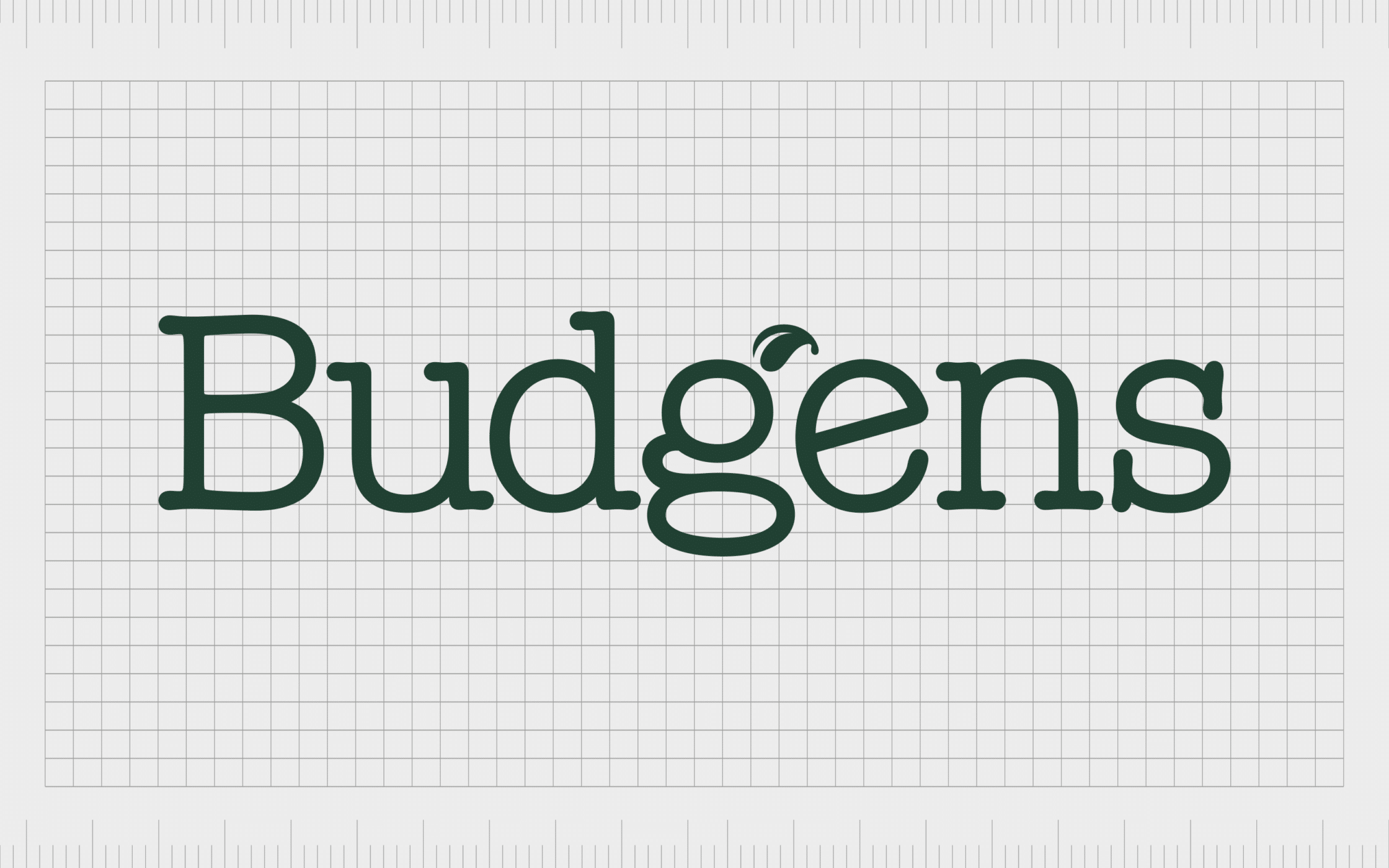
Budgens
A chain of famous UK grocery stores, Budgens started life in 1872, making it one of the older small supermarket options on this list. The company has a presence in regions all around the United Kingdom today, and focuses mainly on selling food and convenience-based items.
Like Londis, Budgens also belongs to the Booker Group, and consequently the larger Tesco brand. However, there’s no reference to the Tesco imagery in this logo. Budgens uses a deep green coloring to reference the natural world, and a serif font to highlight sophistication.
The leaf flourish on the wordmark reminds shoppers of fresh foods.

Heron Foods
Operating on a similar model to Farmfoods and Iceland, Heron Foods focuses mainly on selling low-cost frozen produce. However, the company also offers a range of chilled and fresh foods from well-known retailers like Birds Eye and McCain.
The company originally launched in 1979, and has a strong presence among the United Kingdom today.
Like many of the top value-focused stores in the British landscape, Heron Foods uses bright colors like yellow to capture the attention of their audience and convey a sense of joy. The wordmark of the brand is slightly angled to demonstrate speed and simplicity.
Thanks to a deep blue banner behind the wordmark, Heron Foods can also convey a sense of trustworthiness.
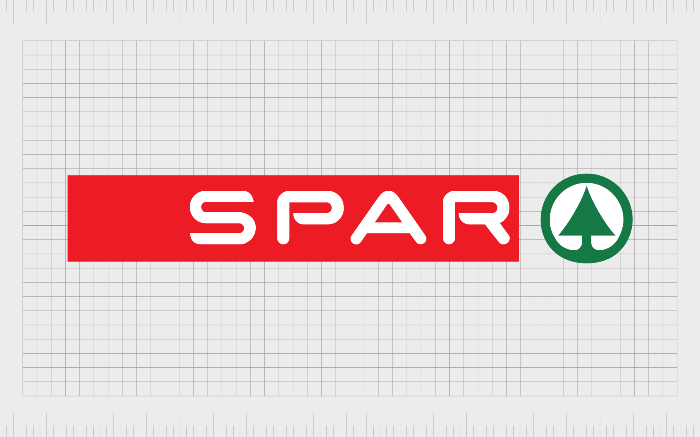
SPAR
SPAR is a Dutch multinational retailer with a significant presence in the United Kingdom. The company supplies branding and support services to various independently owned food retail stores and grocery companies.
The name of the company is actually an acronym which translates to “all benefit by co-operating harmoniously”.
The SPAR logo is an interesting one in our list of British grocery store logos. The image features a wordmark for the company’s name in white on a red background. Next to the red banner is the shape of a simplified tree, which may be used to represent growth and harmonious living.

Premier Stores
One of the many symbol groups in the United Kingdom currently owned by Tesco, Premier is responsible for around 3,000 stores worldwide. The organization was founded in 1994 as a newsagents and grocery store option.
The company sells a range of frozen foods, fresh goods, and other household items.
The image of the “Premier” logo is intended to convey quality and luxury. The dot above the “I” is designed to look like a shooting star, reminding us of wishes coming true.
The Premier store wordmark is also one of the few in the UK grocery market to use the color purple, which is often a reference to quality and style.
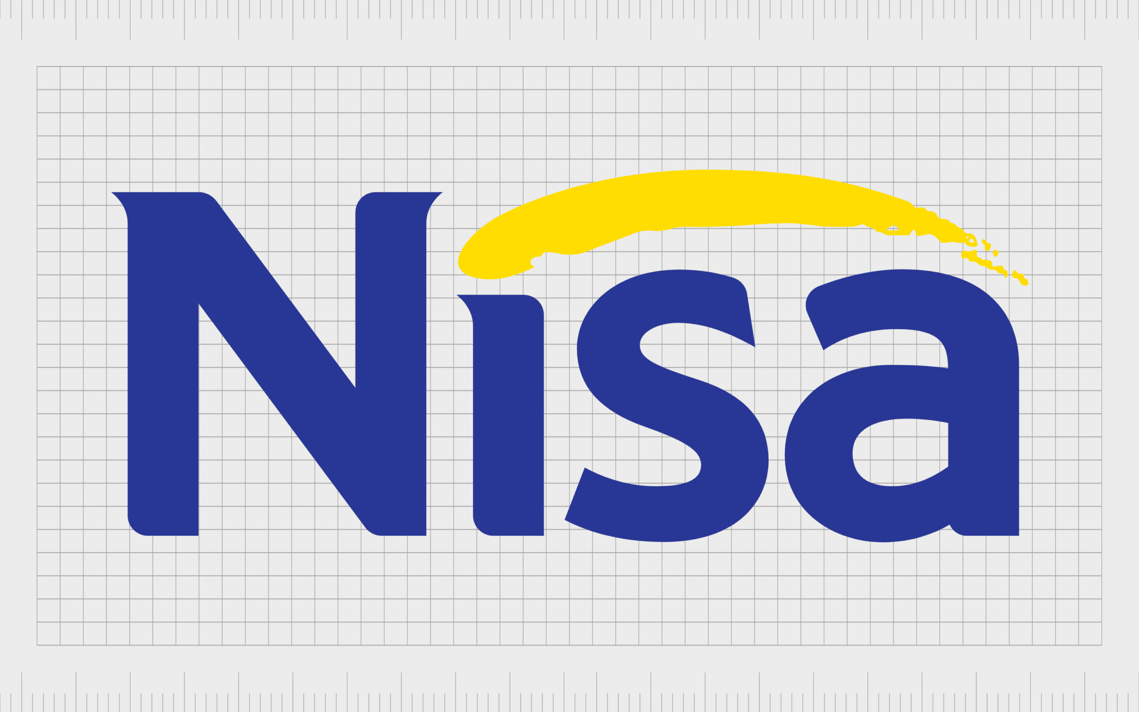
Nisa
Nisa operates a family of independently-owned grocery stores throughout the United Kingdom, with around 2,500 stores located worldwide. The company has a strong relationship with the co-op brand, and sells a number of their proprietary products.
Nisa’s logo highlights happiness with the swooping yellow line, as well as credibility and trustworthiness through a deep shade of royal blue.
The company sometimes also uses the tagline “Making a difference locally”, to appeal to shoppers hoping to support smaller independent businesses throughout the UK.
Learning from British supermarket brands
There are plenty of amazing British supermarket logos to discover across the market today. Each supermarket, whether it’s a leading company like Tesco, or a smaller organization like Nisa, embraces its own unique image to convey different values and feelings.
One of the major elements present across all the supermarket logos we’ve looked at in Britain is the use of a wordmark to help build brand awareness. Only a handful of companies also use an emblem or image to enhance their brand assets.
Hopefully, this article has given you an insight into how grocery stores and supermarkets across the UK have built their identity with phenomenal and eye-catching logos.
You can learn more about some of the top emblems used throughout the UK, and in other regions of the world, by visiting the Fabrik Logofile.
Fabrik: A branding agency for our times.

Clarity starts with a conversation.
Thanks—we’ll get back to you shortly.
Whether you're navigating a rebrand, merger, or simply need a clearer identity—we’re here to help. No hard sell, just honest advice from people who know the sector.
Let’s start with a simple question…
Prefer to email? Drop us a line.
Fabrik’s been helping organisations rethink and reshape their brands for over 25 years. We’ve guided companies through mergers, rebrands and new launches. Whatever stage you’re at, we’ll meet you there.