The complete Wilson logo history: A symbol of excellence in tennis

The Wilson logo is perhaps one of the best-known emblems in sporting history. Known for producing many of the balls used in sports championships and competitions around the world, Wilson is now an icon in its industry. But, how much do you know about Wilson logo history?
Although the evocative script of the Wilson logo is now instantly recognizable, the Wilson emblem hasn’t always been the design we know today. Like many well-known sporting companies, Wilson has updated and refined its symbol through the years.
Today, we’re going to take a closer look at the history and origins of the Wilson company. We’ll also be taking a deep dive into the evolution of the Wilson logo, and how it’s evolved to capture the hearts and minds of customers worldwide.
What is the origin of the name “Wilson”?
Before we start exploring Wilson logo history, let’s dive into the origins of the brand. Wilson, otherwise known as the “Wilson Sporting Goods Company” is an American sports equipment brand located in Chicago, Illinois.
The company is best-known for making equipment for a range of sports, including tennis, baseball, American football, basketball, and soccer. Notably, this organization traces its roots back much further than most people would think.
Sulzberger & Son’s first founded the “Ashland Manufacturing Company” in 1913, using animal by-products from slaughterhouses to create racket strings, surgical sutures, and violin strings. Eventually the company also expanded into tennis racquets and baseball shoes.
In 1915, the former president of Morris & Company, Thomas E. Wilson was appointed president of the manufacturing company. The brand acquired the Hetzinger Knitting Mills to create athletic uniforms, and a caddie bag company to produce golf balls.
In 1918, the Sulzberger company name was changed to “Wilson & Co.” In 1967, the company was sold to Ling-Temco-Vought, and purchased the Chicago Sporting Goods Company, creating a deal to supply equipment to the Chicago Cubs.
By 1925, Wilson had updated its name to “Wilson-Western Sporting Goods.” Then, in 19312, the name was changed to the “Wilson Sporting Goods Company.” Wilson quickly became the official ball supplier of the Basketball Association of America.
In 2020, it was also announced that Wilson would become the NBA and WBNA official ball supplier, starting with the 2021 season.
Wilson logo history: The evolution of the emblem
Though there isn’t a lot of information available on the Wilson logo before the company adopted its new name, the brand has changed its visual identity a handful of times. Notably, despite a history of more than 100 years in the marketplace, there have only been 3 major changes to the logo.
Let’s take a closer look at Wilson logo history.

1914
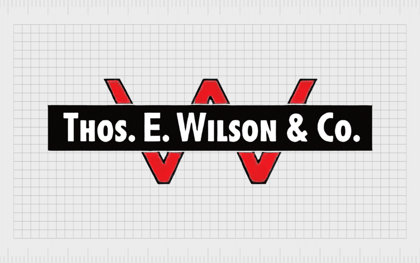
One of the first logos ever introduced by the Wilson company was created in 1914. The emblem consisted of a large letter “W,” written in red, with a thin black outline. Above the “W,” we see a slim black plaque, with a white inscription, in bold sans-serif font.
The inscription reads “Thos E. Wilson & Co,” referencing the current president of the company, and the new name. The introduction of the new logo came at an important time for the business, when it was branching out from tennis racquet strings and similar solutions into new products.

1962
The next version of the Wilson logo, introduced in 1962, was quite different from the original design. The inscription was removed entirely, and the shape of the logo changed. Now, the company used a geometric badge, with a black outline and red stripes at the bottom and top.
The most eye-catching part of the logo was the wordmark for “Wilson,” which featured all uppercase letters in a sans-serif font. The “I” had a slice of red at the top, to match the surrounding stripes.

1994
While some sources say the Wilson logo we know today has been used by the company for decades, others suggest it was only officially introduced in 1994. This logo is once again very different from the original designs used by the Wilson team.
The surrounding borders and decorative elements were removed, leaving nothing but the word “Wilson” behind. The script was updated, to a typeface that mimicked natural handwriting, with cursive elements between the letters.
Depicted in a bright shade of red, this logo symbolized passion and creativity. Although the official logo color palette is red, the Wilson logo often appears in different colors on various balls and pieces of athletic equipment.

The company also introduced a variation of its logo in recent years, which features a red square background, with a large letter “W” placed above the inscription. Both elements appear in white, and share the same font choice.
What does the Wilson logo mean?
Despite years of evolution and growth, the Wilson company hasn’t changed its logo much over the years. Since its inception, the brand has committed to using relatively simplistic emblems, to ensure its designs can stand the test of time.
Today, the Wilson logo may seem simplistic, but it’s a powerful and evocative banner. The inscription used on Wilson products feels extremely humanized, thanks to the handwriting-style font used for the letters.
The cursive script gives the image a sophisticated appearance, while the red and white color choices demonstrate concepts like passion and power. The Wilson logo stands for professionalism, excellence, and innovation, as well as ambition and growth.
The Wilson logo: Fonts and colors
The Wilson symbol is a powerful design in the world of branding. Though relatively straightforward, this logo has captured the attention of customers all around the globe. It’s both powerful and evocative in its careful use of typography and color.
The image tells us instantly that we’re dealing with a sophisticated and professional brand, with a strong passion for the sporting industry. The powerful script of the Wilson logo also works well across a variety of mediums, making it excellent for a sporting goods brand.
If you’d like to explore the Wilson logo for yourself, you can find some useful resources linked below:
What color is the Wilson logo?
The Wilson logo colors have remained relatively consistent throughout the years. Although the company has experimented with its design, the shades of red, black, and white have often appeared in virtually every version of the Wilson symbol.
While the official Wilson logo colors are red and white, there are variations of the emblem that use a simple black and white alternative. Additionally, many Wilson products feature a transparent logo, which allow the image to blend with the colors and textures of the items produced.
What font does the Wilson logo use?
The Wilson logo font has changed a handful of times over the years, evolving from a bold sans-serif typeface to a more humanized, script-style option. Today, the Wilson typeface is unique to the brand. It’s a cursive font, intended to look like natural handwriting.
The typography choice gives the Wilson logo a wonderfully sophisticated and elegant appearance. However, unlike many handwritten fonts, the Wilson logo has fantastic legibility, thanks to the bold strokes on the letters, and the white space between them.
Celebrating the Wilson tennis logo
Throughout Wilson logo history, the incredible sporting goods company has only changed its visual identity a handful of times. By retaining a relatively consistent visual presence, the brand has been able to achieve excellent memorability in the athletic world.
Today, the Wilson logo, though simple, is one of the most memorable and eye catching symbols in the sporting landscape. It instantly appeals to customers and sporting teams all over the globe, thanks to its sophisticated and confident aesthetic.
Fabrik: A branding agency for our times.
Clarity starts with a conversation.
Thanks—we’ll get back to you shortly.
Whether you're navigating a rebrand, merger, or simply need a clearer identity—we’re here to help. No hard sell, just honest advice from people who know the sector.
Let’s start with a simple question…
Prefer to email? Drop us a line.
Fabrik’s been helping organisations rethink and reshape their brands for over 25 years. We’ve guided companies through mergers, rebrands and new launches. Whatever stage you’re at, we’ll meet you there.


