MLS logos: The Major League Soccer logos and their history

How much do you know about Major league Soccer logos? As one of the better-known soccer leagues throughout the US and Canada, the MLS has earned quite a following over the years. Though the Major League Soccer community has a crest of its own, each team also has a unique logo.
Each soccer team logo does a lot more than simply differentiate its club from their competitors. Similar to business and non-profit logos, these emblems tell us a story about the origins, purpose, and values of the team they represent.
Some US soccer team logos are steeped in history, referencing the past of a specific city or location. Others are designed to engage audiences with evocative images and colors.
Today, we’re going to be taking a look at all MLS team logos currently circulating within the league, and providing insights into their hidden meaning.
The features of soccer team logos
Across the globe, the logos of sports teams, from soccer to basketball and hockey teams, stand as some of the most meaningful, powerful emblems around. Each badge or crest shares a narrative about the team it represents, often using a combination of colors, shapes, and icons.
Every MLS team logo is different, although some share common themes, such as showing the name of the team in the crest, or using a badge-style shape. The branding and design groups behind Major League Soccer teams choose each component of their image with care.
The trademarks of Major League Soccer are designed to ignite the passion and loyalty of fans, capturing the attention of viewers from around the world. Every color scheme, shape, and mascot-style animal is meaningful in its own way.
Additionally, like many logos, these emblems can often change over time, adapting to evolving trends, changes in the team structure, and the latest design technologies of the age.
Major league soccer logos: All MLS logos in 2023
The Major League Soccer group (MLS), is a professional soccer league, supported by the United States Soccer Federation. As of 2023, the league consists of 29 teams in total, 3 in Canada, and 26 in the United States.
MLS is the most recent addition to a series of premier soccer leagues. It was first established in 1993, building on its predecessor, the North American Soccer League (NASL).
Here’s your behind-the-scenes insight into MLS team logos as they stand today.
Atlanta United FC
Founded in 2014, Atlanta United FC began life as an expansion team in 2017, the 22nd team to join the league. The team’s logo and colors were revealed in 2015, and the badge features a circle, based on the seal of Atlanta City, with a bold “A” in the center.
Behind the circle are a series of red and black stripes, representing the pillars of the team: community, unity, determination, innovation, and excellence. The official colors of the team are black for strength, red for victory, and gold for ambition.
Austin FC
Based in Austin, Texas, Austin FC was founded in 2018, but only began playing in the league for the first time in the 2021 season. Interestingly, they’re the first major sports league team to play in the Texas capital, which before 2021, was the largest city in the US without a team.
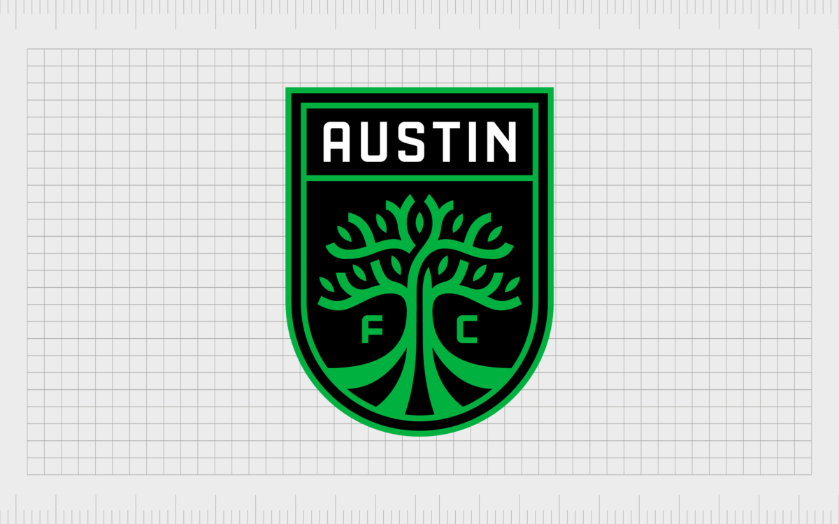
Austin FC’s logo is a shield-style emblem, with a curved bottom section. Within the center of the logo, we see a simplistic green tree, with the letters “F” and “C” on either side. The name of the city is presented in a banner at the top of the brand mark.
Charlotte FC
Introduced as an expansion franchise in 2019, Charlotte FC began playing as an MLS team in 2022. The inaugural match held by the team set the record for the largest standalone match attendance. The Charlotte Football Club is also known as “The Crown”.
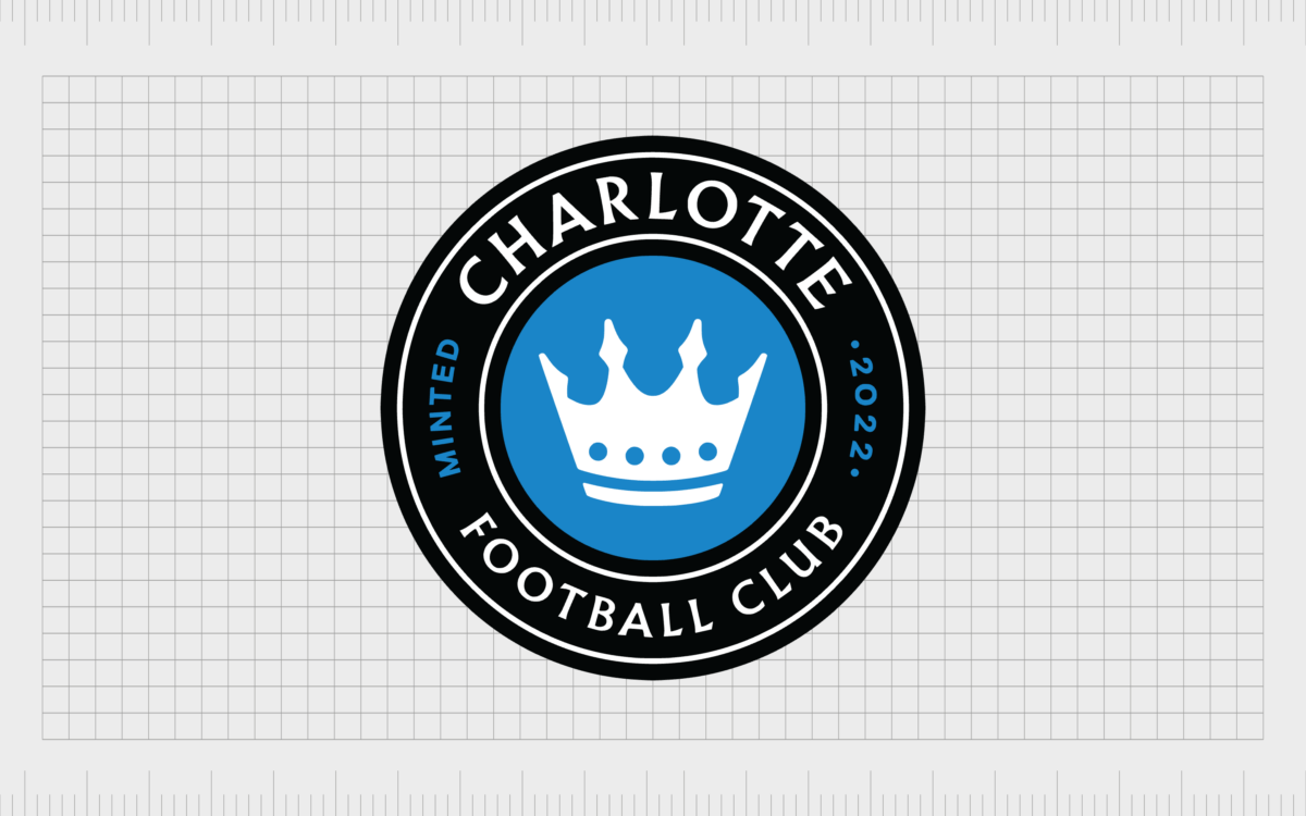
Like many Major League Soccer logos, the Charlotte FC emblem is a circular badge, with a black border, showcasing the name of the team. In the middle, we see a white crown on a blue background, symbolizing heritage, and excellence.
Chicago Fire FC
Named in memory of the Great Chicago Fire in 1871, Chicago Fire was first founded in 1997. The team began playing in 1998, as one of the first expansion team in the league, and won the MLS cup during their first season.
The club rebranded in 2019, and the new logo features a circular emblem, with a large “C” in the middle, surrounded by a blue border. The blue border includes a set of triangles, called the “fire crown”, symbolizing the revitalization of Chicago following the great fire.
Colorado Rapids
Based in the Denver metropolitan area, the Colorado Rapids were founded in 1995. The club is one of the founding members of the MLS, and played their first season in 1996. Colorado also won the MLS cup in 2010, during their second appearance.
The rapids MLS logo has evolved a few times since its inception. The current design features a burgundy colored shield with a pointed top section. In the middle of the design, we see a mountain range, with a soccer ball over the top.
Columbus Crew
Launched in 1996 as one of the first 10 charter clubs in the Major Soccer League, the Columbus Crew team has won six major trophies throughout its lifespan. The colors of the Columbus crew have remained black and gold over the years, though the design of the emblem has changed.
The most recent design is a modern looking emblem, featuring a black banner with a golden border, and stylized letter “C”. The number “96” is a nod to the company’s first year in the competition.
D.C United
One of the most contemporary looking Major League Soccer logos on this list comes from D.C. United, the Washington-based club founded in 1994. D.C. United is the only American team to successfully win the Copa Interamericana title.
The D.C logo combines traditional elements with a modern design. The image features a shield-style crest, with an eagle placed over the top. The logo also includes three stars, and red and white stripes, to represent the flag of Washington D.C.
FC Dallas
Launched as a charter club of the league in 1996, FC Dallas was originally founded as Dallas Burn, before it shifted to its current name in 2004. The team won its first Supporters’ Shield in 2016, and was a runner up for the MLS cup in 2010.
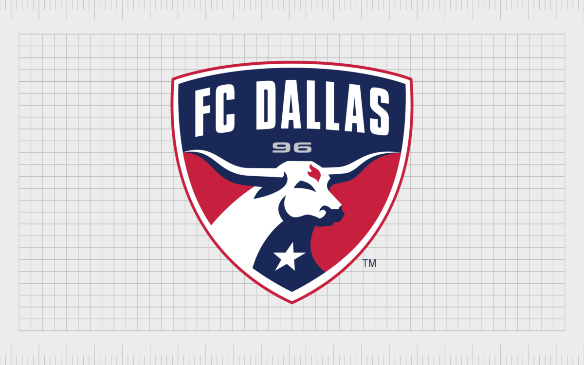
The club badge includes an image of a bull, drawing attention to the Texas mascot. The team also uses the colors of red, white, and blue, to showcase its patriotic personality.
FC Cincinnati
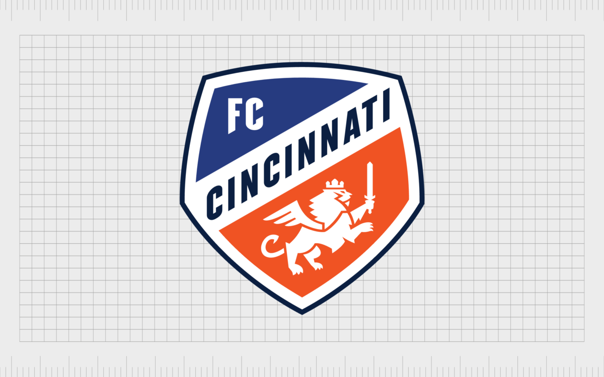
One of the more colorful MLS logos on this list comes from FC Cincinnati, first introduced into the Major League Soccer group in 2015. The team’s primary colors are orange and blue, giving the club a relatively vibrant image.
The original crest of the team used a winged lion of Saint Mark the Evangelist. This image still remains in the design today, though it’s slightly more simplistic.
Houston Dynamo
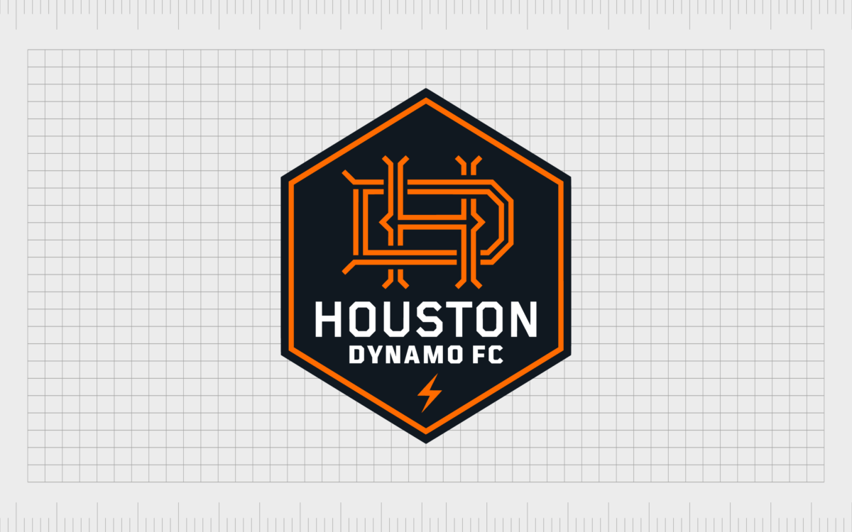
Introduced in 2005, Houston Dynamo FC is a member of the Western Conference for Major League Soccer. The team has earned MLS Cup championship status twice, first winning during their initial seasons in 2006 and 2007.
The crest of the team is almost Art Deco in style, with a monogram appearing in the middle of a hexagon-shaped badge. The design and name is a reference to Houston’s presence in the energy-based industrial economy.
Inter Miami CF
Based in Fort Lauderdale, Florida, Inter Miami CF was introduced to the league in 2018, and began playing for the first time in 2020. The club gained a lot of attention in 2023, after Lionel Messi shared his intention to join the group.
The Miami crest includes two birds placed back to back, which look a little like flamingos, but were actually revealed to be white herons. The colors of the badge are black, white, and pink.
LA Galaxy
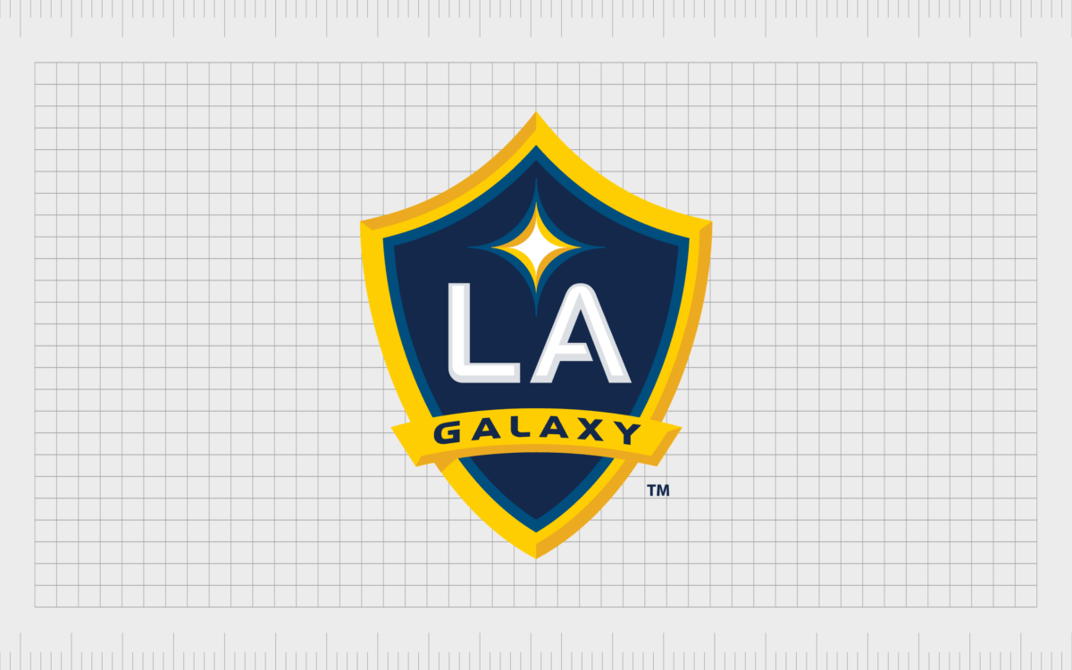
Known as the “Los Angeles Galaxy” team, LA Galaxy began playing in the MLS group in 1996, as one of the league’s first 10 charter members. The franchise currently stands as one of Major League Soccer’s most successful teams, with a record 5 cups.
The relatively simplistic MLS logo used by the LA Galaxy club features a traditional shield, depicted in dark blue and bold, with a four-pointed star in the middle.
LAFC
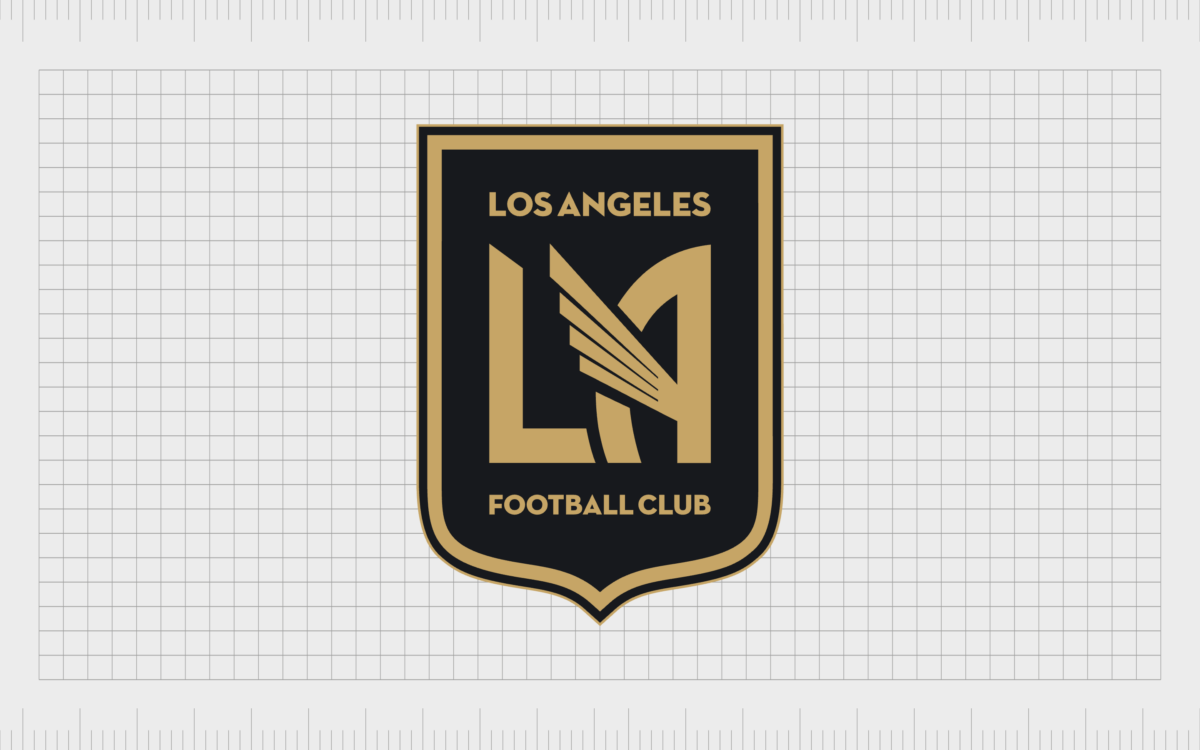
Otherwise known as the Los Angeles Football Club, LAFC is an American soccer team first established in 2014. The team has a fierce rivalry with the LA Galaxy club, the older of the two Los-Angeles-based teams.
Unlike many MLS team logos, the LAFC emblem is inspired by the Art Deco movement, with a shield outline referencing the seal of the city, and an LA monogram. The image was designed by Matthew Wolff.
Minnesota United FC
Based in Saint Paul, Minnesota, the Minnesota United FC club began playing in 2017 as the 22nd team in the league. The club has a relatively interesting and modern emblem compared to most of the U.S. soccer team logos on this list.
The design features a stylized “loon”, the state bird of Minnesota. It includes eleven feathers, designed to represent each of the players on the field.
CF Montreal
Otherwise known as Club de Foot Montreal, CF Montreal is one of the few Canadian professional soccer clubs in the MLS league. It was originally founded in 1992, and began playing in the MLS during 2012 as an expansion team.
The team unveiled a new badge in 2022, shortening its name, and creating a slightly more modern image, with a stylized Fleur de Lys, and blue and black stripes.
Nashville SC
Using a relatively simplistic soccer logo, the Nashville SC team was created in 2020, as a continuation of a USL club with the same name. The club’s primary colors are gold and blue, referencing the shades of Nashville’s flag.
The overall emblem is incased in a golden octagon with a thin outline, as well as a monogram “N” with various vertical bars, designed to represent sound waves.
New England Revolution
Based in the Greater Boston area, the New England Revolution was one of the first ten charter clubs of the MLS, and has competed in the league since its first season. The team was originally founded in 1995, and won its first major trophy in 2007.
The most recent version of the New England Revolution logo was launched in 2021, depicting an “R” inside the shape of a flower. Interestingly, the font is a reference to the Boston Tea Party mark.
New York Red Bulls
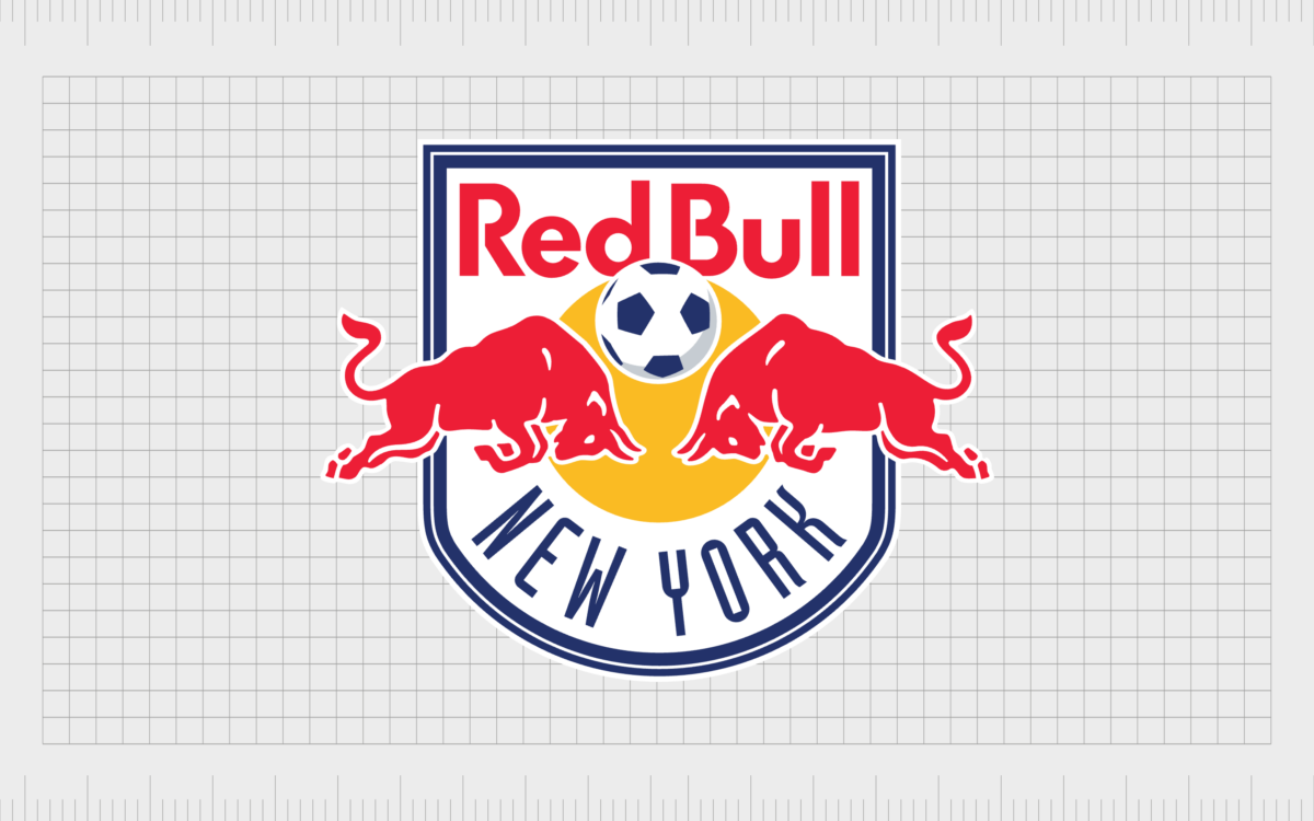
Introduced in 1994, the New York Red Bulls began playing in the MLS during its inaugural season in 1996, under the name New York MetroStars. After the team was sold to Red Bull, its branding, and name changed to reference the company.
The current logo features the same imagery from the Red Bull logo, with two bulls facing head-to-head with a soccer ball in the middle.
New York City FC
Otherwise known as NYCFC, New York City Football Club played its first league game in the 2015 season, as the twentieth team in the league. The team is the second franchise based in New York, after the Red Bulls.
The colors of the NYCFC team have remained relatively consistent throughout the years. The image today features a stylized monogram for “New York City”, inside of a blue, circular border.
Orlando City SC
Launched in 2015 as the 21st franchise of the MLS, Orlando City SC has quite an eye catching soccer logo. The team was the first MLS team in Florida since the Miami Fusion and Tampa Bay Mutiny folded during 2001.
Like other MLS team logos, the emblem of Orland City features a shield emblem, with a gold lion face, surrounded by 21 “flares”. The lion logo and color scheme plays homage to the first professional soccer team in Orlando, the Orlando Lions.
Philadelphia Union
Philadelphia Union was founded in 2008, and started playing in the MLS in 2010 as an expansion team. The Union finished as runners up in the 2014, 2015, and 2018 US Open cup tournaments.
However, in 2020, they earned the Supporter’s Shield.
The Philadelphia Union badge is a reference to the American Revolutionary War, and includes 13 stars, representing the original 13 colonies.
Portland Timbers
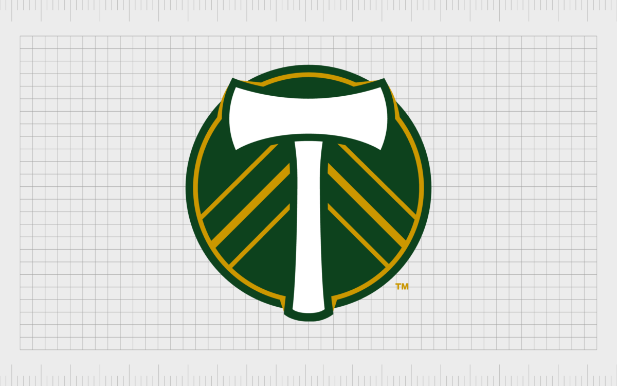
Another relatively simple addition among the logos of MLS teams comes from the Portland Timbers. This club was founded in 2009, and began playing in 2011. The primary color of the simple logo is green, with golden stripes and a white axe in the center.
The emblem incorporates elements of the previous USL design, and is intended to represent wholeness, and unity. The axe is a reference to the Pacific Northwest logging industry.
Real Salt Lake
Often shortened to RSL, Real Salt Lake began playing in the MLS in 2005, as an expansion team. The club has won the 2009 MLS cup, and finished as a runner up for the Supporter’s Shield in 2010, and the MLS cup again in 2013.
The relatively traditional logo of Real Salt Lake is based on a national crest, showcasing a stylized monogram inside of a blue shield design.
San Jose Earthquakes
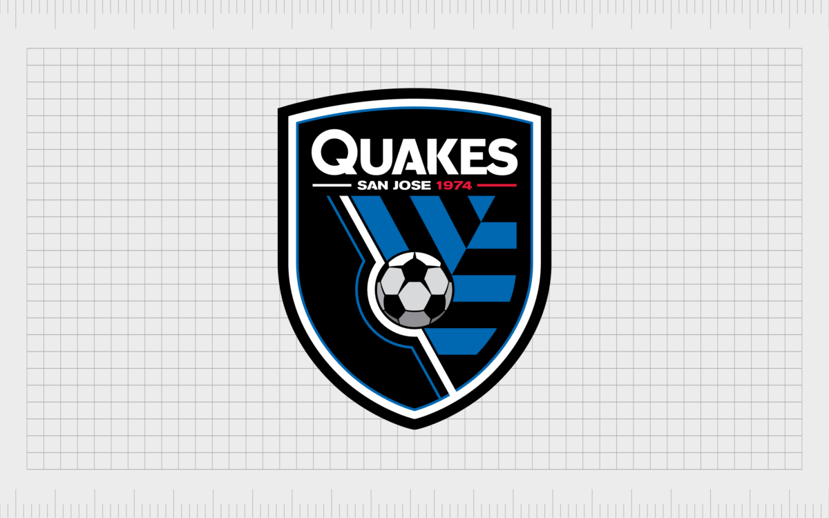
First founded in 1994, the San Jose Earthquakes, often called the “Quakes”, began playing in 1996 as one of the main charter members of the league. The Earthquakes have won two MLS cup titles, and holds a fierce rivalry with the LA Galaxy club.
The current MLS logo used by the Quakes references the company’s previous crest when it played in the NASL group. It features the date “1974” to highlight the previous team.
Seattle Sounders FC
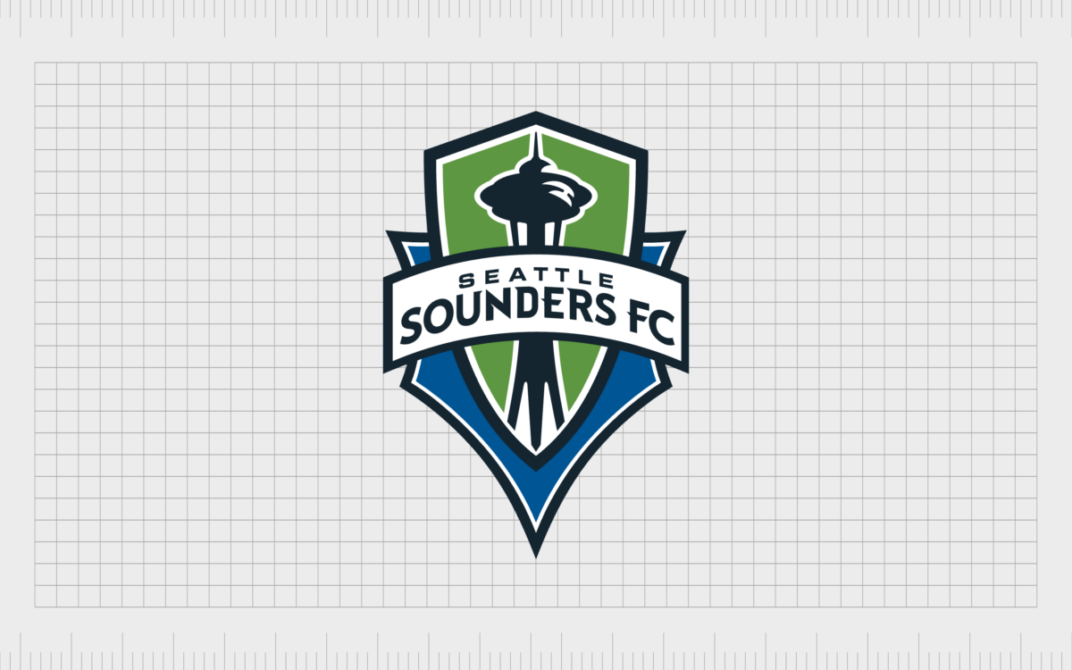
Established in 2007, the Seattle Sounders began playing as an MLS expansion team in 2009. The Phoenix club replaced the second-division franchise that played in the APSL. They’re also one of the league’s most successful teams, with record-breaking match attendance.
The design of the Seattle Sounder’s badge represents a heraldic shield, and includes two layers, to represent community. There’s also an image of the famous Seattle landmark, the Space Needle.
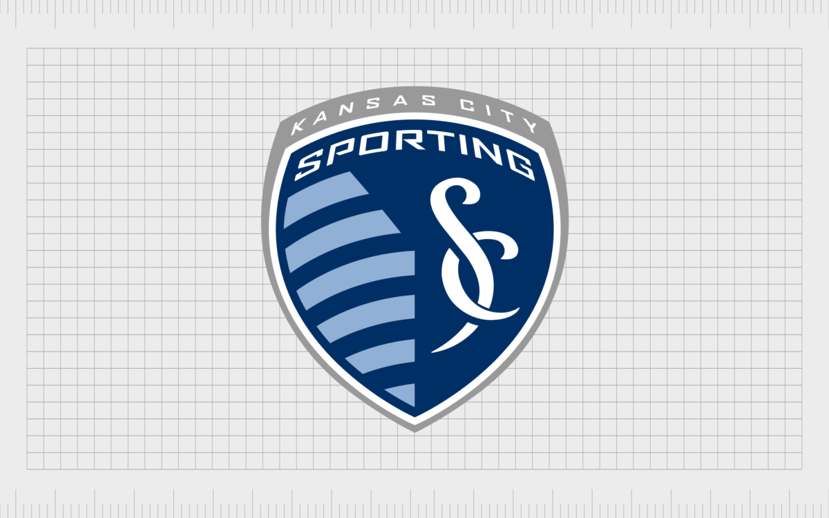
Sporting Kansas City
Sporting Kansas City is based in the Kansas Metropolitan area, and began playing in the MLS as a charter team during 1996. Originally, the team used the name “Kansas City Wiz”. The club also has a reserve team known as “Sporting Kansas City II”.
The Kansas City logo features a teardrop shaped shield, with a stylized representation of the Kansas-Missouri state line. The image alludes to the team’s former logo used for the “Wizards” name.
Saint Louis City SC
Based in St Louis, Missouri, St Louis City is an American soccer club that first joined the MLS in 2023 as an expansion team. The crest of the club is extremely modern, and features the iconic Gateway Arch from St Louis, placed on a shield design.
The curved lines symbolize two of America’s longest rivers. The vibrant red in the image is often confused with pink in some lights.
Toronto FC
The Toronto Football Club is one of the few Canadian teams in the MLS group, and a member of the Eastern Conference. It joined the MLS as expansion team, and the first Canadian franchise in the league during 2007. The official colors of the team are red, grey and white.
The MLS logo used by Toronto FC is relatively traditional, featuring a striped shield, with a decorative element on the top, and a banner inscribed with “Toronto” across the center.
Vancouver Whitecaps
The third and final Canadian club in the MLS, the Vancouver Whitecaps were launched in 2009, and began playing in 2011. The team became the first Canadian club to qualify for the MLS club playoffs during 2012, and they have won three Canadian championships.
The design of the Vancouver Whitecaps logo is intended to look a little like a mountain range. Or a series of diamonds. The overlapping shapes symbolize unity and strength.
Learning from the MLS team logos
Major League Soccer logos, similar to many sports logos, are some of the most evocative in the branding world. The shields and emblems used by famous teams throughout the US and Canada are designed to capture the attention and loyalty of countless fans.
As you can see from the examples of MLS logos above, many designs share similar elements, but they all share a different story about the history and origins of the team.
MLS branding teams leverage a range of colors, fonts, and shapes to draw attention to everything from iconic landmarks to historical events.
If you’re inspired by the MLS logos above, reach out to Fabrik to start creating a competitive logo of your own. We’ll help you create a design that appeals to the passion of your fans.
Fabrik: A branding agency for our times.
Clarity starts with a conversation.
Thanks—we’ll get back to you shortly.
Whether you're navigating a rebrand, merger, or simply need a clearer identity—we’re here to help. No hard sell, just honest advice from people who know the sector.
Let’s start with a simple question…
Prefer to email? Drop us a line.
Fabrik’s been helping organisations rethink and reshape their brands for over 25 years. We’ve guided companies through mergers, rebrands and new launches. Whatever stage you’re at, we’ll meet you there.


