Disney logo history: The evolution of the Walt Disney logo
Virtually everyone is familiar with the Disney company and Walt Disney logo today, but how much do you know about Disney logo history? Like many major brands, Disney has refined its image over the years, using its emblem to capture, engage, and inspire worldwide audiences.
Disney achieved the success it has today through a combination of incredible innovation, marketing and storytelling. The company has effectively built a brand that resonates with consumer emotions everywhere in the world, reminding us of the magic the organization can offer.
The Disney logo is part of what makes the company so memorable. It’s the brand’s most recognizable element, appearing on every Disney product, film, and production. Today, we’re taking a closer look at Disney logo history, to discover how the company found its unique image.
Who started Disney? An introduction to the Disney brand
Before we dive into Disney logo history, let’s take a closer look at the Disney brand. The Walt Disney Company, known commonly as “Disney” is a multinational entertainment and mass media conglomerate. The company was first founded in 1923, by two brothers.
Walt Disney and Roy Disney (his brother) created the “Disney Brothers Studio” to begin branching into the animation industry. Their first major success was the release of Steamboat Willie in 1986, which introduced the world to the iconic character of Mickey Mouse.
After achieving phenomenal success in the 1940s, Disney began branching out into a range of different live-action films, theme parks, and television products. Though the company’s profits temporarily declined after Walt’s death in 1966, the brand has achieved amazing success.
In 2005, under the CEO, Bob Iger, Disney began expanding and acquiring other corporations, leading to the development of various new IPs. Today, Disney is responsible for everything from 20th Century Animation to Marvel Studios, and Pixar.
As of 2023, Disney has emerged as one of the bet-known, and biggest companies in the world. Plus, it’s the proud owner of more than 135 Academy Awards.
Disney logo history: The old Disney logo
Like many movie studios and production companies, Disney has made numerous changes to its logo over the years. The Disney emblem today is a modernized version of various visual assets created by the organization throughout its long lifespan.
Let’s take a closer look at some of the old Disney logo designs.
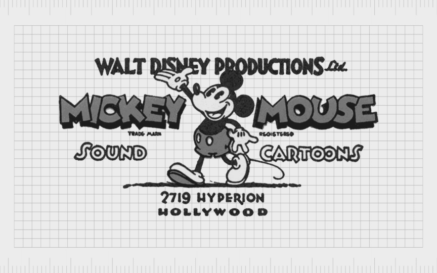
1929
The original Disney logo drew attention to the company’s focus at the time, animation. The iconic character of Mickey Mouse appeared at the center of the emblem, which was created in a greyscale color palette. The character’s name also featured on either side of the mascot.
The “Walt Disney Productions” logo, as well as “Sound Cartoons” and the address of the organization also appeared in this logo, in smaller, simpler font to the typeface used for Mickey Mouse. The overall emblem was friendly and fun, ideal for appealing to a younger audience.
1937
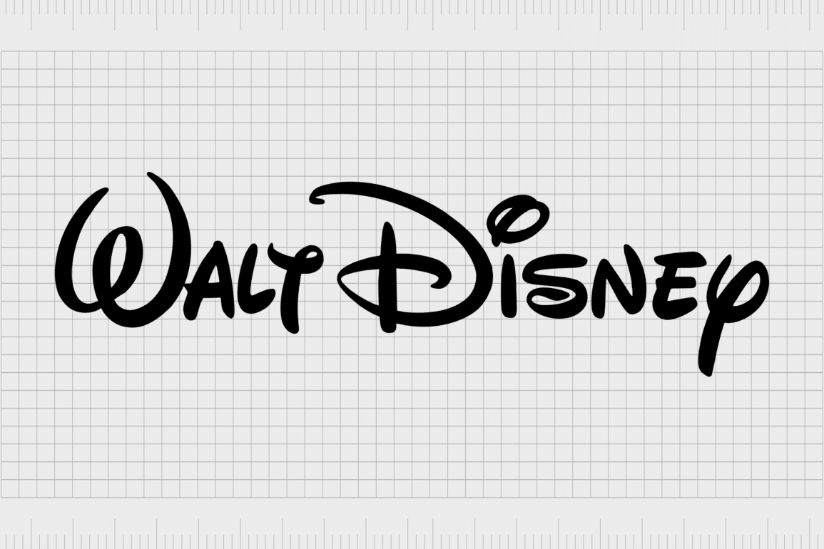
The second logo introduced in Walt Disney history was a lot simpler than its predecessor. It featured the name of one of the company’s founders in a stylish, handwritten font. Despite the artistic design of the typeface, the emblem was still extremely legible.
This creative typeface paved the way for the introduction of various handwritten inscriptions on the Disney symbol in the years to follow.

1948
A secondary version of the Walt Disney handwritten logo appeared in 1948. Though the lines in this inscription were bolder, the design wasn’t as legible, due to the use of lowercase letters and a cursive font. However, the image still appeared fun and stylish.

1972
The 70s introduced us to the inscription that would appear on the new Disney logo for years to come. This wordmark was based on the previous signature design created in 1937, though the lines were thickened, and refined in certain areas.
The sans-serif inscription “Productions” was added underneath the signature, giving the image a sophisticated and balanced look.

1983
In 1983, a slight update was made to the previous design. This Disney logo change introduced the word “Pictures” instead of “Productions”, in a serif-style typeface. The Walt Disney signature remained the same, however, alongside the black and white color palette.

1985
In 1985, Disney built on its existing typeface logo with a new graphical element – Cinderella’s Castle. The silhouette of the structure, with white stripes placed over the top, was placed just above the “Walt Disney Pictures” lettering. Notably, the “Pictures” element also grew in size.
A thin semi-circle was also placed around the castle, giving the overall image a more complete and artistic appearance.

2006
While other companies were simplifying their logos, Disney took a contrasting approach in 2006, making the castle design in the Disney emblem more detailed. The semi-circle around the castle was removed, and a shooting star was added to the top of the design.
The image of the castle was also surrounded by a thin rectangular border. The inscription for “Walt Disney Pictures” remained the same, though some letters appeared a little thinner.
Disney logo evolution: The new Disney logo
The new Disney logo, introduced in 2011, is a variation of the previous design from 2006. It still features the detailed castle element, as well as the shooting star, and the square border. However, in this variation of the logo, the text has been simplified.
Now we only see the word “Disney”, in a much larger version of the previous signature script, with bolder, thicker lines. While this is the official logo used by the Disney brand, there’s also a variation logo used by the Walt Disney Company.

The corporate logo features the full “Walt Disney” inscription, surrounded by the words “the” and “Company” in a bold sans-serif font.
Disney logo meaning: What does the Disney symbol represent?
The Disney logo today is brimming with meaning, designed to connect with the emotions of a global audience. The grand castle centerpiece in the design is a reminder of what the company has done over the years, creating theme parks, animations, and movies.
Inspired by the Neuschwanstein Castle, this design has become one of the most recognizable symbols in the world. It also appears in various Disney movies, where each Disney princess or royal character has their own version of the amazing structure.
The Disney signature, appearing on both versions of the company’s logo, infuses the design with a sense of whimsy and creativity. It looks authentic and hand-written, and is based on Walt Disney’s own signature, tying the company back to its creator.
Together, the Disney symbol and its wordmark convey a company committed to creating magical experiences for everyone it interacts with. The Disney logo highlights the brand’s incredible past, as well as its future vision.
The Walt Disney logo: Fonts and colors
Today, the Walt Disney emblem is perhaps one of the most recognizable logos in the world. The Disney symbol of Cinderella’s castle is something virtually everyone can define at a glance, no matter their age, or where they might be located.
At the same time, the Disney signature has become synonymous with the concepts of quality programming, entertainment, and film development.
If you want to see the Disney logo in closer detail, you can find some useful resources here:
What are the Disney logo colors?
While the Disney colors can vary depending on where you’re viewing the emblem, the official shades used by the company are simply black and white. Notably, the Disney symbol has appeared in other color palettes, such as shades of blue and white on the title screen for Disney films.
What is the Disney logo font?
Perhaps unsurprisingly, the Disney logo font is entirely unique to the brand. The signature inscription was based on the handwriting of Walt Disney himself, the best-known Disney founder. The founder of Disney regularly signed his work, which led to the inspiration for the whimsical inscription.
This amazing font is unlike any other typeface available today. However, many artists and creators have attempted to design their own variations.
The magical Disney logo
Although there have been various changes to the Disney symbol throughout Disney logo history, the design has always featured a consistent sense of whimsy and creativity.
Over the years, the Disney logo has grown more refined and legible, as well as increasingly more iconic. Today, the design features the handwritten signature of Walt Disney, accompanied by one of the brand’s most memorable images – Cinderella’s castle.
Though the color palette for the design is simple, the Disney logo itself is wonderfully evocative. It’s infused with a sense of magic that influences every consumer who sees it.
Fabrik: A branding agency for our times.
Clarity starts with a conversation.
Thanks—we’ll get back to you shortly.
Whether you're navigating a rebrand, merger, or simply need a clearer identity—we’re here to help. No hard sell, just honest advice from people who know the sector.
Let’s start with a simple question…
Prefer to email? Drop us a line.
Fabrik’s been helping organisations rethink and reshape their brands for over 25 years. We’ve guided companies through mergers, rebrands and new launches. Whatever stage you’re at, we’ll meet you there.


