Van Halen logo history and meaning

Have you ever wondered where the Van Halen logo came from? These days, it’s one of the most iconic symbols of rock and roll in the world. However, Van Halen weren’t always so sure of their visual identity at first.
The group, known for masterpieces like “Jump”, and “Runnin’ with the Devil”, had to experiment for a while before they found the symbol to epitomize their approach to music.
It goes to show anyone, even a world-renowned rock band, can have a tough time with logo design. Today, we’re going to dive back into the history of Van Halen, to explore the evolution of the band’s logo, and how it’s changed over the years.
The Van Halen logo history
When Van Halen first formed back in 1972, it was with the name “Genesis”. Unfortunately, this name already belonged to another band, so the group had to reform as “Mammoth”. The logo for Mammoth was a simple wordmark, with 3D letters designed to look like cracked rocks.

When Van Halen changed their name in 1974, the first “official” Van Halen logo emerged. This was an in-house design, according to experts, which was drawn by the original bassist for the group, Mark Stone.
Once again, the band chose a wordmark, this time with highly stylized letters which drew attention to the “V” and the “A”s in the name.

According to some design experts, the elongated components of the letters are similar to the bars in musical notes, albeit with an edgier finish.
The next Van Halen band logo didn’t emerge until 1978. This was when we saw the first iteration of the Van Halen symbol most people recognize today.
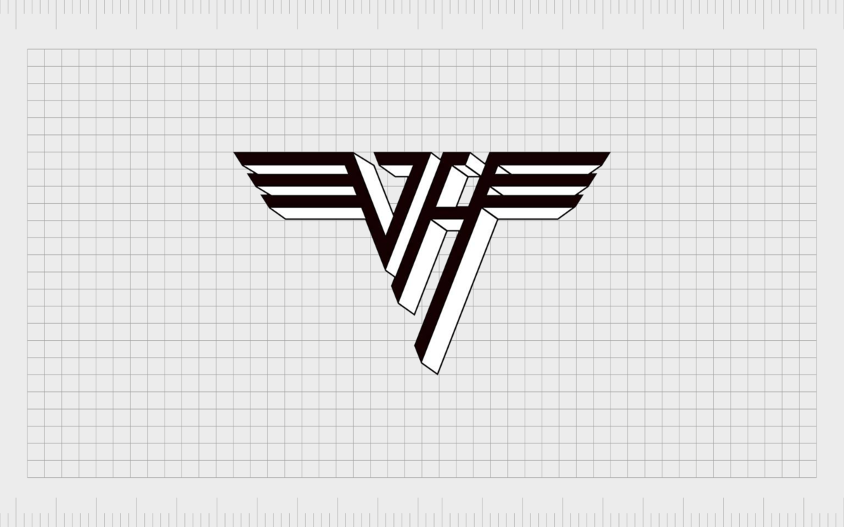
The image included the name of the band on a banner on top of the letters “V” and “H” combined into a V shape. On other side of the “V” were a set of wings drawn in the form of metallic lines.
This original Eddie Van Halen logo, as it’s known today, quickly became one of the best-known versions of the Van Halen emblem. The image was designed by Dave Bhang for the group’s debut album.

The 1978 logo was regarded by many to be the “coolest logo” to appear in music. However, it only showed up on two albums overall, before the group changed the logo yet again with the arrival of Sammy Hagar as a new lead singer.
The evolving Van Halen symbol
Van Halen logos after the 70s featured a few different iterations of the same “flying V” design. The stylized monogram was an attractive image for the group, and a great way to showcase the brand on promotional posters and EPs.
The wing logo has since appeared a few times between 1979 and 1986, as well as between 2012 and 2020.

In 1986, Van Halen also began using a new logo when Sammy Hagar took over as the new lead singer in the band. The image was very similar to the previous Van Halen symbol, but this one transformed the wings of the flying V emblem into a set of golden rings.

Today, Van Halen is now primarily back to the design which appeared during 1979. The current logo is a little simpler however, with less of a “3D effect”.

Van Halen may have had some issues with their logo choices over the years, but the band also knew when to stand their ground. After the 1978 logo was introduced by Dave Bhang, Warner Brother’s Records aimed to change the design again, creating a more “punk rock” version of the symbol.
The group were not willing to change their image however, and instead hold onto Dave’s design for the time being. When the iconic Van Halen symbol did evolve into the new design with the golden rings, many fans responded negatively.
As mentioned, the updated logo emerged after Sammy Hagar took over as the head of the band, but when Eddie Van Halen checked into a rehab in 2007, the band changed its website and reverted back to their original Dave Bhang design.
What font is used for the Van Halen logo?
Many designers and Van Halen fans alike have discussed the “Van Halen identity crisis” which seems evident in a lot of the content created by the band over the years.
Issues with record companies, changing band members, and other complex problems seemed to get in the way of any brand consistency.
Fortunately, Van Halen are now back to the logo they’re best known for.
Today, the elements of the Van Halen logo are:
Van Halen logo font
None of the letters in the Van Halen logo appear to belong to a specific font. The typography was created specifically for the Van Halen band, although you may be able to find tools to replicate a similar style online.
Van Halen colors
The colors of the Van Halen logo have never been truly set in stone. The group has experimented with different shades in the past but seems to use emblems mostly in shades of black and white. The current Van Halen logo is often seen as a black symbol on top of a white background.
Van Halen symbol
The iconic Van Halen symbol is simple enough to understand. The current logo, a version of the design from Dave Bhang, combines the “V” and “H” of Van Halen in slanting capital letters.
The design creates a “V” shape, with wings coming out at the top of either corner of the image. The “wings” are simply a series of lines.
Some versions of the Van Halen Logo today are designed in a “3D” format, but the majority of the band’s merchandise seems to embrace the more minimalist look.
The evolution of the Van Halen logo
Van Halen is a band known for experimenting with a range of brand images over the years. The group has used various unique designs for their logo and wordmarks over the years, with many albums featuring images seemingly designed just for the specific release.
There are albums from Van Halen on the market today with no sign of the iconic Van Halen symbol – just a serif-style font showing the group’s name instead.
Despite some significant confusion over the years, Van Halen still managed to end up with an “iconic” logo. The Dave Bhang logo is still the design most people associate with Van Halen today, and it’s the image you’ll see on most of the official merchandise for the brand too.
Fabrik: A branding agency for our times.
Now read these:
—The story of the Rolling Stones logo
—Exploring the Stranger Things logo
—The Gucci symbol and logo history
—Harley Davidson logo emblem evolution
—Story of the Pokémon logo symbol
—Tidal Music symbol and logo story
—The LA Lakers logo and symbol
Check out these fantastic logo design resources:
Clarity starts with a conversation.
Thanks—we’ll get back to you shortly.
Whether you're navigating a rebrand, merger, or simply need a clearer identity—we’re here to help. No hard sell, just honest advice from people who know the sector.
Let’s start with a simple question…
Prefer to email? Drop us a line.
Fabrik’s been helping organisations rethink and reshape their brands for over 25 years. We’ve guided companies through mergers, rebrands and new launches. Whatever stage you’re at, we’ll meet you there.


