Revlon logo history: The evolution of the beauty brand
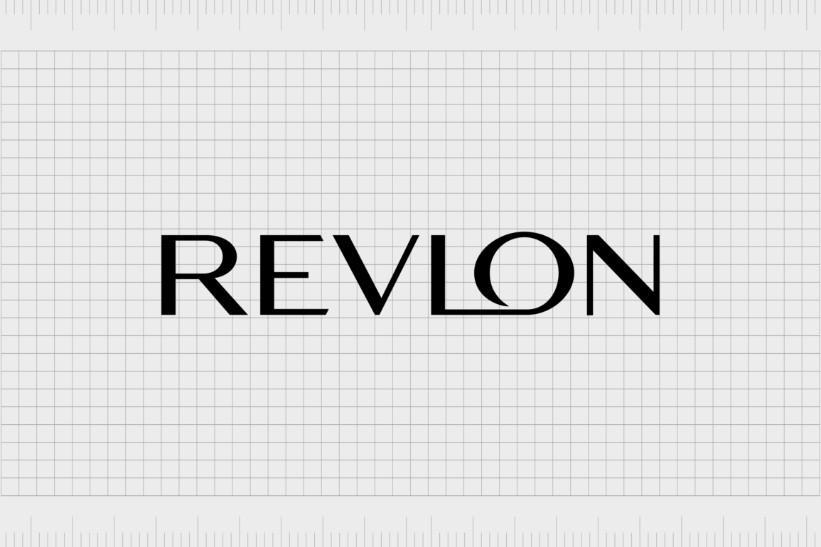
For fans of the beauty industry, the Revlon logo is likely to be a familiar icon. Sleek and symbolic, this memorable emblem distinguishes the company from its rivals in its field, highlighting its commitment to excellence and value.
But where did the Revlon logo history begin, and how has the company’s visual identity changed over the years?
As one of the better-known companies in the cosmetics and beauty space, Revlon has captured the attention of millions of customers over the years. Today, the Revlon emblem is present on products across more than 150 countries worldwide.
Since launching in 1932, the Revlon brand has experimented with numerous marketing campaigns and strategies, but its visual identity has remained largely consistent.
Today, we will examine the Revlon logo history and how the brand has evolved throughout the decades.
What is the story of Revlon? Introducing Revlon
Before we begin our journey into Revlon logo history, let’s learn a little more about the company itself. Revlon Inc is an American cosmetics and skincare company with a presence in more than 150 countries worldwide.
It was first launched in 1932, in New York City, by Joseph and Charles Revson and their chemist business partner, Charles Lachman.
The name for the organization was based largely on the second name of the Revson brothers, with Lachman contributing the defining “L” in the center of the word.
The three men started the Revlon company with just one product, a new kind of nail enamel. They pooled their resources to develop an innovative manufacturing process using pigments instead of dyes.
By 1937, Revlon had begun selling their nail polishes in pharmacies and department stores throughout the US, and in 6 years, the company became a multi-million-dollar operation. In the 40s, Revlon began expanding its product line, adding lipstick and other cosmetic items.
In 2022, Revlon filed for Chapter 11 bankruptcy protection, despite years of success in the cosmetics space. Despite its financial troubles, the organization is currently still in the process of raising equity and looking for new ways to grow.
Revlon logo history: The Revlon emblem through the ages
Though Revlon has spent several decades in the cosmetics space, the company hasn’t made many significant changes to its visual identity in that time.
Looking back through the Revlon logo history, we can see the organization has consistently used a simple wordmark for its emblem, though it has experimented with a few different typography and color choices.
Let’s take a closer look at how the Revlon icon has changed since the beginning of the brand.

1935
For the first few years of its operation, Revlon didn’t have an official logo. The company was experimenting with its formulas and didn’t really begin focusing on branding and marketing until a couple of years later, in 1935.
The initial Revlon badge featured the name of the company, written in a cursive, script-style font with curvaceous lines and swooping elements.
The characters in the wordmark were curved slightly, making it look as though the middle of the world was lifting away from the bottom line.
All of the lowercase letters in the design were connected, while the uppercase “R” had an extended line underlying a few of the following characters. The handwritten logo was often depicted in either black or a scarlet red shade.

1953
In the 1950s, Revlon introduced a new typeface for its logo. While the cursive script styling remained, the letters were much closer together and slightly sharper in nature. The characters leaned slightly towards the right, giving the emblem a sense of motion and speed.
The new wordmark was usually depicted in bright red, one of the most common pigments found in Revlon products. The shade was associated with passion, beauty, and vitality.
1965
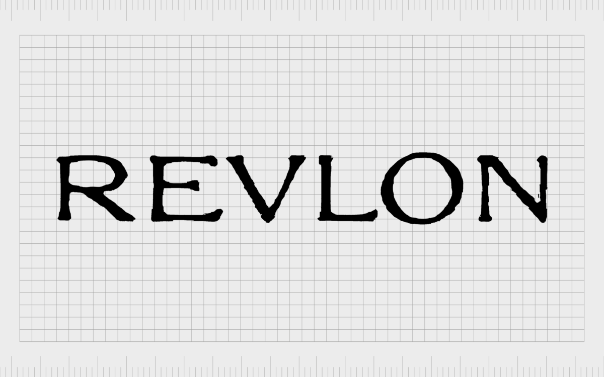
By the 1960s, Revlon had taken a new direction with its logo, opting for a more simplistic, minimalistic wordmark. The cursive, hand-drawn letters were replaced by block, sans-serif characters, all in uppercase.
The slightly textured design of the characters helped to highlight Revlon’s creative personality, while the bold wordmark conveyed ideas of strength and stability.
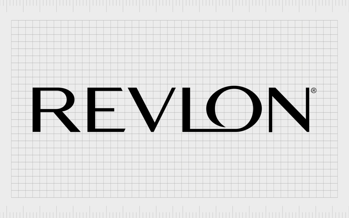
The Revlon emblem, introduced in 1977, is the first variation of the design most people are familiar with today.
The company stuck with the uppercase letters of the previous badge but made them sharper, sleeker, and more refined. The serif-style typeface used for the majority of the characters gave the company an air of sophistication and professionalism.

Perhaps the most compelling part of this logo was the way the “L” and the “O” appear to be connected on the lower line. The original version of this emblem was depicted in black, but Revlon also introduced a red variation of the same wordmark during the 1980s.

2003
Finally, in 2003, Revlon made a very subtle change to its logo, switching the serif letters out for sleeker, more modern sans-serif characters. The majority of the elements from the previous logo remained, including the connected “L” and “O” components.
The slight change in typeface helped the company to create a lighter, edgier, and more forward-thinking aesthetic for its brand. Today, this logo often appears in black on a white background, white on a black background, or in a shade of bright red.
The Revlon logo: Fonts and colors
Though relatively simple, the Revlon logo is an excellent example of how a sophisticated wordmark can convey the unique personality of a brand. The bold letters in the emblem, depicted in a sans-serif font, highlight the professionalism and forward-thinking nature of the company.
The connected “L” and “O” letters also remind us of the organization’s commitment to creativity and innovation.
This minimalistic logo provides Revlon with a versatile way to reach its audience. It works across a range of different platforms and mediums and can be easily converted into different colors for packaging purposes.
You can see some great examples of the Revlon logo first-hand here:
What color is the Revlon logo?
The official Revlon logo colors are usually a combination of black and white. In most cases, the emblem is depicted in black font on a white background. However, there are instances wherein this color palette is inverted.
For certain promotional strategies, marketing campaigns, and product packaging efforts, the Revlon team also experiments with other colors.
Versions of the Revlon logo have been produced in shades of gold and bright red in the past. Additionally, the company uses a red “R,” with the same typeface as its official logo on its website and application icons.
What font does the Revlon logo use?
While the Revlon logo color choices have remained mostly consistent throughout the years, the company has made a number of changes to its font style across the decades.
The inscription of the brand is written in all uppercase letters, in a sleek, sans-serif typeface, with straight cuts on the letter ends and neat lines.
The Revlon logo font is unique to the company, but it’s similar in many ways to options such as Volkolak Sans Display or Acme Gothic Wide Light.
The transformational Revlon cosmetics brand
Exploring the Revlon logo history, we can see how this iconic cosmetics brand has refined and polished its visual identity through the decades.
Although Revlon hasn’t made many significant changes to its wordmark emblem, it has consistently enhanced its font choice and color palette to strengthen its emotional connection to its target audience.
Today, the Revlon logo is a symbol of sophistication, creativity, and professionalism, designed to earn the trust and respect of a global audience.
Revlon logo FAQs
Is Revlon a L’Oréal brand?
No, Revlon is a competing brand to L’Oreal, operating in the same beauty and cosmetics landscape. Currently, Revlon is owned by MacAndrews & Forbes. However, the brand is working on transferring equity and ownership to different individuals.
What is Revlon’s slogan?
Revlon has used a handful of slogans over the years to help advertise and promote its brand. The current slogan for the company is “Be Unforgettable,” which is a direct play on another famous tagline in the organization’s history.
In 1985, Revlon previously used the slogan, “The most unforgettable women in the world wear Revlon.”
What does Revlon stand for?
The name “Revlon” was chosen in reference to the three people who originally founded the brand. The majority of the word comes from the name “Revson,” while the “L” comes from Charles Lachman’s second name.
Fabrik: A branding agency for our times.
Clarity starts with a conversation.
Thanks—we’ll get back to you shortly.
Whether you're navigating a rebrand, merger, or simply need a clearer identity—we’re here to help. No hard sell, just honest advice from people who know the sector.
Let’s start with a simple question…
Prefer to email? Drop us a line.
Fabrik’s been helping organisations rethink and reshape their brands for over 25 years. We’ve guided companies through mergers, rebrands and new launches. Whatever stage you’re at, we’ll meet you there.


